Category Archives: W19-P3 Blog Search

Project 3

Blog search: The Needle Drop

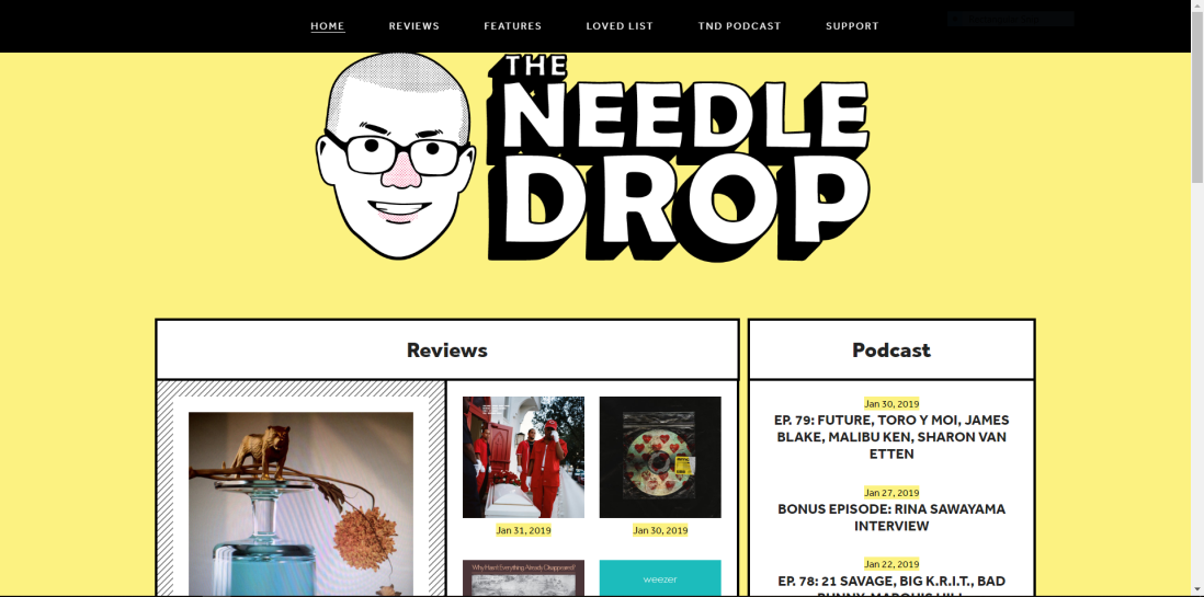
Needledrop cap.The Needle drop is a professional music blogger with a popular youtube channel. He has a lot of titles across the internet, but he calls himself the “Busiest music nerd”. The reason i like this blog is because it gives a fresh perspective to music and the processes around producing music, but also he is a internet meme. He covers all sorts of music related stuff like, the latest music drama, Singles, albums, Random thoughts, and alot more. Anthony (real name) makes a lot of music related content, so his main role in his blog is being a music critic. I think this blog is helpful to understand an audience, because you see how Anthony responds to questions the people ask him and it creates this resource that could be valuable when jumping into music and wanting to understand music from a production/Critic point of view. Keeping this in mind, he is still just giving his opinion and asking for other people’s opinions. These topics vary from having a statement be put in front of him, to covering music related news. Anthony is a pretty funny guy and he is always pumping out new content for his fans, keeping his place as the busiest music nerd.  

The Needle Drop: /http://www.theneedledrop.com/

Professional Blog Review – By Gabriel Sampedro

I chose to review Philip Bloom Blog site because he is a growing independent filmmaker who has gained various experiences with different film styles – those of which include commercials, music videos, corporate films, broadcasting, and other fun videos for the web. I believe from this experience, any Bloom film will not only be enticing but also original.

Throughout the lifetime of Bloom’s career, he has amassed 27 years of knowledge and familiarity with his team, and of course the gear, he is using. Bloom has reviewed numerous cameras and explains on a side-by-side basis, which cameras he prefers and which one he recommends for the job – some insight a curious kid like myself may want to know for a school project. Additionally, Bloom also includes reviews of different types of tripods, drones, and other film-related gear a director of photography might be interested in learning. With links of how to use special cameras and detailed reviews, Bloom demonstrates he’s very supportive of studious learners.

When scrolling throughout Bloom’s blog, I notice there’s ease in finding what I’m looking for. For me, I primarily look for reviews on cameras and other related gears – and that’s a characteristic Bloom’s blog definitely emphasizes. I would highly recommend Bloom’s blog because the information is purposeful and informative. Everything Bloom writes focuses on the audience, and it suits new readers well enough to understand an insight into the art of filmmaking.

http://philipbloom.net/

The Blog Graphic Designers Need

Graphic designers don’t know everything and need a helping hand every once and a while, but where do you go for help? Onextrapixel.com is a great online blog that covers graphic design topics such as how to make a portfolio stand out, how to use white space, and many other helpful tips to ease graphic designers minds.

A great resource from this page is How to Make Your Personal Portfolio Stand Out – 7 Must-Haves. It teaches you how to create an amazing portfolio that helps you find jobs or clients as a graphic designer. A portfolio is one of the most important things a graphic designer needs and should be made perfectly.

I believe Onextrapixel is produced in WordPress or could be run by a completely different engine.

Onextrapixel offers resources, tutorials, and freebies for a variety of subjects. Want to learn some new Photoshop tricks? Onextrapixel. Having trouble with your WordPress theme? Onextrapixel. Need inspiration while picking a font for your logo? Onextrapixel. From photography to illustration to social media, Onextrapixel has all of your bases covered. All in All, take a look at Onextrapixel.com

Blog Search: Poynter

Blog URL: https://www.poynter.org/

The blog I found is a resource for aspiring and current journalists providing various articles about the do’s and don’ts of journalism in the media today.

This blog features many resources that journalists today should follow, usually in terms of good and bad examples that have been published in the media. They publish articles dealing with various topics such as ethics, fact-checking, resources for finding jobs and many more that are constantly being updated.

Example of Fact-Checking articles: https://www.poynter.org/media-news/fact-checking/

With the many issues that professionals and consumers have with the news media today, this blog is very well thought out and produced to a higher standard than most news sites since they are trying to educate people about the profession rather than to entertain or inform.

In addition, Poynter also features job opportunities across the country and training events for students and those trying to improve their skills in specific fields of journalism.

Poynter also posts articles that are taking different approaches to articles and covering the news that would intrigue anyone from photographers to aspiring news anchors and broadcasters. Many of the news stories come from many different sources but are targeted for a more national audience making this blog site ideal for any journalist or people simply trying to get better national news selection.

Different approaches: https://www.poynter.org/reporting-editing/2019/the-oregonian-spent-years-on-a-story-about-a-serial-killer-who-got-away-again-and-again-with-murder/

Photojournalism: https://www.poynter.org/ethics-trust/2019/nyt-faced-hard-choice-over-graphic-photo-selection/

Job Opportunities: https://www.poynter.org/media-news/media-jobs/

By Dom Moulton

Great Free or Paid Resource

Today I’m bringing y’all a nice resource I use when I need idea’s or help with a design. Chris Spooner is a Graphic Designer based in the UK with an awesome blog. His Blog is Spoon Graphics https://blog.spoongraphics.co.uk and is jam packed with information. He has free tutorials on Photoshop and Illustrator ranging from cutting hair away too creating your own syfy phaser. The tutorials are simple to understand with step by step pictures and descriptions. I’ve noticed that there are some repeats, so if you don’t get the first post you stumble onto, you can find an older one that maybe easier to understand. Another plus is all the free brushes, textures, vectors, and occasionally presets. He also has a member subscription where you gain access to 700 Vectors, 100 Mockups, 400 Textures, 900 Icons, 300 Brushes, 7 Fonts, 300 Actions, and 100 Source Files. Since I’ve downloaded his free subscriber bundle, with a mix of a 100 files from each category above, I can say his file organization is near perfect. It’d be perfect if it was labeled exactly how I need it for the work I’m doing. His content is high quality and holds up in print. With his skills it wouldn’t surprise me if the website was built from the up.

Blog Search: The Jellyfish Act

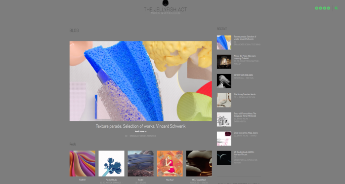
The Blog that I found is dedicated to motion graphics and animation. The blog is called “The Jellyfish Act: Motion Graphics Blog” and the URL/website is below.

https://www.thejellyfishact.com/

I chose this blog site because I am very interested in motion graphics. I think that other students who are interested in this should take a look because you can see people exploring different types of animation. This blog has professionals who work for companies and it also has a few freelance artists. I like that this blog included both so students can see how motion graphics can be applied in the workplace.

One of the professional artists that is showcased is Vincent Schwenk. He is an animator based in Hamburg. The art that is in this blog shows Schwenk exploring texture in animation. It is really fascinating to see the clarity and quality of the short videos. Definitely worth a look!

This blog site is organized well and is easy to navigate. This helps the viewer to focus more on the art rather then trying to find the pieces of the site. All of the images and videos on this site are high quality and easy to see.

This blog site is interesting and exciting to look through. I highly recommend it to anyone who likes animation and wants to see a diverse repertoire of art.

by: Krista Ortiz

Alex’s Blog Search

The name of this blog page is called Hey Sport.

http://heysport.co/


huesports.png

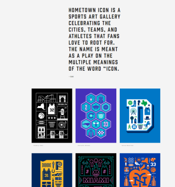
1.) The reason I chose this website was because I found it to be really simple and really easy to navigate through the many different designs this website has to offer. I could see other people finding the website interesting because the blog site is mainly a sports design blog. It doesn’t just appeal to soccer fans either. The website has lots to offer ranging from jersey designs like the one above to having very unique and interesting artwork of specific sports players.

2.) A great resource as you click on the about page, is that the blog was actually created by Tim McCarthy. The website has a link that you can click on http://www.thelastpick.com/

and by clicking on that link you are redirected into the website of Tim McCarthy.

heysports1.png

There you can click on the portfolio page and see all his work. He has even done some work for Apple and his style is nothing short of unique.

3.) Like I said previously, I think the website is very well produced. The reason I say that is because the website is really easy to manage. Not only that but when you click on a certain category that interests you, you will be directed to a page with some very interesting and unique sports graphics.

4.) The quality of the information is great because once you click on a certain art style or series of images that you like, a page will open up with lots of different information regarding the graphic designs.

heysports2


Taking on a New Take – Jacob Adams

“Today, I take a look at one of my favorite filmmaker; and his blog that tells his story.”

Take a Look at it Here!

Simon Cade, a filmmaker, and host of DSLRguide has been producing films since the age of 11. I have been following Simon’s work for as long as I also have been producing films. On YouTube, I watched his channel grow from 50 thousand subscribers to well over 800k at the time of writing this. From simple audio recording tips to professional cinematic color grades. His blog and youtube channel are some of my favorite places to learn about filmmaking. One of my favorite posts is “How to Make a Dramatic Movie Trailer” but with a catch, he couldn’t film any of the footage he used. This meant he had to use stock footage, forcing him to focus on the edit and how the clips tied together. I learned a lot from Simon as I too grew through my filmmaking journey.
Even something as simple as an introduction to filmmaking for beginners takes on a cinematic feeling as Simon tells how a film should be made with several scrabble pieces, aligning to form words. Each blog post covers the behind the scenes of the video, “…literally hundreds of tiny sounds, from the ‘click’ sound of two pieces hitting each other, to the sound of every piece scraping the table as it moved…”  His young age brings on a great contrast to the sometimes older age, boring industry but through it, he stays professional and serious.

“I want to congratulate Simon on his work, his work attitude, and his great knowledge; having never gone to school for film. “

Here are some of my favorite works of Simon Cade of DSLRguide as well as the blog linked to each of them:

-How to Make a Dramatic Movie Trailer-

Blog: http://dslrguide.tv/how-to-make-a-dramatic-movie-trailer/

-Introduction to Filmmaking for Beginners-

Blog: http://dslrguide.tv/filmmaking-for-beginners/

-Color Grading in Filmmaking-

Blog: http://dslrguide.tv/color-grading-in-filmmaking/

-a film is…-

Blog: http://dslrguide.tv/a-film-is/

-Why I Won’t Buy a New Camera-

Blog: http://dslrguide.tv/why-i-wont-buy-a-new-camera/

-How to Make a Music Video- Blog: http://dslrguide.tv/music-video/

W19-P3 Blog Search (Draplin Design Co., North America)

Draplin Design Co. North America.

Draplin Co.

I chose this site/blog because of the amazing things that Aaron Draplin has done and the person he is and company he runs.

Draplin Design Co. (graphic design) has done work with Nixon, Peak Oil, Sizzle Pie, Sasquatch Music Festival, and many many more. I haven’t followed him or the company for long, but the work and the designs and logos and banners have been a part of my life for years.

Being a person of the PNW and Aaron being a Portland based guy with an Oregon based company, I think that in-itself is the reason why you should pay attention also.

Some of the wonders from the site, is the experience of design and life. Its a simple and too the point and over-loaded with information, products, music, fonts, typefaces, vector images, and advice. It gives you a true perspective of someone that has started their own company, and made it, without a care in the world of what people think, as long as they get what they are looking for.

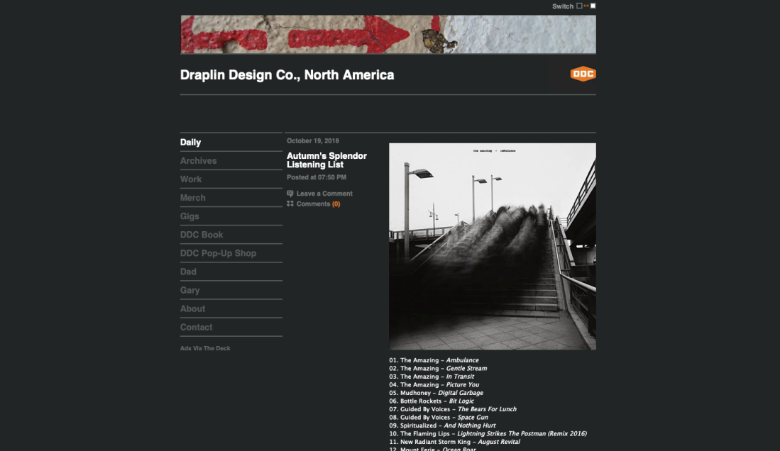
The blog, for fresh eyes, is a simple blog post blog. Theres not articles or long blabbery. He understands that content is content but you dont need the bullshit. Its small in the essence of there not being any extra flashy stuff. Its easy to navigate, understand and very easy on the eyes. Its for anyone and everyone.