Category Archives: Fall 2019

Check out Fotor!

Hey there!

I decided to choose http://www.fotor.com/blog/ as my blog for this research project. 

Honestly, I didn’t know about this blog until this paper was due. I “stumbled upon” it you could say (Hopefully some of you get that reference). I’ve always been into photography and its been a huge part of my life.

This blog has some amazing tutorials with picture graphics for those that as visual learners as well. Not all of it is photography related. That’s what I like about it. It has options for resume design, how to’s for beginners, graphic design trends, and even some inspirational quotes to help you get going! Now this blog is actually a blog for a photo editing program. If you clock the option “upgrade to Fotor Pro” it gives you a list of what is about to be done with the pro program compared to the free program. I really appreciate blogs like this that have such a wide variety of tutorials for multiple things and not just one specific subject.  I wasn’t aware I wanted to design my own lock screen or wallpaper for my phone until I saw the tutorial on Fotor! I’m extremely excited when it comes to creating art so this website definitely caught my eye!
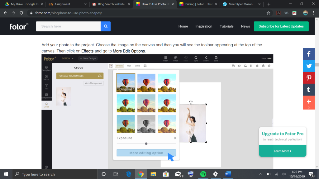
Just an example of the tutorial pictures to help in the articles.

I feel the layout of this blog is very functional and has some great clip art that grabs your eyes. The colors are very bright and inviting. Its simple and easy to use. Although, I feel the search could be a little bit more refined. For instance, I typed “wallpaper” into the search engine, and it gave me a total of 4 articles. One being an article to create your own wallpaper, as I said earlier. The second being an article about smart marketing and the last two being about Christmas. They have a huge variety of articles but could use some help with keywords. I might have to see if there is a free trial of the photo editing portion of this blog. I can’t wait to try out some of the DIY’s it offers! Hopefully you enjoy this blog as much as I do.

P.S – For those of you wondering about the “stumbled upon” reference, the site is shut down, but google it! StumbleUpon was an amazing site where you put your interests into a generator and it would randomly choose sites you wouldn’t usually “stumbleupon” according to your interests.

Thanks for reading!

find your shining star

What makes a blog good?

That’s a question that’s been on my mind a lot since setting up this very blog. You’ve gotta have a nice format, plenty of pictures, decent color choices… not to mention the actual content!

I spent some time today just looking through different blogs online, and while I’m certainly no expert, I can definitively say one thing:

A lot of blogs really suck!!! They look bad. They’re unreadable. All their links are either just endless, horrible lists, or they’re arranged in crowds of blocks with the tiniest, lowest-resolution images on Earth. And I hate them.

So, when I finally found some blogs that actually look pretty nice, it was such a relief. And then I found a blog that looks nice AND is actually relevant to my interests, and I began weeping over my desk, because it really shouldn’t be so hard to find good blogs in a world where, when you search “___ blog,” all the Google results are top 20 lists declaring all the best blogs you should feel bad for not already reading.

…Okay, I’m exaggerating, I didn’t actually cry, but I did feel like I’d finally been thrown a life preserver in a sea of art blog countdowns.

So, without further ado, let me present:

Lights Film School’s Indie Filmmaking Blog.

This blog hosts a TON of different articles about every aspect of creating an indie film. If you scroll to the bottom of the page, you can actually find a little directory guiding you to different subjects, like directing, editing, and sound design. If you just want to see their most current work, each page of the blog itself contains links to up to six articles, each with its own header image, title, and succinct description of the lesson within.

I’m a huge fan of how easy it is to navigate this site! It’s hard for me to focus on big blocks of text without visuals to guide my eyes around, so their choice to have large images attached to each post is genuinely helpful.

Another thing I’m really excited about is, of course: the content! I’ve been interested in the movie making process for a while now, so being able to just click through pages upon pages upon pages of materials on filmmaking advice is very cool.

I’ve only been able to skim a handful of their articles before writing this post (they’re all really in-depth and pretty long!), but I’m looking forward to sitting down with a cup of coffee and a notepad and thoroughly reading their lesson on the prewriting process. It discusses different methods of prewriting and the benefits to using each one, which is something I want to learn more about, especially considering I’m working on prewriting a personal project of my own.

Seriously: LFS makes a good blog. We could all at least learn a thing or two from their excellent design skills, if not their nigh-endless moviemaking knowledge. But don’t take my word for it: if you missed the link above, go ahead and click here to check them out.

-Amanda

Fun With Animation and Film

The Name of the professional blog I chose is called the NFB Blog. (here is the link https://blog.nfb.ca/blog/2019/04/15/national-canadian-film-day-9-hidden-gems/) I chose this blog because they have a lot of examples of animation and stop motion animation. If you’ve read my earlier posts you know I want to do that in the future. Anyway, It’s also a really good place to get inspiration and ideas for fun stories. The other thing I like about this blog is that they credit a bunch of different filmmakers and animators so you can get a variety of different works and know exactly who did. The company name doesn’t just get all of the credit for a bunch of people’s work. 

NFB Blog Screen Grab
NFB Blog

This blog is also has a lot of connections to educational resources to help you learn about all sorts of things, from animation to film making, to even learning about the ocean. Another good resource they have is interactive videos so you can actively learn new things. The only catch is you have to subscribe to get the education content and I think you also have to pay for the subscription. 

The production of the blog is okay. It’s a little hard to follow at times because when you click on something like a video it will send you to one place then you have to click on another page to get to the video and where you can comment. So the navigation a little weird but once you get used to it the navigation gets easier. 

The quality of the information is really good. I love all the examples they give of all the different artists involved in this company. Some of my favorite examples of stop motion animation are by the artists Claude Barras and Curtis Horsburgh. Claude Barras’ style of art is humerus, dark, and I just love it. Curtis Horsburgh’s video “Fyoog” captured how I feel when I get on the bus for school and fall asleep. I also love how you have a choice to do the inactive or educational part of the blog. If I had the money I would most definitely subscribe so I could participate in the educational part of the blog. 

By: Kaitlynn DuBois

Reviewing an Online Blog: Depositphotos

When I was about ten, I bought myself a little camera and took it with me all over the place, snapping shots of my life. I still love taking photos to capture special moments and to just be creative!

Although I am undecided as to what specific career in multimedia design I want to pursue, I am interested in photography and I find inspiration when looking at others’ works of art, something that isn’t lacking in the website I found.

Depositphotos (https://depositphotos.com/ )is a website where you can “download more than 130 million high-quality royalty-free stock images and high-definition footage.” It provides pictures, news images, illustrations, and videos that you can buy or simply browse through.

If you are like me and aren’t interested in buying images, Depositphotos also offers a free option! By simply creating an account on their website, you can receive free weekly stock photo downloads or sign up for informational e-mails!

At the bottom of the website page under a list entitled DEPOSITPHOTOS is a link to the Depositphotos Blog (https://blog.depositphotos.com/ ). From photography and design to business and marketing, these blogs provide inspiration, up-to-date news, and artistic advice. For example, one blog category includes photo collections of specifically selected photos arranged in certain themes, and another includes fascinating interviews of professional photographers. Depositphotos Blog makes it easy for you to blog on their website, and to learn a little about the others who have posted! Commenting on posts is available and easy, and you can also connect with Depositphotos on social media through simple links on their website.

This website is pleasantly arranged in a simple, well-designed format. Navigation links are placed in convenient locations, and posts and advertisements are arranged in neat rows. The simple neutral colors it uses cause the colorful photos to catch your eye.

Here are a few more fun aspects of the Depositphotos website:

When browsing through stock images and media, there is a handy tool bar on the left side of the screen from which you can easily locate what you’re looking for by choosing a color scheme, category, and more.

(I highlighted the tool bar with a pale pink rectangle)

With a click of your mouse, you can also switch the language of the website to any of twenty different languages!

Depositphotos will definitely be my go-to website for photography tips, tricks, and inspiration! I am excited to keep exploring their website and reading their blogs.

Written and posted by: Kailey Slocum

Blog Search

Surrealism Today

https://surrealismtoday.com/

Screen grab of art blog

Surrealism Today is a blog centered on contemporary surrealism art in various mediums. The blog has various work from artists throughout the world posting their work to share with the art community. Surrealism Today is a source to inspire and encourage other artists to create in the medium of their choosing.

I chose this blogging site because surrealism is a favorite art style of mine that I can connect with. What makes it my favorite art style is the collision of reality and dreams that can be horrific or fantastic. I think that this particular blog could be interesting to others because it could be a source of inspiration to create in your medium and also connect with artists from other parts of the world. Aside from interesting, the site has good resources for one to use.

On the digital art page of the blog, I found an example of a good resource. This page contains many hyperlinks to other forms of contacts to artists and links to other art resources. Most of these links further showcase the work of these artists and give the viewers an insider look into an artist’s intent behind their art.

Surrealism Today blogging site is produced well in that it is simple and not over the top with graphics. The entire blog is clear and balanced. Images, videos, and animated images are evenly spaced and aligned. There is a great deal of upkeep and does a wonderful job of organizing their information. 

The quality of information is good and not overwhelming to the viewer. On the home page, the viewer is given insightful information on various artists that are recently featured. This information is given in a snippet, but you’re given the option to click on a link to read on. This sort of setup minimizes heavy text use and gives ample room for visual arts that keeps the viewer interested in exploring the site some more.

Blog Search (Wirrick-Coad)

Michael Ray Photography/Foodportfolio

When searching for a professional blog, it’s all about what the person who made it can teach me. If a website is nice looking and has good photos, that’s great, but I want something more. When looking through food photography blogs I came across Micheal Ray’s Photography page. Not only does this individual do incredible photography of still life, portrait work, and more, he uses most of his time to focus on food photography.

If you get a chance to see his blog, it shows this in return. For some of the photos he’s done, he even has video tutorials on how to do it yourself. That’s a completely free and awesome resource that people like me can use to improve our photography and I’m grateful for it. The ability to learn from a professional for free can sometimes be incredibly hard or straight-up impossible. Michael Ray has gotten so much out of his craft that he loves that he’s wanting others to learn it even if it doesn’t give him anything in return, that’s a dedication to the art form and it truly inspires me.

The information is visible with links that work perfectly fine. The words and art against the clear white background add just the slightest more detail giving everything on the page a little more pop. Of course, everything is in a neatly compacted order and you can find exactly what you’re looking for with ease. I believe that will all these things I mentioned, that’s what creates an amazing blog.

Doug TenNapel

Doug TenNapel is a graphic novelist, video game designer and TV show developer

https://dougtennapel.com/blog/

I have always been a fan of Doug’s work ever since I was a kid. He is the creative genius behind Earthworm Jim, a character that became popular enough to have a video game series, animated series, and a toy line. He is also known for creating The Neverhood. A PC point-and-click game that was created using clay and stop motion that later spawned two sequels, Skullmonkeys and Armikrog. He was also the co-creator of a Nickolodeon cartoon called Catscratch. Which includes three cat characters derived from his first graphic novel, Gear.

This blog is where Doug shares his thoughts on the comics industry, writing, pop-culture, as well as his views on philosophy. He is also an advocate for Indiegogo, a crowdfunding site that contains campaigns for charities, start-up businesses, or other entrepreneurial ideas. He uses it himself for promoting his upcoming graphic novels. 

The site is very well organized. The black and white background colors work very well. Especially with the images of his artwork blending in with the background. The text is easy to read and cyan was a good choice for highlighting certain elements. The site navigation works fluently. 

There is also a link to his Youtube channel where he hosts a podcast and talks about his work, among other topics. He’s had some notable guests on his show and will occasionally communicate with fans through this and his other social media accounts that people can follow. Doug TenNapel likes to encourage young artists to pursue their dreams and get their work out there for the world to see, no matter how weird it is. That’s why I like him.

UX Collective – Not Bob Law’s Law Blog

UX Collective – uxdesign.cc

UX Collective is a publication on Medium focused on topics, research, and resources covering user experience design. I chose The UX Collective as they have well-curated content and keep up-to-date with new trends and developments in user experience design. You may find the UX Collective to be a nice resource if you have interests in UI, Product Design, User Experience Design, and/or Psychology.

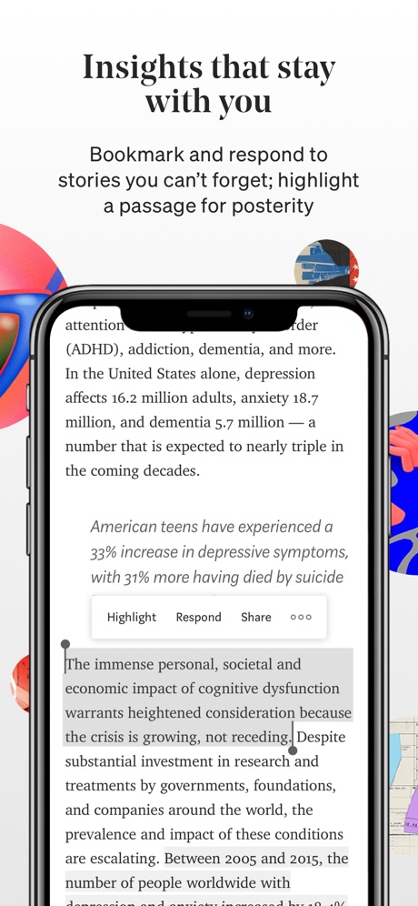
UX Collective is a publication, serving as a distributing host for authors’ content much like a newspaper or magazine. Medium is the online publishing platform that the UX Collective is hosted on. I think the use of the Medium platform enables a high production value as it standardizes the content styling making it accessible and responsive across devices. As a reader, I can highlight key sections and I can bookmark articles for reading later or easy reference. Medium is unique to many blogging platforms as it sorts posts by topic rather than by the writer. It also has a “clap” system for up-voting quality content.

The Medium platform enables me to highlight passages and bookmark my favorite stories.

UX Collective has consistently published helpful and interesting information. I feel this is helped by both the editors and the up-voting system. The articles with the most claps in a given frame of time will filter to the top of the blog’s feed, ensuring readers are presented with high-value content every visit. In the words of the editors: “UX is becoming increasingly popular, and with that comes a lot of clutter, noise, and disorientation. The UX Collective is our attempt at curating some of that content and giving it back to the community in a more structured and digestible way.”

I’ve shared some articles I found to be helpful resources or fun reads below. If you decide to explore further, please note that any starred articles, marked with “⭑”, will be viewable by members only beyond 3 free article views. You might be able to bypass this by opening an incognito window. (CMD+Shift+N)

Thanks for reading!
-Greyson

Recent UX Collective Article Highlights/Resources:

See Also:

Blogging the Blog

For its fresh inspiration, unique perspectives and variety, I chose the blog site Identity Designed. Identity Designed is a collection from around the world of many branding identities. For consideration, artists submit their works in hopes of being featured on ID.

Besides tons of inspiration, ID is a good way to get some attention for your design studio. There are many photographs of different designs with each post and there is some explanation of how-to and creative process. One can find an abundance of opportunities to learn from other creators through the corresponding stories what unexpected problems they faced and how they solved them.  Discover new styles and typefaces, open your mind to new choices, and a treasure cove of other useful information.

One of my favorite examples is the post by Afterhours, London featuring their designs for Lola Tara, a fashion brand. They talk about some of the creative process in choosing the typeface for the logo. They discuss how and why all photography of the garments on models were shot with the intention of mimicking the logo as well. These are good things to think about when considering a design project, yet are often over looked, or just not thought of by novice designers. Because I do a bit of branding work, product photography and also graphics work, these are all very useful notions to keep on mind while doing my own work.

This website is very easy and tidy. ID is incredibly user-friendly and, besides being very aesthetically pleasing, functions well. All posts are of the highest quality, and the audience is imbued with the desire to lift their designs to new heights. I invite you to check out their site at https://identitydesigned.com/

“Searching for an inspiring blog”

By Krizia W.

“DRIBBBLE”

REVIEW

  • I chose this site because it is very up-to-date. I found a lot of blogs that showed up on the first few pages of Google, but it had been a year or more since the last post. I’m sure those blogs have very good content, but I prefer to read something current so I have the ability to comment on a page that isn’t outdated and hopefully make connections with like-minded designers! This blog is mostly designers showing their images/screenshots of websites/package design/etc. There isn’t too much writing other than a short description of the work, but in the world of design, the image speaks clearly enough! This is a very clean, professional, colorful, well-made site! I like that the designs are generally modern and colorful- which is right up my alley.
  • Besides “ALL”, these are the specific categories you can look through, which makes the site very well organized-
     -Animation
     -Branding
     -Illustration
     -Mobile
     -Print
     -Product Design
     -Typography
     -Web Design
  • RESOURCES- They provide a link to MeetUp for meetups in your area, which is very cool! This feature was at the top of the navigation page and it was very easy to find.

This was a very cool posting to see! This designer showed not only the polished, finished product, but also showed the rough sketch that started the whole design! This was very inspiring to see and made the idea of creating an elaborate design more approachable!

———————————————————–