Category Archives: F15-P3 Blog Search

Project 3

Joey’s Choice: A review of a professional BLOG!

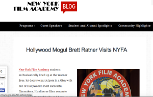
Screen Shot 2015-10-19 at 10.34.30 AM

The New York Film Academy Blog seen here: https://www.nyfa.edu/film-school-blog/ is a wonderful, fun resource for up and coming film makers.  It will link you to their main site for information about programs and offerings from NYFA, but my favorite resource is the blogs about guest speakers, and their insight into the film business.  They tell inspiring stories of passionate people who have carved out their success through the guidance of mentors, and training they have received.

I think the site is well produced, easy to read and follow, and has a nice variety of articles.  Not only do they highlight work and success of alumni, but they provide news about current faculty, changes in the organization, and opportunities to be involved and experience what NYFA has to offer. For example, NYFA Los Angeles has recently welcomed cinematographer Tony Richmond as the new lead faculty of the Cinematography dept.  and also, Wednesday nights in New York they produce a comedy show for students to hone their craft at the Comedy Cafe.

The information in this blog is current, relevant, and interesting to read.  I enjoy the quality of their content and always find fun articles and words of wisdom.  I highly recommend browsing to anyone interested in film, or considering attending film school.

This post was written by Joey Johnson :)

Motionographer

http://motionographer.com/

Motionographer

When we received this assignment, I wasn’t expecting to find a blog I would want to keep checking up on. Then I found Motionographer. The name itself is clever, and the blog itself is well designed. Taken from the “about” page:

Motionographer (pronounced like “oceanographer”) seeks to be a source of inspiration for filmmakers, animators and designers by sharing:

  • Outstanding work from studios, freelancers and students.
  • Feature stories that give readers a deep understanding of the work we like and the industry we love.
  • Commentary that sparks discussion or introspection.
  • Miscellaneous items that Motionographer contributors find interesting.

Motionographer isn’t just about motion design. Inspiration can come from anywhere, and the Motionographer contributors hope to provide you with interesting material regardless of the medium in which it was created.”

This blog is, as it states above, a wonderful source of information and inspiration. It shares everything from music videos and short films to video game trailers and reviews to interviews and beautiful animations. I’ve linked some examples of what I enjoyed above. I plan on coming back to this blog regularly, searching for inspiration and motivation; two things I’m in need of. The blog is managed and updated regularly by a duo of creative people who’ve had the blog since 2006 and will continue to use it for (hopefully!) many more years.

Survive the Forest: An Indie Game Dev Blog

survivetheforest.com is the dev blog for the indie game The Forest.  Some images may be disturbing.

Screen Shot 2015-10-13 at 11.08.54 AM

The Forest is a game that’s in it’s beta stage of development right now.   It seems to be mostly run by Anna who writes updates on the process of the game, bug fixes, patches, dead lines, and includes features like screen shots, trailers, and an FAQ.  The FAQ is a good resource of information for anyone thinking about purchasing the game or wondering about more of the game’s features.   This site is a good example of what a well made dev blog should look like.  The scrolling screenshots on the top of the homepage are attractive and gain the attention of the viewer and can make new viewers more curious about the game.  The posts are easy to look at with clear titles so the reader knows that when a post is titled “v.0.25b – hotfix” they’re going to be reading about the version 0.25b hotfix.

Some things that could be better would be an easier to access archive in case someone wants to compare updates or see what the game was like back in the earlier versions of the game.   For a dev blog it’s fine where it is, but I think it could use some more topics like a Q&A too keep more people interested in the blog and game itself.

From Mermaids to Pyrotechnics

I was thrilled to come across Benjamin Von Wong’s photography blog.  He does amazing fantasy inspired photo shoots and gets to travel to beautiful countries to produce these photographs.  Whats not to be inspired by?

http://www.vonwong.com/blog/

Screen Shot 2015-10-15 at 8.53.43 AM

Screen Shot 2015-10-15 at 8.52.57 AM

Besides just being in awe of the work he has produced and the creative thinking that went into each project, he actually tells you how he pulled off the image. On most of his recent posts he lists the ISO, f stop, and shutter speed settings used to make the image.

Screen Shot 2015-10-15 at 9.55.26 AM

He also gives tutorials and tips for accomplishing unique style and photography tricks to use in your own work. One post in titled, ” How to get free epic models”, he talks about just getting out there and crashing events, insert yourself into the situation. I really think his blog is meant to inspire people and get them to start thinking creatively without the “I cant do it” attitude.

Another thing I found to be helpful, he has an entire section that talks about what equipment he uses. Theres a picture of the object followed by a short description, and sometimes the reason why he likes to use it. I think thats information that can be golden to someone who is just starting out with photography. Everyone wants to know what a professional uses in their work. I think the quality of the information provided in the blog is supported by the images that are products of that information.

The site looks very professional and well produced. The video at the top really draws you into the articles, and has an overview of what the blog entails. I feel that a lot of effort is put into the blog, and I appreciate creative wit he puts into the titles of his entries.

I found a new favorite artist and blog.

Screen Shot 2015-10-15 at 10.17.26 AMScreen Shot 2015-10-15 at 10.18.17 AMScreen Shot 2015-10-15 at 10.19.45 AM

Can’t Stop Scrolling

Blog: BOOOOOOM

Where: http://www.booooooom.com

Looks:

Screen Shot 2015-10-13 at 11.33.01 AM

Screen Shot 2015-10-13 at 11.37.51 AM

I stumbled upon this blog (among a few others) and was immediately drawn to BOOOOOOM. Their name alone was impactful enough to decide it was worth clicking on. Before even checking out the content I wanted to like it…if I ended up not finding any interest in it I would have been a little disappointed, because with a name like that, you have to deliver. Kudos to BOOOOOOM because the delivery was done. This blog focuses on all sorts of digital art, illustration, animation, photography, etc. They showcase a lot of really interesting pieces, like their most recent post, showing a pencil line depicted as an IV. They have it laid out as an eye grabbing photo or illustration, followed by a very clean-looking button/link to read more on the artist and the art.

The image above is a drawing done by an artist, Ibrahim Resnelli, from Bursa, Turkey. The link features another link to learn more about the individual artist, as well as showing other examples of his work.

I think it’s cool that this blog shows work from artists all around the world. In addition to that I think it’s a very well developed blog aesthetic-wise. It’s a very clean layout, not over-crowded or cluttered like I saw some other blogs were. It’s organized in a very clear and simple way, with topic links that stand out right at the top with zero confusion. They even have their Twitter link right at the very top of the page which was smart.

Overall, I really enjoyed scrolling away through this blog. I almost couldn’t stop, just looking at all the incredible artwork being featured. Very inspiring. Good job, BOOOOOOM.

Blog Search

Birth.Movies.Death

http://birthmoviesdeath.com

Screen Shot 2015-10-13 at 11.19.47 AM

Birth.Movies.Death is a blog that covers mostly movie news and editorials but also has pieces on tv and video games from time to time. Things that are posted include casting news, reviews, think pieces, trailer premieres, costume announcements, and really any piece of news related to movies.

What I like about this blog is the breadth of content that is posted. I like that it is not just news but also pieces that include thoughts and opinions. Also related to breadth of content posted is the type of movies that are covered. There is plenty  of coverage related to news about every new superhero movie that comes out but there is also pieces related to small, weird, interesting films. I like that both bigger and smaller movies are covered. The site is very well produced with an aesthetically pleasing layout that makes everything very easy to find. Sections are clearly marked so you can easily find the newest articles, the most read articles, and the task bar at the top of the website make it easy to find anything else on the site you would like to find which includes their features, reviews, trailers and podcasts. There is also a lot of engagement with the readers as the authors will frequently be in the comment section debating various things.

This blog provides very interesting and relevant news and insight pertaining to many different forms of entertainment and I would consider it my favorite site to go to for this type of information.

Blog Search

Birth.Movies.Death

http://birthmoviesdeath.com

Screen Shot 2015-10-13 at 11.19.47 AM

Birth.Movies.Death is a blog that covers mostly movie news and editorials but also has pieces on tv and video games from time to time. Things that are posted include casting news, reviews, think pieces, trailer premieres, costume announcements, and really any piece of news related to movies.

What I like about this blog is the breadth of content that is posted. I like that it is not just news but also pieces that include thoughts and opinions. Also related to the breadth of content posted is the type of movies that are covered. There is plenty  of coverage related to news about every new superhero movie that comes out but there is also pieces related to small, weird, interesting films. I like that both bigger and smaller movies are covered. The site is very well produced with an aesthetically pleasing layout that makes everything very easy to find. Sections are clearly marked so you can easily find the newest articles, the most read articles, and the task bar at the top of the website make it easy to find anything else on the site you would like to find which includes their features, reviews, trailers and podcasts. There is also a lot of engagement with the readers as the authors will frequently be in the comment section debating various things.

This blog provides very interesting and relevant, news and insight pertaining to many different forms of entertainment and I would consider it my favorite site to go to for this type of information.

Professional Blog – Forrest Emery

Joshua Rainey Photography Blog:

http://www.joshuaraineyphotography.com/blog/

Screen Shot 2015-10-13 at 11.01.56 AM

The first thing you’ll notice about this blog is how clean and professional it looks. It grabs your attention immediately and oozes quality all throughout it. This is put on display on the front page as every post is separated into an excerpt with part of the text and a picture at the top of it. This is a great example of how to organize a blog and on top of that, how to make it look really professional.

Every post on this blog is a great resource in and of itself because each one has a variety of information on the location of the photo shoot and the experience the photographer had with them. More obviously, each post has a variety of different shots that you as the reader can learn from and try and emulate.

I really enjoy coming to this blog because it seems like every post provides new insight on being a professional photographer and has a variety of examples of different shots for every occasion. The photographer does weddings, portraits, senior pictures, events, and so much more. It’s almost absurd how diverse this person is, and all of their work is great.