Category Archives: Past Student Work

Joey’s Choice: A review of a professional BLOG!

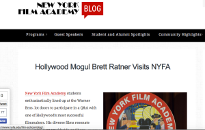
Screen Shot 2015-10-19 at 10.34.30 AM

The New York Film Academy Blog seen here: https://www.nyfa.edu/film-school-blog/ is a wonderful, fun resource for up and coming film makers.  It will link you to their main site for information about programs and offerings from NYFA, but my favorite resource is the blogs about guest speakers, and their insight into the film business.  They tell inspiring stories of passionate people who have carved out their success through the guidance of mentors, and training they have received.

I think the site is well produced, easy to read and follow, and has a nice variety of articles.  Not only do they highlight work and success of alumni, but they provide news about current faculty, changes in the organization, and opportunities to be involved and experience what NYFA has to offer. For example, NYFA Los Angeles has recently welcomed cinematographer Tony Richmond as the new lead faculty of the Cinematography dept.  and also, Wednesday nights in New York they produce a comedy show for students to hone their craft at the Comedy Cafe.

The information in this blog is current, relevant, and interesting to read.  I enjoy the quality of their content and always find fun articles and words of wisdom.  I highly recommend browsing to anyone interested in film, or considering attending film school.

This post was written by Joey Johnson :)


Motionographer

http://motionographer.com/

Motionographer

When we received this assignment, I wasn’t expecting to find a blog I would want to keep checking up on. Then I found Motionographer. The name itself is clever, and the blog itself is well designed. Taken from the “about” page:

Motionographer (pronounced like “oceanographer”) seeks to be a source of inspiration for filmmakers, animators and designers by sharing:

  • Outstanding work from studios, freelancers and students.
  • Feature stories that give readers a deep understanding of the work we like and the industry we love.
  • Commentary that sparks discussion or introspection.
  • Miscellaneous items that Motionographer contributors find interesting.

Motionographer isn’t just about motion design. Inspiration can come from anywhere, and the Motionographer contributors hope to provide you with interesting material regardless of the medium in which it was created.”

This blog is, as it states above, a wonderful source of information and inspiration. It shares everything from music videos and short films to video game trailers and reviews to interviews and beautiful animations. I’ve linked some examples of what I enjoyed above. I plan on coming back to this blog regularly, searching for inspiration and motivation; two things I’m in need of. The blog is managed and updated regularly by a duo of creative people who’ve had the blog since 2006 and will continue to use it for (hopefully!) many more years.

Survive the Forest: An Indie Game Dev Blog

survivetheforest.com is the dev blog for the indie game The Forest.  Some images may be disturbing.

Screen Shot 2015-10-13 at 11.08.54 AM

The Forest is a game that’s in it’s beta stage of development right now.   It seems to be mostly run by Anna who writes updates on the process of the game, bug fixes, patches, dead lines, and includes features like screen shots, trailers, and an FAQ.  The FAQ is a good resource of information for anyone thinking about purchasing the game or wondering about more of the game’s features.   This site is a good example of what a well made dev blog should look like.  The scrolling screenshots on the top of the homepage are attractive and gain the attention of the viewer and can make new viewers more curious about the game.  The posts are easy to look at with clear titles so the reader knows that when a post is titled “v.0.25b – hotfix” they’re going to be reading about the version 0.25b hotfix.

Some things that could be better would be an easier to access archive in case someone wants to compare updates or see what the game was like back in the earlier versions of the game.   For a dev blog it’s fine where it is, but I think it could use some more topics like a Q&A too keep more people interested in the blog and game itself.

Brother To Brother – An Informational Interview

I decided to interview my brother, Cory Emery, because he’s one of, if not the most, talented graphic designers I know. Cory is currently living in Costa Mesa, California and works for Calvary Chapel Costa Mesa as the head graphic designer. I obviously know a ton about him, seeing as how he’s my brother, but it was interesting to pick his brains about his job and get a sense of what he does to pay the bills. I asked him five questions, which I’ll post below, but before I get into that let me show you some of his work!
These are just a few examples of the stuff he’s been working on lately. As you can see, he has great instincts and knowledge of how to design correctly, and he has a distinct style about his work that is really appealing and dynamic. Now that you know a little about him and what he’s been up to, let’s dive into the interview.


Forrest: Why did you decide to pursue graphic design, and how did you get started once your interest was sparked?

Cory: I’ve always been into art. As a kid I wanted to be a cartoonist. My parents got me a MAC TV when I was in 5th grade, which was around the same time Toy Story came out and, because of that movie, I thought it would be really fun to make CG cartoons. I started messing around with different art programs but didn’t do anything serious and eventually stopped due to the career path I ultimately decided to take. I went into another line of work and put the art on the back burner, but once I became a youth pastor I realized I needed shirts and flyers and logos and all kinds of graphics so I bought Photoshop and started getting back into design. Along with Photoshop, I used Illustrator and Streamline and sought help from people who were more advanced than me. I also looked online for tutorials and taught myself how to do most of the things I do today.

Forrest: Describe a typical day at the office for you, from a graphics standpoint.

Cory: The way our system is setup, when someone wants a graphic they fill out a form with their request and I get emailed that form with details on the graphic that’s needed. Then, the team and I decide who’s best to handle the project and go from there. I try and only have a few projects going at any one time and delegate the rest so that I don’t get overwhelmed, and neither does anyone on my team. A good portion of my time is spent meeting with clients and working through what exactly they want so I can produce what they’re looking for. I try not to start any projects until I have enough information and feel confident that I can make what the client wants.

Forrest: If you had to choose your favorite thing about being a graphic designer, what would it be?

Cory: “The win,” which I describe as creating a graphic that the client really likes, but that’s not all. It’s great to make a graphic that a client likes, but when I make something that I really like as well is when I’m the most satisfied. I love hearing positive feedback but sometimes I can feel a bit disconnected from my work because it’s not always something near and dear to me, but if I really like it and the client does as well, it’s immensely satisfying. It’s also really rewarding to see my work being used on banners or screens or whatever it is that they’re used on.

Forrest: In contrast to your favorite thing, tell me about the most challenging part of working on graphics, and, would you say that this is, in turn, the most rewarding part of your job?

Cory: The most challenging part would be the process of working on a project and not being able to quite get it to look like what the client wants. The constant back and forth and tweaking of a project can be taxing, but it is quite rewarding to finish it off and be done with it. Although it is rewarding, it can also be frustrating at times because sometimes the client is just never happy and I will try and fix things for them but there’s nothing I can do to change their mind. In general though I do consider finishing a difficult project one of the the most rewarding parts of my job.

Forrest: Lastly, do you have a particular type of graphic you like to work on the most? For example, event graphics, logos, etc.

Cory: Working with vectors or vector based graphics is probably the most fun. I like working with black or single color, single design graphics because when I can create a graphic and make it look awesome at it’s most simple form it’s extremely satisfying. No matter how someone sees that logo it will look really good. This can be extremely challenging because I rely less on color and style and more on pure design instinct, which can be a pain at times, but when I’m able to pull it off it’s really cool.


Well, that wraps up the interview. I hope you enjoyed reading what it’s like to be a graphic designer and seeing some of my brother’s awesome work!


An Owl’s Guide to LCC

Jenna here, and here are some places Media Arts students should know around the campus.

IMG_3772

Here we have the Media Creation Lab.

IMG_3767

Get used to the Blue Cyc Wall, you’ll see it a lot.

IMG_3766

The cool place where all of us poor art students get to use rad gear.

IMG_3777

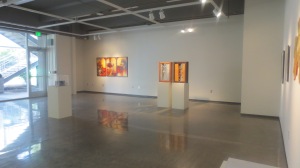
Some fellow birds on display in the Art Gallery.

IMG_3775

Not sure what the Art-O-Mat is, but it’s neat.

IMG_3774

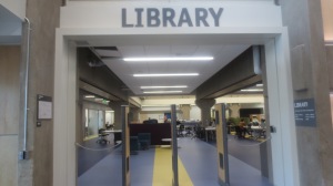
Need help? The Reference desk in the Library is here for you.

IMG_3770

You’ll find this sculpture outside the Health & Wellness building.

IMG_3799

Got some big cheeses taking residence in here.

IMG_3778

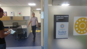
New Center for Student Engagement.

IMG_3783

Christina is a very nice lady, just saying.

IMG_3768

Indie Lab is like a second home.

(Shameless promotion, come see us on Fridays 1:00-3:00 P.M. for open digital drawing sessions!)

IMG_3771

Students First building, see people about financial things.

IMG_3779

When will this construction end…

IMG_3832

Room 113 is like a “Home Room” for students in Media Arts. So fancy.

Rescources for Media Arts Students at Lane

1.MediaCreationLab

1. Within the Library of the center building is the Media Creation Lab. This is a place to work on your homework and project MAC use related classes.

2.Studio

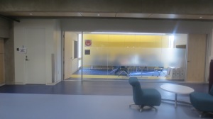
2. In building 17 within the Studio Room here you can find the Blue Cyc Wall. How you ever seen a wall this blue!?

3.Equipment

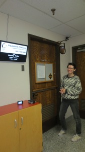
3. Now next to Studio Room, down in the hallway to the right, you can find the Equipment checkout counter. Here if you ever need to borrow equipment for your classes homework or projects, this is the place! Also here is one of our classmates enlightened on being in front of the counter, because for some reason it’s that cool.

4.Main Art Gallery

4. Do you love to see other peoples art styles or work? Do you ever feel inspired or jealousy when you see it? Down in the main Art Gallery on campus you can see it all! This picture is only of half the portion of the main art gallery.

5.Art-O-Mat

5. This is the Art-O-Mat, and for a measly five dollars you can acquire a souvenir, made from students! One souvenir I recommend is I think called, “Sonic-Cow”. The, “Sonic-Cow” is a very interesting, if you know or love Sega’s Mascot character Sonic.

6.Library

6. This is the Library, located in the center building.

7.LargeSilver

7. Right outside in front of the Health & Wellness building entrance is The Large Silver Sculpture. As of now it’s existence is still shrouded in mystery for most students. Even this majestic Turkey can’t even fathom this enigma of a structure, other than staring at it’s self.

8.MaryJo

8.) Here we have Mary Jo Kriendel’s office, within the main Art Gallery Building. Right when you enter it’s the first door to the right. She is known to be an art division office specialist.

9.StudentEngaement

9. Center for Student Engagement, located on the Center buildings second floor. I can be descriptive on what it is or what it consists of, but I have completely forgotten.

10.Christina

10. If you ever have trouble finding your career of study and have a feeling for love of art and computers. Go to Christina Salter’s Office in Building 1. You might find a possibility in what you want to major in and be able to open doors to opportunities. She is an advisory for Media Arts.

11.Media Creation Lab

11.) Located within building 17 on the second floor, is the Indie Lab. If you need to use a MAC and work on homework or projects, this is the place. Also if you want to hangout with the Author of this blog, I’m usually in or the room next to the indie lab, because that area is my crib.

12.TheFlags

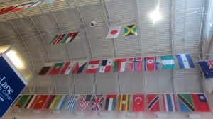
12. In building 1, there are tons of flags, from many different countries. Being patriotic as I am, on the bottom row of flags there’s America! Also since I like Japan too, there’s its white rectangular flag with a large red disc (representing the sun) in the center, at the top row.

13.Construciton

13. Right near the center building, there has been even more Construction and this one is specifically on making a shortcut of stairs. If your class is right next to it be ready to hear a lot of drilling and hammering. Although recently as of now, it has been more quiet.

14.WildCard

14. I’m pretty sure you have seen Turkeys multiple times on Campus and on other peoples blogs, but it’s just that they’re so cute and handsome that you see them frequently. I would have taken a more closer shot of this Turkey, but I was succumb to the fear of being attacked, although the turkey was more fixated in attacking its mirrored image reflecting from the silver sculpture.