Category Archives: Past Student Work

David Verhoeven Interview

               This weekend I was laying on my bed, contemplating the concepts of art, lazily staring at a painting on my wall. I have a few by this artist, collected by my partner. They’re all muted in palette and range in subject from nude portraits to abstractions of reality. Though I have strayed from the path of studio arts, I know that this artist David Verhoeven has done graphic design for wineries and still stands as an inspiration to me. Yesterday I was thankful to catch some of his time and get a few answer to quench some of my curiosity.

imag0113

So.. How does one even start to be a self promoted artist? How do you change from hobby to a
career? David told me that in his early teens he stopped doing art for pure enjoyment, studying professionally.

[img above: photographed business card that David sent me]
“The word “hobby” infers the pursuit of amusement and perhaps as a young child this applied however, early to mid- teens my interest in art matured. Late teens I was working professionally.”

                  Though his subjects have always varied, his primary tools have been ink, gouache, and graphite for a while. With these tools, he made his first series “[···]series of frottages from found objects. A series of paintings in gouache, oil, and acrylic on canvas mounted on wood and most recently torn paper (book leaves) collages.

When I first wanted to interview him, I had recalled various stories about his beginnings as an artist; a young man creating advertisements for companies, doing commissions, selling original art, and I guess I just wanted to know how he got himself out there. He told me it was by word of mouth and development of portfolio that he became well known for this type of work. Though, he said it wasn’t worth the effort he put into it. Nowadays, he relies on promotion through his facebook and from his friends.

893117_640401206035732_6089351168642493810_o

I asked David what his favorite art piece was, but he told me he couldn’t pick one, that it
would be like picking a favorite child. I have no such issues with picking a favorite piece, and here is mine. It is titled  Why Must I. I love his colors and concepts, and I find myself trying to make sense of all of his pictures, but as my eyes soften and travel around the picture, I am able to see where the human image lies–David’s most used subject.

[Credit to Img right: David Verhoeven]

I had one final question before leaving, I wanted to know what advice he had for any beginning artist. “Be true to yourself, your inner voice, be vulnerable.” Be vulnerable is probably one of the best pieces of advice I’ve ever heard. Looking at his body of works, with paintings of his ex wife, paintings for his child, and just expressions of his soul; you can see that David puts himself out there to be judged. That’s always a problem I’ve had with my own art, I guard myself too heavily.

Putting a face and a voice to the art on my walls makes me appreciate it a bit more. I also feel a little demystified, remembering that even the artists who inspire me are human. The next time I head downtown, I want to stop in some of the smaller galleries, and see if any artists are like David–trying to find their voice in a world with many artists showing their gifts.

Remember! Support your local artists whenever you can, and reach out to them. You might just be surprised on how they respond.


Anime Convention: Kumoricon

Kumoricon is a holy haven for nerds of the North West, United States. It is an anime convention, which is the gathering of nerds typically hosted at a convention center, hotel, or even a college campus. Depending on the scale of the convention there will be a variety of activities and panels.

01


There’s a lot of different activities and panels to choose from! You can cosplay as your favorite character from your favorite fandom and choose to partake in a group photo shoot or you can simply walk around the convention in your cosplay, tons of fun! What you can do in cosplay could easily be its own tangent, there’s so much to Kumoricon I want to nerd out on. There are a wide variety of panels to choose from including, fan ran panels from which you can improvise in character depending on the panel, you can watch shows or movies together, also you are able to prescreen never before seen footage of TV shows, movies, or videogames that haven’t been released. There are panels for let’s plays, which is to watch someone play your favorite video game and make commentary live for the audience instead of through Youtube, panels to learn skills from sewing to fan making. There are a lot of different opportunities with all of the different type of panels. Kumoricon is large enough to of hosted on of my favorite animation studios, Trigger.

Besides all of the wonderful panels you can attend there are other functions of a convention that are important as well. Typically, there is a section dedicated to gaming, and not just video games. As there is a huge variety of TVs that are set up with different consoles there are also a wide variety of board games to choose from.  Nerds are very introverted, so this space is great for the socially awkward.

02


For me the most important activity at an anime convention is the Artist Alley, an outlet for illustrators and exhibitors to sell their goods. It’s funny how easily 5 hours can pass by so quickly there, I spent a majority of most of my time there. I’ve participated in selling at an Artist Alley before at New Con and now am addicted to it. I decided not to participate in the venue, yet it didn’t stop me from wanting to learn from the artists that were there. I spent a majority of my time at Kumoricon shadowing the artists. As expected the quality of the products were very inspiring at each booth. There’s a lot more to art than just to be an illustration and I felt that a lot of the artists at Kumoricon understood that. They can self market their drawings with templates such as bookmarks, stickers, keychains and many other options. All of the artists there were so kind, they were able to answer all any questions I had. Luckily a lot of the artists went to NewCon as well so it was really nice for me to see how they’re grown.

It was especially nice to see my fiend Ashley Kincannon, her artist booth was very inspirational. It’s refreshing to see her knowledge of character design. As someone with a mindset who doesn’t create I could remember when I liked a show because of simply a funny joke. Now with an artistic mindset, aspects like a character’s shape or the type of lines applied are more important to me. These are qualities that I see in Ashley’s character design, she has characters of all different sizes, body types, and even textures that show so much personality! It’s very inspirational to be able to present yourself as an artist, and I truly admire how Ashley is very professional yet her art is so much fun. You can see her art at http://www.kincannonconcept.com/

04


Environments That Tell Stories

When you walk into a theme park, you are walking into a media experience that has been designed to tell you a story. Don Carson has been designing theme parks for over thirty years. If you’ve been on Splash Mountain in Walt Disney World, Mickey’s Toontown in Disneyland, or the California Adventure, you’ve been immersed in worlds  that Don Carson helped design.

He has a very comprehensive portfolio web site, nicely designed.
screenshot-2016-11-15-at-7-43-47-pm
As a media student the most fascinating part of it was his blog. He discusses world-building design concepts for theme parks and video games in detail. He has an extensive background in design, concept art, illustration, even retail design. The majority of his blog deals with theme park and video game design. It’s very helpful for people who want to learn design of 3-D spaces that will be having people explore them. There’s posts specific to designing a certain place, and general design concept posts.

I emailed Don and asked for an interview. He’s local to Eugene but was headed out of town, so we did an email interview. He was friendly and welcoming. I have shared our questions and answers below, and most of them are applicable to media designers in general, not just those who design for video games or theme parks. It was an honor to talk to a person who has his designs seen by millions of people from all over the world.


While reading through your blog and website, I noticed a few popcorn carts. Do they have any particular significance for you?

Popcorn and Churro carts are just some of the things that crop up a lot. The challenge is to take an industry standard and function and apply a theme to it while having it still perform its job. Like food trucks or ride vehicles you have to keep in mind how it will be used when you design. Always a fun challenge.

Did you start out having many interests, or did some flow into others?

 I always loved to draw. I wanted to be a cartoonist but my teachers in college crushed that dream when they said I couldn’t make a living. Foolishly I believed them. I majored in Illustration which gave me a good foundation for the work I do now. Along with the fundamentals of good design I learned storytelling in a visual medium, which has informed everything I do today. I still draw every day, often it is in the computer and in 3D software, but I still use all the principles I learned early in my career.

Of your many years of work, how often have you worked on designing with a team? What particular challenges arose from that, and how did you overcome that? Do you currently do more teamwork or design ideas on your own?

With the exception of freelance jobs I often find myself working with or directing teams. Collaboration is the spice of life and I have found that design is more often improved by allowing many creative voices to work together towards a common goal. When it falls apart it is when any one member demands control or feels their contribution is more important than any other. That is where the Design Intent was so valuable. If everyone gets behind the root idea for a project then you are much less apt to have conflict and all energies are focused on getting the best work out of us, all pointed towards a common goal.

So much of your work is designing with children being a part of your target audience. I took my daughter to see the Nutcracker at the Hult last year and the large, bright designs helped clarify the story and draw her in. What aspects do you keep in mind and influence your designs?

Disney taught me about the importance of “appeal” in your design. This isn’t making it child-like for “for children” it is making it approachable. Mickey is appealing because he has the proportions of a human baby or baby animal. I try to design the places, sets, or game environments I would like to visit and explore, and sometimes those places are specifically designed for families or children, but not always.

Is there anything you specifically avoid?

Avoid cynicism. Rolling your eyes or making fun of something (done often in tv and the movies) might be funny on the surface, but it creates a world no one wants to live it. Cynicism suggests that other people are stupid or foolish. Disney over uses the word “magic”, but at its core they are talking about reaching in and touching a childlike part of everyone, without eye rolling, finger pointing, or name calling.


Looking back over your extensive list of projects, which ones stand out as ones that you see as great triumphs to solve challenging design problems?

Designers are never completely content with anything they do. They can see only what got cut or didn’t make it to the final design. Still, although not a triumph I am probably most proud of Splash Mountain in Florida (ironically my first project). It holds up and riding through it today it still succeeds to get across the design principles I hoped it would. Now I work on countless projects, most of which may never get built. Today’s triumphs are more about how well I work and collaborate with others, not what gets built or gets praised.


When I read that you designed Mickey’s Toontown the memories of the place came back very strongly. It is distinct and creatively designed. Can you share with me a few theme park designs that strongly impacted you and you can remember how it felt to be there? How about video game experiences?

Universal’s Wizarding World “lands” come the closest I think to creating fantasy on earth. I am a huge fan of the books and I feel they did a masterful job of transporting us into that world, all within the constraints of a theme park. In video games I love the Bioshock games for their ability to create story rich and beautiful environments. For me killing all the occupants just to get a chance to look around is a necessary evil, but in the case of games like these are worth it to reach the rich narrative and design that holds those worlds together. Like a good book, places like Rapture, Portal’s Aperture Labs, and Skyrim’s landscapes are every bit as rich in detail and story as any really good book.

As a designer, what online sources do you use to keep up with the industry or be inspired?

I am all over the place. I am addicted to the potential of new tools and their ability to bring people inside the worlds in my head. Whether it is a video game, or a theme park, or VR, all are viable outlets for my creative energies, none better than the other, just a different means of telling a story. Each has their challenges and limitation and I love watching and reading about people in the midst of the creative process. “Art Of” books and films are the fuel that brings me back to my drawing table to create more.

As a person starting out in my career with strong creative design leanings, I have many interests. Would you recommended learning a wide variety of skills, or honing in one particular skill and becoming very adept at it (like photography, illustration, film production)?

Allow your interests to guide you. Learn what you need to to manifest the places and stories that are important to you. This doesn’t mean it makes you a movie maker, or an environment designer, or an Illustrator, perhaps you are all of those things? Make sure you feed your brain with the principles of good design and allow yourself to focus these ever growing skills towards whatever interests you from moment to moment. Early on you may take jobs that are necessary to pay the bills, but as your passion and productivity grows so will the opportunities to make a living doing the work you love to do most.

Do you have any recommendations for people like me, looking to enter the design workforce in a couple years, to start out strong and stand out from the others?

Don’t fall into the trap I did early in my career. Don’t waste any time questioning whether your work or your vision is lesser than anyone else’s. The only gift you have for the world is your unique perspective, don’t fight it, run with it. Get better at doing what YOU do, don’t settle for good enough, and don’t look to others as the only successful path. The world rewards the individual life and perspective, be Diana Geronimo the best way you can and the rest will fall into place. You may never be rich, but your will be very happy.


After Glow Exhibit and Lecture: Professional Practices

100_1079

100_1086.JPG

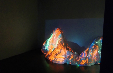
During my time in Intro to Media Arts, I was required to complete what is called “Professional Practices”. To anyone who doesn’t know what that is, “Professional Practices” required the student to conduct an interview or attend an art exhibit/lecture and then write a 500 page paper on the experience. In order to fulfill the requirement, I attended the Krause Gallery Exhibit titled After Glow located at the University of Oregon (UO). The exhibit, an experiment with glowing objects and darkness, consisted mainly of everyday objects painted or dyed  in colors that would glow in the dark.  One of these displays, which is shown in picture #1, resembled a large piece of cloth with splotches of glow-in-the-dark tie dye and draped over some mound. Another display featured a sort of stone pillar with a plastic or glass square, topped with a bowl of what I assume was aquarium pebbles. Upon closer examination of the plastic or glass square, I realized that this was actually an ingenious display within a display that showed a  video of someone manipulating glowing sand in darkness. As the person’s hands moved quickly and fluidly, arranging the sand into weird shapes, I was taken aback on how mesmerizing this video was, and it proved to be the highlight of the exhibit.  For the most part, however,  the exhibit was thoroughly disappointing and didn’t seem to warrant an entire exhibit on it. The reception was very well put together with food and drinks set up outside the exhibit where people conversed with each 0ther until it was time for the next event of the night.

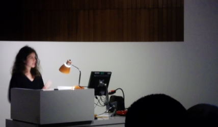
Later we all crowded into a separate building for a lecture by well known and celebrated curator Ruba Katrib on Sculpture as Substance. To anyone who has not heard of Miss Katrib, she is the curator for SculptureCenter in Long Island City, New York, producing group shows such as The Eccentrics (2015), Puddle, Pothole, Portal (2014) (which she co-curated with artist Camille Henrot), Better Homes (2013) and A Disagreeable Object (2012).   Before the main lecture commenced several other people took the stand in order to address the event and to introduce its main speaker. The first person talked about the founding of the  Connective Conversations which this was a part of, and how it helped artists from around the state of Oregon to participate. The second speaker listed Katrib’s exploits and introduced her to the audience, which was met with a round of applause. When Miss Katrib finally took the stand, she proceeded to talk about the fundamentals of sculpture and how the art of sculpture engages our sensory realms. An example she gave of this was the work of artist Anicka Yi, and one of here design’s with clothing and Tempuru-fried flowers engaged the viewer’s sense of smell and taste. Katrib also pointed out that art can mimic or suggest real life or the human body, such as Marcel Dechamp’s Wedge of Chastity and the Skin Pool, the latter of which represented art in an organic form. There was so many other fascinating concepts that Miss Katrib talked about, all of which were eye-opening to me as an artist. Particularly the concept of art engaging one’s sensory realms was something that I never heard before and it proved to be a very educational experience which I hope to use this knowledge in my field in order to improve upon my skills as an artist.


Report: Elliott Erwitt on the street

Elliott Erwitt’s photography is renowned for it’s raw and honest feel and I like how effortless his photos are. His pictures of people and situations are both introspective as well as humorous and I love the juxtaposition in many of them. I enjoyed working on this assignment, it pushed me to focus on composition over technique. I’d like to strive for a similar combination of luck and effortlessness in my own work

Version 2
ISO800 f/22 25s
Version 2
ISO1600 f/1.8 1/60
Version 3
ISO1600 f/1.8 1/200
Version 2
ISO1600 f/22 1/50

.


Learning is Inner Peace

A video done for my Intro to Media class. I’ve never used Premiere before and this was definitely was a learning curve for me. The theme was what the number 5 means to you and my original idea was harmony, though with the shots I had I wanted to find my zen in the progress. The music was originally going to go with the harmony theme, harmony itself was too complicated for me to explain. To have harmony is to have peace and zen is inner peace.

Sound credit to: http://www.bensound.com/royalty-free-music/track/relaxing


Explain Like I’m Five

On Reddit, one of the main forums is ELI5: Explain Like I’m Five. It’s dedicated to simple explanations for complex concepts. I have always found the title amusing because rarely does it discus topics that a five year old would be concerned about. That’s likely because it’s run by adults, for adults. However, what if you asked some younger folks, much closer to the age of five, to share things that a five year old would like to do? I asked four kids to share how they do things in a way a five year old would understand.

I enjoyed learning to use Premier Pro to edit it together. It was a great challenge and I learned many aspects of this very versatile program. I look forward to working with it in the future.


Relaxing Forest Ambience

This project had its share of highs and lows. It was very fun, yet difficult at times. I got the idea for the project from my previous one where it centered in the forest. Since I live in the forest I decided that it was a perfect opportunity to show how calming and beautiful a walk through the woods could be. I also had to include the motif of 5 in most of my compositions which was very fun finding objects or an arrangement of 5 objects. While production of the video and photographs seen in the final video was relatively easy, the editing portion of the project proved quite difficult. For example, while editing, I had to get use to the editing software since I was use to editing using Adobe After Effects so I had to spend a short period of time learning of ways to edit my project in a quick and efficient manner. I also had to learn how to balance the time of each shot both with the photos and the video, for that I incorporated dissolves to transition between certain scenes while adding some zooms for most the photographs to make an almost calming view of the image. For short video that I added to the project I slowed it down and cut it to as certain point in order to make it more effective. This project Proved to be both challenging and fun at the same time and I love how it turned out.


Kids

This video was very fun to make. I let my kids act in it, so they feel involved in what dad does at school all day. Kirk Hollins Jr was kid pool and Iman Burks my niece was the killer teddy bear. M y youngest duaghter Tatianna Hollins was the Tay Tay. I filmed the video in my sisters back yard. It was a interesting project that I really injoyed.