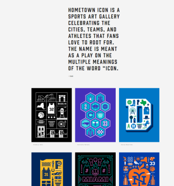
The name of this blog page is called Hey Sport.

1.) The reason I chose this website was because I found it to be really simple and really easy to navigate through the many different designs this website has to offer. I could see other people finding the website interesting because the blog site is mainly a sports design blog. It doesn’t just appeal to soccer fans either. The website has lots to offer ranging from jersey designs like the one above to having very unique and interesting artwork of specific sports players.
2.) A great resource as you click on the about page, is that the blog was actually created by Tim McCarthy. The website has a link that you can click on http://www.thelastpick.com/
and by clicking on that link you are redirected into the website of Tim McCarthy.

There you can click on the portfolio page and see all his work. He has even done some work for Apple and his style is nothing short of unique.
3.) Like I said previously, I think the website is very well produced. The reason I say that is because the website is really easy to manage. Not only that but when you click on a certain category that interests you, you will be directed to a page with some very interesting and unique sports graphics.
4.) The quality of the information is great because once you click on a certain art style or series of images that you like, a page will open up with lots of different information regarding the graphic designs.


The design work that goes into making an easy-to-navigate website is incredible! I love that this site is all about sports, but it looks very professional and clean in terms of design. I assume the company is the same way. Great find!
I love how this site features many different types of art featuring athletes, sports teams and cities. I love sports and different pieces of art so this blog was really fun to navigate!