2016 Archive Available

Every so often we take a snapshot of our website, to preserve exactly what it looked like, and simplify removing outdated content. While it’s important to prevent ROT, we also have an obligation to preserve a historical archive of what’s on our site. You can find the most recent site archive is available at https://2016sitearchive.lanecc.edu.

Unlike our current website, which is backed by a database, and which tracks even the smallest change to a page, the archive is a static set of HTML pages, and will not change further. While this means we’ll lose a little bit of history, we felt it to be a necessary compromise. Drupal, like WordPress of Joomla, is complex software, and to prevent security issues needs to be kept up to date and occasionally upgraded. HTML, on the other hand, isn’t interactive in the same way, and is mostly bulletproof. And, since it’s much simpler, it requires a lot less hardware to run.

The down side of these snapshots is that they will eventually decay. Links to external sites will go bad as other sites remove changes. Videos will be removed, and embeds will no longer work. But the content of our pages will stick around. So we can proceed less cautiously with removing content from the website, since to preserve it for the public all we need to do is link it to the archive.

If you’re interested in our last snapshot, from five years ago, you can visit https://2011sitearchive.lanecc.edu

Older snapshots are more limited, often just an image of the homepage. You can view them here:

Full details, along with further history and notes are available on the webguide pages.


Goals for 2017 on the web

There’s two months left in 2016, and the web team wanted to set a couple goals for the Lane website before we close out the year. An important part of our mission is to keep our pages as readable and relevant to our visitors as possible. One way to do that is to prevent and remove ROT – redundant, outdated, or trivial content on the web.

Redundant Content

Redundant content is dangerous content. If the same content appears in multiple places online, it’s only a matter of time until only one place is updated and the content is out of sync. Then we’re providing conflicting messages. Beyond that, redundant content makes it confusing for search engines to know which pages to serve. Pages are scored by search engines primarily by the number of other pages that link to them.

Here’s a (super simplified) scenario. Say we have two different places that describe our refund policies, and both of those pages link to the same page of meeting notes about changing those policies. Sites, both internal (on the www.lanecc.edu site) and external (including sites run by other organizations, but also places like moodle), link to a page on refund policy. But some link to the first place, and others link to the second page. When you search for refund policies, what do you get in your results?

We can’t be sure – and you might even get the PDF, because it’s getting some page rank from each of the two other pages. But if we had that content on just one page, everyone would link to it correctly, letting search engines value it correctly and making search better for everyone.

Outdated Content

That outdated content is an issue should be obvious, but even content that’s just several years old and no longer relevant can be an issue. We have 732 pages that haven’t been updated in over 4 years. Some of that content has certainly changed since then, and is now incorrect. It’s going to be a tremendous effort for us to go through and figure out which of those pages need updating, and which can just be removed.

Trivial Content

Trivial content is a difficult one. It might be content that you find really important – say, a photo album of an event a few years ago. But if that content isn’t helping the mission of your site and of the website as a whole and isn’t required to be there by law or by grant conditions, ultimately it’s trivial and should probably be removed..

Trivial content doesn’t need to be an entire page. Sometimes it’s just a line, like “Welcome to the Underwater Basketweaving Department!” that purports to make the department look friendly but falls flat. This excess content confuses search, and makes it dififcult for people to find what they need, ultimately leading people to feel like website is cluttered and difficult to navigate.

Long Content

We also have a problem with content length on our site. Sometimes pages are necessarily long, like COPPS policies (though there’s certainly some of those that could use help!). But often pages are so long they make it difficult to find what you need. Due to the way we store our pages, I don’t have an easy way to count words on pages, but I can count letters. These aren’t perfect counts, because they include some of the HTML that helps to style the page, but they’re a great estimate. I did a count of our pages last night and found some crazy pages: 50,000 characters. 80,000 characters. 90,000 characters. If we use an average of 6 letters per word, that’s as much as 15,000 words on a page! Positively insane. How can students find what they need?

Our Goals

As editors on the website, we’re enlisting you for help! Here’s the goals we’d love you to help us meet this year:

  1. Reduce the total number of pages on the Lane website by 5% (from 5768 to 5475).
  2. Reduce the number of pages with more than 20,000 characters by 20% (from 193 to 155)
  3. Reduce the average character count of our pages by 10.5%, from 4803 to 4300.
  4. improve the average age of our pages by 6 months, from roughly 24 months old to 18 months old.

Except for the total page count, these goals and statistics are actually calculated against what we call a “basic page”. So these don’t include news releases, COPPS pages, or the landing pages.

On December 1st, we’ll post an update with how we’re doing on each of the goals, then check in again on January 1st to see if we met them.

And of course, if you need any help getting back into editing your pages, let us know! Just contact Lori, Jim, or me and we’ll be happy to help.


Understanding WCAG 2.0: 1.4.2 – Audio Control

The third standard we’ll explore in our series on understanding WCAG 2.0 is 1.4.2, Audio Control. This standard is required for WCAG level A compliance, which is part of the level AA compliance that Section 508 requires. Here’s the complete text:

1.4.2 Audio Control: If any audio on a Web page plays automatically for more than 3 seconds, either a mechanism is available to pause or stop the audio, or a mechanism is available to control audio volume independently from the overall system volume level. (Level A)

I wasn’t able to think of a place this applies on a Lane website, but I wanted to be sure to mention it. The only place we usually have audio play is on pages with video, and the embed options we have available on Lane pages make it difficult, if not impossible, for audio to play automatically. If you’re building pages for your class, or are doing some web development as part of IT, please be alert to this guideline.

Of course, I’m also of the personal opinion that we don’t want your site reminding everyone of mid 2000’s mySpace profile pages. You know the ones. You’d land on it to find a crazy, mismatched background and Nickelback playing with no way to make it stop. You couldn’t close the browser fast enough. Let’s not bring those days back.

If you’d like to read more about audio control, you may also be interested in this list of techniques, which provides examples and more detail.

Interested in more? Check out the listing of all the posts in this series.

Understanding WCAG 2.0: 1.3.3 – Sensory Characteristics

The second standard we’ll explore in our series on understanding WCAG 2.0 is 1.3.3, Sensory Characteristics. This standard is required for WCAG level A compliance, which is part of the level AA compliance that Section 508 requires. Here’s the complete text:

1.3.3 Sensory Characteristics: Instructions provided for understanding and operating content do not rely solely on sensory characteristics of components such as shape, size, visual location, orientation, or sound. (Level A)

As a mostly non-technical requirement, this one is actually pretty easy to understand, and it isn’t too different from a standard that’s already in section 508 (§1194.22(c)), which says you’re not allowed to convey information strictly through color. Standard 1.3.3 simply expands that requirement to cover visual and auditory impairments.

This doesn’t mean that you can’t convey information using some sort of sensory characteristic. You often should. If you have a button on a page to proceed to the next page, I’d encourage you make it look like a green arrow, and tell people to look for a green arrow right in the instructions. But you then also have to very carefully label the arrow as linking to the next page – you can’t rely on someone seeing green or being able to identify the arrow shape.

You also need to be careful referring to an element on a page by position. You can’t have instructions that say “Click on the link in the top right corner of the page”. But you can have instructions that say “Click on the link titled ‘College Catalog’ in the top right corner of the page”. Again, you need to provide an alternate method of locating that link. In this case, we’re using the link text.

The exception to this is above and below. In English, it’s generally acceptable to refer to content preceding the current reading position as being “above”, and content that follows to be “below”. Since your page should have sequence, you can usually refer to content above and below.

Here’s a final example:

Time 8 9 10 11 12 1 2 3 4
Underwater Basketweaving
Quidditch

Above, you’ll see a table with my schedule for this academic year. I’m not taking a particularly demanding schedule, but this way of presenting my schedule only conveys when classes are through color. So this doesn’t even pass existing 508 rules.

Time 8 9 10 11 12 1 2 3 4
Underwater Basketweaving
Quidditch

This one isn’t ok either. We’ve just traded colors for shapes. But you can probably see where this is going:

Time 8 9 10 11 12 1 2 3 4
Underwater Basketweaving
Quidditch

This one is probably ok, according to a strict reading of the guideline. But we could improve it further, by providing span‘s that are visible only to screen readers, which describe when the classes take place. We can’t be sure those symbols are readable by a screen reader either.

If you’d like to read more about sensory characteristics, you may also be interested in Guideline 96: Providing textual identification of items that otherwise rely only on sensory information to be understood, which provides an example and a bit more detail.

Interested in more? Check out the listing of all the posts in this series.
Understanding WCAG 2.0: 1.3.2 – Meaningful Sequence

The first standard that we’ll explore in our series on understanding WCAG 2.0 is 1.3.2, Meaningful Sequence. This standard is required for WCAG level A compliance, which is part of the level AA compliance that Section 508 requires. Here’s the complete text:

1.3.2 Meaningful Sequence: When the sequence in which content is presented affects its meaning, a correct reading sequence can be programmatically determined. (Level A)

In other words, if the order of the content on the page is important, you need to tell a screen reader the order somehow.

There’s a lot of ways to give content order. This blog post has order, for example. So far, we have a paragraph (a p element), a blockquote, then two more paragraphs. WordPress puts all of those a division (a div element). So the structure of this blog post is:

  1. div
    1. p
    2. blockquote
    3. p
    4. p

This blog post depends on sequence for the content to make sense – after all, if the paragraphs got switched, it wouldn’t make sense.

Screen readers use the order of tags on a page to automatically determine sequence. So if your page is mostly text and pictures, you probably already meet this requirement.

The problem occurs when there’s content which is visually in sequence, but whose actual representation isn’t in sequence. Imagine this scenario. You want to put two pictures on your page next to each other, with a caption on each one. You’re having trouble making it look right, so you decide to use a table. It’d look something like this:

A picture of a cat in a monitor A picture of a cat chewing on a monitor

Poof! It works, right? But tables can be read left to right or top to bottom, and the screen reader has no way to know which it should do. So, like most of us, it defaults to left to right, meaning it reads this:

  1. table
    1. A picture of a cat in a monitor
    2. A picture of a cat chewing on a monitor

See the problem now?

Ah, but wait, you say, what about alt tags? Don’t they label the picture?

Well, they would. But this is a circumstance where you want to have an explicitly empty alt tag – alt="". Because these pictures are captioned, an alt tag is redundant. If they had an alt tag we’d be reading the caption to them twice: once in the tag, and once in the caption. And also, even if we did want an alt tag here, that wouldn’t solve the problem.

Blind people aren’t the only people to use screen readers. Many people simply have really, really poor vision, and may be using a screen reader to help read to them. And while their vision is poor, it doesn’t mean they couldn’t still enjoy these cat pictures. The table above doesn’t let someone with poor vision associate a caption with the appropriate picture.

The solution is to use div tags, and set them to the left and the right side of the page. One easy way is to set your div tags to 50% of the width of the page, then set one to float to the left, and the other to float to the right (for the technically minded, you’d may also need to clear afterward). On our Drupal pages, you can use the classes “half left” and “half right” on div tags. Because we’re then grouping our picture and our caption inside of a div on each side, everything will be read in order.

Tables aren’t the only concern with sequence. Have a look at this list:

  • Head east on H St NWt
  • Turn right onto 13th St NW
  • Turn left onto Pennsylvania Ave NW
  • At the traffic circle, take the 1st exit onto 1st St NW

We recognize those as directions, right? But the bullet points are actually a problem. Those bullet points are considered an unordered list (A UL tag). Directions have a sequence. If we use bullet points, we haven’t told the screen reader what order to read the bullets in (it’ll probably know, but why risk it?). Instead, we need to use an ordered list (an OL tag):

  1. Head east on H St NWt
  2. Turn right onto 13th St NW
  3. Turn left onto Pennsylvania Ave NW
  4. At the traffic circle, take the 1st exit onto 1st St NW

You should also pay attention to div tags that are floated from the text. If you have an introductory paragraph that explains some topic, then a sidebar floating that provides clarifying points, you’ll want to make sure the clarifying sidebar is inserted into the HTML after the introductory paragraph, since understanding it depends on first reading the introduction.

If you’d like to read more about meaningful sequence, you may also be interested in Guideline 57, Ordering the Content in a Meaningful Sequence, which provides an example and a bit more detail. For complex layouts, you may also want to look at aria-flowto, which provides a kind of goto statement for text, to tell the screen reader when to jump over text that is out of sequence for presentation.

Interested in more? Check out the listing of all the posts in this series.

Updated Accessibility Requirements

An Update to the Update:

1/23/17 – The new 508 rules are out! You can read the announcement from the Access Board (on a website powered by Drupal!), or read my summary of the rules changes.

Original Post:

As people that maintain content on the web, we’re all responsible for making sure our content adheres to the Section 508 standards. However, as discussed in an earlier post, these rules are a little dated. Fortunately, the government is currently in the process of updating the rules, and a final rule could come any day – although the government has not been successful updating these standards in the past.

The new rules are likely to closely mirror the WCAG 2.0 standards, which are an international, consensus driven standard for accessibility for a wide range of technology formats, including web pages, Word documents, PDFs, and many others. WCAG 2.0 includes three different levels of compliance: A, AA, and AAA. It’s expected that the new 508 ruling will require compliance to the AA level.

During the next few posts, we’ll explore some of the ways the new standards differ from what we currently require of our Drupal pages. If you’d like a head start, you can view a complete comparison table on the Access Board website, which we’ll use as the basis to explore what’s different between 508 and WCAG 2.0.

One final note: although I’ll be writing these posts with a lens toward how it applies to our web pages, 508 rules apply to all the materials we create or purchase, including classroom materials. If you’re an instructor, you may want to get in touch the ATC for help ensuring your class materials comply with accessibility requirements.

All Posts in this Series

Twitter Cards and Open Graph

Across the Internet, Social Media now drives almost a third of all visits to pages. At Lane, that number is substantially lower: on our main website, it’s just 1%. One way to increase the number of people who click our links in social media (our click-through rate) is to improve our link copy and picture to make our posts more readily grab people’s attention.

This blog post is going to demonstrate two ways to do that. Though we’re going to be discussing ways to customize how your link is shared, we’ve set up defaults to improve how all pages look when shared, without you having to do anything at all. But a couple minutes of work will go a long way to making your shared link stand out.

Open Graph

The behemoth of social media is, of course, Facebook, so we’ll start there. Facebook developed a standard called Open Graph, which is a way to add hidden tags that tell Facebook, Google+, LinkedIn, and others how to share your page. Let’s take a look at what it looks like when we share a link on Facebook:

Facebook share window.

A similar preview box will show up when you share a link on LinkedIn or Google+.

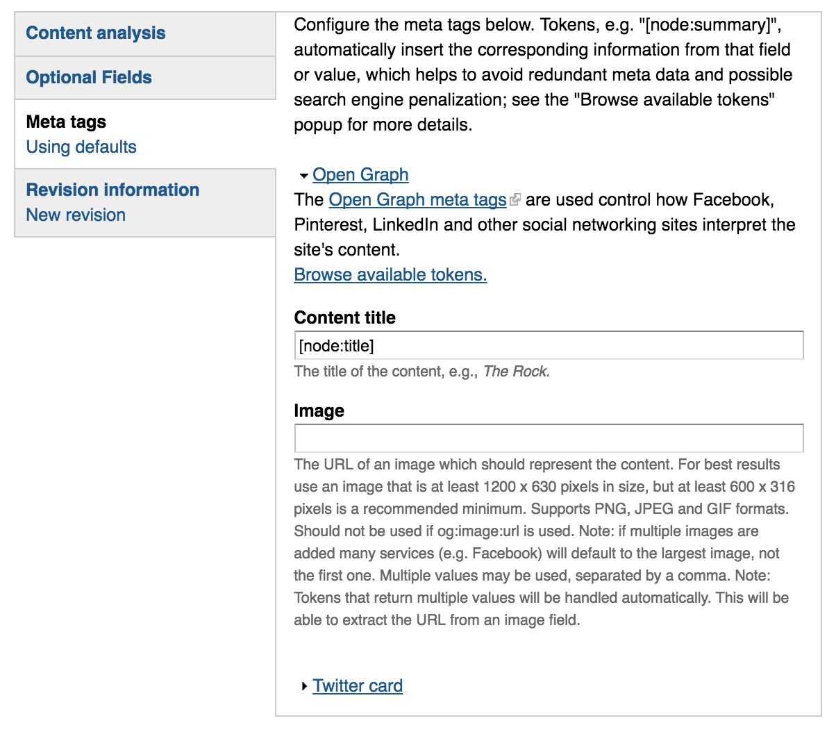
If you’re a social media user*, you’ll now have an extra horizontal tab down at the bottom of your edit page, called “Megatags”. If you click on that, you’ll see two blue links: Open Graph and Twitter Cards. Let’s click on Open Graph and take a look.

Drupal Metatags tab. Relevant fields are further explained in the following text

Content Title

The first field in there, Content Title, is the only one that’s absolutely mandatory. Since it’s mandatory, by default we tell it to use the page’s title (that’s what [node:title] means).

A small digression: titles within Open Graph aren’t quite the same as titles on the Lane website. On the Lane website, we automatically add the department name and college name to the end of the title. So a page that says it’s title is “Contact” would actually have a title like “Contact | Science Division | Lane Community College”. That works no the web, where you want to show hierarchy. But in social media, that’s a title everyone is going to skip right over.

Open Graph titles are probably better thought of as headlines. Think back to that first picture we had – the title in that picture was “About”. That might be a good website title, but “About” is a terrible headline. We want something that’s going to catch people’s attention, and give them a reason to read a little bit further down. So let’s change it. We’ll instead use “Ready to learn more about Lane?”

Image

The next field, image, is probably your best opportunity to get attention. Facebook will always pick an image on the page, but sometimes you can do better. If you’d like to tell a social network what image to use, add it in here. If you’re not sure how to find the full url for an image, get in touch with us by emailing webmaster@lanecc.edu.

We’re going to leave the image in our example alone, since Facebook chose a pretty good image for us.

Description

Open Graph has one more important field, the description. But rather than ask you to type in a description all over again, we’re going to make use of a field that you may not have known you’ve had access to all along. If you’ve ever looked at the optional fields tab, you may have seen something like this:

Our optionl files tab, which included a field named 'search engine summary'

The search engine summary field provides a meta description tag, which Google and other search engines use as a snippet in search results. We use the same tag for Open Graph. If you’ve left it empty (like we have in our example) Google, Facebook, and others will create a description for you. Here’s what Google creates:

text is cut off, but reads: Lane offers many different educational opportunities–we truly have something for everyone! students by clock tower at main campus bus station As the third

The text in black is Google’s preview for the page. But it doesn’t make any sense –  “students by the clock tower” comes out of nowhere. That’s because Google is using the alt text from a photograph as part of the description. Let’s put in a new description so Google doesn’t do that. As a rule of thumb, you want a couple of keywords that people might be searching for, and you want to keep under 160 characters. We’ll use “Explore transfer and career & technical opportunities at Lane Community College in Eugene, Florence, Cottage Grove, and online”.

With those fields updated, here’s what the page will now look like when it’s shared:

Updated facebook post, featuring the text we'd talked about earlier

Better, right? Two caches. First, you’ll notice only part of the description showed up. That makes writing descriptions tricky. Facebook shows fewer characters than Google does. So if you can, keep the important parts of your description in the beginning. Second, after you make these changes, it takes Facebook as much as a day to recognize the updates. But you can force it, if you’d like. Enter the URL you’re going to share on Facebook on their debugger. Facebook will tell you when the last time was it took a snapshot of the page. If that snap shot is from before you made your changes, you can ask Facebook to crawl it again.

Twitter Cards

Twitter doesn’t use the same Open Graph standard that most other social networks use. Instead, it uses something called Twitter Cards. There’s two primary types of cards we’re interested in: the summary card and the summary card with large image. The only real difference between the two is the size of the image.

With the summary card, your image should be square, and a minimum of 120x120px. With the summary card with large image, your image should be rectangular, and at least 280x150px. It’s important you use as appealing of an image as possible, as it’s what’s going to make your post stand out best. By default, Twitter will use the Lane logo, but their guidelines state they don’t want the same image to be used repeatedly.

Setting up your Twitter card is much like setting up Open Graph. Click the Twitter card link, set the title and image, and make sure you’ve already set the SEO summary under the Optional Fields tab. Then, when shared on social media, you’ll see a card, like this:

Sample Twitter card, containing the text from earlier, in an attractive presentation on Twitter.

If you’d like a preview, you can use the card validator on the Twitter site.

One Caveat

For good reason, we don’t allow you to set these fields on pages you don’t control. So the editor of the science page can’t set the description of the math page. So if you’re going to be sharing a link for a page and you notice a problem with one of these fields, or you think the page could really use a better picture, email us at webmaster@lanecc.edu and let us know. We’ll take care of setting the meta tags to make sure everyone has a great shared link experience.

* Not sure if you’re a social media user? If you see an error message when you click on this link and log in, you’re not. But if you see a list of the sites you manage, you’re a social media user! If you’d like to become a social media user, check the Drupal dashboard for a list of upcoming training opportunities.


Hard Sentences & Tone

Need a review? Check out parts one, two, or three first.

While we’ve made some big improvements, our page still sounds institutional and still has some pretty complex sentences in it. Let’s start in HemingwayApp (here’s the text, if you’d like to follow along)  and check out our list of things to be concerned about:

  • 6 hard to read sentences
  • 2 very hard to read sentences
  • 5 uses of passive voice

Let’s do the very hard to read sentences first, since they’re our biggest problem. Here’s the first:

Print jobs are sent from workstations in these labs or your computer to a print release station, a print cloud, or directly to a machine, where jobs are released and paid for using your TitanPrint credits.

Usually when HemingwayApp finds something complex it’s because of the number of ideas expressed. Let’s break this sentence up:

Print jobs are sent from workstations in these labs or your computer to a print release station, a print cloud, or directly to a machine. Jobs are then released and paid for using your TitanPrint credits.

Fixed! On to the next one:

Once your print allocation is used, you must add funds to your TitanPrint account to continue printing by using a credit card or a print card purchased from the Titan Store.

Again, we see there’s two distinct ideas here. The first is that once your credits are gone you’ll need to add more to continue printing. The second is that you can add credits either online or at the TitanStore. So let’s split this sentence as well:

Once your print allocation is used, you must add funds to your TitanPrint account to continue printing. Funds can be added with a credit card or a print card purchased from the Titan Store.

No more very hard sentences, and we’re down to grade 8! Let’s tackle some of the merely hard sentences:

When you print a document from your lab computer, or laptop on the campus network, your print is routed to the nearest available printer.

can be simplified to:

When you print a document, your print is routed to the nearest available printer.

We lose a little bit of information here, because we’re not explicitly saying a computer must be on the network, but many students won’t understand what that means anyway, and the idea that printing needs to be done from campus is implied.

If you are in a heavy traffic location you will then need to release your job by logging into your TitanPrint account.

can be simplified to:

If printers are busy, you may need to release your job by logging into your TitanPrint account.

And this:

Color printing costs $.25 (twenty-five cents) per side of paper (resulting in $.495 per page if duplex / double sided).

can be simplified to:

Color printing costs $.25 per page ($.495 if double sided).

To make sure the decimal point is seen, we should write $0.25 and $0.495. So let’s fix that too. This next sentence:

Once your print allocation is used, you must add funds to your TitanPrint account to continue printing.

can be simplified to:

If you run out of credits, you must add funds to your TitanPrint account to continue printing.

Together, that gets us down to a 7th grade reading level – pretty close to our target. Let’s take a look at passive voice sentences (note that the above fixes fixed one of those for us too). If you’re not familiar with passive voice, here’s two sentences:

  1. “I’m going to throw the ball across the room.”
  2. “The ball is going to be thrown across the room.”

The second is clearly a much weaker sentence, but it’s the type of detached writing that’s often seen in academic journals. We want to avoid it wherever we can, because it’s boring to read.

The easiest to fix is “Funds can be added…”. Let’s have the reader perform the action, and instead say “You can add funds…”

Although that technically gets us under the suggested limit for passive voice use, let’s fix one more thing:

You will be charged $.07 (seven cents) per side of paper with a $.005 discount for duplex printing. Color printing costs $.25 per page ($.495 if double sided).

The troublesome part is “will be”, but we can do more than just fix passive voice here. Let’s make those two sentences work together a little better:

Each black and white page costs $0.07 per page, while color printing costs $0.25 per page. Double sided (duplex) pages receive a half cent discount per page.

While we’ve made some big improvements, our page still sounds a little institutional. So let’s look at the tone, using a Tone Analyzer. Go ahead and paste our text directly into the box and click Analyze.

Right now our text is 73% social and 26% writing tone. Writing tone is a little more formal. In our case, the words that are causing the Writing tone are Tentative and Analytical – not necessarily good things. Where possible, we should strive for text that’s friendly, almost conversational, but authoritative. That sort of tone is my goal in these posts – we’re having a conversation, but I’m trying to sound like I know what I’m talking about.

The bottom half of the tone analyzer has some suggestions on how you can adjust your text. You can try clicking on some of the words to see suggestions. I didn’t find the suggested words very helpful here, but it did make clear that the reason we sound tentative is because we keep having these hesitant sentences – things like “if” and “or” that make it seem like we’re never confident in what we write.

Unfortunately, there isn’t much we can do about that, due to the nature of what we’re writing about. But we can make our page sound a little more conversational by adding contractions. Just a simple change like “you are” to “you’re” helps make the text seem less academic. Don’t over do it, of course – the first time I catch a “y’all” in one of our pages, I’ll be less than happy to say the least – but try to write how you talk.

After all those changes, I ran through the text one more time, finding more ways to reduce the length of our content. That includes restructuring the first two paragraphs, so that the first one introduces TitanPrint, while the second one provides a high level overview of how it works. And now that our sentences are simpler, it’s easy to remove the last pair of adverbs. Here’s our final result:

Print Final

And, of course, our final text.

To summarize:

  • Split complex sentences up. It will say the same thing, but be easier to read.
  • To keep your sentences interesting, avoid using the passive voice

If you’re really passionate about language, you’re probably tempted to keep going, and keep rewriting. Believe me, I understand. This page is at least two grade levels higher than I’d like. There’s another dozen changes to make. But there’s a lot of other pages to work on, and writing on the web is all about maximizing the use of our time.

Next time, in the last post of this series, we’ll talk a little bit about writing for Search Engine Optimization and take a quick preview of some of the tools we’ll be introducing soon to help you write better right within Drupal.

Simplifying the Text

Need a quick review? Here’s Part 1 and Part 2.

Last post I mentioned that we’d be using HemingwayApp to make some improvements to our page. First, a quick overview of some features of HemingwayApp. On the right, there’s basic statistics about our page. If you plug in the text from the page (and you should! This post will make a lot more sense if you follow along!), you’ll see that there’s 355 words at a grade 12 reading level. Just below that, color coded to help you find them, are some things to avoid:

  • 3 hard to read sentences
  • 8 very hard to read sentences
  • 3 phrases with simpler alternatives
  • 3 adverbs
  • 8 uses of passive voice

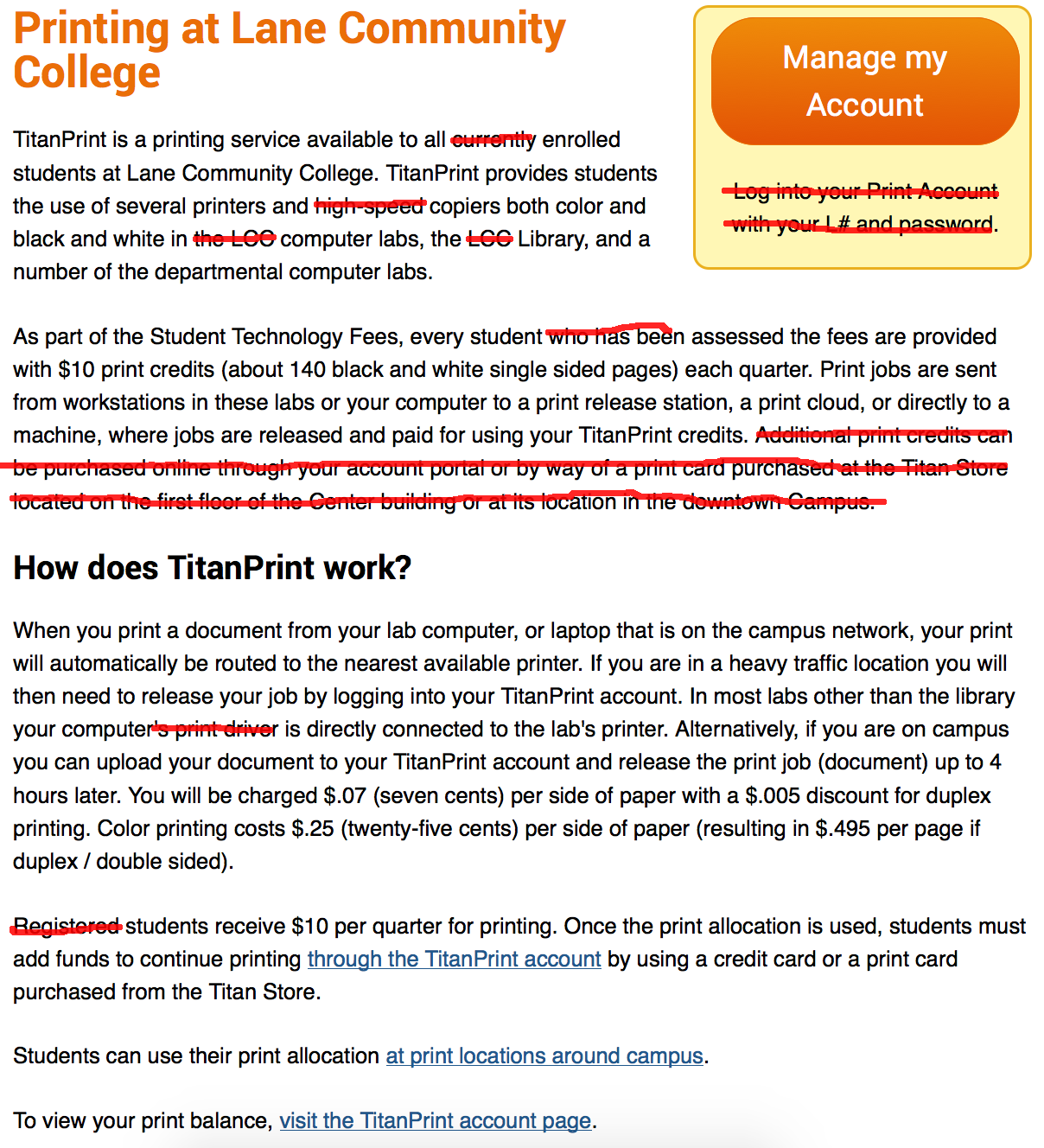
Before we set about tackling them all, let’s first see if we can’t reduce the overall number of words. There’s a basic rule of thumb in editing (from an excellent book!) that says 2nd draft = 1st draft – 10%. We’re at 355 words now, let’s get down to below 319. Please forgive my touchpad picture editing skills!

Page with some words crossed out

If you’re following along, you can copy the text from here, or you can make the edits yourself.

With just those edits HemingwayApp says we’re at 305 words at an 11th grade reading level. That’s a pretty big improvement already, and we haven’t changed the content of the page at all. We’ve also improved on the list of things to look out for:

  • 3 hard to read sentences
  • 6 very hard to read sentences (down from 8)
  • 2 phrases with simpler alternatives (down from 3)
  • 3 adverbs
  • 6 uses of passive voice (down from 8)

Rather than tackle those in order, let’s pick the low hanging fruit. Adverbs are usually easy to deal with, so we’ll start there.

Adverbs can be a great way to clarify meaning, but they’re often just filler words (students looking to make their essays longer rejoice!). Look at the phrase “your print will automatically be routed” – HemingwayApp wants us to eliminate automatically, and it’s right – that word doesn’t help us at all, so we should cut it. The other two adverbs are both the word “directly’, which we’ll keep for now, since in both places it provides some clarification.

On to the simpler alternatives suggestions. Mouse over each one (they’re in purple) to see what HemingwayApp suggests. They’re not all great suggestions, but “many departmental computer labs” is better than “a number of the departmental computer labs” and “Or” is simpler than “Alternatively”. Just like that, we’re at Grade 10. We now have 0 phrases with simpler alternatives, we’re under the suggested limit for adverbs, and we’ve reduced the number of very hard to read sentences.

We’ve made quite a few changes, so let’s go through and make sure everything reads right. This time we’re looking for tense, voice, and flow. We want to make sure sentences in the same paragraph use the same tense, since its difficult reading when one sentence talks about something in the present, and the next talks about something in the past.

With voice, we want to be consistent. Right now it’s a mix of 2nd person (“You will”) and 3rd person (“The student will”). We don’t have a hard rule about when to use each, but you definitely don’t want to mix them. Since we want our page to be conversational, let’s use 2nd person.

Last we’ll look for flow. Do the sentences and paragraphs all sound good together? Does it sound like it was written by one person? Does it feel right? This is also a good time to make sure we’re using appropriate vocabulary (like “term” instead of “quarter”).

Doing the whole page in a blog post would be very boring, so I’ll use this example paragraph:

TitanPrint is a printing service available to all enrolled students at Lane Community College. TitanPrint provides students the use of several printers and copiers both color and black and white in computer labs, the Library, and many departmental computer labs.

First, let’s switch this to use 2nd person.

TitanPrint is a printing service available to you as an enrolled student at Lane Community College. TitanPrint provides you the use of several printers and copiers both color and black and white in computer labs, the Library, and many departmental computer labs.

Now we need to fix the second sentence, which is very difficult (it’s highlighted pink in HemingwayApp). “…color and back and white…” is a very complex phrase, so we’ll first cut that. We’re not losing anything, because color options are addressed further down the page. Then, we’ll simplify the locations, since there’s no reason to list all the locations here when the locations are also listed on the Print Locations page, linked at the bottom of this page. That leaves us with this:

TitanPrint is a printing service available to you as an enrolled student at Lane Community College. TitanPrint provides you the use of several printers and copiers across campus.

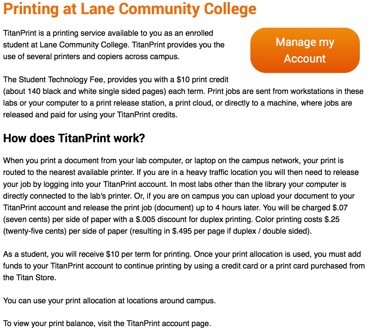
Rewriting for those three things helped me to eliminate a passive voice use and cut quite a few more words. Some of those words included the instructional text about using your L Number and passphrase on the account page. Though you can’t see it, that’s actually repetitive, since the account login screen provides the same text. Here’s the fully rewritten page, applying changes like those I made to the first paragraph:

Page at the end of this post

And the complete text for it.

We’re down to 281 words, and at just a 9th grade reading level – a substantial improvement.

To summarize:

  • Avoid adverbs
  • Use consistent tense and voice
  • Make sure your content flows together
  • Rewrite, rewrite, rewrite
  • Shoot for at least a 10% reduction in your word count on your second draft
  • Use tools to help you rewrite – many of your mistakes are going to be invisible to you as the author otherwise.

Finding our Page & Some Quick Fixes

As mentioned in the last post, we’re going to fix one of the 5800 pages on the website. The page we’re working is on loan to us from the fine folks in charge of print management.

Before you work on any web page, you want to make sure you understand the purpose of the page. First, a quick overview of how printing works at Lane. Each student receives a certain amount of money for printing. After that money is gone, students add more money to their account if they need to print more. So the purpose of this page is to help people find printers, learn what printing costs, and to add money to their accounts.

Alright, so let’s look at the existing landing page:

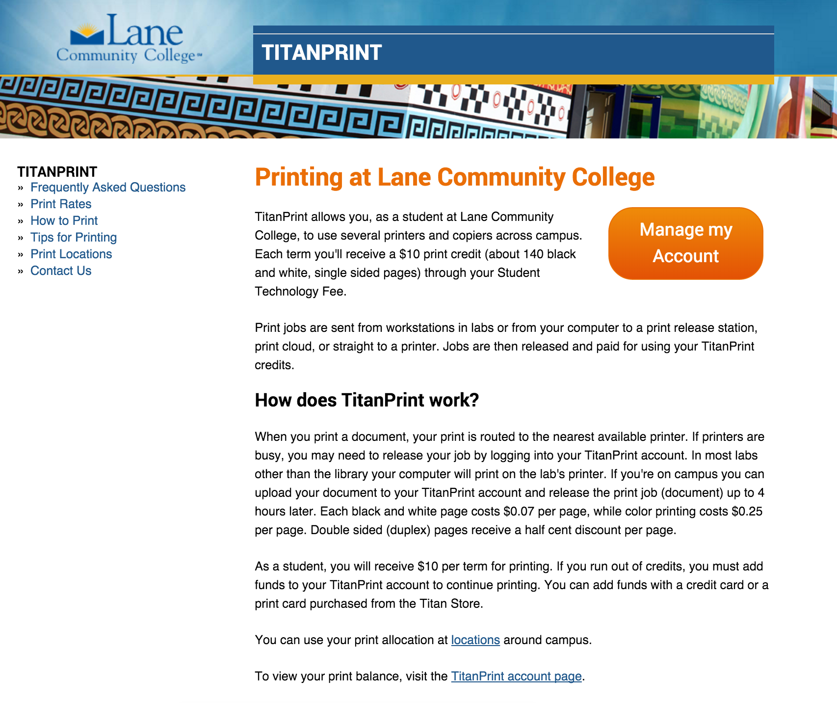
The current print landing page
Currently we’re at 357 words at a Grade 12 reading level – ouch.

You may have noticed the text in that picture was a little small (you can read the entire text here if you’d like). But there’s advantages to small text like this. You and I are highly motivated readers. After all, this is “our” page, and we’re going to pay attention to every little detail. But our actual readers aren’t motivated. In fact, they’re likely to skim in an F shaped pattern, reading as little as is reasonable. When the text is small, we’re forced to skip over the text and focus on the bigger picture (you can zoom out on any page by pressing ctrl-minus on a PC, or cmd-minus on a Mac).

What catches your eye on that page?

My eye goes straight to that huge orange button on the right hand side. That button is the Call to Action (CTA) for this page. If at all possible, you want to make sure your page always has a CTA. It doesn’t need to be a giant button like this, it could just be a link with some white space to make it stand out. This page makes a reasonable assumption that the majority of visitors are looking to recharge their print accounts.

What catches your eye next?

I don’t know about you, but I see the a variant of TitanPrint written no less than 5 times in big, huge letters.
Print Landing Page with TitanPrint - this includes text that wasn't in the previously linked text, which did not include menus
There’s some circumstances when that’s ok, but in this case it’s unnecessary. Let’s get rid of a few. First to go? The one on top of the box in the top right corner – that button can stand by itself. Second? The orange one at the top of the page. Let’s instead replace it with with the first sentence of the first paragraph: “Welcome to printing at Lane Community College”. But let’s also get rid of “Welcome to” – using “Welcome to” on any web page usually ends up feeling superficial rather than friendly.

Picture of the landing page with suggestions incorporated
And that’s as far as we’re going with this post. So, to summarize:

  • Know the purpose of this page
  • Make sure your page has a Call to Action that meets that purpose
  • Make sure to take a step back from your page and see how it looks

Next up we’ll use HemingwayApp to make some quick edits to the page text.