Finding our Page & Some Quick Fixes

As mentioned in the last post, we’re going to fix one of the 5800 pages on the website. The page we’re working is on loan to us from the fine folks in charge of print management.

Before you work on any web page, you want to make sure you understand the purpose of the page. First, a quick overview of how printing works at Lane. Each student receives a certain amount of money for printing. After that money is gone, students add more money to their account if they need to print more. So the purpose of this page is to help people find printers, learn what printing costs, and to add money to their accounts.

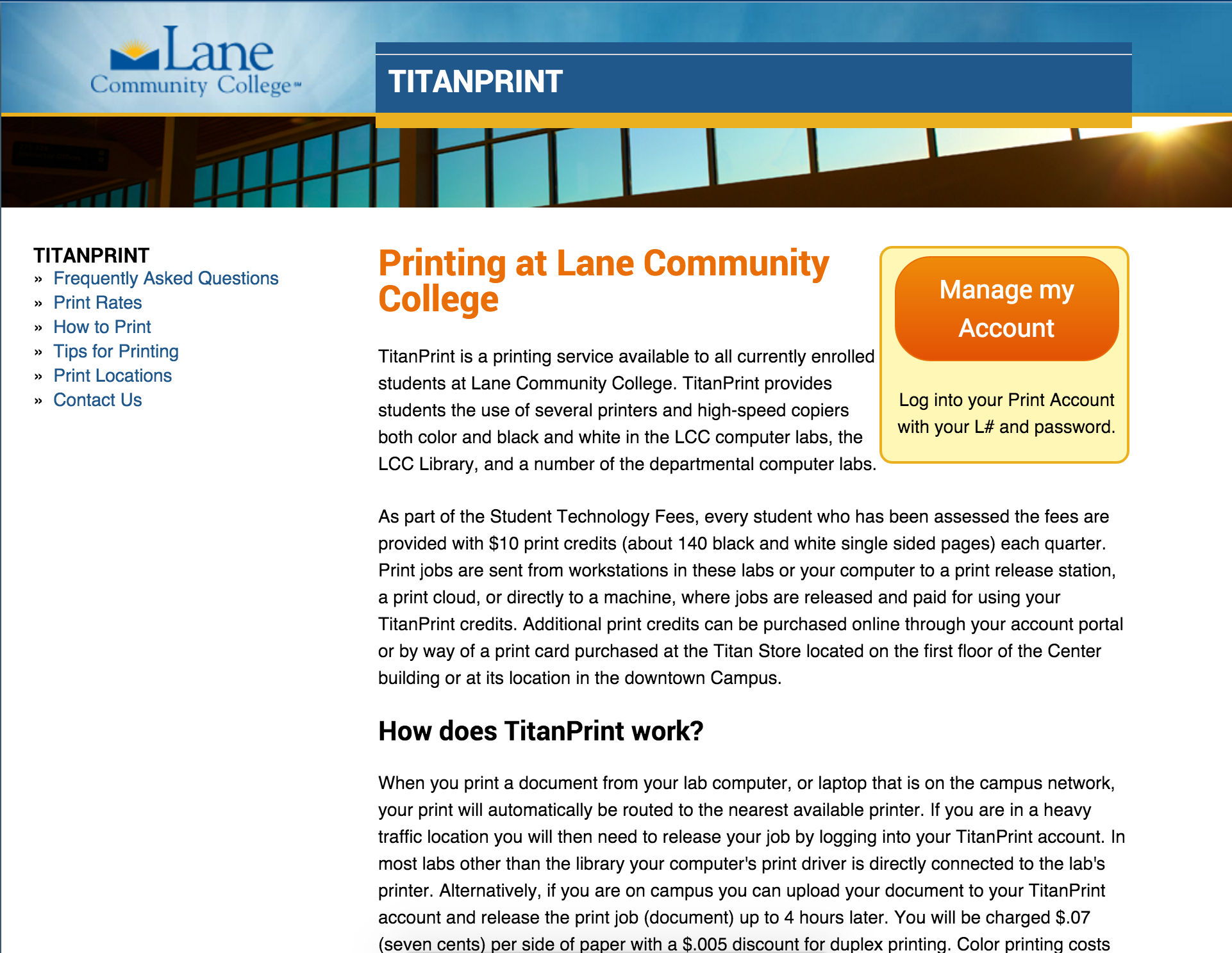
Alright, so let’s look at the existing landing page:

The current print landing page
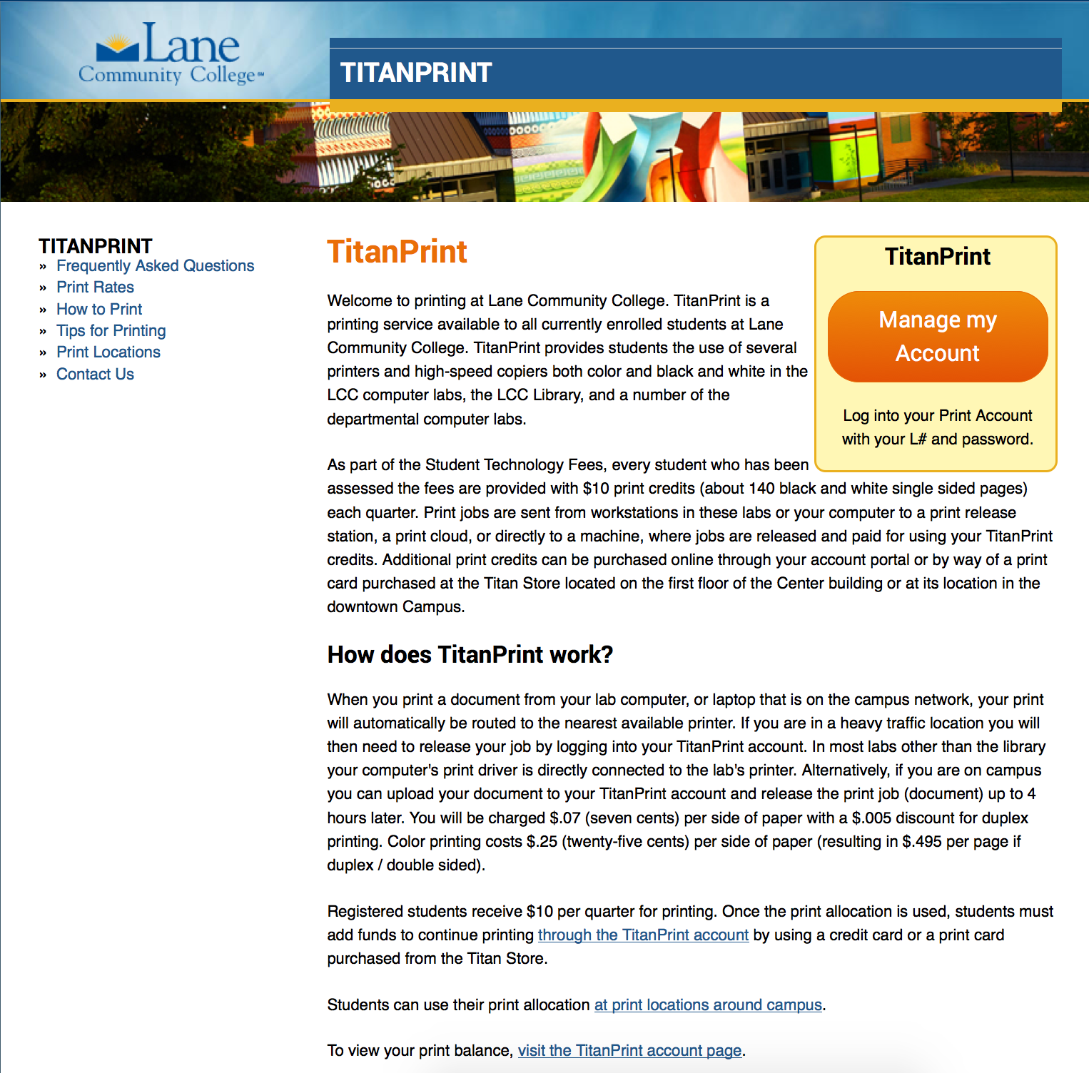
Currently we’re at 357 words at a Grade 12 reading level – ouch.

You may have noticed the text in that picture was a little small (you can read the entire text here if you’d like). But there’s advantages to small text like this. You and I are highly motivated readers. After all, this is “our” page, and we’re going to pay attention to every little detail. But our actual readers aren’t motivated. In fact, they’re likely to skim in an F shaped pattern, reading as little as is reasonable. When the text is small, we’re forced to skip over the text and focus on the bigger picture (you can zoom out on any page by pressing ctrl-minus on a PC, or cmd-minus on a Mac).

What catches your eye on that page?

My eye goes straight to that huge orange button on the right hand side. That button is the Call to Action (CTA) for this page. If at all possible, you want to make sure your page always has a CTA. It doesn’t need to be a giant button like this, it could just be a link with some white space to make it stand out. This page makes a reasonable assumption that the majority of visitors are looking to recharge their print accounts.

What catches your eye next?

I don’t know about you, but I see the a variant of TitanPrint written no less than 5 times in big, huge letters.
Print Landing Page with TitanPrint - this includes text that wasn't in the previously linked text, which did not include menus
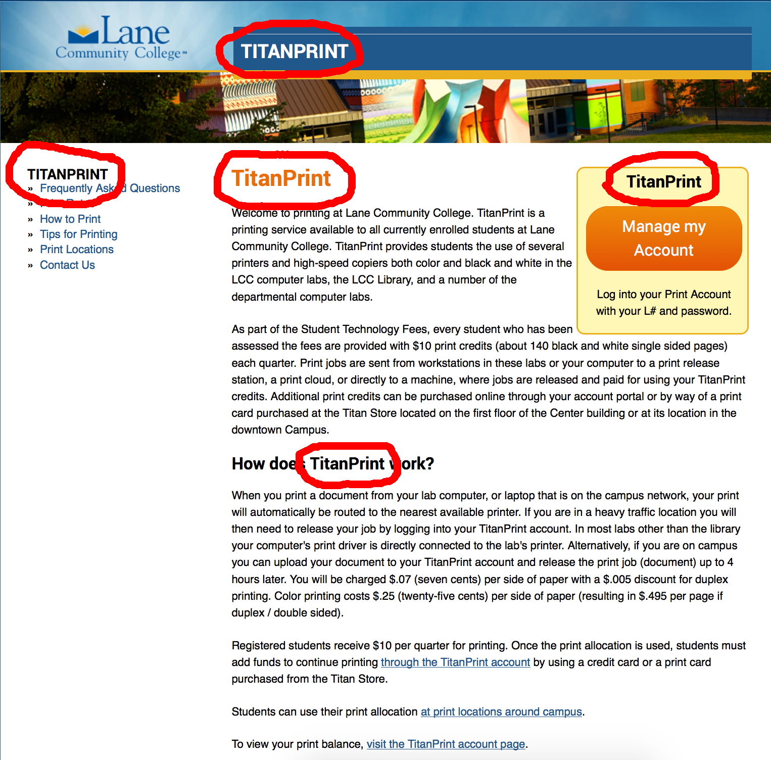
There’s some circumstances when that’s ok, but in this case it’s unnecessary. Let’s get rid of a few. First to go? The one on top of the box in the top right corner – that button can stand by itself. Second? The orange one at the top of the page. Let’s instead replace it with with the first sentence of the first paragraph: “Welcome to printing at Lane Community College”. But let’s also get rid of “Welcome to” – using “Welcome to” on any web page usually ends up feeling superficial rather than friendly.

Picture of the landing page with suggestions incorporated
And that’s as far as we’re going with this post. So, to summarize:

  • Know the purpose of this page
  • Make sure your page has a Call to Action that meets that purpose
  • Make sure to take a step back from your page and see how it looks

Next up we’ll use HemingwayApp to make some quick edits to the page text.

Content Redevelopment

Welcome to the first of a series of posts on rewriting your content to be friendlier, easier to read, and easier for search engines to find.

As employees of an educational institution, we’re constantly reading and writing to our peers. I know that I spend a lot of time in Groupwise – I read 16,134 words in emails just this week – and we’re only three days in! If my emails were a final paper for a class, they’d be an A+ guaranteeing 66 pages of Times New Roman, double spaced. Of course, like many of us, I’m on a few committees as well. There’s a ton of words in minutes and papers read preparing for meetings. And all this reading isn’t lightweight – email alone averaged a 10th grade reading level – pretty good, considering the number of emails that were just “Thanks!” or “Sounds Good”, both of which are really only a step from “See Spot Run”. And I can’t be anywhere near the worst – some of you must have it a lot worse.

At work, we deal with complex topics like student retention or math completion, with lots of complex statistics and intricacies that demand exacting language. In our classrooms, we’re responsible for educating students, and part of that is helping students learn to read and write at a college level. And the content we provide in our classes reflects that.

So far, so good. But the website isn’t work communication, and it usually isn’t a teaching venue. The website is a marketing and recruiting tool that sometimes does double-duty as a repository of knowledge for students, employees, and community members. That means content needs to be findable and readily digested.

Over the next few weeks, we’ll be completely rewriting a page on the website. The owner of that page has graciously volunteered to let me tear it apart and write about it here. I chose this page for two reasons: first, it accurately represents the type of writing we see all over the Lane website, and second, it’s a manageable length. There’s a few pages that are thousands of words long that desperately need help, but for a blog post, we need something we can read in one sitting.

Tools

The primary tool we’ll be using to rewrite this page is HemingwayApp, an amazing website that will provide us with instant readability feedback. Though HemingwayApp won’t tell us how to write, it will tell us some of the places we’ve gone wrong.

We’ll also look at the ToneAnalyzer, a tool that tries to figure out the emotional tone of some body of text. Generally speaking, we want a tone that’s social (but maybe a different kind of social than you’re thinking).

Finally, the web team has been preparing to roll out some integrated tools in Drupal that will help you analyze the readability and the SEO friendliness of your content. We’ll see a preview of what those will look like after we’ve finished rewriting.

Do as I say, not as I do

One of our goals in rewriting the content will be end up at a 3rd to 6th grade reading level. That might feel surprisingly low, especially at an academic institution. So why so low? Two reasons. First, a large number of people both in our target audience and across the country can’t read at a college or even high school reading level. We have a responsibility to present our content at a level where the majority of our audience can understand it.

But also because people generally don’t want to work hard when we read. Everyone knows that sitting down and reading Joyce or Proust is a great personal development exercise. But for most of us, it isn’t fun (observe the layer of dust on that shelf in my living room). The fun books, the best sellers, the ones we enjoy reading and not just having read were often written at a surprisingly low reading level. We should strive to do the same on the web.

Of course, these blog posts may fall short of that ideal. And that’s ok – this blog is meant to be educational and technical. So while it’s still important I follow the basic rules – like avoiding passive voice, providing meaningful hierarchy, and meticulously avoiding excessive use of modifiers – I’m judging my audience to be capable of handing the added difficulty and writing for them.

Sometimes that’s ok on the Lane website, too. It’s probably alright that the Graham-Leech-Bliley Procedure is at a grade 20 reading level and is more than a thousand words long. That’s appropriate for the target audience for that page. And sometimes, we’re stuck with difficult language as well. I tried really hard to make our privacy statement accessible, but ultimately it’s a legal agreement, and language choices were limited (it’s grade 10). But we have to do as best we can.

Game Plan

Next post, we’ll review the content on our sample page and the context of the site where it lives.

All the posts in this series:

IE9 & 10 Support Discontinued

On January 12th, 2016, Microsoft will be discontinuing support for all versions of Internet Explorer earlier than version 11. You can read the announcement from Microsoft, as well as why and how to upgrade, here. If you run Windows at home, it’s very important that you keep your computer updated in order to help keep it safe.

Similar to when we stopped supporting Internet Explorer 8, if you choose to continue using an outdated version of Internet Explorer, it does not mean the Lane website (or most of the rest of the Internet) will suddenly stop working for you. It just means that out of the hundreds of different browser, operating system, and screen resolution combinations that we try to test, we’re no longer going to test with IE8, IE9, or IE10 – we’ll be doing our Internet Explorer testing strictly with IE 11. Since users of the all of the outdated versions of Internet Explorer combined represent less than 4% of our web traffic, most folks won’t even notice we’re doing anything different.

If you use Internet Explorer at work, you may not be able to upgrade due to administrative policy or because you use an application that requires an older version of Internet Explorer. In that case, consider using multiple browsers, where you use Internet Explorer strictly where you have to, and Firefox or Chrome everywhere else, in order to limit the number of sites Internet Explorer is exposed to.

New Map and Tour

Today, we’re officially launching our new Campus Map! We’ve been quietly working on this project all summer, and we’re ready to show it off in all its glory.There’s a lot of awesome features on this map that we’d like to walk you through, but before we do that, Go check it out!

Here’s some pictures that show how detailed this map is:

West Entrance Garden Labyrinth
CFE Buildings and Learning Garden
Building 5 Mural and Art

Courtyard Between Center and Building 11

And so many awesome things:

  • The entire map is completely mobile friendly
  • Check out the tours tab on the left hand side, where you can take a virtual tour of campus
  • The search feature on the left is super helpful for finding things on campus – just search for it, and if it’s one of the layers the map can help you find it
  • Panoramic Photos! Turn on the Panoramic Photos layer and then click one of the 360 icons.
  • Speaking of layers, there’s only a few that are public right now, but we’re gradually adding other departments to the map to add layers that are interest specific. For example, we’ll have a layer about all the art on campus, a layer about our athletics facilities, and a layer about campus food options.

This project was a partnership between the Webteam, Marketing and Public Relations, Outreach and Recruitment, and CampusBird.

Have some feedback about the map?

[gravityform id=”4″ title=”true” description=”true”]

Mobile Traffic Milestone

Graph of mobile traffic, showing a clear pattern of year over year growth, including one day when 20% of visitors were mobile.
Percentage of visitors each day using a mobile device over the last two years

Last Sunday, for the first time ever, more than 20% of visitors to the website were mobile. And I don’t think the general trend can be missed: we’re up 38% on mobile compared to last year. Just more proof that we can’t ignore mobile when thinking about the web.

Also interesting? I was surprised to find that Saturdays and Sundays are our biggest mobile days. Each of the small spikes on the graph (not the gigantic ones) is a weekend. Anyone have any ideas why?

Don’t Make Me Think!

We’ve reached the Information Architecture stage of our web-project planning, a.k.a. how are we going to organize the new site? The ideal experience for any web user is to simply find what they need when they need it, without having to think. The ideal site is completely intuitive.  Steve Jobs has been quoted as saying the ideal technology does not require a how-to manual.  The aesthetics are such that users can simply figure it out. Given the breadth of the Lane web site this may be out of reach, but it is certainly an ideal worth pursuing.

Ambient Findability

Taking ques from the de-facto experts on web usability and intuitive design (see Peter Morville’s Ambient Findability and Steve Krug’s Don’t Make Me Think), we have begun a series of card-sorting activities with our stakeholders.

Card-sorting is exactly what it sounds like. A small group is provided a stack of 40 – 50 index cards with site names on them (counseling, welding, child care, library, course schedules, etc.) and ask them to organize them into 5 (or less) categories. Minimal direction is given – groups can add new cards – combine cards – organize as they see fit. Then we watch and listen to the discussion… see what they devise and listen to the logic behind it. They have a small window of time to get this done – 20 minutes or so – and then we have an open discussion about the results. A simple exercise that gets folks thinking about taxonomy and information architecture without having to know those terms – without having to read Ambient Findability or Don’t Make Me Think! Useful. Insightful. Simple.

So far, we’ve done card-sorting activities with current students, potential students (high schools), and lane employees. And we are now at the stage of aggregating and comparing the results. We aren’t there yet, but thought it might be worth while to share some of the process (and pics) of this activity.