Getting access to edit pages on the website

We’re making an effort to bring this blog back! Wanted to start today with a quick note about getting editing control of your website.

On the old website, pages were organized into “folders”, and we’d provide access to the entire folder at once. On the new website, access is actually set on a per-page basis. This is a bit of a pain for us, since it means we need to add users individually to every page, but it opens a lot of flexibility for you.

There’s a couple areas where we’re still trying to work out how editing permissions are going to work. The first has to do with pictures & uploaded files. The media system on the new website is wildly different, and I’m still not sure how to assign permissions correctly. We can still provide permissions to pages with images, but it sometimes takes some work to make it happen, and so far there’s no way for most people to upload images or files to the site.

The other area is the types of pages that are available to edit. Most standard pages can be edited, but program pages and steps to enroll pages are  two where we’re not assigning permissions yet. For now, please continue to route those through us.

If you’d like to get involved with making edits to your site, reach out to webmaster@lanecc.edu and we’ll help you get started.

Content Freeze

As we enter December, we’re also entering a new phase of our website redesign. Very soon – possibly the end of this week – we’ll be entering into a content freeze. Editing privileges to the sites listed at the bottom of this post will be suspended as soon as we enter the freeze. I’m really, genuinely sorry I can’t provide an exact date here. Some difficulties unique to 2020 has made that impossible. I hope to know the exact date a little later this week.

Where we are and what’s next

Our redesign firm is putting the finishing touches on our website. Next they’ll import our current content, and we’ll start testing. Lori and I will try to test the new website on every possible combination of Chrome, Edge, Firefox, and Safari on Android, iOS, Mac OS, and Windows. We expect that testing to last for a few weeks, as we go back and forth fixing problems and testing again.

While we test, we’ll be working on reformatting the imported content. Our current website is built around one giant text area (the “body” field), with things like pictures or videos inserted in it. The new website will be built around reusable content blocks, like accordions, videos, or image galleries. It will take some time to reformat into the new system, but once we’re there, we should be a lot more flexible and consistent across our pages.

As part of the redesign process, the firm identified some areas where we’re lacking content. In addition to reformatting and rewriting existing content, we’ll also be doing some content development. And of course, we’ll be hunting for images to use all around the site. Don’t be surprised if we reach out looking for a higher resolution image from your pages!

While this process is a lot better than the last time we did this (when we had to hire someone to copy and paste, full time, for over a year. She was bored out of her mind!), it does create a problem: after we import all the current content into the new website, there’s going to be a multi-week period where if you make an edit to your current site, it won’t automatically be moved into the new site. That brings us to the freeze.

The freeze

Possibly as soon as the end of this week, we’ll be turning on a new module which disables edits on the list of sites found at the bottom of this post. If your site is in the list, and you absolutely must make a change to your content, reach out directly to Lori instead of doing the edit yourself. She’ll make the change on both the old and the new sites simultaneously, so we don’t lose any of the changes. This will significantly increase Lori’s workload, so please try to limit changes to what’s absolutely essential.

One question we’ve had already is forms. There are a number of departments with a critical form they need to access. If your site is frozen, you will still be able to log in and use your forms. This freeze only impacts the ability to edit your page content. For now, we’re keeping the ability to edit your forms, but may need to disable form editing when we reach the point where we’re migrating forms into the website. Unfortunately, the migration process cannot move forms, so we’ll be recreating those manually. If your form will eventually be moved to SoftDocs, it will not be migrated to the new site, even if it isn’t ready in SoftDocs when we launch the new site. The old form will continue to work for some time in the old site, but I encourage you to move it to SoftDocs as soon as possible.

If your site isn’t in the list below, then nothing in this post applies to you. We’re only migrating student and prospective student oriented content to the new website, and if your site is primarily staff oriented (ATC, FPD, PD, etc) or is largely administrative (COPPS), then we’ll probably be leaving it in the current website for now. You’ll continue to have access, and continue to be able to make changes as normal. Sometime next summer we’ll hopefully start adding functionality to that site, and work toward having a true intranet.

After Launch

While we won’t be able to nail down the exact launch date for the new site until after we’re in there reformatting and redeveloping content, we expect it to be some time late in winter term. Since we’ll be doing double entry for all website changes, it’s in our interest to get there as fast as we can.

When we launch, we plan to very slowly add new users to the site. There’s a number of reasons for this caution. Some are technical, like the all new permissions structure. But we’re also trying to create a more consistent voice on the new website, and think that’s going to be very hard to do if we bring in all 148 current website editors. Details to come as we get a little closer.

Thank you for being understanding of our need to keep everything somewhat flexible this year! If you have any questions, please feel free to reach out via email.

The List

There are some sites on here which are hybrids. For instance, Academic Technology’s site has some student pages, like the SHeD, but is mostly employee oriented.  We’ll be working with those sites  to try and unfreeze parts of them midway through the process.

While this list should not be considered final, here’s the list of sites we’re planning to freeze right now:

  • abse
  • academictechnology (LETS and SHeD pages)
  • accreditation
  • admissions
  • advising
  • advtech
  • als
  • alumni
  • apprenticeship
  • artgallery
  • arts
  • Arts and Humanities
  • aslcc
  • aviationacademy
  • bond
  • budget
  • business
  • calendars
  • cc
  • ce
  • cec
  • cfe & lcfc
  • cit
  • collegenow
  • commencement
  • cooped
  • cottagegrove
  • covid19
  • ctecc
  • culinary
  • dentalclinic
  • disability
  • diversity
  • downtowncenter
  • engineering
  • eorp
  • esfs (not the document submission form or degreeworks FAQ pages)
  • esl
  • español (undocumented students pages)
  • facilities transportation (excluding motor pool) and event scheduling pages
  • fec
  • financialaid
  • firstyearexperience
  • florence
  • food
  • foundation
  • gec
  • governance
  • healthclinic
  • healthpe
  • honors
  • hp
  • hr (employee recruitment and affirmative action pages. hr sub-terms, such as employment classifications may not be impacted)
  • hsconnections
  • information technology student computer labs pages
  • international
  • laneonline
  • leadership
  • learningcommons
  • llc
  • longhouse
  • math
  • mcc
  • mediaarts
  • mhwc
  • mpr/success
  • newsroom
  • pathways
  • perarts
  • pie
  • psd
  • ptk
  • qcc
  • rtec
  • safelane
  • schedule
  • scholarships
  • science
  • scp
  • seniorprogramming
  • sexualrespect
  • socialscience
  • speaker-series
  • sss
  • studentconduct
  • studentemployment
  • studentlife
  • sustainability
  • testing
  • trio
  • tutor
  • va
  • wc

12/6 – This post was edited to add accreditation and budget to the above list, and to add notes to the esfs, español, facilities, it, and hr sites.


Website Redesign Check-in

It’s been a while since our last redesign post, but don’t think we haven’t made some progress. We’ve been averaging about one video call per week, and are getting closer and closer to development work.  Some of the things we’ve done:

Developed Batch 1 Designs

Our first batch of pages included the homepage, a career community page, and a program page. Our assumption is that these are some of the first pages most prospective students are going to look for, so we wanted to dive right into them. Our homepage is definitely going to shift direction, and be focused very narrowly on prospective student.

User Tested Batch 1

To be certain that we were on track with design and the information architecture, we did some intensive testing with some real prospective students. Users were asked to perform specific tasks, with people watching exactly what they did and seeing where they struggled.

Finalized Batch 1 Designs

We made some changes to the designs to address issues uncovered in user testing. Some were easy to address, but one has been a particular thorn.

Lane has a lot of different offerings, and people are confused by them. We have degrees, 2 year certificates, 1 year certificates, less than 1 year certificates, career pathways certificates, and non-credit credentials. There’s even more variety within the certificates. Some are financial aid eligible, some are not. Some are stackable with a degree, some are independent. Some are stackable, but you choose between multiple options. Some are technically stackable, but are marketed to a different market segment than the degree. We’ve gone several rounds with trying to balance standardization of design (to reduce confusion) with the flexibility to accommodate all our programs (to stay accurate). We’ve landed on a layout we think will work, and we hope to test it again, but it’ll be difficult to know if it’s worked for all programs until well after launch.

Reviewed Batch 2 Mockups

Our batch 2 pages included some Registration and Tuition related pages. While we’re pretty happy with the design of these pages, they’ve helped highlight a problem for us: our internal organization doesn’t always match how people think about us. For example, consider how students pay for college. We have a lot of departments that deal with money: a Financial Aid office, a scholarship and student employment office, a veterans benefits office, a bursar, and several people that work with sponsored accounts. There’s probably more. There’s really good reason for splitting them apart, and each requires a ton of very specific expertise. But if I have a question, and I’m not sure which of those areas can answer my question, who do I call?

Started Batch 3

Our Batch 3 designs relate to the application sorter and steps to enroll pages. We’ve done quite a few versions of these since our last redesign in 2013. For instance, our sorter page swapped from being person type oriented to goal oriented. Yet, despite all those changes, our sorter continues to be one of the least liked pages on the site. Our new design is going to try to leverage some of that experience, and include information that can help you navigate either way, while simultaneously emphasizing the most commonly used enrollment pathways.

Content planner

Our greatest amount of work has been the content planner. This maps content on our current website to the new website, and identifies where the gaps are. We’ve got a bunch of folders and empty documents set up in google docs right now where we’ve been starting to develop new content and rewrite some old content. There were more than a hundred pages which we need to keep, but which don’t have an obvious home in the new website, and I’ve been slowly making my way through. Some of the rewritten content will be launched before we launch, while most of the new stuff won’t be launched until the whole site is ready.

Meanwhile, as we continue our review of every page on the website, Lori’s been aggressively working on some of the recommended page merging and deletion. Thank you to the dozens of you that have helped us delete old pages!

What’s next?

After we finalize batch 3 this week, we’re hoping to do another round of prospective student testing. Very soon development will start, and while the site is being built, we’ll continue our work on content.

One of our big challenges will be photography. Normally for a website redesign you’d schedule a couple of professional photo sessions on campus, but due to COVID-19, that’s tricky. Before launch, it’s unlikely campus will look quite as busy as it would normally, we won’t see groups of people together, and the people we do see may be wearing masks. I’ve been trying to make it out to campus once in a while to get some photos, but there’s only so many empty shots of campus we can use. If you have any amazing photos – ideally where everyone in the picture has signed a photo release – and you’d be willing to let us use them, send them our way!

One of the campus turkeys in front of the center building
One of the photos from my weekend adventures shooting photos on campus

More accessible phone numbers

In the last post, I learned that not only does phone number format matter from an SEO perspective, but phone numbers can be really annoying to the blind. Depending on the screen reader, a phone number like 541-463-3000 could be read as “five hundred forty-one dash four hundred sixty-three dash three thousand”. That seems terribly annoying.

I started out trying to implement the solution at the end of this blog post, but then my curiosity got the best of me, and I got digging deep into CSS speech modules. It looks like support is limited even though they’re so cool! But the limited support means I’m going to stay away.

Instead, we’re back to the regular expressions replacements, using the Drupal custom filter module. Currently, we look for

/\((\d{3})\) (\d{3}-\d{4})/

And then replace it with

 <a class="telephone_link" href="tel:+1-${1}-${2}">${0}</a>

Over the last few days, we’ve changed that to grab each number individually:

/\(((\d)(\d)(\d))\) ((\d)(\d)(\d)-(\d)(\d)(\d)(\d))/

and replace it with something much, much longer:

<a class="telephone_link" href="tel:+1-${1}-${5}" aria-label="${2} ${3} ${4}. ${6} ${7} ${8}. ${9} ${10} ${11} ${12}">${1}-${5}</a>

It’s a bit of an ugly regular expression, but not only will this hopefully make a better experience for screen reader users, it’ll also introduce a new phone number format as currently recommended by the AP: 541-463-3000.

Progress on the Website Redesign

We’ve been working on the website redesign for a while, but I’m afraid that I’ve totally dropped the ball at posting updates to this blog. Things have been much busier than anticipated. Though I’m sure I’m missing some parts, here’s a quick overview of what’s happened so far.

Completed a brand and identity inventory

In order to help iFactory get to know Lane as a college, we answered a multi-page inventory covering basic items like what our roles are, questions on our market, our programs offerings, and even our guided pathways efforts.

Hosted an on-site visit by the iFactory team

Three iFactory employees came to campus to get to know us even better, eat some delicious Eugene food, and conduct focus groups with students and employees to learn more about what the campus thinks is important in the website. Afterward, they surveyed more than one hundred current students for their thoughts about our website.

Developed four personas to make sure our web content meets everyone’s needs

Well, at least as many needs as we can. Think of personas as pretend people which you can use to evaluate the site. For instance, we have Colleen, a traditional high school student interested in taking some classes at Lane to save money before transferring to a 4-year college. The other three are even more complicated, with tricky backstories. While we’ll never capture every unique situation at Lane, our personas are different enough to make sure we look at every piece of this redesign from at least four very different perspectives.

Evaluated six different mood boards to see which images and designs most feel like Lane

Having collected a lot of information about the college, we were presented with six different mood boards. You can think of these like Pinterest boards for the college, with different collections of pictures and screenshots of other college websites. We provided feedback on each one, and explained why they did or didn’t feel like Lane.

Evaluated three different mockups of potential homepage elements, to get a feel for the design language which will eventually build our site

From the mood boards, some simulated pieces of a  new site were created for us to critique. We provided feedback again on which directions we wanted to pursue.

Provided feedback on two rounds of information architecture for the new site.

While working on some of the design tasks, we were presented with two iterations of an information architecture (IA). The IA is how the site is going to be structured, and starts to provide some structure to the navigation on our site. While we’re pretty confident the IA we’re going to use is roughly correct, it’s still being polished.

Completed a content inventory

We were provided with a spreadsheet of more than ten thousand different URLs that are a part of the Lane domain. While they weren’t all part of the Lane website, they were each linked somehow from the Lane website and a part of our domain. Our job was to determine what to do with each page. Was the content correct? Could it be merged elsewhere? Should it be archived? This task took several weeks of near full time work, and resulted in our cleaning a lot of content. Due to the sheer number of pages to look at, we weren’t able to consult with everyone on each page, but I did talk to dozens of people about their content throughout December and January.

Provided feedback on several rounds of wireframes of possible college pages

One common step in website development is to draw a rough layout of content, without putting any color or pictures in it. The goal is to get you to stop thinking about the appearance of the content and instead think about the layout and the flow of the text. Some wireframing software will even make the lines look like they were drawn with a crayon or thick marker, just so that you know immediately that we’re just roughing in content elements.

Evaluated two different homepage mockups (with help from 44 of you!) to see what direction we want to go with the college homepage.

This is when things got really exciting. Finally, in the last month, we’re starting to see some fairly polished concepts of what the new homepage might look like. We’re still finalizing some of the language, so they’re not quite ready to share, but we’re getting close.

What’s next?

We’re currently working through wireframes and mockups for several other types of pages, and have started preliminary conversations with their developer. Soon, we’re going get an outside perspective on the actual content of our website, and see where we have some gaps. Quite a bit of time this spring is likely to be occupied with content development, since we know we have some content gaps.

I’d also like to share the first change that we’re confident that is going to impact our web editors. On the current site, almost all of your content is in one field called “Body”. This is great, in that it’s very customizable, and terrible, in that it’s very customizable, leading to broken, inconsistent pages. Best practices developed a few years after our previous launch suggest  providing reusable components that you can plug into any part of your site: a slideshow here, a callout quote there, some text over there. They also suggest making them remixable, so you can lay out your page however you’d like, using a common language of elements, letting your page be instantly familiar to everyone as a Lane page, but also customized to your content.

We’re going to be adopting that approach as a part of this website launch, which I hope will help meet some of the website customization needs I haven’t been able to meet over the last few years!

More details soon, honest!

Web Team goals for 17-18

It’s the end of the academic year, which means it’s time to start thinking about goals for next year. Our first set of goals will be similar to our goals from last year:

  1. Reduce the total number of pages on the Lane website by 5% (from 5550 to 5273)
  2. Reduce the number of pages with more than 15,000 characters by 10% (from 249 to 224)
  3. Reduce the average character count of our pages by 10% (from 4650 to 4185)
  4. Improve the average age of our pages (the average late updated date) by 4 months (from 16 months to 12 months)

We’re also going to add two goals relate to page use:

  1. Increase session counts for www.lanecc.edu during the period 6/14/17-6/14/18 compared to the previous year by 5%, from 3,228,904 to 3,390,349
  2. Decrease the bounce rate for www.lanecc.edu during the period 6/14/17-6/14/18 compared to the previous year by 5%, from 37.05% to 35.19%

We’ve never had page use goals like that, so this will be interesting for us as we really dig into how to increase engagement and findability of our pages.

If you’d like to help us meet our goals, just edit your pages! We’ve made a lot of progress in making our pages more recent – many pages used to be over two years old! We’re happy to help. Just email Lori and she’ll get you pointed in the right direction.

Using all Capital Letters

An instructor asked me the other day, “How does a screen reader read text in ALL CAPITAL LETTERS?”

I didn’t know, and through it was a great question, and had to figure it out. Let’s start with some sample text:

It’s VERY important you remember these:

  • USPS
  • NASA
  • DVD

There’s four words in all caps there. Let’s look at each one, from the bottom to the top:

DVD is an initialism, meaning you read each letter in it, like CPU or FBI. NASA is an acronym, meaning you read it as a word, even though each letter stands for a word. USPS is another initialism. But VERY is just a word, with all capital letters being used for emphasis.

Of course, it’s wrong to use capital letters in this way – you should instead be using an em or strong tag (though which one is complex, and I didn’t find the examples in the specification very helpful). But the instructor’s question wasn’t about what should happen, it was about what does happen. How can a screen reader know which of those words it should treat as words or acronyms (which are like words, in terms of pronunciation), and which it should treat as initialism (and read letters instead of the word)?

I ran each of the examples through the say program on my Mac, and here’s what I got (sentence case was pronounced like lowercase):

Word Uppercase Lowercase
Very word word
USPS letters word
NASA word word
DVD letters letters

There’s some interesting logic there. I think this table shows my Mac will always read dictionary words as words (like “very”). And I think it shows that my Mac also has a list of known acronyms and initialisms, so it knows how to read those. For words that aren’t in either list, but also aren’t in the dictionary (like USPS), it reads all capital letters as initialisms, but lowercase as a word (a reasonable assumption, since most of the time it encounters words that aren’t in the dictionary, it’s probably due to the lang attribute not being set correctly.

Of course, this is just say on my Mac, which isn’t even a screen reader. WebAIM has some general rules for how screen readers read things, but it isn’t really predictable how a screen reader is going to pronounce words in all capitals. Pronouncing typographic symbols is hit or miss as well — some, like @ and % are read correctly. But most others (like the parenthesis, or the mdash in the previous sentence) aren’t read universally. Rare punctuation, like the interrobang (‽) may not be read at all.

I was hoping that abbr would influence how screen readers pronounce words, but that doesn’t appear to be the case (and, if you’ve been around HTML for a while, remember you’re not supposed to use acronym at all — though it probably wouldn’t do anything here anyway).

What does this mean for you at Lane?

Use the abbr tag to specify acronyms and initialisms if possible. Even though screen readers won’t necessarily change how they handle pronunciation, abbr with a title attribute makes it easier for anyone to understand meaning. Try hovering over this: NASA.

If you want to use capital letters for emphasis: don’t. Instead, use either an em or a strong tag, depending on if you’re trying to emphasize something or make it note that it’s more important than surrounding text. And, of course, never use strong in place of a header.

If you want to use capital letter for aesthetic reasons, then you should use a bit of CSS to make it happen:

.all-caps {
  text-transform: uppercase;
}

Screen readers ignore CSS, so this use is entirely for presentation. Just make sure you don’t confuse presentation with meaning.

I ran a quick search on our website for pages that have a lot of capital letters all in a row:

SELECT entity_id
FROM   field_data_body
WHERE  body_value REGEXP BINARY '[A-Z ]{10}';

There were 748 results. Editing 748 pages obviously won’t happen overnight, and on each one we’ll need to determine if we should instead be using a header, a strong, an em, or just normal text. For now, I’ve queued a task for us to tackle in the future, but if you’re editing your page and notice some misuse of capital letters, we’d be forever appreciative if you’d fix it.

Closing out the year for the Web Team

If you’ll recall from our original goals post, or the update that followed, we had a few goals on the web team the last two months of the year:

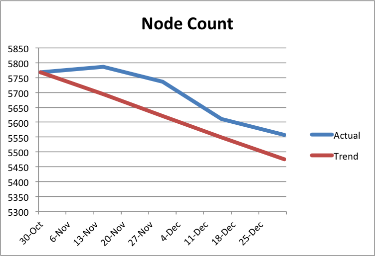
  1. Reduce the total number of pages on the Lane website by 5% (from 5768 to 5475).
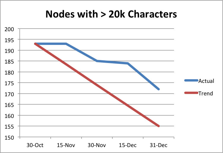
  2. Reduce the number of pages with more than 20,000 characters by 20% (from 193 to 155)
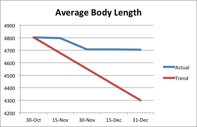
  3. Reduce the average character count of our pages by 10.5%, from 4803 to 4300.
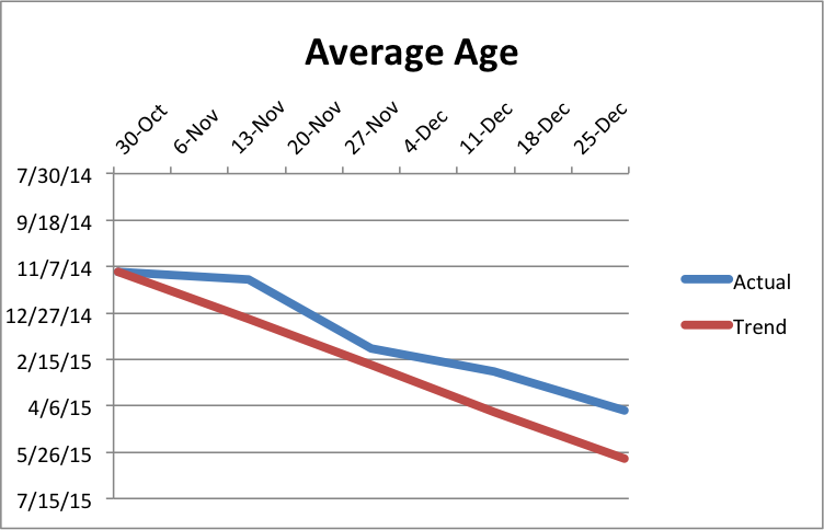
  4. improve the average age of our pages by 6 months, from roughly 24 months old to 18 months old.

I’m very sorry to report that while we made a lot of progress, we were unable to meet any of our four goals. Here’s the graphs:

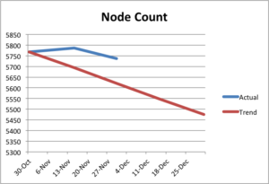
Node Count Graph, showing progress from 5768 to 5557We were able to make some progress eliminating nodes even in December, but things slowed down. Part of that is because with so many people on vacation around the holidays, it’s difficult to get permission to delete a page. We’d been shooting for a 5% reduction, but we were only able to get 3.5%.

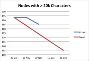
Graph of nodes wiht more than 20k characters, showing progress from193 to 172As mentioned in the previous goals post, it turns out that many of these really long nodes are pages that are really hard to reduce, like board meeting minutes or transcripts of in-service addresses. I reviewed almost every page and removed a lot of really bad markup: things that we should have removed when initially porting pages to Drupal, boldfaced text that should have been headers, HR tags used improperly, and so very, very many &nbsp; characters. We’ll tackle some of those in a future post.

We’d been looking to make a 20% improvement, but we only managed 10.8%.

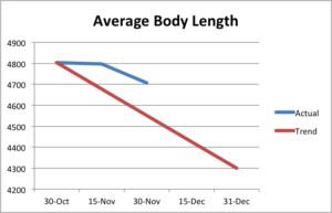
Graph of average length of our pages, showing no progress in the last month.Average length was really depressing for me, especially as I’d update statistics after working on these goals for a few hours. I might spend two hours meticulously working my way through the list of really long nodes, since they’d help us meet this goal the most. And I might see a visible improvement on the body length graph. But then I’d work on eliminating some nodes, and inevitably those nodes would be really short, meaning our average body length would go right back up.

Still, we made some gains early on, and the site as a whole is improved. We’d been shooting for a 10.5% reduction, but we only made a depressing 2% improvement – about 100 characters.

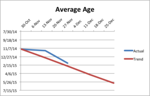
Average Age, showing steady progress along our trend lineWe probably made the most progress on this goal, but our failure to make progress early in November really hurt us. Over the two months we tried to meet our goals, pages got about four months newer.

We tried to meet this goal primarily by updating our oldest pages.

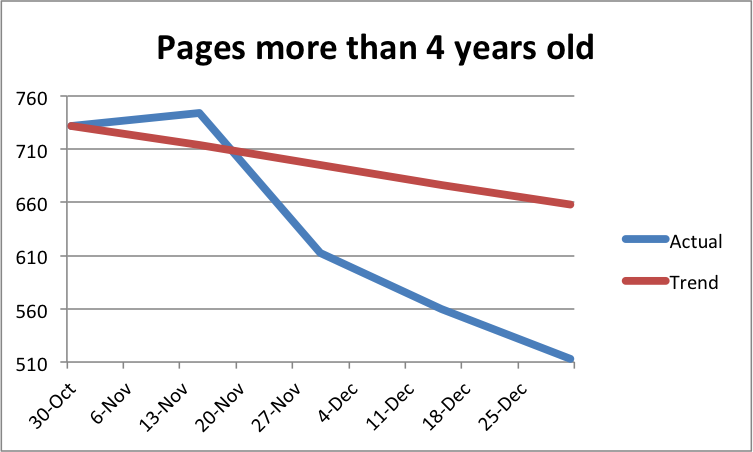
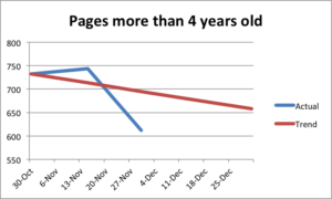
Count of pages at least four years old, showing progress from 732 to 513We substantially reduced our really old pages. And while it’s great we made that progress, since we hate ROT, it just wasn’t enough for us to meet our goal.

We still have lots of tasks queued up in Basecamp for us to do related to content, that we just didn’t have time to get to as part of this challenge including reworking some tables that are used improperly, removing even more HR’s, fixing some pages that are using redundant text blocks, eliminating duplicated pages, adding headers, removing improper use of the • character (people use it for bullets, but they should be using the bullet tool), and figuring out what to do with pages where people wrote “check back for content soon” several years ago. So we expect to make more progress in the coming months.

A special things to everyone who helped out with our goals. Here are the ten champions of the last two months, who made the most edits on the site, helping us toward our goals:

Name Number of Revisions
Lori Brenden 545
Kyle Schmidt 179
Amy G 132
Emily M 91
Tammy S 58
Elizabeth P 41
Melanie B 39
Joan A 31
Wendy S 30
Penny M 27

Happy New Year everyone!

Web Goals check-in

As promised in our initial goals post, a month as passed and now it’s time to check-in and see where we are on meeting our goals. As a review, those goals were:

  1. Reduce the total number of pages on the Lane website by 5% (from 5768 to 5475).
  2. Reduce the number of pages with more than 20,000 characters by 20% (from 193 to 155)
  3. Reduce the average character count of our pages by 10.5%, from 4803 to 4300.
  4. improve the average age of our pages by 6 months, from roughly 24 months old to 18 months old.

Let’s take a look in order, along with some graphs. On each of these graphs, the straight line is the trend line – in order to keep on track for our goal, we need that line to be below the trend line.

Reduce the total number of pages on the Lane website by 5% (from 5768 to 5475)

Clearly, we’re running behind – the count as of today is 5737, about 110 more than we’d hope to have. It turns out that removing pages is really hard. While we’ve removed some things to our archive, we’re fighting an uphill battle as things like news releases and meeting minutes get added.

Reduce the number of pages with more than 20,000 characters by 20% (from 193 to 155)

We’re making progress on this one, but again, it turns out to be really hard. We have 185 nodes with more than 20,000 characters, but we were looking to only have 174 this week. Many of the pages that are really long are actually Board Minutes, which we don’t delete and can’t shorten. Right now we’re optimistic we’ll still find enough pages to fix, but this will be hard.

Reduce the average character count of our pages by 10.5%, from 4803 to 4300.

Although we’ve managed to improve from 4803 characters to 4706, we’re still 150 characters over where we wanted to be. Again, it turns out the board minutes are in large part to blame. But we’re still optimistic.

Improve the average age of our pages by 6 months, from roughly 24 months old to 18 months old.

We came closest on this one. At the start of last month, our average page had last been edited on 11/12/14. Now, that date is 2/3/15 – almost three months newer. That’s a lot of page edits. But we’re still two weeks behind our goal for today, which was 2/21/15.

When tackling this goal, we had a separate subgoal to reduce the number of pages we have that have gone more than four years without an edit. Lori’s done a lot of work on this list, reducing the number of pages on it from 732 to 612, which makes a pretty impressive graph:

Surprisingly, despite all that effort on our very oldest nodes, it wasn’t enough. But we have a month to go, so there’s still some time. We’ll check in again on January 1st!


Goals for 2017 on the web

There’s two months left in 2016, and the web team wanted to set a couple goals for the Lane website before we close out the year. An important part of our mission is to keep our pages as readable and relevant to our visitors as possible. One way to do that is to prevent and remove ROT – redundant, outdated, or trivial content on the web.

Redundant Content

Redundant content is dangerous content. If the same content appears in multiple places online, it’s only a matter of time until only one place is updated and the content is out of sync. Then we’re providing conflicting messages. Beyond that, redundant content makes it confusing for search engines to know which pages to serve. Pages are scored by search engines primarily by the number of other pages that link to them.

Here’s a (super simplified) scenario. Say we have two different places that describe our refund policies, and both of those pages link to the same page of meeting notes about changing those policies. Sites, both internal (on the www.lanecc.edu site) and external (including sites run by other organizations, but also places like moodle), link to a page on refund policy. But some link to the first place, and others link to the second page. When you search for refund policies, what do you get in your results?

We can’t be sure – and you might even get the PDF, because it’s getting some page rank from each of the two other pages. But if we had that content on just one page, everyone would link to it correctly, letting search engines value it correctly and making search better for everyone.

Outdated Content

That outdated content is an issue should be obvious, but even content that’s just several years old and no longer relevant can be an issue. We have 732 pages that haven’t been updated in over 4 years. Some of that content has certainly changed since then, and is now incorrect. It’s going to be a tremendous effort for us to go through and figure out which of those pages need updating, and which can just be removed.

Trivial Content

Trivial content is a difficult one. It might be content that you find really important – say, a photo album of an event a few years ago. But if that content isn’t helping the mission of your site and of the website as a whole and isn’t required to be there by law or by grant conditions, ultimately it’s trivial and should probably be removed..

Trivial content doesn’t need to be an entire page. Sometimes it’s just a line, like “Welcome to the Underwater Basketweaving Department!” that purports to make the department look friendly but falls flat. This excess content confuses search, and makes it dififcult for people to find what they need, ultimately leading people to feel like website is cluttered and difficult to navigate.

Long Content

We also have a problem with content length on our site. Sometimes pages are necessarily long, like COPPS policies (though there’s certainly some of those that could use help!). But often pages are so long they make it difficult to find what you need. Due to the way we store our pages, I don’t have an easy way to count words on pages, but I can count letters. These aren’t perfect counts, because they include some of the HTML that helps to style the page, but they’re a great estimate. I did a count of our pages last night and found some crazy pages: 50,000 characters. 80,000 characters. 90,000 characters. If we use an average of 6 letters per word, that’s as much as 15,000 words on a page! Positively insane. How can students find what they need?

Our Goals

As editors on the website, we’re enlisting you for help! Here’s the goals we’d love you to help us meet this year:

  1. Reduce the total number of pages on the Lane website by 5% (from 5768 to 5475).
  2. Reduce the number of pages with more than 20,000 characters by 20% (from 193 to 155)
  3. Reduce the average character count of our pages by 10.5%, from 4803 to 4300.
  4. improve the average age of our pages by 6 months, from roughly 24 months old to 18 months old.

Except for the total page count, these goals and statistics are actually calculated against what we call a “basic page”. So these don’t include news releases, COPPS pages, or the landing pages.

On December 1st, we’ll post an update with how we’re doing on each of the goals, then check in again on January 1st to see if we met them.

And of course, if you need any help getting back into editing your pages, let us know! Just contact Lori, Jim, or me and we’ll be happy to help.