WebAIM Top Million 2024

Unfortunately for us, but fortunately for the rest of the world, our ranking has slipped a bit this year, from 149,013 last year to 199,996 this year. Our ranking among community colleges in Oregon hasn’t changedstill #4and our ranking across public educational institutions improved from #8 to #7.

So why do I say our ranking slipping is good? Because throughout the last year we’ve substantially increased our rate of PDF remediation, and are confident that we have fewer accessibility errors across our pages (we fix every accessibility error our checker finds! Plus we have fewer pages this year!). So if we’re slipping in the rankings, that’s because pages across the world are getting more accessible, and that’s good for everyone.

WebAIM Top Million 2023

A couple years back, we looked at how we placed in WebAIM’s top million homepages for accessibility. At the time, we were ranked #242,359, putting us in the top 25% for the first time, and ranking #7 in the state for community colleges and #13 for Oregon public colleges.

After the launch of our new website, we’re now ranked #149,013! That ranks us as #4 in the state for community colleges, and #8 for Oregon public colleges! See our entry on WebAIM’s site.

One of the really helpful things to come out of the website redesign is the addition of an automatic accessibility checker on every page. As we edit pages now, we’re correcting accessibility issues whenever we spot them, so we’re even more optimistic for our rank next year.

Should links open in new windows?

In a word: no. As stated by the WAI, new links can be “…disorienting for people, especially people who have difficulty perceiving visual content”.

As with anything else on the web, there’s always an exception, and you should definitely check out the link above to read about some specific scenarios where opening a new tab/window can be appropriate. But those scenarios are rare. People know how to use the back button. Depend on that, rather than a new tab/window.


An audio captioning guide

Today’s post is a quick one, to share this awesome captioning style guide from Humber College, which I found while trying to figure out the appropriate way to caption a choir singing a round acapella (I still don’t know the answer). In addition to the most helpful information I found on captioning music, also included are suggestions on timing, dialog, sound effects, and accents. Since we need to caption almost every video on our website, it’s worth a quick glace to get an idea of how it should be done.

Creating an inaccessible website

Recently I found a post which explores some of the limitations of automated website accessibility checking tools by building a site that scores a 100% on Google’s accessibility checker, while being completely inaccessible.

That post explores the very real limitations of automated tools. Tools like that can be useful, and help us by checking some of the low hanging fruit. But they never do a great job. For instance, just to highlight one obvious example mentioned in the post, here’s some examples of alt text on a logo which links to the homepage which would pass an automated check, but are really terribly inaccessible:

  • alt=”logo”
  • alt=”logo.png”
  • alt=”Picture”
  • alt=”The Lane Community College Logo”
  • alt=”Lane Community College”

You know what some good alt text would be? “Visit the LCC homepage” – it’s a linked logo, so provide the purpose of the link.

When it comes to automated accessibility tools, use them to give you an idea of the overall accessibility of a page, but always double-check some items yourself – particularly ones that are difficult to for a computer to check, like link purpose.

Looking for more on alt text? Check out a decision tree for alt text

Welcome back!

I know, I know, we’re in week 4, and I’m finally putting out my first post of the year. But it’s 2020. It’s that kind of year.

Last week the web team attended the 2020 HighEdWeb annual conference. This is one of my favorite conferences, and it was even better this year because it was absolutely free online (though in central time, which made for some early mornings). Here’s some gems:

Plain Language Matters.

It’s an accessibility issue. It’s an equity issue. People skim online. If we make that hard for them, they leave. Take a look at our previous plain language post.

Resource pages & emails don’t work.

One of the groups at Miami University did a lot of extensive testing. People don’t self serve. If you have a lot of links and resources that you want to put out there, consider a drip campaign to slowly provide those links at a pace people can digest. Use social to highlight different resources at different times. Include titles that highlight the problem the resource solves (“Looking for a tutor late on a Sunday night before class? Look no further!”). Track what you do to see what works (and reach out if you’d like help setting that up!). Rather than a resource page, consider a blog, where those resource links can be provided in context, and do some content marketing for you. We’ve also covered resource pages in the past.

Stop posting flyers and event posters online.

Especially now, when we’re not going to see them in person. Flyers and posters are designed for print, and don’t translate well to digital. If you’re considering putting a flyer or poster online or on a digital sign, reach out – we’ll connect you with some graphic design resources, and help design for the medium you’ll be promoting on.

The college website is for prospective students. And those students know when they’re being marketed to.

Carlton did a great session where they detailed extensive user testing before their homepage redesign. They found things like:

  • prospective students (particularly Gen Z) think the entire website is for them. Even the section clearly labeled “Alumni”. But your homepage should be for them before any other audience: most other audiences search for something, then land on some other page. Prospective students are the most likely, by far, to land on the homepage.
  • they know when pictures are staged. They want to see people in place: shots that show what students actually do some place on your campus, and how that sets you apart. Person under a tree reading a book? Clearly staged. Dining hall shot? Every college has a dining hall. Candid shot of a class outside? Student learning to machine something? Much better.
  • Carousels don’t work. I think one possible exception is a photo gallery, but that’s tricky.
  • The large hero image on a program’s website sets the tone and creates a greater impression than all the text there.
  • From one of their slides: “Students want #nofilter, but we’re giving them #fellowkids”

FAQs don’t work.

While we may think splitting our content up into questions is easier for the student, it actually makes things harder to understand. Read your entire FAQ page, make groups out of the content and write a header for each one, and then rewrite the content in each group to paragraph form. It’ll work better for everyone. Here’s a page with the slides, a sample FAQ with real life before and after examples, and some other resources for why we should stop using FAQ pages. You can also review our previous post on FAQs.

Top 25%

WebAIM’s analysis of the accessibility of the top million homepages came out the other day, and we made the top 25% for the first time. That puts us as #7 in the state for Community Colleges, #13 for Oregon public colleges. Well done SOU for being the highest ranked college in the state!

That’s two successive improvements to our rank. Hopefully we’ll move up quite a bit post redesign! See our entry on WebAIM’s site.

More accessible phone numbers

In the last post, I learned that not only does phone number format matter from an SEO perspective, but phone numbers can be really annoying to the blind. Depending on the screen reader, a phone number like 541-463-3000 could be read as “five hundred forty-one dash four hundred sixty-three dash three thousand”. That seems terribly annoying.

I started out trying to implement the solution at the end of this blog post, but then my curiosity got the best of me, and I got digging deep into CSS speech modules. It looks like support is limited even though they’re so cool! But the limited support means I’m going to stay away.

Instead, we’re back to the regular expressions replacements, using the Drupal custom filter module. Currently, we look for

/\((\d{3})\) (\d{3}-\d{4})/

And then replace it with

 <a class="telephone_link" href="tel:+1-${1}-${2}">${0}</a>

Over the last few days, we’ve changed that to grab each number individually:

/\(((\d)(\d)(\d))\) ((\d)(\d)(\d)-(\d)(\d)(\d)(\d))/

and replace it with something much, much longer:

<a class="telephone_link" href="tel:+1-${1}-${5}" aria-label="${2} ${3} ${4}. ${6} ${7} ${8}. ${9} ${10} ${11} ${12}">${1}-${5}</a>

It’s a bit of an ugly regular expression, but not only will this hopefully make a better experience for screen reader users, it’ll also introduce a new phone number format as currently recommended by the AP: 541-463-3000.

Does phone number format matter?

The other day, Lori pointed out that the phone number format on one of the mockups from iFactory was different from what we normally use. In accordance with AP style, we use (541) 463-3000. But the new mockups use the format 541-463-3000. And it’s pretty common to see phone numbers formatted with two dots: 541.463.3000. Does the format matter?

Yes. It turns out google is better at recognizing some formats as phone numbers than others. That post tested ten different formats, and found that the one we use and the one iFactory used are the ones best recognized by Google. The double dot notation? To quote the linked blog: “The phone number format you should avoid at all costs is #3: [###.###.###].

Of course, that doesn’t settle which of those two is best. So I checked to see if there are any accessibility considerations with phone numbers. There are, but they don’t relate to visible format. All phone number formats are terrible, and something like (541) 463-3000 would probably be read to a blind person as “five hundred forty-one [pause] four hundred sixty-three three thousand”. There’s a fix for that, using aria-label on a surrounding link, but that just adds something for my todo list, and doesn’t solve the debate here.

And that’s how I found myself at 10pm, doing a survey of college websites, to see how they format phone numbers:

541-463-3000 25 Harvard, UO, OSU, Washington, UC Denver, KSU, UMass, FSU, F&M, UCLA, MIT, Cal State Fullerton, Ohio State, Penn State, VT, Louisiana State, Wisconsin State, Yale, Georgetown, Alaska, Berkeley, Skidmore, Colby, Baylor, OHSU
541.463.3000 10 Portland State, Gettysburg, NYU, SNHU, WGU, U Phoenix, UVA, Middlebury, GA Tech, U Maine
(541) 463.3000 1 Gonzaga
(541) 363-3000 13 Idaho, UVM, Dickinson, Michigan State, Kentucky State, U Penn, UConn, Binghamton, Dartmouth, Cornell, Ithaca, Notre Dame, American
Mix 2 Rutgers, Princeton
This, for a variety of reasons, is not a scientific study. They’re just the first 50 colleges and universities that came to mind (and now you know I don’t follow college sports), and I didn’t check their style guide. I just looked at the first contact number I could find. As I said, not a scientific study. Just evidence of a person who’s too far down this rabbit hole to give up, far too late on a weeknight.
 
Of course, that left me with a clear winner. And I had to know why. From a blog post in 2006, I learned AP changed their preferred style, and Lane hasn’t kept up. A quick email to someone who owns a recent AP style guide verified it.
 
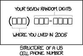
So we’ll probably go with 541-463-3000. The parenthetical format, (541) 463-3000, feels like it come from an age when area codes were mostly optional. And for many of us, me included, that’s no longer the case. Just please don’t use the dotted phone notation on your pages!
related XKCD comic
 

Accessibility and Pizza

This is just a quick post to share some news about the ever evolving legal web accessibility landscape. The LA Times has a nice write-up of Robles v Dominos, and how by declining to review the 9th Circuit ruling, we’ve conclusively determined that the Americans with Disabilities Act does apply to websites and apps.

While this doesn’t impact the college directly – we were already subject to website accessibility requirements – it does serve as a great reminder that digital accessibility lawsuits are on the rise, and we need to continually work to ensure what we do is accessible.

And remember, that work doesn’t include just websites, but all things posted online, on any website used in relation to Lane. PDFs have some pretty good checking tools that are worth looking at.