Our website has nearly fifty pages with the word “Contact” in the title. For us, this has actually been our standard for a long time: we’ve always tried to make the bottom link in a menu a contact page. But, in designing the website, we started to believe this was the wrong approach.
First, many department homepages work better as contact pages. Why make someone click a link, just to see what the phone number for a department is?
Second, many of those contact pages ended up reproducing pages in the employee directory. Why have duplicate pages? And, since the employee directory updates directly from Banner, it’s much less likely to be out of date than a manually updated page.
On the new site, we’ll be introducing the support block on pages, and eliminating many of those contact pages. Here’s an example of a draft support block on the Continuing Education site:
The support block supports a little bit of variation, and we’ll be able to do things like showcase people, include logos, and add additional yellow buttons. We’re hoping this will result in a standardized look and feel for our contact information, while allowing us to substantially reduce the size of the website.
Of course, this means we need to fix any data quality issues in the employee directory. Be sure to check out your listing in the directory, and use the edit button at the bottom of the page to make corrections. For extra credit, check your department’s listing, and see if anything is missing.
One of the changes we’ll be introducing in the new website is a better integration with 25 Live, our event scheduling system. If you’re hosting and event, and would like to get it on your website, rather than asking us to do it, and going several rounds via email to get something on there, you’ll instead schedule it on 25 Live (which, to reserve a room, you’d do anyway) and tag it so it shows up on the website. That’s it – somewhere around fifteen minutes later, the event will just show up. It’ll look like this:
You see the problem: it looks like we only have one governance council. Going forward, if your event is open to the public, it’s going to be incredibly important to make sure to get that scheduled on 25 Live. If you don’t, it simply won’t show up.
But here’s one potentially confusing thing: that “More Events” Button takes you to our all events age, rather than taking you to a list of events tagged like in the view (in this case, governance events). That might be something we reevaluate in the future, as we better understand the capabilities of the new integration, but it will be several weeks yet.
I’ve had a lot of questions on the content freeze recently, and I’d like to clear one of those up: there’s no end date on the freeze. Part of that is practical: until the website launches, we need to make updates to both the old and new site whenever there’s a content changes.
But even after launch, we’re not going to be immediately adding a bunch of accounts. Last time, we had a massive training program where literally hundreds of people learned to use the website to make edits. In retrospect, this was a bad idea:
Many people took the training without ever making any changes to the website (only about 1 in 3 accounts on the website is even active anymore, and we’ve deleted dozens of accounts who never made edits)
Most people don’t make many edits to the site. Excluding Lori and me, over the last 9 years, the average user has only made about 100 edits – about one per month since launch. There are only 11 people, including 2 retirees, who have made more than 600 page edits since we started. By contrast, Lori has made more than 16,000.* Of course, there are some outliers who have made over a thousand edits – more on them in a minute.
Providing web editing access to hundreds of people ensured that our website would never have a consistent voice. Even today, there are sections written in very academic sounding third person, sometimes right next to a more casual 2nd person. If we’re going to provide a good experience to prospective students, this needs to stop.
Right now our focus is on launching the website. Once we’ve launched, and have a better handle on how we’ll handle user permissions, we’ll start exploring ways to help get our really frequent website users more involved. But whatever that process, it will be very slow, and very deliberate.
* These numbers are actually more complicated than this, since we’ve deleted thousands of pages, and I can’t capture those edits in these statistics. Since those pages were often the least edited pages, Lori’s total edits should be several thousand higher.
In a word: no. As stated by the WAI, new links can be “…disorienting for people, especially people who have difficulty perceiving visual content”.
As with anything else on the web, there’s always an exception, and you should definitely check out the link above to read about some specific scenarios where opening a new tab/window can be appropriate. But those scenarios are rare. People know how to use the back button. Depend on that, rather than a new tab/window.
Today’s post is a quick one, to share this awesome captioning style guide from Humber College, which I found while trying to figure out the appropriate way to caption a choir singing a round acapella (I still don’t know the answer). In addition to the most helpful information I found on captioning music, also included are suggestions on timing, dialog, sound effects, and accents. Since we need to caption almost every video on our website, it’s worth a quick glace to get an idea of how it should be done.
I know, I know, we’re in week 4, and I’m finally putting out my first post of the year. But it’s 2020. It’s that kind of year.
Last week the web team attended the 2020 HighEdWeb annual conference. This is one of my favorite conferences, and it was even better this year because it was absolutely free online (though in central time, which made for some early mornings). Here’s some gems:
One of the groups at Miami University did a lot of extensive testing. People don’t self serve. If you have a lot of links and resources that you want to put out there, consider a drip campaign to slowly provide those links at a pace people can digest. Use social to highlight different resources at different times. Include titles that highlight the problem the resource solves (“Looking for a tutor late on a Sunday night before class? Look no further!”). Track what you do to see what works (and reach out if you’d like help setting that up!). Rather than a resource page, consider a blog, where those resource links can be provided in context, and do some content marketing for you. We’ve also covered resource pages in the past.
Stop posting flyers and event posters online.
Especially now, when we’re not going to see them in person. Flyers and posters are designed for print, and don’t translate well to digital. If you’re considering putting a flyer or poster online or on a digital sign, reach out – we’ll connect you with some graphic design resources, and help design for the medium you’ll be promoting on.
The college website is for prospective students. And those students know when they’re being marketed to.
Carlton did a great session where they detailed extensive user testing before their homepage redesign. They found things like:
prospective students (particularly Gen Z) think the entire website is for them. Even the section clearly labeled “Alumni”. But your homepage should be for them before any other audience: most other audiences search for something, then land on some other page. Prospective students are the most likely, by far, to land on the homepage.
they know when pictures are staged. They want to see people in place: shots that show what students actually do some place on your campus, and how that sets you apart. Person under a tree reading a book? Clearly staged. Dining hall shot? Every college has a dining hall. Candid shot of a class outside? Student learning to machine something? Much better.
Carousels don’t work. I think one possible exception is a photo gallery, but that’s tricky.
The large hero image on a program’s website sets the tone and creates a greater impression than all the text there.
From one of their slides: “Students want #nofilter, but we’re giving them #fellowkids”
FAQs don’t work.
While we may think splitting our content up into questions is easier for the student, it actually makes things harder to understand. Read your entire FAQ page, make groups out of the content and write a header for each one, and then rewrite the content in each group to paragraph form. It’ll work better for everyone. Here’s a page with the slides, a sample FAQ with real life before and after examples, and some other resources for why we should stop using FAQ pages. You can also review our previous post on FAQs.
Today’s helpful resource is the Plainlanguage.gov’s web language guidelines. While the whole thing is worth at least a skim, we’ve already covered a lot of the content in depth (see, for instance, the content redevelopment series). But I want to just briefly dive into the section labeled Follow Web Standards. There are four items that get their own subsection:
Avoid FAQs: We’ve talked about this before, but it’s worth revisiting. FAQ pages tend to be disorganized and hard to process. Try to eliminate them where you can.
Don’t cut and paste the text of print documents to create web content. People are more likely to leave your webpage, potentially costing you time and money, because they will not take the time to find what they are looking for.
Print writing is different from web writing.
If you’ve created print materials, you’re going to need to rework them if you want them to be effective on the web. Make sure you’re speaking directly to the page visitor, and using conversational, but clear language. The purpose of print content is different than the purpose of web content.
The Nielsen Norman Group has done multiple studies on PDFs and has consistently found that users hate them and avoid reading them at all costs.
That should speak for itself. Avoid posting PDFs unless there’s no other option, or unless you need a document to print a certain way.
That’s it for this week, and also this year! Summer starts next week, so I’ll be taking a long break from blogging. Lots more to come this fall, along with lots of detail on the new website!
We’ve talked about why we get backlink requests, but what do they look like? So glad you asked. Let’s talk about my dog.
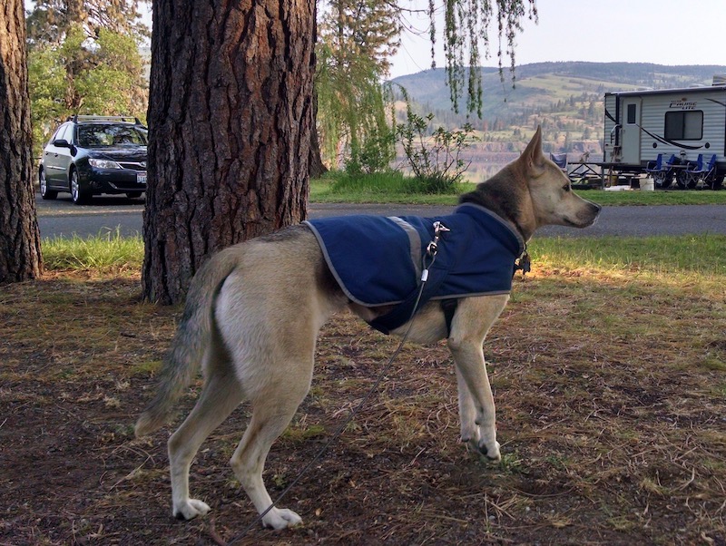
Five years ago I tried to take my dog hammock camping. She got cold overnight, and I had to put her in the car to get warm. When I wrote up the trip on my personal website, I linked to a dog sleeping bag manufacturer, since I naïvely thought my dog would sleep in one and keep warm (spoiler alert: she will not).
Dog tax. Picture from the trip. She was even wearing a jacket!
A couple weeks ago, I got a backlink request from a website that wrote up a guide to buying a dog sleeping bag. This request fit the form of a standard backlink request template so well that I based a fill in the blank backlink generator request on it:
This isn’t the exact email I got, but it’s close enough to get an idea of the structure of a request. They try to include a little information about you, which they can look up online (like your job title). They include something vaguely complimentary (like calling your post “amazing”). Then they explain how their site would fit perfectly in with your content before wishing you well.
I think the process goes like this. Someone writes a vague template, based on a script available on some SEO website. Then they search for some term like “College scholarships” or “Student Resources”, and go through the top 50 or 100 pages, emailing the site owner with an email customized just enough that it won’t feel generic, unless you get a lot of backlink requests.
So how do you respond?
Consider not responding at all. There are ways to automate gathering contact information (using a WHOIS record or various screen scraping techniques), so it’s entirely possible that your request was sent by a script, instead of a person. Don’t feel bad about ignoring a computer.
Definitely don’t click on the link they sent you. If someone sends you an unsolicited link, never ever ever* click on it. If you’re really curious, at least Google the url first. See what you can learn about the page. Don’t just trust the text of a url – there’s ways to spoof that too.
You can also just forward those requests to us. Believe me, we get a lot of them. Our general rule is to not respond to backlink requests for commercial websites, and to avoid including links to commercial websites in our pages. We sometimes make exceptions for local, non-profit organizations. But since those organizations are part of our community and usually know someone at Lane, they tend not to reach out using a form email.
Remember, linking to a website from your page can provide an implicit endorsement of that page. Make sure you trust what you’re linking to.
Back in the resource pages post, I briefly mentioned backlink requests. Since if you don’t get these regularly they can be difficult to identify and understand, I thought we could dig into them. Backlink requests aren’t evil, and getting backlinks can certainly help your Search Engine Optimization (SEO). But the people making the requests don’t necessarily have the interests of our students in mind, so you should know how to spot requests and why they’re sent.
A quick refresher. Search engines mostly work by looking at how pages link to each other. Pages that get linked to a lot (that have a lot of inbound links) are considered more authoritative. Links from those pages are worth more than links from sites with fewer inbound links. If you have a website that you’re trying to get to rank higher in search, getting other sites to link back to yours will help.
One way to make that happen is to ask. You can do that many different ways. For instance, you could find a website with a broken or outdated link, and suggest to the website owner that they link to your site instead. Or there’s the testimonial strategy, where you write a testimonial and offer it for free to another website, with an expectation they’ll attribute your testimonial to your site. Offering a guest blog post is another. The most straightforward is to ask directly. And the easiest place to ask for your link to be included? A resource page.
College websites are particularly attractive targets. While as mentioned above, Google certainly provides a lot of search engine weight to links, there are all sorts of other factors they consider. One of those is domain name. Not every domain is easy to get. Anyone can purchase a .com, a .org, or dozens of others. But some, like .mil, .gov, and .edu are very hard to get. If you want an .edu domain, you need to be an accredited post-secondary educational institution. And you can only have one.
Because an external agency has guaranteed the validity of the domain, Google is thought to give .edu sites a little boost over sites with more open domains (part of why you probably don’t want a .com for your department!).
When someone sends you an email, requesting you put their link on your site, ask yourself if they stand to gain financially from an increase in traffic on their website. The link they’re sending you might not sell anything directly. But that page might link to something that does or to a page with advertising – linking to a page on a site provides a boost to that page’s rank, which in turn provides a smaller boost to all the pages that page links to.
We should also remember that linking to a site provides something of an endorsement of that site. Particularly on resource pages we’re effectively promising students that we’ve validated these resources as good and trustworthy. Make sure they are.
Next post we’ll look at the structure of a backlink request and how to respond.
As mentioned in the broken links post, there are a lot of pages on the Lane website that are what I’d call “Resource pages”. These pages don’t necessarily provide a lot of content on their own, but have a lot of links on them to help visitors find useful resources on other pages. I’ve heard some conflicting opinions on resource pages, so I wanted to dig into if these pages are problematic, or generally helpful.
Our resource pages are often full of broken or moved links
While we’ve made some progress on how many broken or moved external links there are still thousands of broken links on the site. Because resource pages tend to be full of links to external sites, they naturally collect bad links. I’ve spent a lot of time during the last week fixing pages, and I keep coming back to resource pages, just because they have so many links.
It only takes a few bad links on a page before visitors start to wonder if the other links are any good. If I’m on a page with a couple bad links, for me it’s an immediate indicator that this page hasn’t been reviewed in a while, and I probably shouldn’t trust it.
They’re only helpful sometimes
Resource pages are usually put together out of a genuine desire to be helpful. But they’re not as well used as you might think. Here’s some data for the last year on 5 different pages I’d consider to be resource pages:
Page
External links on page
% of external links clicked
1
17
47%
2
133
19%
3
27
19%
4
12
42%
5
25
52%
At best, only about half the links on a resource page are even clicked. And sometimes, that number is a lot worse.
There’s also a whole set of people who are never even going to see your resource page. In user experience discussions, we sometimes talk about searchers (who use the search box) and browsers (who explore the site using navigation). While obviously you can be both at different times, finding a resource page as a searcher feels like a long shot to me. More likely, you’d just perform a search on Google itself and not look for anything on our site.
To me, it feels like resource pages are for browsers. People who came to the site for something else, and then stumbled on these pages and have time and interest in what was is them.
Of course, that’s just my conjecture. So I thought I’d check the data.
Page
Views
Entrance
Exit
% Bounce
1
774
30%
27.39%
38.2%
2
222
45%
38.74%
60.61%
3
93
5%
5.43%
0%
4
78
5%
17.95%
0%
5
410
14%
11.19%
64.29%
This surprised me. While pages 3 and 4 certainly match my thinking, pages 1, 4, and 5 don’t. 1 and 2 actually have a higher than average entrance and bounce rates – an indicator that these pages are being found via search and attracting traffic. But the higher than average bounce rate is an indicator that we’re not retaining that lands on those pages. The people who find those links aren’t staying around.
I did a quick check on Google Webmaster Tools to see what people were searching for. Unfortunately, there weren’t enough queries listed for Pages 2 or 4 to learn much, but Page 1 stood out. There were a lot of queries referencing a specific service that actually has a page of its own, but was linked from this page. That’s a potential issue: it means that searchers aren’t finding the page they’re looking for, but instead have to land on the resource page first, then figure out what link to click.
That said, at least page 1 provided context for the links. Some resource pages are literally just collections of links, without even headers, making it very difficult for people landing on the page to find what they’re looking for.
Can hurt us in SEO
To understand this one, you’ve got to know a little bit about how Google works. This will, of course, be a gross oversimplification. If you’re interested, the wikipedia page has considerable detail.
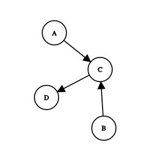
Here’s a simple directed graph:
True story: I once vehemently told a professor in college that I would never need to know anything about directed graphs like this.
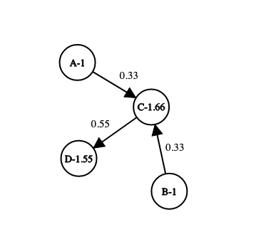
Pretend each one of those circles is a web page, and each arrow represents a link from one page to another. Google uses those links to infer importance, and gives each page a score. If we start with each page having a score of 1, and we allow each page to transfer a third of its score to a linked page, we get something like this:
Turns out that professor was totally right, and I was totally wrong. Common experience for me.
If each page has a base score of 1, and gives a third of that rank across every link, you end up with A and B keeping their scores (no one links to them), C having a score of 1.66, and D a score of 1.55. So if there’s a search, and these 4 pages are in the result set, they’ll end up with C first, and D second. Links from C are more valuable than other links, but can still be beat out by lots of low value links.
You can likely predict how people try to game this: link farming. If you get a bunch of websites to link to your page, you’ll get ranked higher. For a while, you could even pay for links to your page. Google has since adjusted their algorithm to account for that and now, if they see your page as a link farm, they’ll bump it down in the rankings. So how do they know if you’re a link farm?
We’re not entirely sure. But we think one way has to do with the ratio of outbound to inbound links – that is, links to other sites vs links to your own. If we have a page with a few dozen outbound links, like on some of our resource pages, then suddenly that ratio isn’t so good. There’s no strict rule about what that ratio should be, and since Google doesn’t publish either its actual algorithm for ranking pages, or what your score is, we can’t really know if our resource pages make Google see us as a link farm. But it’s something to keep an eye on.
You should also be alert to backlink requests. These often show up as an email, where someone will ask you to include a link to their page on your page. It’s possible that their site is actually helpful, but more likely they’re reaching out trying to capitalize on your page’s score to improve their own.
Internal resources are just as bad
Of course, that doesn’t mean you should just start packing your page full of internal links either. There are a number of pages on the site that are entirely internal link resources pages, often including an abbreviated steps to enroll or a subset of our one master resources for students page. As previously mentioned, the intent is good, but if enough people add pages like that, we’ve just added more pages for our visitors to sort through, and set up a circumstance where pages can be out of sync (that is, content doesn’t match, and we tell students potentially conflicting things). What starts out as an attempt to fix a broken navigation on our site can end up exacerbating the problem.
There’s a place for resource pages
For instance, here’s a budget page. If I do an analysis like with the pages above, the numbers will look terrible. And this page definitely doesn’t provide any links in context. And compared to some of our pages, I can’t imagine it gets a lot of traffic. But that isn’t the point. This page gets used a lot in the budget planning cycle, as emails and presentations refer people to this site as a place to find specific resources. While it may be one of the most plain pages on the site, the headers make it quite functional. Sometimes a resource page is the right choice.
So what’s the conclusion?
As with anything else complicated, it depends. There’s a place for resource pages, but if you’re thinking about putting one together, you should think long and hard about if that’s the best solution. For instance, if you’re putting that page together because you genuinely think it’s important students learn about each of those links, you might be better off communicating a few resources every so often with a targeted population, or regularly posting resources to social media, or you might be better off working resources into each of your other pages, surrounded by related content.
If you absolutely must have a resources page, then make certain to put some context with the links, so that page visitors know why you’re bothering to put this link on a page. Be sure to revisit your links once in a while, and fix any broken or moved ones. And watch out for backlink requests!
If you have a page and you’d like to know if it’s working, reach out! We can dig into how people are finding it, what they’re clicking on, and if they go on to other pages.

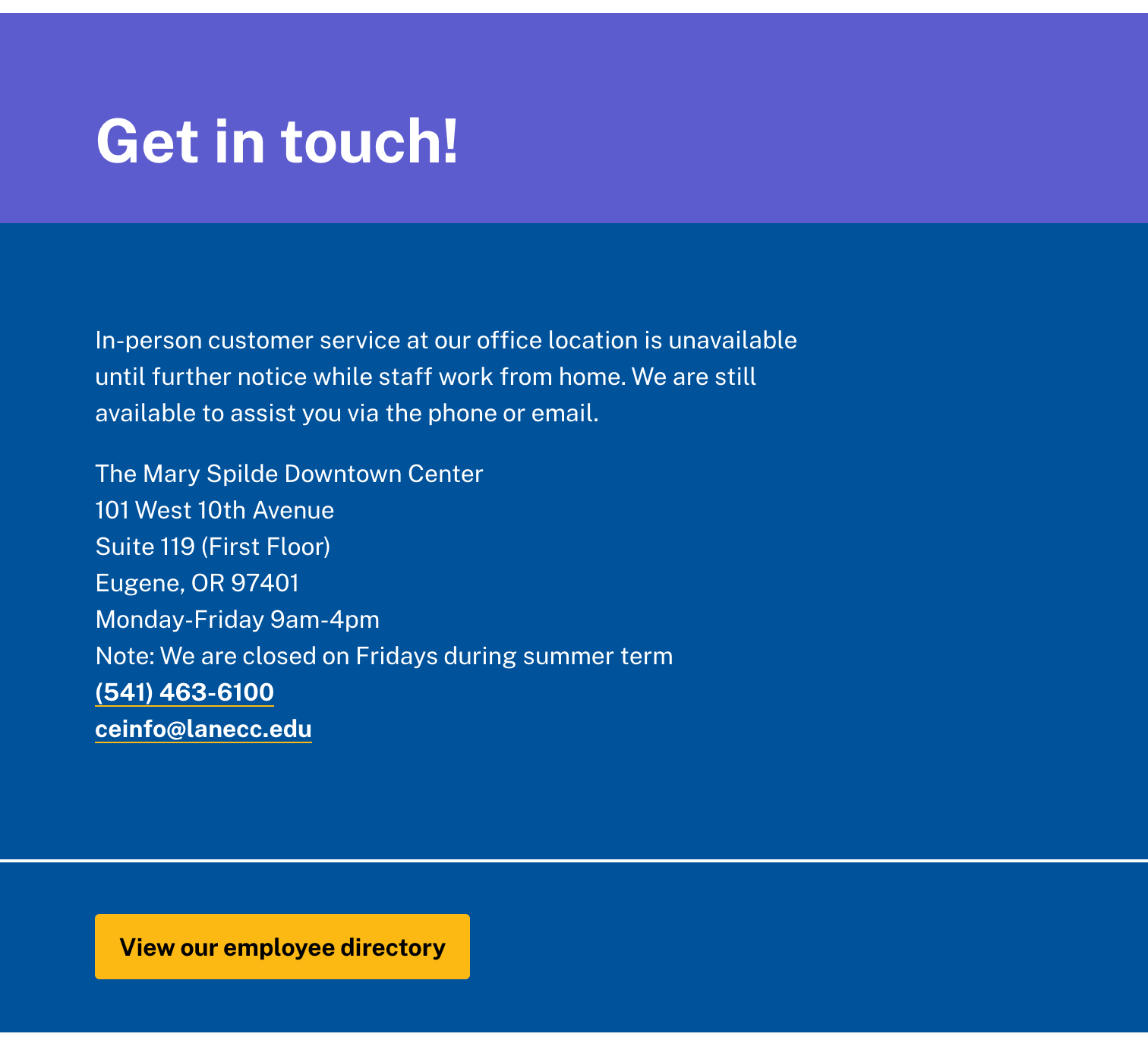 The support block supports a little bit of variation, and we’ll be able to do things like showcase people, include logos, and add additional yellow buttons. We’re hoping this will result in a standardized look and feel for our contact information, while allowing us to substantially reduce the size of the website.
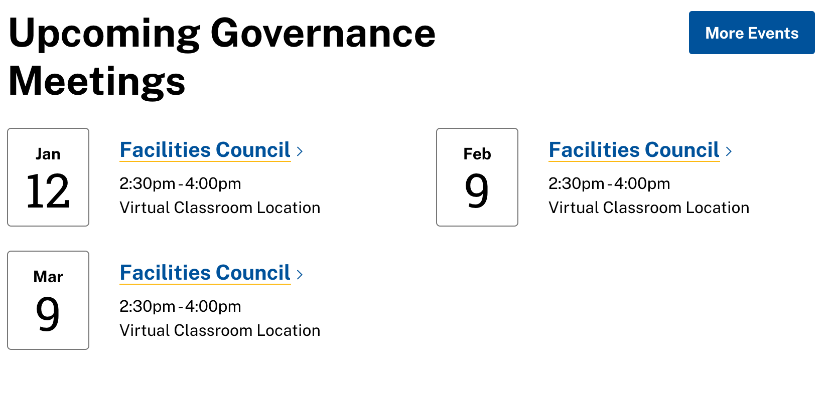 You see the problem: it looks like we only have one governance council. Going forward, if your event is open to the public, it’s going to be incredibly important to make sure to get that scheduled on 25 Live. If you don’t, it simply won’t show up.