Correctly Linking Images

We all know how to make an image accessible. And we all know how to make a link. But how do we make them play together? How do we do something like this:

Download the Graphic StandardsSince we’re good people, we add alt text describing the image, right? Maybe something like “Graphic Standards Cover”? That’d give us (overly simplified) HTML like this:

<a href="standards.pdf"><img src="cover.png" alt="Graphic Standards Cover"></a>

But that’s actually not so great for accessibility. A screen reader will read “Graphic Standards Cover”, which doesn’t make the action (downloading the standards) clear.

My first instinct was to add a title to the link. But the title is almost never read by a screen reader, and may even make things worse. The reader will read the alt text. To make it clear what the link does we need to change the alt text:

<a href="standards.pdf"><img src="cover.png" alt="Download the Lane Graphic Standards"></a>

Now we’ve solved the accessibility problem, but we may have created a user experience (UX) problem. Scroll up a second and look at that image again. Did you know that you should click that picture to download the PDF? Or did you think it was just a picture? We can’t even rely on people discovering the picture is linked by hovering over it with the mouse and the cursor changing: it isn’t possible to hover with your finger on a phone.

Sometimes it may be immediately clear that a picture is clickable from context. If it isn’t we may need to add some help:

<a href="standards.pdf"><img src="cover.png" alt="Download the Lane Graphic Standards">Download the Lane Graphic Standards</a>

Now we’ve solved our UX problem, but we’re back to an accessibility issue! A screen reader will read the alt text and the link text. It’ll be like the same sentence is printed twice. The solution to this is to have explicitly empty alt text:

<a href="standards.pdf"><img src="cover.png" alt="">Download the Lane Graphic Standards</a>

Explicitly empty alt text will be ignored by the screen reader entirely, while missing alt text can cause unpredictable or even negative behavior.

You could also go back to adding descriptive text as the alt text. In our example above, that isn’t appropriate, since the cover is really just decorative. But consider another example:

A cat chewing on a monitor. Link opens a larger image.That image is linked to the full size picture. Describing the contents of the picture is completely appropriate. But remember that most screen readers can pull links out of a page, and let someone navigate from link to link directly. For that reason, our alt text is “A cat chewing on a monitor. Link opens a larger image.” The alt text serves double duty.

This post does not, of course, mean it’s always appropriate to use an image. It’s important to avoid off-brand or inappropriate images. It’s important not to add so many linked pictures that your page hierarchy gets lost and navigation gets more difficult. And if something can be done in CSS, it probably should be. It wouldn’t hurt to use images as pictures as rarely as you can.

If you’re not sure what to do with links at Lane, get in touch! We’re always happy to help.

Using all Capital Letters

An instructor asked me the other day, “How does a screen reader read text in ALL CAPITAL LETTERS?”

I didn’t know, and through it was a great question, and had to figure it out. Let’s start with some sample text:

It’s VERY important you remember these:

  • USPS
  • NASA
  • DVD

There’s four words in all caps there. Let’s look at each one, from the bottom to the top:

DVD is an initialism, meaning you read each letter in it, like CPU or FBI. NASA is an acronym, meaning you read it as a word, even though each letter stands for a word. USPS is another initialism. But VERY is just a word, with all capital letters being used for emphasis.

Of course, it’s wrong to use capital letters in this way – you should instead be using an em or strong tag (though which one is complex, and I didn’t find the examples in the specification very helpful). But the instructor’s question wasn’t about what should happen, it was about what does happen. How can a screen reader know which of those words it should treat as words or acronyms (which are like words, in terms of pronunciation), and which it should treat as initialism (and read letters instead of the word)?

I ran each of the examples through the say program on my Mac, and here’s what I got (sentence case was pronounced like lowercase):

Word Uppercase Lowercase
Very word word
USPS letters word
NASA word word
DVD letters letters

There’s some interesting logic there. I think this table shows my Mac will always read dictionary words as words (like “very”). And I think it shows that my Mac also has a list of known acronyms and initialisms, so it knows how to read those. For words that aren’t in either list, but also aren’t in the dictionary (like USPS), it reads all capital letters as initialisms, but lowercase as a word (a reasonable assumption, since most of the time it encounters words that aren’t in the dictionary, it’s probably due to the lang attribute not being set correctly.

Of course, this is just say on my Mac, which isn’t even a screen reader. WebAIM has some general rules for how screen readers read things, but it isn’t really predictable how a screen reader is going to pronounce words in all capitals. Pronouncing typographic symbols is hit or miss as well — some, like @ and % are read correctly. But most others (like the parenthesis, or the mdash in the previous sentence) aren’t read universally. Rare punctuation, like the interrobang (‽) may not be read at all.

I was hoping that abbr would influence how screen readers pronounce words, but that doesn’t appear to be the case (and, if you’ve been around HTML for a while, remember you’re not supposed to use acronym at all — though it probably wouldn’t do anything here anyway).

What does this mean for you at Lane?

Use the abbr tag to specify acronyms and initialisms if possible. Even though screen readers won’t necessarily change how they handle pronunciation, abbr with a title attribute makes it easier for anyone to understand meaning. Try hovering over this: NASA.

If you want to use capital letters for emphasis: don’t. Instead, use either an em or a strong tag, depending on if you’re trying to emphasize something or make it note that it’s more important than surrounding text. And, of course, never use strong in place of a header.

If you want to use capital letter for aesthetic reasons, then you should use a bit of CSS to make it happen:

.all-caps {
  text-transform: uppercase;
}

Screen readers ignore CSS, so this use is entirely for presentation. Just make sure you don’t confuse presentation with meaning.

I ran a quick search on our website for pages that have a lot of capital letters all in a row:

SELECT entity_id
FROM   field_data_body
WHERE  body_value REGEXP BINARY '[A-Z ]{10}';

There were 748 results. Editing 748 pages obviously won’t happen overnight, and on each one we’ll need to determine if we should instead be using a header, a strong, an em, or just normal text. For now, I’ve queued a task for us to tackle in the future, but if you’re editing your page and notice some misuse of capital letters, we’d be forever appreciative if you’d fix it.

508 Refresh is done!

So we’ve been waiting a long time for the Section 508 refresh to finish. There’s even a time lapse of Matt Damon waiting for the updated rule:

Matt Damon's aging scene from Saving Private Ryan

But it’s here. Finally, actually here. Published on January 18th, and in effect in one year. You can read the entire thing online (scroll to the end for the appendix to find the actual rule) or just keep reading for the parts I found interesting.

As expected, it looks like the new rule matches pretty closely with WCAG 2.0:

For Section 508-covered ICT, all covered Web and non-Web content and software – including, for example, Web sites, intranets, word processing documents, portable document format documents, and project management software – is required, with a few specific exceptions, to conform to WCAG 2.0’s Level A and Level AA Success Criteria and Conformance Requirements

There’s also a safe harbor for the new rule:

…the Revised 508 Standards include a “safe harbor” provision for existing (i.e., legacy) ICT. Under this safe harbor, unaltered, existing ICT (including content) that complies with the existing 508 Standards need not be modified or upgraded to conform to the Revised 508 Standards

In other words, if your existing stuff is compliant with the old 508 standards, and you don’t alter it, you’re ok. The access board also clarified what an alteration is:

 “Alteration,” in turn, is defined as a change to existing ICT that affects interoperability, the user interface, or access to information or data

And they clarified what existing ICT (including content) is:

ICT that has been procured, maintained or used on or before January 18, 2018.

I’m not entirely sure to what extent changes to existing content matter. In other words, if you update just part of a web page that’s compliant under the old rules, but not the new rules, are you obligated to bring the entire page up to the new rules?

The old standards didn’t do a very good job of specifying which types of content were covered; the new standards clarify this:

First, in proposed E205.2, the Board proposed that all public-facing content comply with applicable technical requirements for accessibility. Public-facing content refers to electronic information and data that a Federal agency makes available directly to the general public.

In this case, while most of us aren’t Federal agencies, our school receives Federal money, so this still applies to us. This section goes on:

Second, in proposed E205.3, the Board proposed that non-public-facing electronic content covered by the 508 Standards be limited to the following eight categories of official agency communications: (1) emergency notifications; (2) initial or final decisions adjudicating an administrative claim or proceeding; (3) internal or external program or policy announcements; (4) notices of benefits, program eligibility, employment opportunity, or personnel action; (5) formal acknowledgements of receipt; (6) survey questionnaires; (7) templates and forms; and (8) educational and training materials.

You can ignore the word “proposed” in those two quotes – there’s further clarification that these were the categories adopted, in addition to this one:

…the Board has added a ninth category to final E205.3, requiring that “intranet content designed as a Web page”…

Since the new 508 requirements cover not only web pages, but all ICT (Information and Computing Technology), there was some concern that the WCAG 2.0 standards (which were written primarily for the web), wouldn’t apply to non-web ICT. In the end, it was determined that some of the WCAG 2.0 standards don’t make sense:

Specifically, non-Web documents and non-Web software need not comply with WCAG 2.0 Success Criteria 2.4.1 Bypass Blocks, 2.4.5 Multiple Ways, 3.2.3 Consistent Navigation, and 3.2.4 Consistent Identification.

I’m seeing a lot of WAI-ARIA in modern web apps, but:

WAI-ARIA is a valuable specification, but the technology it addresses is too narrow for our Standards and Guidelines to require its use at this time.

So in other words, you can use WAI-ARIA to comply with a WCAG 2.0 standard, but the use of WAI-ARIA isn’t required.

To sum it up, the new 508 rules (at least, the part that applies to web pages) are just the WCAG 2.0 guidelines, with this change:

For non-Web software, wherever the term “Web page” or “page” appears in WCAG 2.0 Level A and AA Success Criteria and Conformance Requirements, the term “software” shall be substituted for the terms “Web page” and “page”. In addition, in Success Criterion in 1.4.2, the phrase “in software” shall be substituted for the phrase “on a Web page.”

Later this month there’ll be two webinars on the updated rules. I’ll be attending one of them, and will be sure to update this post if my understanding of any of the above was incorrect.

If you’d like a lot of detail on the differences between the old 508 rules and WCAG 2.0, you can follow along with the posts I’ve been writing, complete with examples and how the guidelines apply to Lane.

A couple no-nos

I’m taking a break from our accessibility posts this week to instead post on a couple bad practices I spotted across the website while trying to meet our website goals.

&nbsp;

Many typewriters, especially less expensive ones, used the same amount of space for each letter – that way, the platen of the typewriter would advance the same amount no matter what character you typed. Your page would end up being monospaced  – here’s an example on screen using a monospaced font:

Lane’s mission is to transform students’ lives through learning, but how do we know this is so? To know, we must develop clear learning outcomes and evaluate our curriculum and pedagogical practices regularly to ensure a quality learning environment. Assessment of student learning focuses on students’ attainment of knowledge and skills at the course and program or discipline level. This is accomplished by infusing the curriculum with general education learning outcomes intended to prepare students for success in the 21st century.

Because each character is the same width, it can be hard to distinguish sentences. So people taught to type on typewriters were often taught to include a second space after the period, like this:

Lane’s mission is to transform students’ lives through learning, but how do we know this is so?  To know, we must develop clear learning outcomes and evaluate our curriculum and pedagogical practices regularly to ensure a quality learning environment.  Assessment of student learning focuses on students’ attainment of knowledge and skills at the course and program or discipline level.  This is accomplished by infusing the curriculum with general education learning outcomes intended to prepare students for success in the 21st century.

As computers and printers become commonplace, new fonts were available and proportional spaced fonts, which had always been used in professional printing, came back into use. Here’s our sample paragraph again in a proportional spaced font:

Lane’s mission is to transform students’ lives through learning, but how do we know this is so? To know, we must develop clear learning outcomes and evaluate our curriculum and pedagogical practices regularly to ensure a quality learning environment. Assessment of student learning focuses on students’ attainment of knowledge and skills at the course and program or discipline level. This is accomplished by infusing the curriculum with general education learning outcomes intended to prepare students for success in the 21st century.

Every letter gets the appropriate amount of horizontal space. Narrow letters, like i, l, or I get much less space than wide letters, like W, M, or G. Characters like the comma or period are built with an appropriate amount of space after them already. So what happens if you were trained on a typewriter and have been typing double spaces your entire life? Right now, you get this:

Lane’s mission is to transform students’ lives through learning, but how do we know this is so?  To know, we must develop clear learning outcomes and evaluate our curriculum and pedagogical practices regularly to ensure a quality learning environment.  Assessment of student learning focuses on students’ attainment of knowledge and skills at the course and program or discipline level.  This is accomplished by infusing the curriculum with general education learning outcomes intended to prepare students for success in the 21st century.

Let’s put aside that the font wasn’t designed to work with double spaces like that, leading to it looking like there’s holes in the text, and increasing the chance that our text will have rivers (in other words, it looks funny). Let’s instead talk about how HTML gets double spaces to work.

HTML wasn’t designed to support two spaces after a period, so browsers automatically collapse repeated spaces into just one. So to create to spaces after a period, as I did in some of the examples above, I had to insert a non-breaking space character. It’ll appear as a normal space when you’re viewing it, but if you were to look at the source of the page, you’d see &nbsp; – & in HTML means we’re about to start a character entity of some sort, the nbsp means non breaking space, and ; finishes the entity.

Non-breaking spaces act like invisible letters, and have some weird effects. They’re designed for places where the text shouldn’t break – that is, move onto two lines. So say we have a brand name, like ACME Products, that we don’t ever want to be on two lines. We’d put a non-breaking space between, like ACME&nbsp;Products, and then no matter how we resize the browser, we’ll always see those words together: ACME Products.

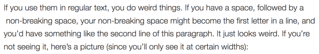
If you use them in regular text, you do weird things. If you have a space, followed by a  non-breaking space, your non-breaking space might become the first letter in a line, and you’d have something like the second line of this paragraph. It just looks weird. If you’re not seeing it, here’s a picture (since you’ll only see it at certain widths):

screenshot of the text of the previous paragraphYou might also have trouble centering things:

This line should be centered 

This line is actually centered

I doubled the size of the text to make the problem more pronounced, but it’s true at any size. Since non-breaking spaces are invisible unless you know to view the source, they can be an endless source of frustration when you try to lay out your page.

There’s a place to use the non-breaking space, but almost everywhere it’s used on our website it’s used incorrectly. This week, we’ll be adding a filter to remove double spaces after periods when when the page is rendered. This is an imperfect solution, since the non-breaking spaces will still be present in the editor, and this won’t fix other problems, like the text centering problem above. But it will make our website look a little more uniform.

Horizontal Rules

The HR tag used to be strictly a presentation element – it was there so you could draw a horizontal line across your page. While HR’s are still usually rendered as a horizontal line, they now have a semantic meaning. From MDN: The HTML <hr> element represents a thematic break between paragraph-level elements (for example, a change of scene in a story, or a shift of topic with a section).

If your website uses HR’s to break paragraphs that have very different subjects, you’re in great shape. But if there’s another element that might indicate that break, then you shouldn’t use the HR. So, for example, if you have a series of paragraphs, each labeled by a header, don’t use an HR since the headers act as the break. Similarly, an HR should never be the first thing in a section (like pages that start with an HR), because there’s nothing to break at the start of a section. And you should never have more than one HR in a row.

We’ll be removing some HR’s from the site in the coming weeks where they’re not used properly. If you’d like some more info on HR’s, you can go into depth in the specification.

Understanding WCAG 2.0: 2.4.4 – Link Purpose

The next standard we’ll explore in our series on understanding WCAG 2.0 is 2.4.4, Link Purpose. This standard is required for WCAG level A compliance, which is part of what Section 508 requires. Here’s the complete text:

2.4.4 Link Purpose (In Context): The purpose of each link can be determined from the link text alone or from the link text together with its programmatically determined link context, except where the purpose of the link would be ambiguous to users in general. (Level A)

Before we get into this standard, let’s first take a look at how sighted people read on the web. And to do that, we first need to discuss this contraption:

An eye tracking machine. Described in detail in textThat’s a modern eye tracker – the ones I used in college were closer to these. But they all work the same. You rest your head on a head rest and a camera records where your focus is as you look at a screen. Lots of interesting work has been done with eye trackers, like determining that your eyes don’t move smoothly over text while reading. On the web, eye trackers have helped us learn that people don’t carefully read pages from the top to the bottom, carefully considering every line of text. Instead, people read pages in an F shaped pattern:

A screenshot of a web page, showing a heat map over laid on top of it, with the red areas in a vague F patternThat’s part of an image from this page discussing the F-shaped pattern at length. People are busy and don’t really read web pages. They read a little across the top, then they scan.

Why should we expect non-sighted people to be any different?

Most screen reading software (JAWS of course, but even Voiceover, which comes with Macs) features tools that make it possible to jump around the page, effectively skimming for content the visitor is interested in.

Which brings us back to link purpose. Imagine you’re using a screen reader, and you ask it to get you the links in a page, so you can skim to the one you’re looking for. It gets you these:

Would you have any idea what class you were going to look at for the second link? To meet this standard, we’d need to adjust how that link is presented in the page. So let’s work with an example. We’ll assume I’m putting together a short snippet that links people to my Underwater Basketweaving class.

<a href="https://classes.lanecc.edu/course/view.php?id=50473">
  https://classes.lanecc.edu/course/view.php?id=50473
</a>

That’s about as bad as you can possibly do, and almost exactly what’s in the list above. It’s just a linked URL in the page, with no context at all.

<a href="https://classes.lanecc.edu/courses/underwater-basketweaving/schmidt">
   https://classes.lanecc.edu/courses/underwater-basketweaving/schmidt
</a>

That’d be better – that’ll still appear as just as link on the page, but at least it’ll be a meaningful and friendly url. Not ideal, but better than what we had before. Also, better for SEO. Better yet would be to set the link text to be something meaningful:

<a href="https://classes.lanecc.edu/course/view.php?id=50473">
  Underwater Basketweaving Class
</a>

That’d look like this: Underwater Basketweaving Class, which could be perfect. But that isn’t your only option. You can instead choose to provide context in the surrounding text:

<p>Check out the Underwater Basketweaving class
  <a href="https://classes.lanecc.edu/course/view.php?id=50473">
    https://classes.lanecc.edu/course/view.php?id=50473
  </a>
</p>

You can also make use of the title attribute to clarify the purpose a link:

<a title="Underwater Basketweaving Class" href="https://classes.lanecc.edu/course/view.php?id=50473">
  Learn about the best class around!
</a>

If you have a particularly complex situation, like where a single label for a link can apply to multiple links, you can also use the aria-labeledby attribute. Confusingly (at least to me) there’s also the aria-label attribute which can be used as well. But I’m not sure why you’d prefer that to the title.

There’s a lot more information available on link purpose, in particular the rest of the techniques I didn’t discuss above.

Interested in more? Check out the listing of all the posts in this series.

Understanding WCAG 2.0: 2.4.3 – Focus Order

The next standard we’ll explore in our series on understanding WCAG 2.0 is 2.4.3, Focus Order. This standard is required for WCAG level A compliance, which is part of what Section 508 requires. Here’s the complete text:

2.4.3 Focus Order: If a Web page can be navigated sequentially and the navigation sequences affect meaning or operation, focusable components receive focus in an order that preserves meaning and operability. (Level A)

Any part of a program or web page that can receive input from the user can have focus. Let’s take a look at a webform, so we have a something to reference:

Sample Form


This is an interactive webform, so you can click in either of the input boxes. Go ahead, try it right now. I’ll wait.

There’s four elements on that page that could receive focus, but only three that can. I’ve marked the submit button as disabled, so you can’t click it. That element can’t have focus, so you can’t submit the form.

There’s a couple ways to navigate that form. If you’re sighted, you might use the mouse to first click in the first box, and then again to click in the second box. But if you can’t see the screen, it’s hard to use a mouse. Instead, you’d probably use the tab key to move between elements.

The sequence focus follows when tabbing is called the tab order, and is set using the tabindex attribute on html elements. I didn’t set the tab index on any of those elements, so the browser automatically fills in the tab order for us, using the structure of the HTML – in this case, from top to bottom. But take a look at this form:

Bad Sample Form


Doesn’t that feel a little… evil?

For the purposes of editing our web pages, that’s really all there is to this standard. Make sure that the order you move from input to input on your pages makes sense. And if it doesn’t, use the tabindex attribute to fix it.

If you’re doing web development, there’s a little more to consider. Using CSS, it’s possible to position elements in a different order visually than the way they’re written in code. That isn’t necessarily against the rules, but you need to make sure the tab order still works (in addition to the concerns in 1.3.2). Also be alert to things like modal dialogs, or popovers which can visually steal focus from the webpage, but which may not trap the tab key, and may mean someone with low vision can only see the modal, but can still tab outside of it.

If you’d like to read more about focus order, you may also be interested in these techniques, which provides examples and more detail.

And if you’ve never watched a blind person use a computer, you really should. That video is part of a great, funny collection of videos on what it’s like to live without sight.

Interested in more? Check out the listing of all the posts in this series.

Understanding WCAG 2.0: 2.4.1 – Bypass Blocks

The next standard we’ll explore in our series on understanding WCAG 2.0 is 2.4.1, Bypass Blocks. This standard is required for WCAG level A compliance, which is part of what Section 508 requires. For the first time in this series, we’re exploring a standard that’s substantially equivalent to existing 508 standards (1194.22(o)). Here’s the complete text:

2.4.1 Bypass Blocks: A mechanism is available to bypass blocks of content that are repeated on multiple Web pages. (Level A)

The existing 508 standard is a little more specific, simply requiring a mechanism to bypass “repetitive navigation links”.

Let’s look at a screenshot of a page on the Lane website, and then break it into some blocks.*

The Lane contact page, at lanecc.edu/contact

If we overlay this page with some blocks, we get something like this:

A labeled version of the same page at lanecc.edu/contact

If you’re a sighted person, you can quickly skip over the repetitive blocks that appear on every page – you just move your eyes immediately to the start of the body. But if you’re dependent on a screen reader, you’re forced to read the entire page from top to bottom, with one notable exception, like this:

  1. Header
  2. Sidebar
  3. Body (including the in-page block)
  4. Social Bar
  5. Footer Links
  6. Social Links
  7. Contact Info
  8. Megamenu

Notice how the body is the 3rd thing on there? If you depend on a screen reader, you’ll be forced to hear those first three regions read to you on every single page. In our case, that could be well over a hundred links read to you before you get to the content you need.

And why’s the megamenu block read last, even though it’s at the top of the page? That’s an example of a block where the position in the code doesn’t match the position on the page. The megamenu appears to be at the top of the page, but it’s actually at the bottom of the code, meaning a screanreader reads it last. There’s some complex reasons for that, which would make this post unreasonably long, so we won’t go into them here.

Section 508 helps out by requiring a way to skip repetitive navigation links. Usually this is done by creating a link on the text “skip to content” at the very top of the page, which links to an anchor mid page, right where the body is. To meet this 508 requirement, we put a pair of skip links at the top of all our pages:

  • One that says “skip to navigation”, which skips directly to the sidebar
  • One that says “skip to main content”, which skips directly to the top of the body

We also put two more in the footer, which let you skip over parts of the footer:

  • One at the top of the footer links, which skips to the footer links
  • One at the top of the social links, which skips to the contact info

There isn’t one to skip the megamenu, since it’s at the bottom of the page, so there’s nothing to skip to – this is a bit of an imperfect solution, but until we can fix it (See this issue to follow along), it’ll work.

Together, these skip links give people these shortcuts to skip parts of the page that appear all over the site:

Same contact page, with arrows

Though it seems like the skip to navigation link is a bit silly (since it’s skipping nothing in that image), it’s actually important for other pages where we have links in the header (like our landing page).

Under WCAG, instead of just skipping repetitive navigation links, we also need to have a way to skip repetitive page blocks. And that means we need to consider content even at the paragraph level. So while the in-page block in our image isn’t a problem on the contact page, it would become a problem if it was on every page on the site, or even every page on a chunk of the site (like every page in the science department). Then we’d need a skip link.

I’ve seen repetitive text on our site in two places. First is departments that have a common paragraph or sentence they show on every page. For instance, a department might want to show their department vision on every page. That’s actually not ok – instead, they should have their vision just once on their landing page, or link to a page with their vision from their menu.

The second place is people who put lots of links that say “return to top”, which link to the top of the page. Strictly speaking, these aren’t really skip links, but they are completely unnecessary, and a holdover from an earlier time on the web. Screen readers and keyboards both have shortcuts to jump to the top of the page (it’s ctrl-home on a windows computer or cmd-up on a mac) – but most people just scroll or flick the page with their finger on a phone. There’s a place to use an in-page link to the top of the page, but those places are pretty rare.

If you’d like to read more about bypass blocks, you may also be interested in these techniques, which provides examples and more detail. Specifically, it includes discussion about about using aria-roles, which provide an easy way to identify page regions, and make it easier to navigate a page.

Interested in more? Check out the listing of all the posts in this series.

* The word blocks has a very specific meaning in Drupal, but that’s not how we’re using it here. As far as WCAG is concerned, blocks can refer to Drupal blocks, regions, zones, or even just paragraphs.

Understanding WCAG 2.0: 2.1.2 – No Keyboard Trap

The next standard we’ll explore in our series on understanding WCAG 2.0 is 2.1.2, No Keyboard Trap. This standard is required for WCAG level A compliance, which is part of what Section 508 requires. Here’s the complete text:

2.1.2 No Keyboard Trap: If keyboard focus can be moved to a component of the page using a keyboard interface, then focus can be moved away from that component using only a keyboard interface, and, if it requires more than unmodified arrow or tab keys or other standard exit methods, the user is advised of the method for moving focus away. (Level A)

This one won’t directly impact most of our Drupal users, but it does impact anyone choosing software or building their own.

People with poor vision have difficulty using the mouse, since they can’t necessarily see where it’s pointing. Instead, they’ll often navigate using the keyboard, often by using the tab key to move between elements on the website. Here’s an example:

Screenshot of the Codepen edit interface

You can also view this interface directly on CodePen.

CodePen is a great site for doing some quick testing, and I use it all the time when troubleshooting. But it traps your keyboard, failing this accessibility requirement. CodePen is trying to be helpful here – when editing on the page, it’s helpful to be able to indent your code like you would normally in a text editor. But this has the nasty side effect of meaning that once you’re editing on the page, you can’t tab out of that element. For CodePen to be compliant, they’d need to advise us on an alternate method to move between edit boxes using the keyboard.

So if you’re programming something, working with a vendor, or otherwise procuring software for use at Lane, just be aware that you need to make sure there isn’t an element on the page (or within desktop software!) that can trap the keyboard and keep someone from using the page successfully.

If you’d like to read more about keyboard trapping, you may also be interested in this technique, which provides examples and more detail.

Interested in more? Check out the listing of all the posts in this series.

Understanding WCAG 2.0: 1.4.4 – Resize Text

The next standard we’ll explore in our series on understanding WCAG 2.0 is 1.4.4, Resize Text. This standard is required for WCAG level AA compliance, which is part of what Section 508 requires. Here’s the complete text:

1.4.4 Resize text: Except for captions and images of text, text can be resized without assistive technology up to 200 percent without loss of content or functionality. (Level AA)

This one might seem super straight forward, but there’s a bit of subtlety to it.

It used to be that browsers didn’t zoom, they’d actually just increase the font size. If you pressed Control + you’d increase the font size (Command + on a Mac), and if you pressed Control – you’d decrease the font size (Command – on a Mac). But this created all sorts of problems. If text was inside of a fixed width container, like a div or a table, and the font size increased, the text would suddenly outgrow the container. CSS developed something of a reputation:

Coffee mug, with the text "CSS is Awesome" overflowing a containing boxBrowser makers changed directions, and instead of the zoom shortcuts changing the font size, they’d instead zoom the entire page. As the apparent font size increased, the containing element would increase size at the same time.

But you can still force your browser to zoom only the text. In Firefox, under the view menu, there’s an option to tell it to zoom text only. Here’s what our contact page looks like normally:

The Lane contact page, at lanecc.edu/contactHere’s what it looks like if I tell Firefox to only zoom the the text, and press cmd + four times (which confusingly zooms the text 300%):

The Lane contact page, zoomed 300%. Description follows in text.See where the issues crop up? Across the top, in our mega menu, the text gets to be bigger than the container. And again, in the twitter and events bar at the bottom, there’s a weird line across the middle (because we should have used a tiling image).

Despite those issues, our pages pass this standard easily. You’re allowed to use either text zoom or page zoom, and using page zoom our page looks great.

As always, a couple of tricky things:

First, if we had to support an old browser that didn’t support zooming (I’m looking at you, IE6), then we’d need to provide an on page method to change text size, usually using a big of Javascript. But here at Lane, we don’t support anything before IE11, so we usually don’t need to worry about this.

Second, mobile is tricky. Our website includes this meta viewport tag:

<meta name="viewport" content="width=device-width, initial-scale=1, maximum-scale=1, minimum-scale=1, user-scalable=no" />

But that can actually be problematic, as it prevents pinch zooming. But it turns out that some browsers (like Safari) don’t respect that meta tag. And other browsers support a “reader view”, which strips out a lot of styling to make the page easier to read on mobile. So while the WCAG recommends not including that specific meta tag, and we’ll likely remove it on the next iteration the Lane website, we’re probably fine for now because of the ready availability of workarounds.

Third, text on images should be avoided whenever possible. While page zoom will increase the size of an image appropriately, when you zoom an image it gets pixelated. Pretty much exactly unlike on TV:

This, along with the need to include alt text, is one of the reasons we encourage you to not use text on images on your pages.*

There are a lot of technologies where text zooming is more of an issue than it is on the web, like Flash or Silverlight, but since they don’t typically apply to the Lane website, we’re going to skip over them here. But if you’d like to read more about text resizing, you may also be interested in some of the techniques, which provides examples and more detail.

Interested in more? Check out the listing of all the posts in this series.

* For the super nerdy, SVGs are actually the exception to this rule, since as web ready vector images, they’ll zoom with the browser. But there’s no real convention for placing alt text on an SVG, so I’d encourage you not to use these yet either.