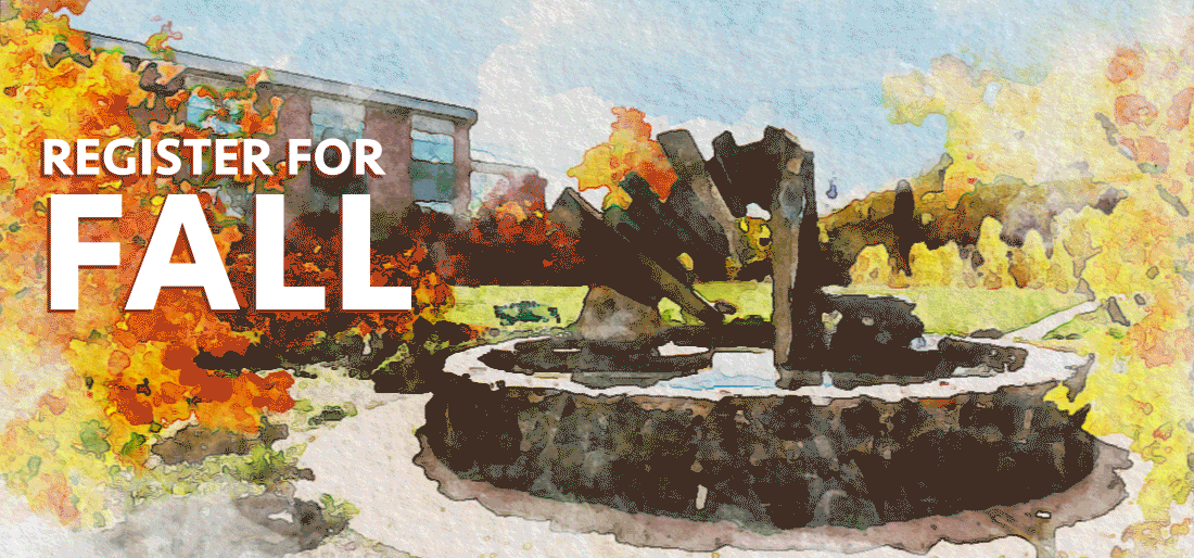
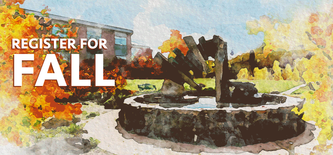
At the beginning of the month we changed our normally static homepage to include the following animated gif:
 We tend to swap the homepage image to be an animated gif about three or four weeks before classes start, and link it directly to our registration platform. While these images can be pretty, after you’ve watched them for a couple of minutes, they start to feel really annoying. And, invariably, after a week or so, the first complaints show up. But here’s how we respond:
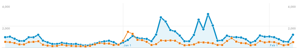
 Those images drive hundreds of clicks in the weeks after we launch them. So, annoying or not, if they’re achieving their objective, that’s what’s important, right?
But then we got a complaint email that wasn’t about the image being annoying, it was about the image being distracting. And that got me thinking – they were probably right. Motion can negatively impact people with various cognitive impairments.
Before we go into how we responded, let’s talk a little bit about why we’re using a gif. I mean, the gif format is 30 years old. Almost everyone has moved on to web video. But when we launched the updated website, we were stuck supporting all the way back to Internet Explorer 6. And for Internet Explorer 6, 7, and 8, there was no non-flash video option. So we build the website with support for images, but often not video (though we’ve been adding some support, it hasn’t been across all parts of the site).
WCAG 2.2.2: Pause, Stop, Hide
Stuck with gifs, I tried to resolve this as quickly as possible, since there was someone out that I knew was negatively impacted by the image. I quickly skimmed the WCAG 2.0: 2.2.2 standard, but it turns out this one is a little more complicated than I first thought. Here’s the full text:
2.2.2 Pause, Stop, Hide: For moving, blinking, scrolling, or auto-updating information, all of the following are true: (Level A)
- Moving, blinking, scrolling: For any moving, blinking or scrolling information that (1) starts automatically, (2) lasts more than five seconds, and (3) is presented in parallel with other content, there is a mechanism for the user to pause, stop, or hide it unless the movement, blinking, or scrolling is part of an activity where it is essential; and
- Auto-updating: For any auto-updating information that (1) starts automatically and (2) is presented in parallel with other content, there is a mechanism for the user to pause, stop, or hide it or to control the frequency of the update unless the auto-updating is part of an activity where it is essential.
On a first read, I assumed this success criterion didn’t apply. After all, there’s no moving, blinking, or scrolling information. Leaves are moving, but text is not. But, as many high school teachers I ignored told me, always read all of the instructions.
Attempt 1 – the programming solution:
My first thought was to do some searches and see if I could find a way to quickly add a pause button to animated gifs, since that would be an easy, site wide fix. I was definitely reaching here, but it turns out it’s a somewhat viable option. This solution involves creating a png of a single frame of the gif, and swapping them on click. That felt problematic to me. While it might work if you click to pause the image, because our image is linked to our registration platform, I’d need to add an actual button over the image somewhere. That can be rather involved, with making it cross-browser, all screen size friendly, and ensuring it’s sufficiently accessible itself.
Attempt 2 – reduce complexity:
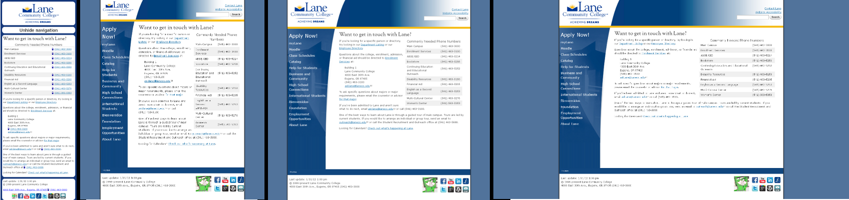
With the button ruled out, I thought that the easiest thing we could do would be to just remove some complexity from the image. We could make the leaves go slower, and maybe remove a few leaves. After a bit of work, our student designer put together this image for us within a few hours of the initial complaint:
 That image has about half as many leaves, so it’s a lot less complex. And the leaves stay off the screen for a bit, meaning there’s always time without motion on the screen.
But while I was able to confirm the reduced complexity image solved the problem for our user with the complaint, I couldn’t shake the feeling that I really ought to read the entire standard.
Returning to the standard
It turns out that if I’d just scrolled the page down a little bit, I’d have seen the information in the very first sentence. Here it is:
The intent of this Success Criterion is to avoid distracting users during their interaction with a Web page.
While I still think the success criterion needs some edits to be more clear about what constitutes “information”, certainly the purpose of the standard is to reduce distraction. And both Penn State and WebAIM agree: animations need to be very short or user controllable.
Attempt 3 – short animation:
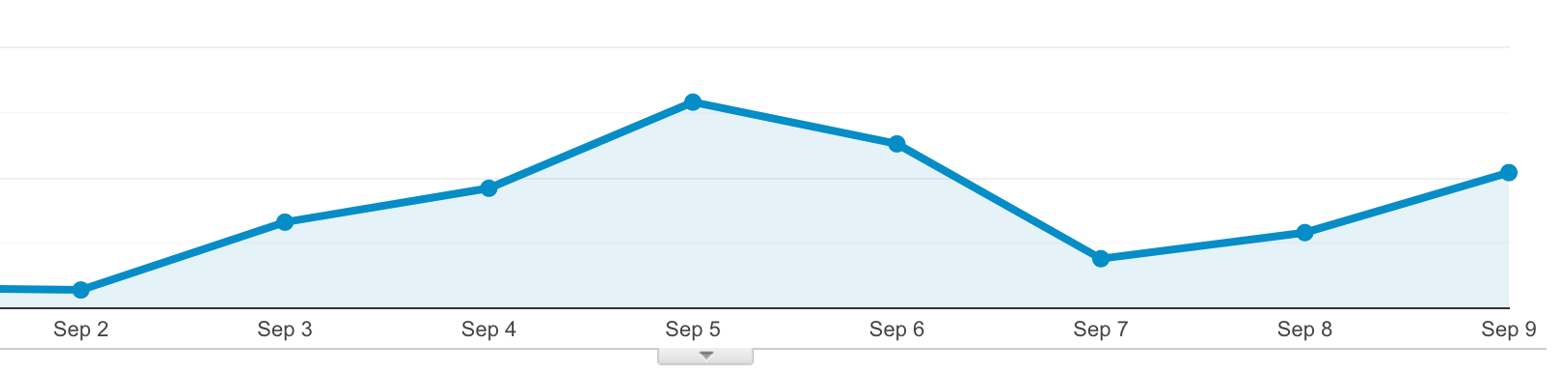
The next easiest fix was to turn off looping on the animation. That way there’s still enough motion to capture attention, but not enough to distract. Here’s what we came up with:
 Of course, there’s some some downsides. For instance, say you embed a gif halfway down a page, and it takes more than 5 seconds to scroll there (like this page! If you’re not seeing motion, reload the page and scroll quickly). The visitor will never see the animation (note – this is fixable with lazy loading of images, but those weren’t a thing when we built this site, and we’ve had trouble grafting them on). But for us, with the image essentially at the top of the page, it’ll probably work. This also doesn’t work for cinemagraphs, which depend on perfectly looping images to create the effect of slight motion in an otherwise still world.
Next steps:
After we had an actual fix in place, we did a quick check across the entire site for other animated gifs, and found only one other place where there was a problem. That image has since been removed completely.
We’re currently exploring finally adding video support for some of the last areas of the website that don’t support it. Video would not only provide a way to pause animation, it would also allow for much higher resolution images and more complex animations. But fitting video into pages is also more complex, and if we’re unable to find a way to do what we need without a lot of work, we might end up waiting for the next iteration of the website. More details on that soon!