Twitter Cards and Open Graph

Across the Internet, Social Media now drives almost a third of all visits to pages. At Lane, that number is substantially lower: on our main website, it’s just 1%. One way to increase the number of people who click our links in social media (our click-through rate) is to improve our link copy and picture to make our posts more readily grab people’s attention.

This blog post is going to demonstrate two ways to do that. Though we’re going to be discussing ways to customize how your link is shared, we’ve set up defaults to improve how all pages look when shared, without you having to do anything at all. But a couple minutes of work will go a long way to making your shared link stand out.

Open Graph

The behemoth of social media is, of course, Facebook, so we’ll start there. Facebook developed a standard called Open Graph, which is a way to add hidden tags that tell Facebook, Google+, LinkedIn, and others how to share your page. Let’s take a look at what it looks like when we share a link on Facebook:

Facebook share window.

A similar preview box will show up when you share a link on LinkedIn or Google+.

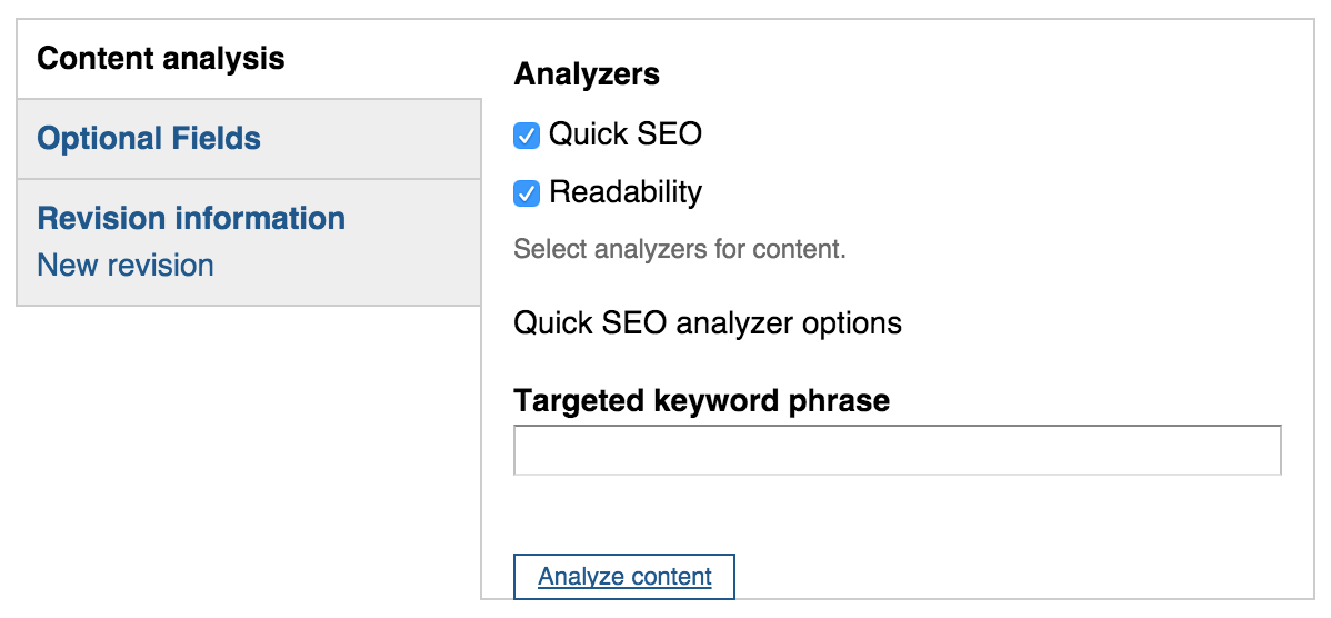
If you’re a social media user*, you’ll now have an extra horizontal tab down at the bottom of your edit page, called “Megatags”. If you click on that, you’ll see two blue links: Open Graph and Twitter Cards. Let’s click on Open Graph and take a look.
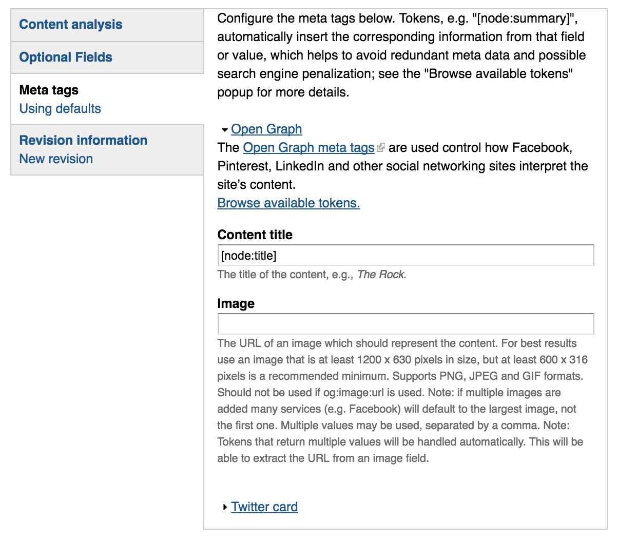
Drupal Metatags tab. Relevant fields are further explained in the following text

Content Title

The first field in there, Content Title, is the only one that’s absolutely mandatory. Since it’s mandatory, by default we tell it to use the page’s title (that’s what [node:title] means).

A small digression: titles within Open Graph aren’t quite the same as titles on the Lane website. On the Lane website, we automatically add the department name and college name to the end of the title. So a page that says it’s title is “Contact” would actually have a title like “Contact | Science Division | Lane Community College”. That works no the web, where you want to show hierarchy. But in social media, that’s a title everyone is going to skip right over.

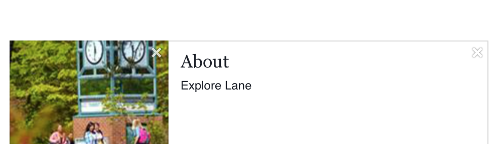
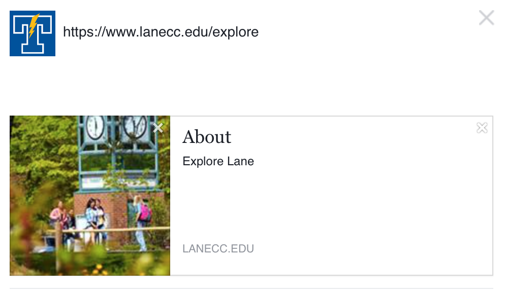
Open Graph titles are probably better thought of as headlines. Think back to that first picture we had – the title in that picture was “About”. That might be a good website title, but “About” is a terrible headline. We want something that’s going to catch people’s attention, and give them a reason to read a little bit further down. So let’s change it. We’ll instead use “Ready to learn more about Lane?”

Image

The next field, image, is probably your best opportunity to get attention. Facebook will always pick an image on the page, but sometimes you can do better. If you’d like to tell a social network what image to use, add it in here. If you’re not sure how to find the full url for an image, get in touch with us by emailing webmaster@lanecc.edu.

We’re going to leave the image in our example alone, since Facebook chose a pretty good image for us.

Description

Open Graph has one more important field, the description. But rather than ask you to type in a description all over again, we’re going to make use of a field that you may not have known you’ve had access to all along. If you’ve ever looked at the optional fields tab, you may have seen something like this:

Our optionl files tab, which included a field named 'search engine summary'

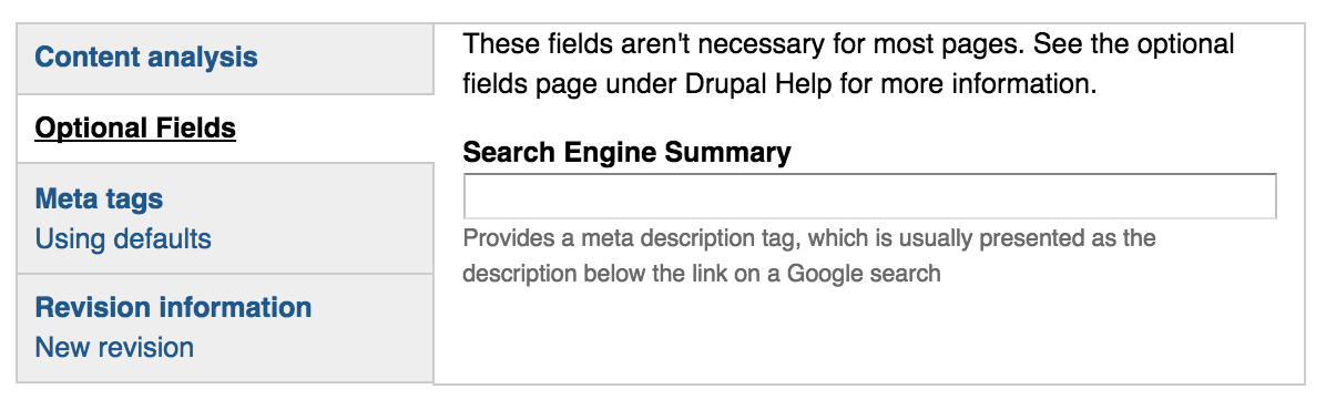
The search engine summary field provides a meta description tag, which Google and other search engines use as a snippet in search results. We use the same tag for Open Graph. If you’ve left it empty (like we have in our example) Google, Facebook, and others will create a description for you. Here’s what Google creates:

text is cut off, but reads: Lane offers many different educational opportunities–we truly have something for everyone! students by clock tower at main campus bus station As the third

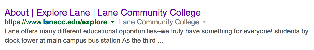
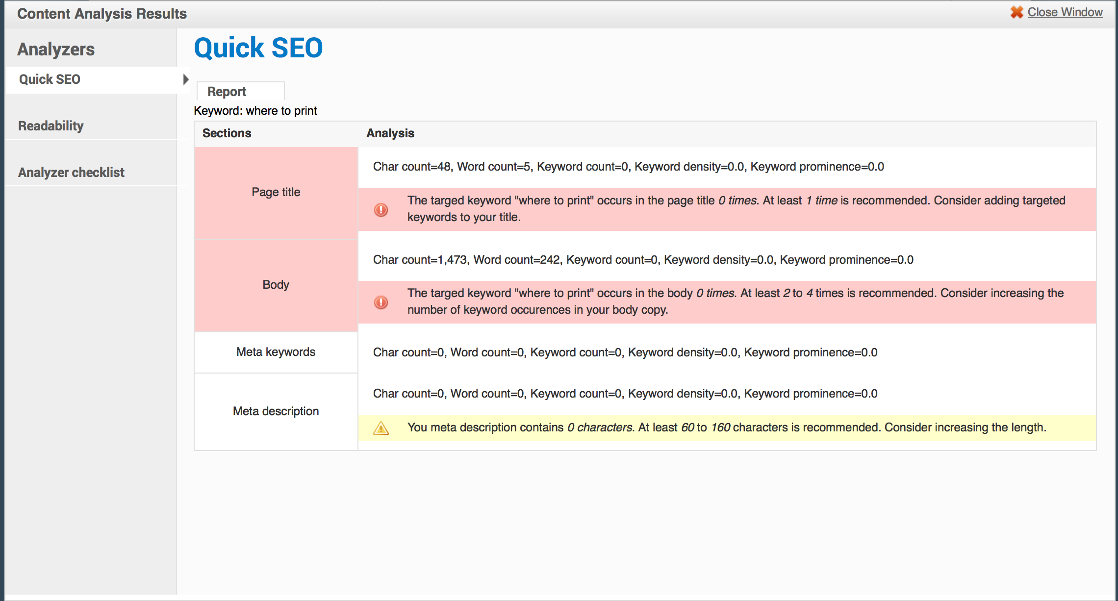
The text in black is Google’s preview for the page. But it doesn’t make any sense –  “students by the clock tower” comes out of nowhere. That’s because Google is using the alt text from a photograph as part of the description. Let’s put in a new description so Google doesn’t do that. As a rule of thumb, you want a couple of keywords that people might be searching for, and you want to keep under 160 characters. We’ll use “Explore transfer and career & technical opportunities at Lane Community College in Eugene, Florence, Cottage Grove, and online”.

With those fields updated, here’s what the page will now look like when it’s shared:

Updated facebook post, featuring the text we'd talked about earlier

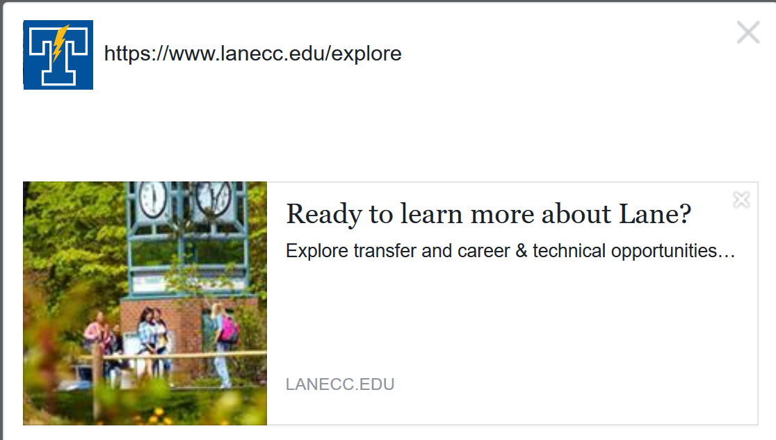
Better, right? Two caches. First, you’ll notice only part of the description showed up. That makes writing descriptions tricky. Facebook shows fewer characters than Google does. So if you can, keep the important parts of your description in the beginning. Second, after you make these changes, it takes Facebook as much as a day to recognize the updates. But you can force it, if you’d like. Enter the URL you’re going to share on Facebook on their debugger. Facebook will tell you when the last time was it took a snapshot of the page. If that snap shot is from before you made your changes, you can ask Facebook to crawl it again.

Twitter Cards

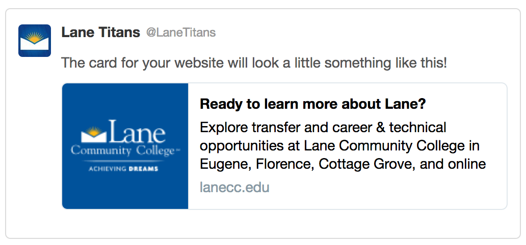
Twitter doesn’t use the same Open Graph standard that most other social networks use. Instead, it uses something called Twitter Cards. There’s two primary types of cards we’re interested in: the summary card and the summary card with large image. The only real difference between the two is the size of the image.

With the summary card, your image should be square, and a minimum of 120x120px. With the summary card with large image, your image should be rectangular, and at least 280x150px. It’s important you use as appealing of an image as possible, as it’s what’s going to make your post stand out best. By default, Twitter will use the Lane logo, but their guidelines state they don’t want the same image to be used repeatedly.

Setting up your Twitter card is much like setting up Open Graph. Click the Twitter card link, set the title and image, and make sure you’ve already set the SEO summary under the Optional Fields tab. Then, when shared on social media, you’ll see a card, like this:

Sample Twitter card, containing the text from earlier, in an attractive presentation on Twitter.

If you’d like a preview, you can use the card validator on the Twitter site.

One Caveat

For good reason, we don’t allow you to set these fields on pages you don’t control. So the editor of the science page can’t set the description of the math page. So if you’re going to be sharing a link for a page and you notice a problem with one of these fields, or you think the page could really use a better picture, email us at webmaster@lanecc.edu and let us know. We’ll take care of setting the meta tags to make sure everyone has a great shared link experience.

* Not sure if you’re a social media user? If you see an error message when you click on this link and log in, you’re not. But if you see a list of the sites you manage, you’re a social media user! If you’d like to become a social media user, check the Drupal dashboard for a list of upcoming training opportunities.


Click to Expand

A few days ago, an astute employee over in Enrollment Services pointed out that our steps to enroll pages weren’t completely accessible to the blind. This is an important problem, and a surprisingly tricky one.

The current legal requirements for web accessibility (including §1194.22, which we’re most interested in) are referred to as Section 508. These standards provide some useful guidance on how to help folks with an impairment of some kind. For instance, they describe how images should have an alt text field, except for when that image doesn’t support understanding of the content (e.g. a background or filler image).

On the other hand, these standards are now old enough to vote, meaning they’re older than Facebook, Twitter, selfie sticks, Google Chrome, iPhones, the Columbus Blue Jackets, and Windows XP. Needless to say, they’re showing their age.

There’s no way to make click to expand text accessible under current 508 guidelines. Our best option would be to duplicate the page and provide a text only version. Unfortunately, that could lead to a screenreader having to read a lot of unnecessary text.

The solution relies in the proposed new standards. These are still in progress, but the web community is confident they’re going to heavily include something called WAI-ARIA. WAI-ARIA provides a way to mark up your pages with extra attributes that screen readers know how to recognize, so the blind can better use interactive pages.

Returning to our original problem, starting this evening we’re now using the hide-show accessible plugin on those pages. This plugin lets you write some fairly simple markup in your page which will then get converted to a click to expand box like on the steps to enroll.

To use, you’ll first want to click the blue link below the edit box in Drupal that says “disable rich text”. Then, if you want a simple button with some text below it, you’ll want to paste this in:

 <p class="js-expandmore">Click on me</p>
 <div class="js-to_expand">
     here is the hidden content!
 </div>

Then replace “Click on me” and “to show me!” with whatever works for your page. You’ll get something like this:

plus sign with some latin text that'd normally be clickable

And when you click to expand, you’ll see this:

minus sign, with the same text as before, but now with more text shown below it

If you’d like a little bit of color, you can also use an h3 element, which would place that text in an orange box:

    <h2 class="js-expandmore">Lorem dolor si amet</h2>
    <div class="js-to_expand">
       here is the hidden content
    </div>

Exactly the same as before, but now it’ll look like this:

same plus with text, but now with an orange background

This is actually the more correct use – you nearly always want to use an h element of some kind when it describes the text after it.

For really advanced use, you can also add a full class to make the button full width. Or you can add the blue class to make the orange background blue instead. Or both!

    <h3 class="js-expandmore blue full">Lorem dolor si amet</h2>
    <div class="js-to_expand">
       here is the hidden content
    </div>

would look like this:

blue background, full width, with same plus and text

This is definitely getting into advanced content editing in Drupal, so if you’re stuck don’t hesitate to contact us at webmaster@lanecc.edu.

Remember, we should always try to use the right tool. For instance, these kinds of show and hide buttons might seem like they’d be perfect for an FAQ. But we already have a different setup for FAQ questions, that takes care of alphabetizing and tracking changes to each question. And remember that many of the visitors to your page won’t bother clicking the button at all. Always spend time simplifying your content to make sure the important message is apparent even without clicking to show your other text.

Writing for Readability and SEO

This is the last post in a series about rewriting content. Though you’re welcome to read it by itself, you might want to read the first four posts first: One, Two, Three, and Four.

Now that we’ve fixed our page so that it’s easier to read, we need to make sure it’s easy to find. When we talk about making things easy to find, we really mean making them easy to find by Google, as more people find our content on the website via Google than they do any other source. Writing easy to find content is one aspect of Search Engine Optimization, or SEO.

Writing for SEO

Soon, we’ll be adding a new tool to the Drupal edit interface to help you perform a keyword analysis. To use it, you’ll simply edit a page, then scroll all the way to the bottom:

The Drupal content analysis box

After we turn it on, if your user has the correct role, you’ll see that Content analysis tab. Let’s start with doing a Quick SEO analysis, and put a phrase in the box. I’ll use “Where to print”, since that’s something I think people might google to find out where to print. Then click the button.

Content Analysis Results page

Your results will pop over the page, and be very hard to miss. But don’t worry – if you accidentally close that popover, the results will still be in the page. Let’s look at each of the sections in the results.

Page Title – The title is probably the most important place to put important keywords, but it’s important not to make it too long. Our current title is “TitanPrint”. That’s also something that people might google, especially as we try to message out about TitanPrint. So I’m ok with it, and we’ll leave this alone.

Body – The body is the second best place to put your important keywords and phrases. We’re missing my phrase entirely. So I should probably fix that. Let’s rework the second to last sentence:

You can use your print allocation at locations around campus.

And instead we can write:

Curious where to print? View print locations to across campus.

And of course we’ll link print locations to to the proper page.

Meta Keywords – We don’t use these. They’re generally ignored.

Meta Description – When you search for something, Google helpfully tries to use a snippet of the page to give you a preview of what’s on the page. If you’re finding that snippet to be unhelpful, you can enter a description that Google may use instead. If you’d like to enter one, check under the “Optional Fields” tab at the bottom of the page, and fill out the Search Engine Summary field.

Readability

In the popover, there was another tab labeled readability, which provides a series of different reading level scores. Depending on your content these may vary wildly, so it’s usually best to just use the average.

The reading level content analysis interface

Our reading level has an average of 8.3 – pretty close to what HemingwayApp told us. This interface isn’t as friendly as HemingwayApp, and doesn’t provide live feedback, but it saves you a lot of copying and pasting, so we encourage you to give it a try.

That’s it!

We’re almost done testing content analysis, so hopefully by the time you read this post you’ll be able to use it. If you have any trouble finding it, or using any of the tools we’ve covered in these posts, please, please, please contact us at webmaster@lanecc.edu and we’ll help you out. Also don’t hesitate to contact us for additional help with SEO – we have a bunch of information from Google Analytics that we’d be happy to share.

And be on the lookout for some upcoming sessions where we rework some content together, live, in person. Keep checking the announcements box on the Drupal dashboard right after you log in.

Call to Actions

This weekend, while rolling out some minor module updates, we also added a way to convert a link from this:

Picture of a link on the page

to this:

Picture of an Orange Call to Action Button

If you’re not a fan of orange, you can also use the blue version:

Picture of a Blue Call to Action Button

These big, hard to miss buttons are the page’s Call To Action (CTA). When you’re working on a page, you should be thinking about what the CTA for each of your pages is. What do you want the visitor to do on that page? Is your page purely informational (example: financial aid disbursement schedule)? Or are you trying to get them to take some sort of action (example: register for the Convening the State event)? If your page falls into the latter, you may want to consider the above CTA buttons.

To use them, you’ll need to add two classes to your link. For orange, you’d add cta and cta-orange, for blue you’d add cta and cta-blue. Don’t know what that means? Don’t worry about it! Just give Lori a call and she’ll walk you through it. Super easy.

One more thing: your page should only have one CTA. If there’s absolutely, positively, no way at all in the world you can have just one CTA, you can maybe add a second. If you have a bunch of CTA’s, you’re not helping people find what they need, you’re splitting their attention and making it unclear what they should do. And wherever possible, we should be trying to make it clear what we want people do on our pages – remember, people skim more than they read.

Drupal does CAS

For the last two years, the IT department has been working on a project to improve identity, communications, and passwords across campus. We’re finally ready to start rolling pieces of that out. And you, lucky Drupalers, are getting to test one of the very first pieces.

Starting on October 9th, when you log into Drupal, you’ll be automatically taken to the CAS login page. What’s CAS? CAS provides a Central Authentication Service, which means that when you log into it, you’re actually logging into all the services that CAS is aware of. And when you log out, you’re logging out of all the services that CAS is aware of.

In the future, this is going to let us do some pretty neat things. For example, that means after you log into Drupal, when you go to myLane and press login, you’ll just automagically be logged in – without having to enter your L Number and password all over again. But for now, it’s just going to look like a different login page. So what’s it look like?

Screenshot of the CAS login screen

No, really, that’s it. When you go to the Drupal login page, it’ll automatically go to the CAS login page. After you log in, you’ll go back to Drupal.

It’s super important that you remember to log out when you’re all done. Since logging into CAS logs you into all services, if you forget to log out that means the next person that comes up to that computer could not only use Drupal as you, but also use any other CAS enabled service (and eventually, that’ll mean almost everything at Lane!). So please, hit the log out button when you’re done!

Encrypt all the things!

Over the last few weeks, we’ve been battling a problem where the web server would sometimes forget its own name. Some days it would want to go by www.lanecc.edu, other days it would want to go by 163.41.113.43 (our public IP address), and other days it would use our internal server name. We gave it a stern talking to, but it refused to cooperate.

The solution is to specify Drupal’s base_url variable. Normally, Drupal tries to identify what server name to use and it does a pretty good job. But clearly our server isn’t so great at that anymore. Specifying the base_url forces Drupal to use what we tell it.

But the base_url needs to be a full URL, complete with protocol. So it needs to be “http://www.lanecc.edu” or “https://www.lanecc.edu” – we’re not allowed to just say “www.lanecc.edu”. Why does that matter? Because even though the difference is just one letter – an “s” – that turns out to be one of the most important letters on the Internet.

HTTP is the protocol that defines how a lot of content on the internet moves around. It’s part of how this page got to you. But it’s a completely unencrypted format. When you’re browsing the web in HTTP, you’re sending everything in clear text – anyone that can listen in (for example, on an unencrypted WiFi connection) can read whatever you’re sending. But if we add the “s”, and browse via HTTPS, then everything we do is encrypted, and no one can listen in*.

But there’s some gotchas with HTTPS pages. For instance, most webpages actually consist of multiple requests – the Lane homepage has 34. If even one of those requests is made over HTTP instead of HTTPS, then we have a “mixed mode content error”, and the browser hides that content.

And that’s kept us from specifying our base_url so far. If we set it to “http://www.lanecc.edu”, then on pages that are HTTPS, like webforms, then all the styles and javascript will break, since those would be sent over HTTP. And if we went the other way, and set the base_url to “https://www.lanecc.edu”, then our caching infrastructure, which is built assuming most connections are over HTTP, would break, significantly slowing down the site. So we’ve been stuck running a mixed-mode site – most people use HTTP, but authenticated people and webform users use HTTPS.

There’s a number of reasons that isn’t ideal, which are well outside the scope of this already too long blog post. And the wider Internet is moving forward with using HTTPS only everywhere. So yesterday, we deployed new caching infrastructure which will allow us to go with using HTTPS only. Going forward, all connections with www.lanecc.edu will be  encrypted.

This should be a almost completely transparent transition, but if you notice any problems, email us at webmaster@lanecc.edu and let us know!

* strictly speaking, this isn’t true, and there’s a a whole category of attacks that can still work on HTTPS. But there’s a fix for that too, and we’re working on rolling that out too some time in the future.


Some Announcements

Over the last few weeks, we’ve added some features to Drupal that may interest you.

First, we’ve added some new buttons to the WYSIWYG editor:

  1. The “K” button works much the same way as the Flickr button, and allows you to embed Kaltura Videos (hosted on http://). For more information, talk to Dean Middleton
  2. The map button allows you to embed the new style Google Maps maps. Google changed both the Google Maps interface and the embed codes recently. If you see a white box on the left hand side of Google Maps, you’re using the old version, and should continue to just paste the map link into the WYSIWYG on its own line, like always. But if Google Maps takes up the entire screen, you need to copy the embed code and paste it using the new Google Maps button in the toolbar.

Second, we’ve had some problems with revision messages. Here’s a real life sample of some of the message we’ve seen the last few weeks:

  • z
  • .
  • Revised page
  • Update1
  • page update
  • routine
  • same
  • got it

Clearly, these are incredibly unhelpful. Log messages should be concise and descriptive. Here’s some great ones:

  • Revised office hours and added fall term hours
  • Update reference to Retail AAS
  • added IT maintenance window event spud
  • updated links to event flyers
  • added link to BP040

When we’re trying to figure out when something changed, it’s a lot easier if we can skim through the revision log. And it helps you – that way you can see who else changed your pages, and what they did.

Due to the number of really poor revision log messages, we’ve been forced to add some checks within Drupal for obviously bad ones. If your message doesn’t meet the terribly low bar we’ve established, your node will not save, and you’ll be asked to enter a better message.

Remember, if you find yourself constantly entering messages like “Trying again” or “One more time”, you should try using the Preview button to make sure what you’re adding is what you want. That way you’re not creating 3 or 4 revisions for one small change.

There’s also a couple of people who include their initials with the log message. Although we used to really like having that information when we were using Contribute, we track your login when you make changes now, so there’s no need to also have your initials. Save a few keystrokes!

Finally, we’ve also open sourced a piece of our Drupal Migration. if you visit our GitHub page, you can find the source of our Migration Tracker, which kept track of the old and new URLs, and made it possible for us to migrate over several months, rather than needing to do it overnight.

A Static Server

As I may have blogged once or twice previously, making websites really fast is important to me. Recently, we’ve made a change that should help us improve the speed of not only www.lanecc.edu, but of many of Lane’s other websites, including this one.

When you request a webpage, in addition to fetching the page itself, you usually end up requesting each individual image, font, css sheet, and javascript sheet. Making those requests is expensive. There’s a sliding window, which limits how many requests you can make at once. So if the window size is 5, but you need to make 6 requests, you need to wait for one of the first 5 requests to finish before you can make the 6th. On the other hand, if you only need to make 5 requests, your browser can start rendering the page a lot sooner.

One way is to combine images into a css sprite. Here’s ours:

Lane's CSS Sprite, which combines social media and other common icons and images from the website into one image.

That’s 15 different images combined into one. And even though there’s empty space on the bottom right, it’s actually usually faster to fetch a slightly bigger image then it is to fetch each icon individually.

Another way is CSS and JavaScript aggregation. Most pages on our website have 35 CSS sheets and 35 JavaScript files – but after aggregation, you only end up requesting 7 of each (there’s reasons why 7 of each is better then just 1 CSS and 1 JS, but that’s outside the scope of what we’re doing here).

But the easiest way to speed up a request is to not make it at all. When you make a request, you send some request headers with it, that tell us things like if you’ll accept a compressed version and what language you prefer. Then we respond with a header that tells you how long you should keep our response cached on your computer. If you need that resource again before the expires time we gave you, you just use the local one, rather than fetching a new one.

In addition to sending headers with your request, and us sending different ones, we also send each other cookies.

A picture of some cookies
baked by https://www.flickr.com/photos/plutor/3646688/in/photostream/

Cookies are always set on a domain. When you log into Moodle, cookies are set on the domain classes.lanecc.edu, so Moodle knows on every page load that you’re logged in. But here, on the Lane website, we’re not so lucky, as you can actually use the website on either www.lanecc.edu, or on just lanecc.edu. So we set our cookies on .lanecc.edu. That little dot before lanecc.edu is critical. That tells your browser to send your cookies to all domains that end in lanecc.edu.

The downside is that those cookies are sent on every request to our domain – even requests that don’t need them, like the request your browser made to show you the picture of those cookies up there.

What does this have to do with static?

We’ve started moving relatively static (unchanging) resources, like the college logo and the megamenu onto the static asset server, which we’re putting on the domain static.lanecc.net. Since these resources are relatively unchanging, we can set a long expires time – maybe 30 or even 45 days in the future (for now, it’s set to 0minutes in the future, for testing). Once your browser has fetched them, you won’t need to fetch them again for a whole month. And because they’re not under the lanecc.edu domain, you won’t send any cookies (and we won’t send any back), making the few requests you do need to make even smaller.

If you’re really curious about the inner workings of our new static asset server, I’ve added some extra geeky content to the Our Tech Stack post.

In the months to come, we’ll keep migrating content onto the static asset server, trying to reuse resources between websites, so that the logo you see on myLane is served from the same URL as the logo you see in Moodle, reducing the number of requests you need to make, and making it simpler for us to update things in the future.

Link text standards

Take a look at these two sentences:

Which is better?

Answer? the first one. There’s a couple reasons.

First, it turns out that descriptive text in links like this is actually really helpful for search engines to determine what’s on that page. So providing descriptive links can really help improve search.

Second, if you’re linking to another Lane page from within Drupal, if you use descriptive text you don’t need to worry about ever updating the link. We’ll take care of it for you. If you use the URL as your link text, then you might get a weird situation where the link text no longer matches the url you’re linking to – it says “lanecc.edu/science/bio” but you’re actually sent to “lanecc.edu/science/biology”.

Third, it simply looks better. No one wants to read long, ugly looking urls as part of their text.

“But wait,” you say, “what about when someone prints the page?”

We’ve thought of that. When you print a page from the Lane website, we automatically include the url next to the linked text. Of course, we’d rather you didn’t print web pages in the first place, but that’s a discussion for a different day.

Of course, there’s exceptions to this rule. Use common sense.

We’ve added a check to our linkchecker, so from here on out we’ll be actively hunting for these links. We’ll fix some of them for you, but we may also contact you for some help rewording your content.

As always, if you have any questions about best practices with content, send Lori an email.

New Social Media Options

On some Drupal pages, there’s links to department social media on the left hand sidebar, right at the bottom of the navigation menu (for an example, check out the Marketing and Public Relations site). Recently, we’ve added a few more social media options that you can add to your website. The whole list of options is:

  • Blogs
  • Facebook
  • Flickr
  • GooglePlus
  • Instagram
  • LinkedIn
  • Pinterest
  • Twitter
  • Tumblr
  • YouTube

If you don’t currently have permission to add social media sites to your department’s pages, talk to Lori about becoming an advanced content editor. And if there’s any other social media sites that you think we’re missing, let us know.

As always, make sure to follow the Social Media Standards!