Welcome back!

I know, I know, we’re in week 4, and I’m finally putting out my first post of the year. But it’s 2020. It’s that kind of year.

Last week the web team attended the 2020 HighEdWeb annual conference. This is one of my favorite conferences, and it was even better this year because it was absolutely free online (though in central time, which made for some early mornings). Here’s some gems:

Plain Language Matters.

It’s an accessibility issue. It’s an equity issue. People skim online. If we make that hard for them, they leave. Take a look at our previous plain language post.

Resource pages & emails don’t work.

One of the groups at Miami University did a lot of extensive testing. People don’t self serve. If you have a lot of links and resources that you want to put out there, consider a drip campaign to slowly provide those links at a pace people can digest. Use social to highlight different resources at different times. Include titles that highlight the problem the resource solves (“Looking for a tutor late on a Sunday night before class? Look no further!”). Track what you do to see what works (and reach out if you’d like help setting that up!). Rather than a resource page, consider a blog, where those resource links can be provided in context, and do some content marketing for you. We’ve also covered resource pages in the past.

Stop posting flyers and event posters online.

Especially now, when we’re not going to see them in person. Flyers and posters are designed for print, and don’t translate well to digital. If you’re considering putting a flyer or poster online or on a digital sign, reach out – we’ll connect you with some graphic design resources, and help design for the medium you’ll be promoting on.

The college website is for prospective students. And those students know when they’re being marketed to.

Carlton did a great session where they detailed extensive user testing before their homepage redesign. They found things like:

  • prospective students (particularly Gen Z) think the entire website is for them. Even the section clearly labeled “Alumni”. But your homepage should be for them before any other audience: most other audiences search for something, then land on some other page. Prospective students are the most likely, by far, to land on the homepage.
  • they know when pictures are staged. They want to see people in place: shots that show what students actually do some place on your campus, and how that sets you apart. Person under a tree reading a book? Clearly staged. Dining hall shot? Every college has a dining hall. Candid shot of a class outside? Student learning to machine something? Much better.
  • Carousels don’t work. I think one possible exception is a photo gallery, but that’s tricky.
  • The large hero image on a program’s website sets the tone and creates a greater impression than all the text there.
  • From one of their slides: “Students want #nofilter, but we’re giving them #fellowkids”

FAQs don’t work.

While we may think splitting our content up into questions is easier for the student, it actually makes things harder to understand. Read your entire FAQ page, make groups out of the content and write a header for each one, and then rewrite the content in each group to paragraph form. It’ll work better for everyone. Here’s a page with the slides, a sample FAQ with real life before and after examples, and some other resources for why we should stop using FAQ pages. You can also review our previous post on FAQs.

Writing for Readability and SEO

This is the last post in a series about rewriting content. Though you’re welcome to read it by itself, you might want to read the first four posts first: One, Two, Three, and Four.

Now that we’ve fixed our page so that it’s easier to read, we need to make sure it’s easy to find. When we talk about making things easy to find, we really mean making them easy to find by Google, as more people find our content on the website via Google than they do any other source. Writing easy to find content is one aspect of Search Engine Optimization, or SEO.

Writing for SEO

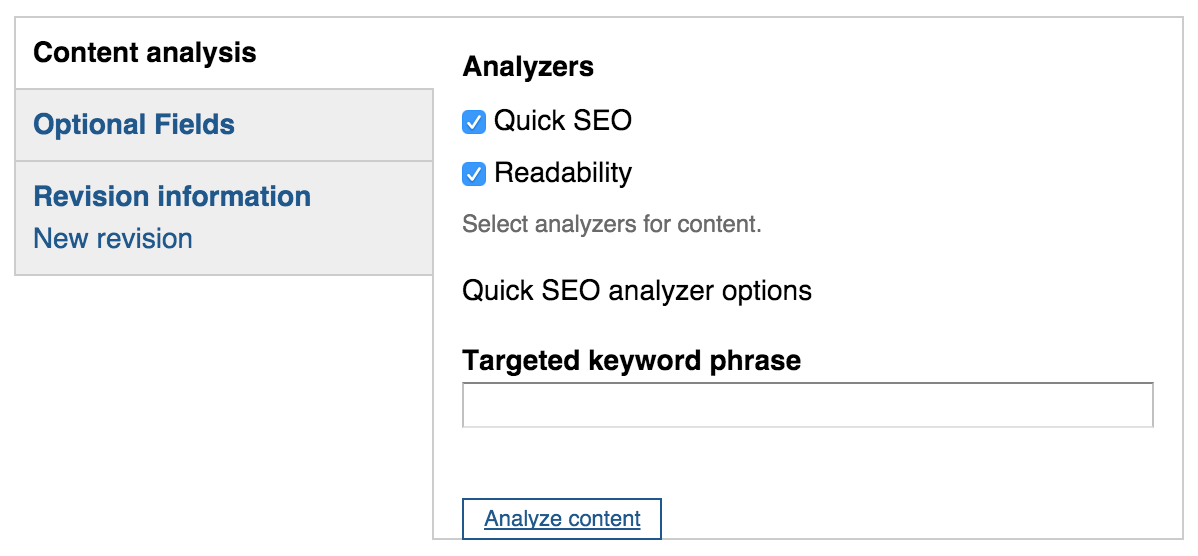
Soon, we’ll be adding a new tool to the Drupal edit interface to help you perform a keyword analysis. To use it, you’ll simply edit a page, then scroll all the way to the bottom:

The Drupal content analysis box

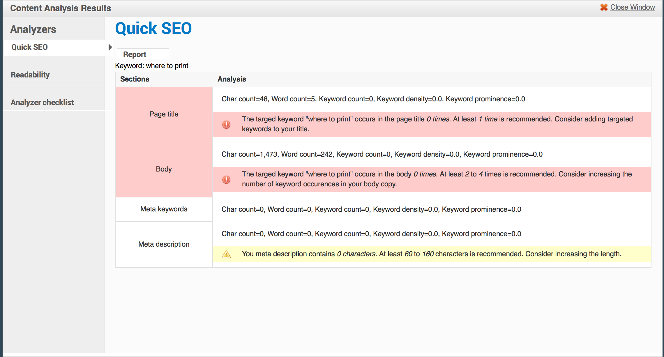
After we turn it on, if your user has the correct role, you’ll see that Content analysis tab. Let’s start with doing a Quick SEO analysis, and put a phrase in the box. I’ll use “Where to print”, since that’s something I think people might google to find out where to print. Then click the button.

Content Analysis Results page

Your results will pop over the page, and be very hard to miss. But don’t worry – if you accidentally close that popover, the results will still be in the page. Let’s look at each of the sections in the results.

Page Title – The title is probably the most important place to put important keywords, but it’s important not to make it too long. Our current title is “TitanPrint”. That’s also something that people might google, especially as we try to message out about TitanPrint. So I’m ok with it, and we’ll leave this alone.

Body – The body is the second best place to put your important keywords and phrases. We’re missing my phrase entirely. So I should probably fix that. Let’s rework the second to last sentence:

You can use your print allocation at locations around campus.

And instead we can write:

Curious where to print? View print locations to across campus.

And of course we’ll link print locations to to the proper page.

Meta Keywords – We don’t use these. They’re generally ignored.

Meta Description – When you search for something, Google helpfully tries to use a snippet of the page to give you a preview of what’s on the page. If you’re finding that snippet to be unhelpful, you can enter a description that Google may use instead. If you’d like to enter one, check under the “Optional Fields” tab at the bottom of the page, and fill out the Search Engine Summary field.

Readability

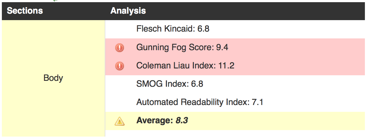
In the popover, there was another tab labeled readability, which provides a series of different reading level scores. Depending on your content these may vary wildly, so it’s usually best to just use the average.

The reading level content analysis interface

Our reading level has an average of 8.3 – pretty close to what HemingwayApp told us. This interface isn’t as friendly as HemingwayApp, and doesn’t provide live feedback, but it saves you a lot of copying and pasting, so we encourage you to give it a try.

That’s it!

We’re almost done testing content analysis, so hopefully by the time you read this post you’ll be able to use it. If you have any trouble finding it, or using any of the tools we’ve covered in these posts, please, please, please contact us at webmaster@lanecc.edu and we’ll help you out. Also don’t hesitate to contact us for additional help with SEO – we have a bunch of information from Google Analytics that we’d be happy to share.

And be on the lookout for some upcoming sessions where we rework some content together, live, in person. Keep checking the announcements box on the Drupal dashboard right after you log in.

New Search Engine

A slightly early holiday gift from the web team: new search!

Just before break, we finished our migration away from our Google Mini to Google’s hosted Site Search. We hope you’ll find it more reliable, more accurate, and easier to use on your phone. Try it out at lanecc.edu/search, or using the megamenu at the top of most Lane web pages.

Happy Holidays!

Search Engine Feedback

Have some feedback?

We're always interested in learning how to better improve our search engine. If you couldn't find something, fill out the form below and we'll do our best to find what you were looking for and fix it for others in the future.


Please include the exact text you typed into the search engine
Consider including what you expected to find, as well as a brief description of what you did find.

Thanks for your feedback! If you'd like us to get back to you, please include some contact information here:

Link text standards

Take a look at these two sentences:

Which is better?

Answer? the first one. There’s a couple reasons.

First, it turns out that descriptive text in links like this is actually really helpful for search engines to determine what’s on that page. So providing descriptive links can really help improve search.

Second, if you’re linking to another Lane page from within Drupal, if you use descriptive text you don’t need to worry about ever updating the link. We’ll take care of it for you. If you use the URL as your link text, then you might get a weird situation where the link text no longer matches the url you’re linking to – it says “lanecc.edu/science/bio” but you’re actually sent to “lanecc.edu/science/biology”.

Third, it simply looks better. No one wants to read long, ugly looking urls as part of their text.

“But wait,” you say, “what about when someone prints the page?”

We’ve thought of that. When you print a page from the Lane website, we automatically include the url next to the linked text. Of course, we’d rather you didn’t print web pages in the first place, but that’s a discussion for a different day.

Of course, there’s exceptions to this rule. Use common sense.

We’ve added a check to our linkchecker, so from here on out we’ll be actively hunting for these links. We’ll fix some of them for you, but we may also contact you for some help rewording your content.

As always, if you have any questions about best practices with content, send Lori an email.

Search Engines

Back when we first started the website redesign, we received a lot of feedback about how our search engine – https://search.lanecc.edu – didn’t work very well. Now most of our questions are about altering the behavior of the search engine to make it work differently. Over the next few posts, I’d like to explore what changed, as well as why not every request can be responded to, as well as dig a little bit into what you, as a Drupal editor, can do to improve how the search engine views your pages.

How does search work at Lane?

We use a Google Mini search engine, which allows us to index and search up to 50,000 documents. We have complete control over what pages are in our search (the “index”), and limited control over what’s shown in the results. Also, it’s blue, which is a nice contrast to the beige and black of most of the machines in the data center.

The first big change we made to search as part of the redesign was to upgrade our Google Mini, which we did in early 2012, switching to a brand new search server with upgraded hardware and software. We found a pretty immediate improvement – no longer did it feel like using an old search engine from ’05 or ’06, and instead it felt like using one from ’10 or ’11. Unfortunately, Google has discontinued the Mini, and there will be no further upgrades. We’ll need to find a new solution in the future (Apache Lucerne?).

Along came a migration

Then we started migrating pages to Drupal. This brought with it a bunch of new practices that we’ll get into some other time, but all of which dramatically increased the relevance of search. The down side is that we changed virtually all of the URLs for pages on lanecc.edu (Yes Sir Tim, I know it was a bad idea). While we’ll hopefully never need to do this again, it meant there was some confusion in the results for a while.

The migration also meant that we cut a lot of pages. More than 10,000 of them. Enough pages that cutting them significantly changed how the mini calculated page rank. We’re still removing these from the search index. It’s a slow process, since we don’t want to delete more than one or two folders worth of files each day, so that if someone was still depending on a page or image that didn’t get migrated, it won’t be as hard to get that person their missing files.

Reset

Since the mini wasn’t removing pages that had long since disappeared, we decided to reset our search index. This is pretty much what it sounds like. We tell the mini to forget about all the pages it knows, and start over from the beginning. When we did this last, around Thanksgiving, our document count in the index went from about 40,000 all the way down to 16,000. We think results improved quite a bit.

We’ll reset again around Christmas, which is traditionally one of the slowest days on the website. Hopefully that’ll bring the document count down even more, and make results even better.

Biasing

At the same time as our last reset, I figured out that I’d been using Results Biasing incorrectly. Results Biasing is a way that we an introduce rules into the search engine to influence the results. Our first rule tells the mini to significantly decrease the pagerank of urls that end with xls or xlsx, under the assumption that when you’re searching Lane, you’re probably not interested in some Excel sheet.

I thought that by simply entering rules in the Results Biasing page on the mini administrative interface, I was affecting the search results. Turns out this isn’t actually true. There’s a second radio button to hit on the Frontend Filter, where you actually enable Result Biasing on the collection that frontend is searching. What are containers and frontends? A container is a collections of urls that match certain patterns. For example, we have a container of just pages that match pages related to our COPPS pages, and another just for the Library. Frontends are the user interface to those collections, where you can customize what the search button says, what the background color of the results is, etc. You can use any front end with any collection, but in our case each frontend belongs to just one collection.

Feedback

The other big thing we did to our search was to add a feedback form in the bottom right hand corner of the search results page. To date we’ve had 40 people let us know about their  searches that didn’t get them the results they needed. Many of those have resulted in us making a tweak to the search engine, either adding pages to the index, or adding a KeyMatch, or fixing something on the page to improve its visibility.

Feedback has started to taper some, while queries have stayed steady (if you adjust for changes in enrollment), so our assumption is that search is working pretty well. If it isn’t, please submit some feedback!

Next time

Now that we’ve got some basics out of the way, next time we can dig into how search engines calculate results (If you’d like some homework, here’s a bit of light reading), as well as more of what we can do to influence those results.

Search Visualization

Not too long ago I wrote a post on how we use search data to influence our information architecture decisions. In our quest to be even better, we’ve made a few modifications.

Originally we were only looking at keywords (each of the words you search for) and queries (your exact search, often a phrase). As a refresher, here’s the graph of our common queries at the time:

Graph of Common Search QueriesRight away we can see some redundant queries. “staff directory” and “directory” are really people searching for the same thing. Similarly, “campus map” and “map” are both people looking for the campus map. Although this is useful information to know, as it lets us figure out what terminology to use, it’d be nice if we could condense things so we just saw what people were trying to find – these are the sites that should be more prominently linked.

So our first change was to condense the number of queries, by grouping related ones into their most common term. We didn’t do it for all of them – just the top 300 or so – but it was enough to represent the majority of our search traffic. Our second change was to increase the amount of data for better accuracy. We’re now looking at the top 500 keywords and queries every week, instead of just the top 100. After 12 weeks, that gives us 1523 different queries, and 921 different keywords.

That much data means we needed a new, fancier way to get a big picture of it. Conveniently, as part of a different project, I’ve been learning to visualize data using d3.js *, and the thousands of points in our search data make a perfect starter project for me.

To really see the power of d3, you’ve got to see the graph in person. But here’s an image, in case you’re on an older browser (IE7 & 8 support is sketchy):

top 50 Search Query, using a streamgraph
Top 50 Search Queries

This particular type of graph is called a streamgraph. To read it, click on it to go to the website where it’s actually hosted, then mouse over a particular band. The width of that stream represents the proportion of traffic that searched that a particular query. The thickness of the river represents the total amount of traffic. Because a streamgraph sits around a central line, rather than a bottom line (like the one in the first image of this post), it’s easier to see changes in volatile data.

If you look at the graph on the webpage (and not here!), you’ll see a few dots below the graph. Mouse over them to see annotated events that we think might have contributed to sudden search bursts. Some of them, like the ExpressLane burst, are obvious. Others are just my guesses. And others are totally unidentified. If you have any ideas what might have caused one of those bursts, let me know in a comment, so I can have an even better understanding of how our site is used!

* I also cheated and used a project called Rickshaw, which provides an even gentler interface to d3 for time series data.

Search Statistics

I promised earlier that there’d be a follow-up post with new and interesting search data from our Google Mini. I’ll do my best to geek-out with as many stats as I can.

Google’s search statistics are given for for two types of data: queries and keywords. A query is the actual search performed on the search engine, for example “Labrador Puppy”. The keywords are (mostly) the words in the query. For my example we’d have two keywords, “Labrador” and “Puppy”. Some keywords, such as “the” or “and” we choose to ignore – no one is seriously searching for “the” on our website and expecting to find something meaningful.

Every Monday we collect data on the 100 most common queries and keywords from the previous week. After two months of collecting data, we’re have 190 keywords and 330 queries in our database. Let’s look at just the top 15 of each:

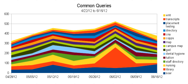
Graph of Common Search QueriesThis graph is called a “Stacked Area Graph”, and it helps us to compare not only queries against each other, but also to see how queries change over time. So, in this chart, it appears that 6/2 was the busiest day on the search engine. In reality, because we’re only looking at the top 15 queries, we’re seeing some skewed data. If you look at all 300 of the queries we’re tracking, 6/2 was actually one of the slowest days.

So what can we learn? For one, we can learn what people are having trouble finding. The most popular search on our search engine has been for “soar”, and that it peaked last week – right before SOAR happened yesterday. This might be a hint that people were having trouble finding SOAR information without searching for it – a good indicator that maybe a more prominent link to SOAR should appear before the event.

We also see a few queries that should be combined. “map” and “campus map” is one example, “staff directory” and “directory” are another. We’re not combining them in our data right now because we want to see what people call things. For example, we can tell that more people are searching for “staff directory” than just “directory”, so it’s probably better to call our future staff directory (yes! this is coming!) a “Staff Directory” instead of just “Directory”.

We can also start to wonder why “library” was such a common query on 6/2, which is right around finals. If there’s often a lot of searches for the Library just before finals, we’d probably want to feature something on the Library on the homepage, to make it easier to find.

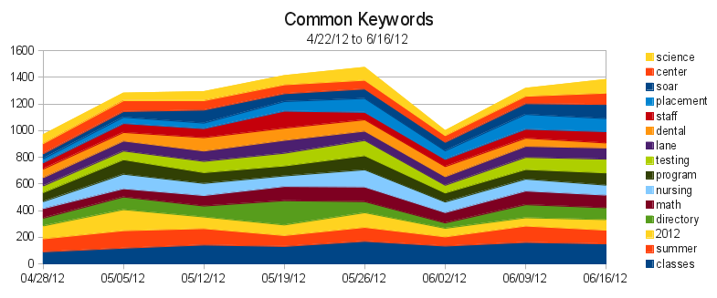
Graph of 15 most common KeywordsKeywords help us in different ways. Here we can see that our most popular keyword, “classes”, is actually used in searches more than any of our actual queries. So we know that many people are searching for classes, using a variety of queries. So we should probably investigate our analytics figure out where people are going after searching for classes. Then we can try to make those pages easier to find.

While there’s certainly improvements to make, most of this data is simply baseline information for after we finish revamping our information architecture. Then, as we implement our new Information Architecture, we should be able to see how that impacts our search traffic, to see if we’re providing a quantitatively better experience.

And to think, there’s thousands of data points inside the mini, and we’ve barely scratched the surface!


Search Tips & Our Mini

As previously mentioned, we’ve been tuning our Google Mini the last few weeks. Hopefully you’re getting a much better search experience. But to make sure you are, starting yesterday, when you do a search on our search server, you’ll find a blue bar at the top. If you do a search on our site and don’t find what you’re looking for, click the link in the blue bar and let us know! I’ll do my best to try to figure out what went wrong.Thanks Jace Smith for the suggestion to make a feedback form in the first place!

The Google mini is also going to provide us with lots of interesting search statistics. While it’s too early to look at them now, it’s not too early to talk about how we’re going to use these statistics to make a better website. Every week we pull a list of the 100 must commonly searched for keywords and phrases. Over time, we’re going to look for trends and try to learn what people can’t easily find on the website. So, if “Bike Lane” keeps showing up, we’ll know that we’re not doing a very good job of making “Bike Lane” easily findable on the homepage, and we’ll try to fix that.

We’ll also be using these statistics to improve the actual results of the search. For example, if we notice that people keep searching for “nuring”, we’ll tell the Google Mini to search for “nursing” instead. Or if a department changes it’s name, and people keep searching for the old name, we can tell the Mini to search the new name and save lots of confusion.

I should also note that although I’m trying to make the mini work as awesome as I can, I can’t control what Google does. So when you search on google.com, that has nothing to do with our search engine, and there’s only so much I can do to improve your results. That leads us to Search Engine Optimization, which is much too big of a topic for this post.

Progress Report

So, it’s been two weeks since my last post. What have we been up to?

First, we set up a new Google Mini, which gives us access to updated software that’s years newer than what we were using for search. We’ve also changed what pages we’re searching. Instead of only searching the Lane Website, we’re now including some of our other websites, including Titan Athletics and the LCC Knowledge Network.

Tuning a search server is pretty tricky, and since ours is indexing over 50,000 webpages, any adjustments we make take some time to see – sometimes hours. But we’re watching the logs, and trying to make it easier to find the things that you search for most.

We’ve also deployed a few more of our websites to Drupal. Here’s a list of all the “chunks” of the site that are now hosted on Drupal:

There’s a ton more “chunks” to do, but we’re making progress. As always, please let us know if you spot something not working! If you’re responsible for your department website, check out the ATC Training Schedule to to find a workshop so you can get trained.