
I promised earlier that there’d be a follow-up post with new and interesting search data from our Google Mini. I’ll do my best to geek-out with as many stats as I can.
Google’s search statistics are given for for two types of data: queries and keywords. A query is the actual search performed on the search engine, for example “Labrador Puppy”. The keywords are (mostly) the words in the query. For my example we’d have two keywords, “Labrador” and “Puppy”. Some keywords, such as “the” or “and” we choose to ignore – no one is seriously searching for “the” on our website and expecting to find something meaningful.
Every Monday we collect data on the 100 most common queries and keywords from the previous week. After two months of collecting data, we’re have 190 keywords and 330 queries in our database. Let’s look at just the top 15 of each:
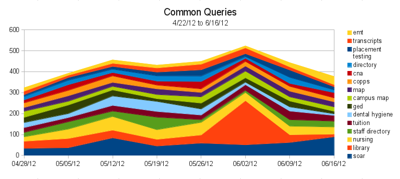 This graph is called a “Stacked Area Graph”, and it helps us to compare not only queries against each other, but also to see how queries change over time. So, in this chart, it appears that 6/2 was the busiest day on the search engine. In reality, because we’re only looking at the top 15 queries, we’re seeing some skewed data. If you look at all 300 of the queries we’re tracking, 6/2 was actually one of the slowest days.
So what can we learn? For one, we can learn what people are having trouble finding. The most popular search on our search engine has been for “soar”, and that it peaked last week – right before SOAR happened yesterday. This might be a hint that people were having trouble finding SOAR information without searching for it – a good indicator that maybe a more prominent link to SOAR should appear before the event.
We also see a few queries that should be combined. “map” and “campus map” is one example, “staff directory” and “directory” are another. We’re not combining them in our data right now because we want to see what people call things. For example, we can tell that more people are searching for “staff directory” than just “directory”, so it’s probably better to call our future staff directory (yes! this is coming!) a “Staff Directory” instead of just “Directory”.
We can also start to wonder why “library” was such a common query on 6/2, which is right around finals. If there’s often a lot of searches for the Library just before finals, we’d probably want to feature something on the Library on the homepage, to make it easier to find.
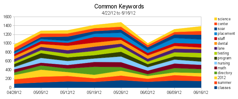 Keywords help us in different ways. Here we can see that our most popular keyword, “classes”, is actually used in searches more than any of our actual queries. So we know that many people are searching for classes, using a variety of queries. So we should probably investigate our analytics figure out where people are going after searching for classes. Then we can try to make those pages easier to find.
While there’s certainly improvements to make, most of this data is simply baseline information for after we finish revamping our information architecture. Then, as we implement our new Information Architecture, we should be able to see how that impacts our search traffic, to see if we’re providing a quantitatively better experience.
And to think, there’s thousands of data points inside the mini, and we’ve barely scratched the surface!
One thought on “Search Statistics”
Comments are closed.