Search Tips & Our Mini

As previously mentioned, we’ve been tuning our Google Mini the last few weeks. Hopefully you’re getting a much better search experience. But to make sure you are, starting yesterday, when you do a search on our search server, you’ll find a blue bar at the top. If you do a search on our site and don’t find what you’re looking for, click the link in the blue bar and let us know! I’ll do my best to try to figure out what went wrong.Thanks Jace Smith for the suggestion to make a feedback form in the first place!

The Google mini is also going to provide us with lots of interesting search statistics. While it’s too early to look at them now, it’s not too early to talk about how we’re going to use these statistics to make a better website. Every week we pull a list of the 100 must commonly searched for keywords and phrases. Over time, we’re going to look for trends and try to learn what people can’t easily find on the website. So, if “Bike Lane” keeps showing up, we’ll know that we’re not doing a very good job of making “Bike Lane” easily findable on the homepage, and we’ll try to fix that.

We’ll also be using these statistics to improve the actual results of the search. For example, if we notice that people keep searching for “nuring”, we’ll tell the Google Mini to search for “nursing” instead. Or if a department changes it’s name, and people keep searching for the old name, we can tell the Mini to search the new name and save lots of confusion.

I should also note that although I’m trying to make the mini work as awesome as I can, I can’t control what Google does. So when you search on google.com, that has nothing to do with our search engine, and there’s only so much I can do to improve your results. That leads us to Search Engine Optimization, which is much too big of a topic for this post.

Progress Report

So, it’s been two weeks since my last post. What have we been up to?

First, we set up a new Google Mini, which gives us access to updated software that’s years newer than what we were using for search. We’ve also changed what pages we’re searching. Instead of only searching the Lane Website, we’re now including some of our other websites, including Titan Athletics and the LCC Knowledge Network.

Tuning a search server is pretty tricky, and since ours is indexing over 50,000 webpages, any adjustments we make take some time to see – sometimes hours. But we’re watching the logs, and trying to make it easier to find the things that you search for most.

We’ve also deployed a few more of our websites to Drupal. Here’s a list of all the “chunks” of the site that are now hosted on Drupal:

There’s a ton more “chunks” to do, but we’re making progress. As always, please let us know if you spot something not working! If you’re responsible for your department website, check out the ATC Training Schedule to to find a workshop so you can get trained.

Lane goes to DrupalCon

Recently, two of us got to go to DrupalCon Denver. There were a lot of other drupalista’s there:

DrupalCon Keynote, Day 1

We saw all sorts of sessions, but the one that stuck with me the most was Luke Wroblewski‘s keynote address on the last day. He gave a talk on the importance of Mobile First Development. You can (and should!) watch the full presentation at the his site, but here’s the thing that hit me hardest.

When you’re developing for mobile devices, you lose 80% of your screen size. That means you need to focus your pages on your core mission. Here’s the example he used, from Southwest’s website:

Southwest's website on the desktopWhereas here’s their exact same website, viewed on a (pretend) iPhone:

Southwest's website, viewed from an iPhoneFlickr does something similar. Here’s their site on the desktop:

Flickr's website, viewed on a Desktop computerAnd once again, here’s their site on a (pretend) iPhone:

Flickr's site viewed from an iPhoneIn each case the mobile website shows only the things you most want to do – buy a ticket, check in, upload photos, and seeing photos taken nearby you, which is hard to do on a regular old computer. The sites are, in many ways, actually providing a better experience than the normal desktop website, and are sometimes even providing capacities that can’t be found on a desktop.

We’re super excited to be committed to a mobile first approach, and are pumped from a week of learning all the latest and greatest things about Drupal. Plus, we learned that next year’s DrupalCon will be in our own backyard (be sure to resize their site and to try scrolling it some to see some awesome css/html5 effects!).

Git and Us

Let’s pretend you’re writing a big paper that’s due at the end of the week. Things are going pretty well, but suddenly you realize that maybe if you rework your argument a little bit and rearrange some text, your argument will be a lot stronger. But you’re not 100% sure it’ll work – there’s a chance you’ll shuffle a bunch of stuff around and it won’t read right, and you’ll regret you ever changed anything at all. What do you do? You make a snapshot of your paper, and save it elsewhere. So you might go to “Save As”, and create “BigPaperBackup” and then try out your changes on “BigPaper”. If things don’t go well, you can always switch back to BigPaperBackup.

But what if your paper also has some images in it, and they’re going to change in your new paper? Suddenly we’ve got to track two different things, so we can’t just rename the file. That’s ok, we can just create a folder, and save a snapshot of the paper and images in there. So now we have a “Paper-Backup” folder, and a “Paper-Working” folder, and we’ll just make all the changes in the Working folder. If things don’t go well, we can always switch back.

But what if our paper is actually a group paper, and there’s a bunch of people working on it? And what if we want to keep regular snapshots of what the paper looked like, so we can go back and see why we made each change? And what if I’m not actually talking about a simple paper, I’m actually talking about the Lane Drupal Migration, with has 8078 different files in it, all of which we need a history for?

The answer is a type of computer program called a Version Control System, and the little story I told up there is just a variant of the well known Git Parable. Git is the version control system we’re using here at Lane, but there’s actually a bunch out there, including Mercurial, which has an awesome tutorial and is a little friendlier for Windows users.

There’s another tool out there called Gource, which lets you take the commit log for your project and turn it into a video showing the changes you’ve made. Although you might not be able to see the effects of each of these changes (many are just fixes for little bugs that crop up in testing), here’s a video showing every change that’s happened over the last seven months:

Responsive Design

Usually I’m all technical, but let’s take a break and just look at some pictures. Here’s one:

Graph of Mobile Visits to Lane's WebpageThere’s two lines in that graph, both of which represent mobile visits to Lane’s Website. Both lines are for the time period December 7th to February 7th, but orange is last year while blue is this year. For those keeping score at home, that’s a 102% increase in traffic. Put another way, last year 1 in every 33 visits was on a cell phone, while this year it’s 1 in every 15. This is a trend we see accelerating.

So we’ve decided to adopt a Mobile First Website strategy. Our new website will be built first and foremost for mobile devices – but it’ll turn on extra things for fancier devices like normal computers and tablets.

There’s an important distinction here. Unlike some websites, which maintain two versions of their site (look for any website with a url like http://m.example.com), we’re only maintaining one site. This makes things a lot easier for us, but it also means that you always know you’re getting the exact same information, regardless of if you’re on a cell, a tablet, or a regular computer. It might just look different.

We’re implementing our Mobile First strategy using a technique called Responsive Design. Using this technique, we first check to see the size your screen using something called a Media Query. If your device doesn’t respond, or can’t respond, we assume that you’re on a mobile phone. This is the Mobile First approach – we first assume you’re on mobile. If your device does respond, we tell it to display things optimized for that device width.

Sorry –  I got technical again. Here’s a picture of what it looks like:

Lane's website appearance at 4 sizesThere’s actually 4 different images there. Which one you get depends on the size screen that you have. If you want to see it in action, get on the computer with the biggest monitor you can find and try resizing your browser window while viewing our contact page.

Don’t Make Me Think!

We’ve reached the Information Architecture stage of our web-project planning, a.k.a. how are we going to organize the new site? The ideal experience for any web user is to simply find what they need when they need it, without having to think. The ideal site is completely intuitive.  Steve Jobs has been quoted as saying the ideal technology does not require a how-to manual.  The aesthetics are such that users can simply figure it out. Given the breadth of the Lane web site this may be out of reach, but it is certainly an ideal worth pursuing.

Ambient Findability

Taking ques from the de-facto experts on web usability and intuitive design (see Peter Morville’s Ambient Findability and Steve Krug’s Don’t Make Me Think), we have begun a series of card-sorting activities with our stakeholders.

Card-sorting is exactly what it sounds like. A small group is provided a stack of 40 – 50 index cards with site names on them (counseling, welding, child care, library, course schedules, etc.) and ask them to organize them into 5 (or less) categories. Minimal direction is given – groups can add new cards – combine cards – organize as they see fit. Then we watch and listen to the discussion… see what they devise and listen to the logic behind it. They have a small window of time to get this done – 20 minutes or so – and then we have an open discussion about the results. A simple exercise that gets folks thinking about taxonomy and information architecture without having to know those terms – without having to read Ambient Findability or Don’t Make Me Think! Useful. Insightful. Simple.

So far, we’ve done card-sorting activities with current students, potential students (high schools), and lane employees. And we are now at the stage of aggregating and comparing the results. We aren’t there yet, but thought it might be worth while to share some of the process (and pics) of this activity.


Upgraded Templates

You may have noticed the new contact page on the Lane website. This is the first page that we’ve moved, or ported, to Drupal (only 11,999 to go!). You’re going to see many more pages start looking like this soon, so let’s spend a few minutes going over some vocabulary, and then talk about what’s different.

First, let’s talk porting. This just means moving from one platform to another. For example, say we made a really awesome video game for one console, perhaps an XBox. The game is finished, it works great, and it’s tons of fun. But we can’t play on any other console, like a Wii or a Playstation. To use another platform, we’d need to modify the game for that other system. Because the content of the game is done, porting takes a lot less time than starting from scratch, but we still need to find all the little differences between the systems. We’re doing something similar. The content of our website is done, we just need to move (port) it from one platform (static HTML pages) to another (Drupal).

The second thing we need to talk about is templates. As we port the content of the website, we’ll be putting it in a big database. When it’s time for Drupal to show you a webpage (like the contact page), Drupal grabs the content of that webpage from a database, inserts it into a template, and returns the dressed up webpage to you. So a template simply says how the page is going to look. This way, look and feel is totally separate from content – we can change either the design or the content without impacting the other one. Of course, the big important question is, “What’s the template going to look like?”

We don’t know yet. There’s lots of people (Faculty, Students, and Community members) involved in the process of figuring that out. But, figuring out what the webpage is going to look like takes more than a couple of days. In fact, it will take until at least summer. So we need a temporary template that we can use with Drupal, so that pages can be ported while we decide how they’re going to look.

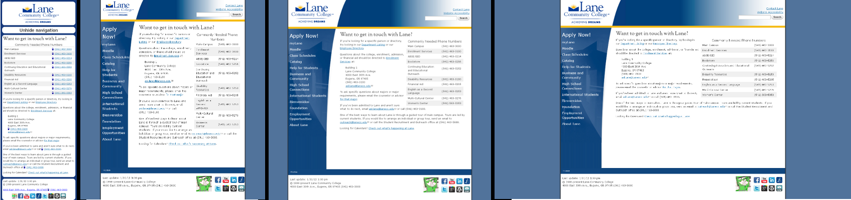
The contact page has the temporary template. It looks a little (ok, a lot) like this:

The new template for the contact page
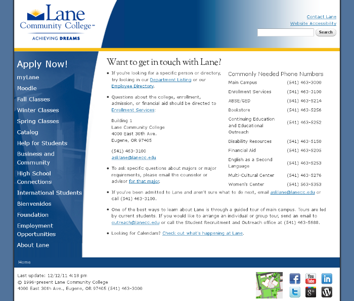
This should look similar to the existing Lane pages, but it incorporates some subtle changes and updates that I couldn’t resist putting in. Here’s a cheat sheet of things to look for:

  • Social Media Links – In the bottom right hand corner of the page you’ll see links to Lane’s presence on various social media platforms (Facebook, Twitter, Google+, etc).
  • Access Keys – On pages using the new template, you can press your web browser’s access keys to jump to different parts of the page. For example, on Firefox on Windows, you can press Alt+Shift+N to jump to the Navigation links on the page, or Alt+Shift+C to jump directly to the content (Check Wikipedia to find your access keys). This improves our Section 508 Compliance (§1194.22 (o), if you want to be all specific).
  • A New URL – pages using the Drupal template will have a URL that starts with www2.lanecc.edu instead of www.lanecc.edu. Sorry about that. This is a necessary requirement while we’re porting content. In the future, all of the pages will be at www.lanecc.edu, though www2 links will work for a long time. If you need to use an url that likely won’t change in the next few years, you can just replace www2 with www, since we’ve done some magic to make those pages jump to www2 automatically.
  • Different URLs – some pages will have exactly the same URL as they had before. Some will be a little different. For example, the old contact page was at http://www.lanecc.edu/sf/info.html the new one is at http://www2.lanecc.edu/contact. For some time, both urls will work. But we’ll eventually be migrating entirely to the new urls, which we hope will be more descriptive of what’s on the page.
  • Automatic Update Times – Each page has an associated update time which will be displayed at the bottom. You can use these to see how old the page content is. We’ll be using them to see which pages are going “stale” so we can try to keep things fresh.
  • Telephone Links – Any phone number is now clickable. If you’re on your cell phone, you’ll see phone numbers underlined, with a little phone next to them. If you click on a telephone number from your cell phone, you’ll be prompted to call that number. If you’re not on your cell phone, you can still click on phone numbers, but they won’t be highlighted or have the phone icon. Clicking on them probably won’t do anything (unless you have a way to make phone calls from your computer).
  • File Type Icons – links to files like Word documents, PowerPoints, and PDFs will have icons next to them representing their file type, making it easier to know what you’re clicking. (This isn’t on the contact page, but be looking for them elsewhere!)

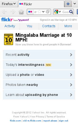
There’s one more exciting benefit to the new template. There’s now a mobile version, using something called Responsive Design. Since I’m over 900 words in this blog post already, I won’t go into detail yet, but for now, try viewing the contact page on your mobile phone, or try opening the page and then shrinking the web browser window on your computer to a much smaller size. Expect another post with more information about our mobile plan soon!