As we prepared to launch the new design, one of the things we were sure to focus on was accessibility. While that’s been covered in previous posts, there’s another area of web accessibility that’s often forgotten that I’d like to highlight here: Color Blindness.
Color Blindness is a complex condition, manifesting one at least ten different ways, and affecting some ten million Americans. Although most color blind individuals are actually color weak – meaning some vision of a color, but trouble distinguishing it from nearby colors – we chose to do our tests on the more severe form, rationalizing that if we can design a website that works for true color blindness, it will also work for weakness.
Here’s some simulations of different areas of our site for different types of color blindness:
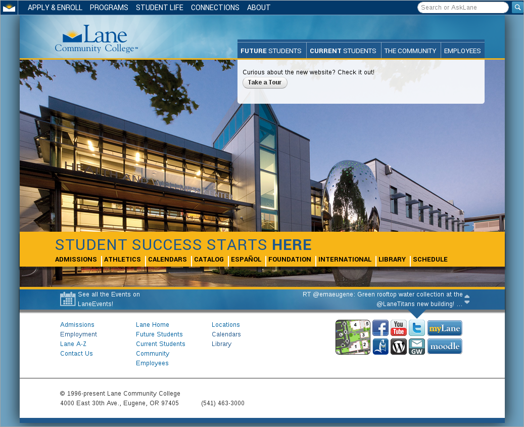
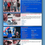
Homepage:


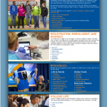
Future Students:


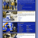
Current Students:

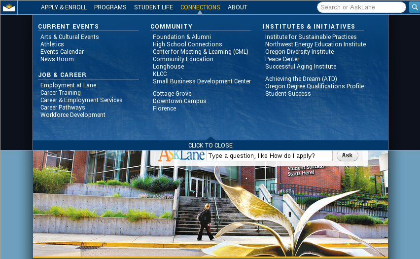
Community:
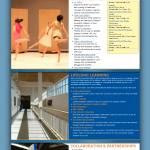
Content Page:


The primary thing to look for in those images is contrast. Do the color choices of our design ever create a situation where a color blind person wouldn’t be able to find some of the text? For example, if the design had adjacent green and orange elements, a person with Protanopia would probably be unable to tell them apart. From what I can see, we’re in pretty good shape. And just to make sure, I double checked with a colorblind coworker.
Another thing to think about with Color Blindness is the use of color to convey important information. For example, say you receive a message on a website, “The email was not sent”. If that message is in red, most of us would assume that it was a bad thing – the email we were trying to send didn’t make it. But if that message was in green, then most of us would assume it was a good thing – the message we desperately didn’t want to send was canceled. For this reason, Drupal includes a checkbox next to “good” messages, and an X next to “bad” messages, so that the intent of the message is always clear, even if the color isn’t apparent.
Although we tried our best to test a few regular content pages (like http://www.lanecc.edu/esfs, or http://www.lanecc.edu/finaid), with over 4000 pages, it isn’t possible for me to hand check every one. For that reason, if you’re a content editor, please try to keep contrast and intent in mind when you’re working on your pages.
I created those images using GIMP, a free software program, using the Color Deficiency Filter (under Views). If you’d like to try seeing your page, there’s a number of color blindness simulators online. I’d recommend http://www.etre.com/tools/colourblindsimulator/