
Recently, two of us got to go to DrupalCon Denver. There were a lot of other drupalista’s there:

We saw all sorts of sessions, but the one that stuck with me the most was Luke Wroblewski‘s keynote address on the last day. He gave a talk on the importance of Mobile First Development. You can (and should!) watch the full presentation at the his site, but here’s the thing that hit me hardest.
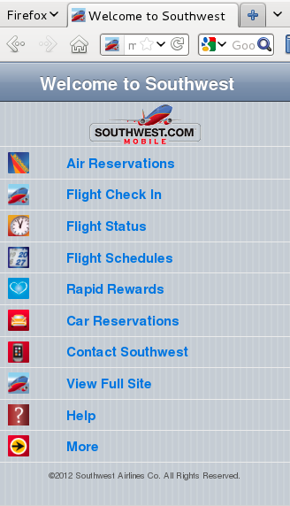
When you’re developing for mobile devices, you lose 80% of your screen size. That means you need to focus your pages on your core mission. Here’s the example he used, from Southwest’s website:
 Whereas here’s their exact same website, viewed on a (pretend) iPhone:
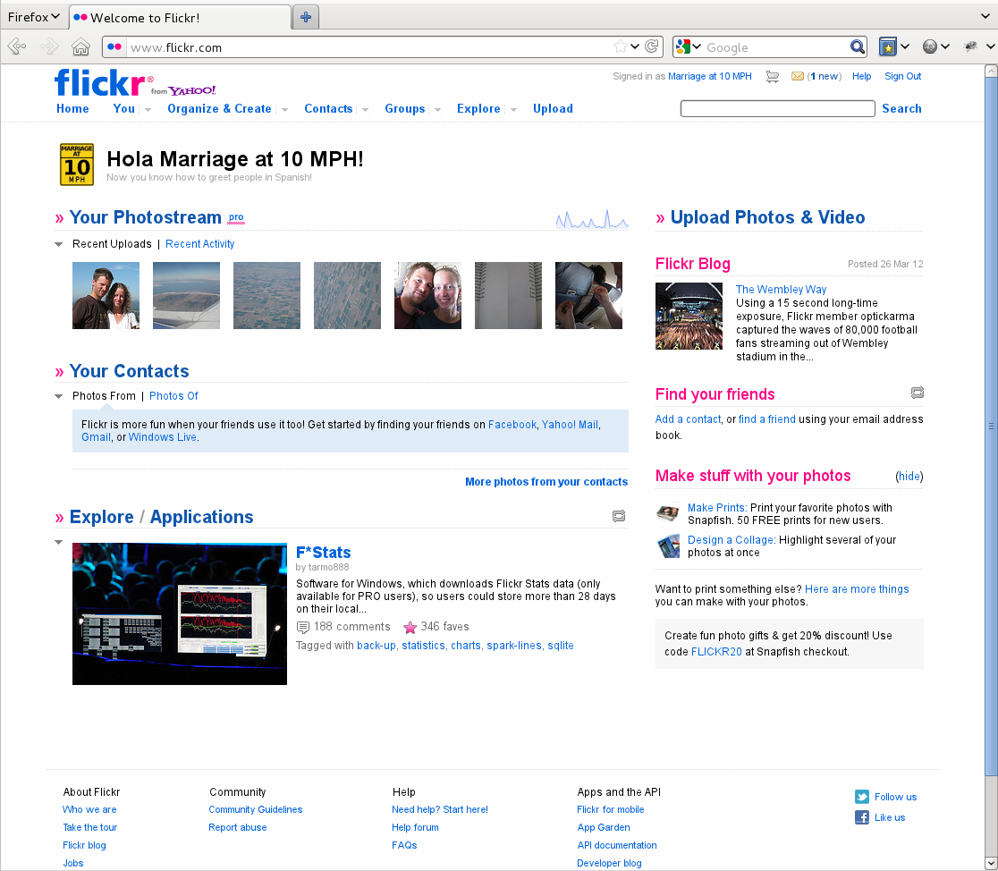
 Flickr does something similar. Here’s their site on the desktop:
 And once again, here’s their site on a (pretend) iPhone:
 In each case the mobile website shows only the things you most want to do – buy a ticket, check in, upload photos, and seeing photos taken nearby you, which is hard to do on a regular old computer. The sites are, in many ways, actually providing a better experience than the normal desktop website, and are sometimes even providing capacities that can’t be found on a desktop.
We’re super excited to be committed to a mobile first approach, and are pumped from a week of learning all the latest and greatest things about Drupal. Plus, we learned that next year’s DrupalCon will be in our own backyard (be sure to resize their site and to try scrolling it some to see some awesome css/html5 effects!).
Thanks for sharing insights like this. I teach web programming here at Lane and this is one insight I’ll start incorporating into the way I teach web programming!