Filehost has been upgraded to OwnCloud 7

Filehost has been upgraded to the latest version of OwnCloud. Here’s a very brief overview of some of the changes:

  • Responsive UI. Now it won’t look so bad when you are browsing the web ui on your phone or tablet.
  • The left nav bar is now a drop down that appears when you click the menu to the right of the OwnCloud cloud icon.
  • There is now a sidebar on the left that makes it much easier to figure out the status of your shared files.
  • To find the webdav link, just click the gear icon in the bottom left corner.
  • There are now limited odt and doc editing capabilities. Very limited. Just select Documents in the nav menu.

I’d also encourage you to check and update your sync clients if there’s an update available.

Mobile Traffic Milestone

Graph of mobile traffic, showing a clear pattern of year over year growth, including one day when 20% of visitors were mobile.
Percentage of visitors each day using a mobile device over the last two years

Last Sunday, for the first time ever, more than 20% of visitors to the website were mobile. And I don’t think the general trend can be missed: we’re up 38% on mobile compared to last year. Just more proof that we can’t ignore mobile when thinking about the web.

Also interesting? I was surprised to find that Saturdays and Sundays are our biggest mobile days. Each of the small spikes on the graph (not the gigantic ones) is a weekend. Anyone have any ideas why?

Responsive Tables

Before I get started, I should warn you, I’m putting my geek cap on for this one.

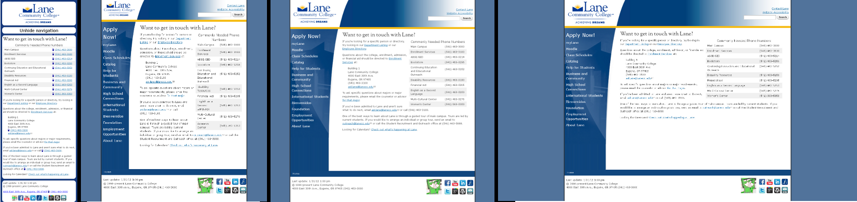
If you’ll recall, the new Lane web design is responsive (if you don’t remember what that means, check out the original post). Unfortunately, there are two parts of our website that dislike being responsive: images and tables.

The problem with images has to do with size. If you’re on a cell phone, you have very limited screen space. So you don’t want to download big huge images, only to have your cell phone shrink them down. That wastes both bandwidth and processing time on your phone. In other words, it’s a slow page. But despite that problem, at least the page still works and looks right.

Tables are a different story. Here’s an example of a non-responsive table:

Program Entry/Application Application  Deadline Prerequisites Schedule/Location Contact Person
Bridge to C.N.A. Application tk Bridge Prerequisites TBA / LCC Juanita Kirkham
C.N.A. I  Application tk C.N.A. I Prerequisites TBA Juanita Kirkham
Healthcare Professions Orientation Call (541) 463-5223
to reserve your space
Open until filled TBA /LCC WorkSource Lane at LCC Staff
Fundamentals of Microsoft Word 2010 for the Workplace Call (541) 463-5223 to be placed on waiting list Open until filled Typing Speed: 15 words per min. Ongoing two 5 week sessions a term/LCC WorkSource Lane at LCC Staff
Fundamentals of Microsoft Excel 2010 for the Workplace Call (541) 463-5223 to be placed on waiting list Open until filled  Typing Speed: 15 words per min. Ongoing two 5 week sessions a term/LCC WorkSource Lane at LCC Staff
Basic Computer for the Workplace Call (541) 463-5223
to reserve your space
Open until filled  – Ongoing-3 weeks/LCC WorkSource Lane at LCC Staff

Look ok? Try making your screen narrower or viewing this post on a cell phone. Your web browser recognizes that this is tabular data, and that it doesn’t make much sense if you can’t see the entire row. But your web browser also runs into a hard limit – the width of your screen. As your screen shrinks, the web browser will continue trying to reflow the text – meaning re-lay it out – in the table. But eventually, either the table needs fewer columns or the browser needs to break words apart to get things to fit. Neither answer works. So it just draws some of the table off the right edge.

This can be real problem on a mobile phone. In a best case, it’s just kind of ugly, and you can scroll the page with your finger to see off the right edge. In the worst case, the phone won’t let you scroll (or you’re on an older device where you can’t scroll), and you can’t see the right side of the table at all.

There’s been a series of excellent write ups on different ways to approach this problem, so I won’t rehash them all here. We considered two – flip scroll and “no-more-tables“.

First, we tried Flip Scroll. It’s an almost ideal method – it preserves the visual layout of the table, without adding much additional content. But we found that it didn’t render correctly in earlier (1.x and 2.x) Android devices, which represent the majority of our Android users. There were also some concerns with accessibility, since it makes it harder to tell how rows flow together. So we moved on to “No-More-Tables”. This method does change the visual appearance on mobile, but it was supported on the dozen devices I tested.

To see these tables in action, take a look at any page on the Lane webpage that has a large table on it, such as the the Workforce Development Short Term Trainings page. Because we’re rendering tables responsively on the client side, nothing needs to change for our content editors – they just keep on making tables like normal. The only exception to this rule is if there’s a table where the data series are in rows rather than columns. If that sounds like a problem you might have, see the table documentation on the internal Drupal Help Site.

If you’re interested in knowing more about Drupal and/or responsive tables, let me know in the comments, and I can publicize the mini modules we made to try each of these techniques.

EDIT (7/31/12) – One of these modules is available on Github

Lane goes to DrupalCon

Recently, two of us got to go to DrupalCon Denver. There were a lot of other drupalista’s there:

DrupalCon Keynote, Day 1

We saw all sorts of sessions, but the one that stuck with me the most was Luke Wroblewski‘s keynote address on the last day. He gave a talk on the importance of Mobile First Development. You can (and should!) watch the full presentation at the his site, but here’s the thing that hit me hardest.

When you’re developing for mobile devices, you lose 80% of your screen size. That means you need to focus your pages on your core mission. Here’s the example he used, from Southwest’s website:

Southwest's website on the desktopWhereas here’s their exact same website, viewed on a (pretend) iPhone:

Southwest's website, viewed from an iPhoneFlickr does something similar. Here’s their site on the desktop:

Flickr's website, viewed on a Desktop computerAnd once again, here’s their site on a (pretend) iPhone:

Flickr's site viewed from an iPhoneIn each case the mobile website shows only the things you most want to do – buy a ticket, check in, upload photos, and seeing photos taken nearby you, which is hard to do on a regular old computer. The sites are, in many ways, actually providing a better experience than the normal desktop website, and are sometimes even providing capacities that can’t be found on a desktop.

We’re super excited to be committed to a mobile first approach, and are pumped from a week of learning all the latest and greatest things about Drupal. Plus, we learned that next year’s DrupalCon will be in our own backyard (be sure to resize their site and to try scrolling it some to see some awesome css/html5 effects!).

Responsive Design

Usually I’m all technical, but let’s take a break and just look at some pictures. Here’s one:

Graph of Mobile Visits to Lane's WebpageThere’s two lines in that graph, both of which represent mobile visits to Lane’s Website. Both lines are for the time period December 7th to February 7th, but orange is last year while blue is this year. For those keeping score at home, that’s a 102% increase in traffic. Put another way, last year 1 in every 33 visits was on a cell phone, while this year it’s 1 in every 15. This is a trend we see accelerating.

So we’ve decided to adopt a Mobile First Website strategy. Our new website will be built first and foremost for mobile devices – but it’ll turn on extra things for fancier devices like normal computers and tablets.

There’s an important distinction here. Unlike some websites, which maintain two versions of their site (look for any website with a url like http://m.example.com), we’re only maintaining one site. This makes things a lot easier for us, but it also means that you always know you’re getting the exact same information, regardless of if you’re on a cell, a tablet, or a regular computer. It might just look different.

We’re implementing our Mobile First strategy using a technique called Responsive Design. Using this technique, we first check to see the size your screen using something called a Media Query. If your device doesn’t respond, or can’t respond, we assume that you’re on a mobile phone. This is the Mobile First approach – we first assume you’re on mobile. If your device does respond, we tell it to display things optimized for that device width.

Sorry –  I got technical again. Here’s a picture of what it looks like:

Lane's website appearance at 4 sizesThere’s actually 4 different images there. Which one you get depends on the size screen that you have. If you want to see it in action, get on the computer with the biggest monitor you can find and try resizing your browser window while viewing our contact page.