
Usually I’m all technical, but let’s take a break and just look at some pictures. Here’s one:
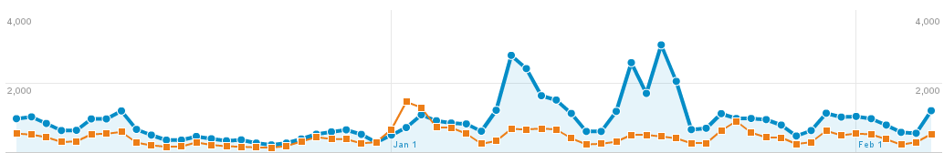 There’s two lines in that graph, both of which represent mobile visits to Lane’s Website. Both lines are for the time period December 7th to February 7th, but orange is last year while blue is this year. For those keeping score at home, that’s a 102% increase in traffic. Put another way, last year 1 in every 33 visits was on a cell phone, while this year it’s 1 in every 15. This is a trend we see accelerating.
So we’ve decided to adopt a Mobile First Website strategy. Our new website will be built first and foremost for mobile devices – but it’ll turn on extra things for fancier devices like normal computers and tablets.
There’s an important distinction here. Unlike some websites, which maintain two versions of their site (look for any website with a url like http://m.example.com), we’re only maintaining one site. This makes things a lot easier for us, but it also means that you always know you’re getting the exact same information, regardless of if you’re on a cell, a tablet, or a regular computer. It might just look different.
We’re implementing our Mobile First strategy using a technique called Responsive Design. Using this technique, we first check to see the size your screen using something called a Media Query. If your device doesn’t respond, or can’t respond, we assume that you’re on a mobile phone. This is the Mobile First approach – we first assume you’re on mobile. If your device does respond, we tell it to display things optimized for that device width.
Sorry – I got technical again. Here’s a picture of what it looks like:
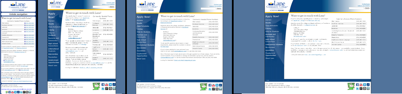 There’s actually 4 different images there. Which one you get depends on the size screen that you have. If you want to see it in action, get on the computer with the biggest monitor you can find and try resizing your browser window while viewing our contact page.