
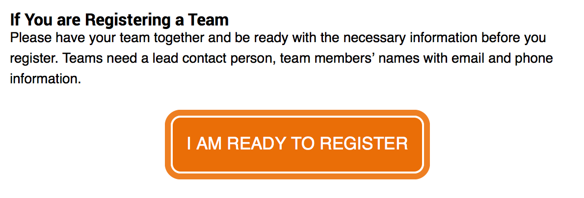
This weekend, while rolling out some minor module updates, we also added a way to convert a link from this:
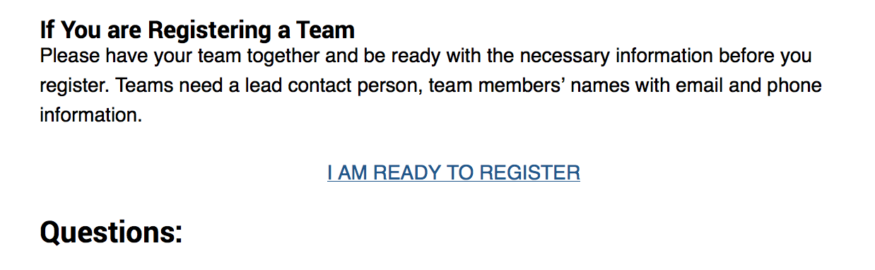
to this:
If you’re not a fan of orange, you can also use the blue version:
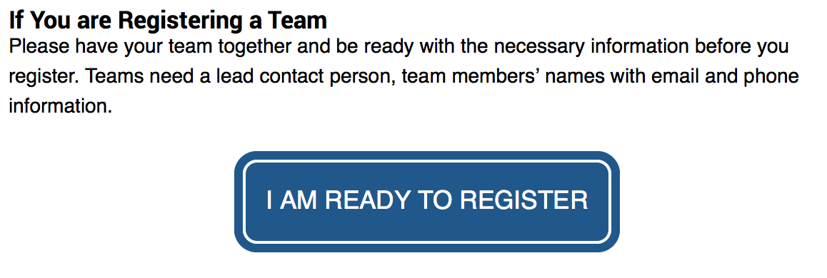
These big, hard to miss buttons are the page’s Call To Action (CTA). When you’re working on a page, you should be thinking about what the CTA for each of your pages is. What do you want the visitor to do on that page? Is your page purely informational (example: financial aid disbursement schedule)? Or are you trying to get them to take some sort of action (example: register for the Convening the State event)? If your page falls into the latter, you may want to consider the above CTA buttons.
To use them, you’ll need to add two classes to your link. For orange, you’d add cta and cta-orange, for blue you’d add cta and cta-blue. Don’t know what that means? Don’t worry about it! Just give Lori a call and she’ll walk you through it. Super easy.
One more thing: your page should only have one CTA. If there’s absolutely, positively, no way at all in the world you can have just one CTA, you can maybe add a second. If you have a bunch of CTA’s, you’re not helping people find what they need, you’re splitting their attention and making it unclear what they should do. And wherever possible, we should be trying to make it clear what we want people do on our pages – remember, people skim more than they read.