Need a review? Check out parts one, two, or three first.
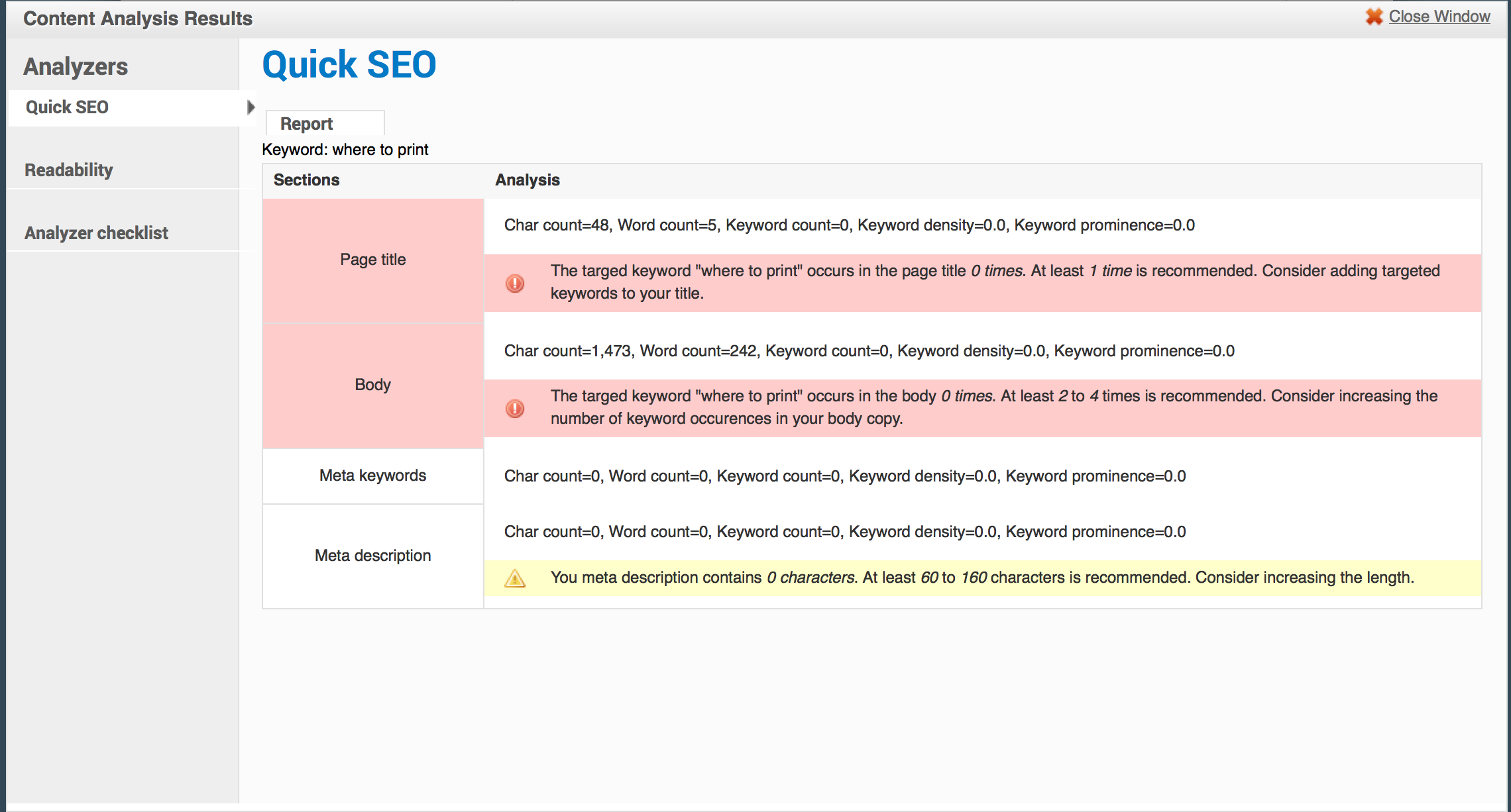
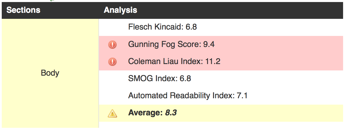
While we’ve made some big improvements, our page still sounds institutional and still has some pretty complex sentences in it. Let’s start in HemingwayApp (here’s the text, if you’d like to follow along) and check out our list of things to be concerned about:
- 6 hard to read sentences
- 2 very hard to read sentences
- 5 uses of passive voice
Let’s do the very hard to read sentences first, since they’re our biggest problem. Here’s the first:
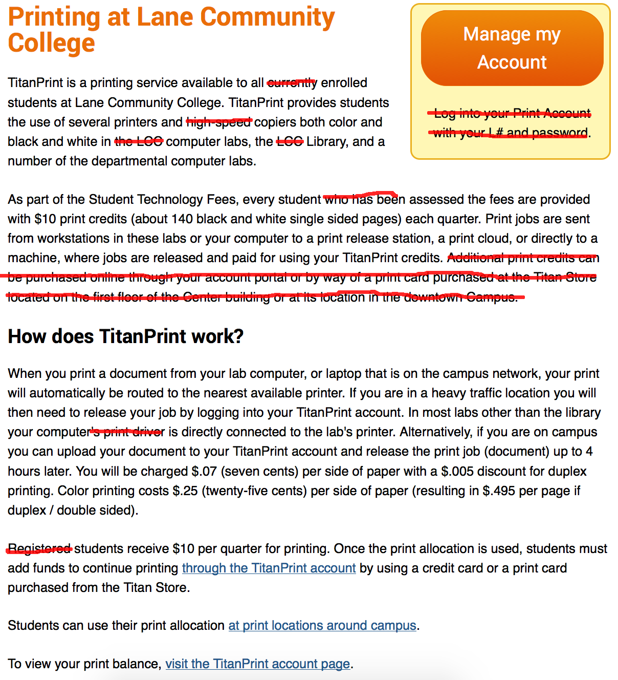
Print jobs are sent from workstations in these labs or your computer to a print release station, a print cloud, or directly to a machine, where jobs are released and paid for using your TitanPrint credits.
Usually when HemingwayApp finds something complex it’s because of the number of ideas expressed. Let’s break this sentence up:
Print jobs are sent from workstations in these labs or your computer to a print release station, a print cloud, or directly to a machine. Jobs are then released and paid for using your TitanPrint credits.
Fixed! On to the next one:
Once your print allocation is used, you must add funds to your TitanPrint account to continue printing by using a credit card or a print card purchased from the Titan Store.
Again, we see there’s two distinct ideas here. The first is that once your credits are gone you’ll need to add more to continue printing. The second is that you can add credits either online or at the TitanStore. So let’s split this sentence as well:
Once your print allocation is used, you must add funds to your TitanPrint account to continue printing. Funds can be added with a credit card or a print card purchased from the Titan Store.
No more very hard sentences, and we’re down to grade 8! Let’s tackle some of the merely hard sentences:
When you print a document from your lab computer, or laptop on the campus network, your print is routed to the nearest available printer.
can be simplified to:
When you print a document, your print is routed to the nearest available printer.
We lose a little bit of information here, because we’re not explicitly saying a computer must be on the network, but many students won’t understand what that means anyway, and the idea that printing needs to be done from campus is implied.
If you are in a heavy traffic location you will then need to release your job by logging into your TitanPrint account.
can be simplified to:
If printers are busy, you may need to release your job by logging into your TitanPrint account.
And this:
Color printing costs $.25 (twenty-five cents) per side of paper (resulting in $.495 per page if duplex / double sided).
can be simplified to:
Color printing costs $.25 per page ($.495 if double sided).
To make sure the decimal point is seen, we should write $0.25 and $0.495. So let’s fix that too. This next sentence:
Once your print allocation is used, you must add funds to your TitanPrint account to continue printing.
can be simplified to:
If you run out of credits, you must add funds to your TitanPrint account to continue printing.
Together, that gets us down to a 7th grade reading level – pretty close to our target. Let’s take a look at passive voice sentences (note that the above fixes fixed one of those for us too). If you’re not familiar with passive voice, here’s two sentences:
- “I’m going to throw the ball across the room.”
- “The ball is going to be thrown across the room.”
The second is clearly a much weaker sentence, but it’s the type of detached writing that’s often seen in academic journals. We want to avoid it wherever we can, because it’s boring to read.
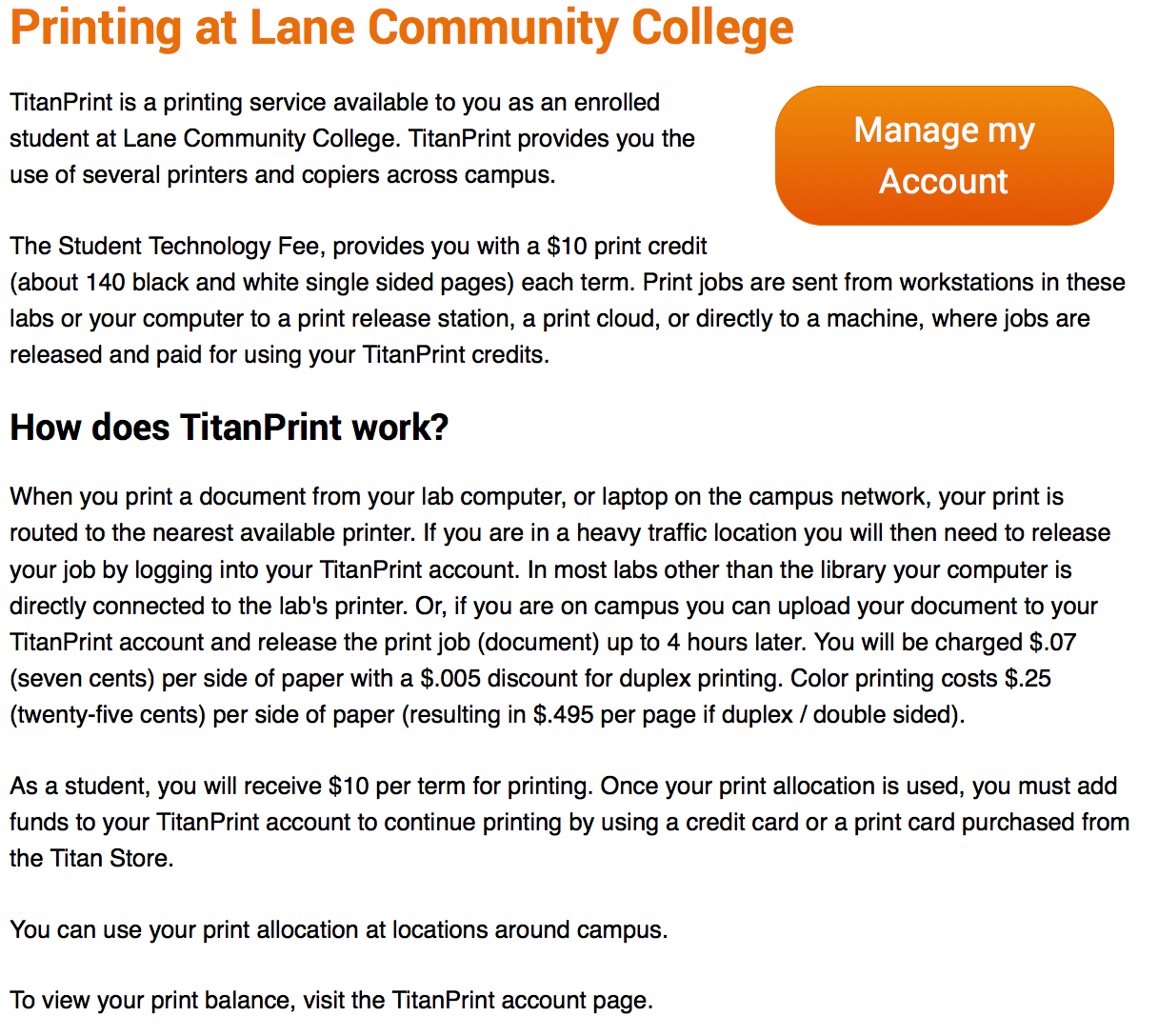
The easiest to fix is “Funds can be added…”. Let’s have the reader perform the action, and instead say “You can add funds…”
Although that technically gets us under the suggested limit for passive voice use, let’s fix one more thing:
You will be charged $.07 (seven cents) per side of paper with a $.005 discount for duplex printing. Color printing costs $.25 per page ($.495 if double sided).
The troublesome part is “will be”, but we can do more than just fix passive voice here. Let’s make those two sentences work together a little better:
Each black and white page costs $0.07 per page, while color printing costs $0.25 per page. Double sided (duplex) pages receive a half cent discount per page.
While we’ve made some big improvements, our page still sounds a little institutional. So let’s look at the tone, using a Tone Analyzer. Go ahead and paste our text directly into the box and click Analyze.
Right now our text is 73% social and 26% writing tone. Writing tone is a little more formal. In our case, the words that are causing the Writing tone are Tentative and Analytical – not necessarily good things. Where possible, we should strive for text that’s friendly, almost conversational, but authoritative. That sort of tone is my goal in these posts – we’re having a conversation, but I’m trying to sound like I know what I’m talking about.
The bottom half of the tone analyzer has some suggestions on how you can adjust your text. You can try clicking on some of the words to see suggestions. I didn’t find the suggested words very helpful here, but it did make clear that the reason we sound tentative is because we keep having these hesitant sentences – things like “if” and “or” that make it seem like we’re never confident in what we write.
Unfortunately, there isn’t much we can do about that, due to the nature of what we’re writing about. But we can make our page sound a little more conversational by adding contractions. Just a simple change like “you are” to “you’re” helps make the text seem less academic. Don’t over do it, of course – the first time I catch a “y’all” in one of our pages, I’ll be less than happy to say the least – but try to write how you talk.
After all those changes, I ran through the text one more time, finding more ways to reduce the length of our content. That includes restructuring the first two paragraphs, so that the first one introduces TitanPrint, while the second one provides a high level overview of how it works. And now that our sentences are simpler, it’s easy to remove the last pair of adverbs. Here’s our final result:
And, of course, our final text.
To summarize:
- Split complex sentences up. It will say the same thing, but be easier to read.
- To keep your sentences interesting, avoid using the passive voice
If you’re really passionate about language, you’re probably tempted to keep going, and keep rewriting. Believe me, I understand. This page is at least two grade levels higher than I’d like. There’s another dozen changes to make. But there’s a lot of other pages to work on, and writing on the web is all about maximizing the use of our time.
Next time, in the last post of this series, we’ll talk a little bit about writing for Search Engine Optimization and take a quick preview of some of the tools we’ll be introducing soon to help you write better right within Drupal.