Web Team goals for 17-18

It’s the end of the academic year, which means it’s time to start thinking about goals for next year. Our first set of goals will be similar to our goals from last year:

  1. Reduce the total number of pages on the Lane website by 5% (from 5550 to 5273)
  2. Reduce the number of pages with more than 15,000 characters by 10% (from 249 to 224)
  3. Reduce the average character count of our pages by 10% (from 4650 to 4185)
  4. Improve the average age of our pages (the average late updated date) by 4 months (from 16 months to 12 months)

We’re also going to add two goals relate to page use:

  1. Increase session counts for www.lanecc.edu during the period 6/14/17-6/14/18 compared to the previous year by 5%, from 3,228,904 to 3,390,349
  2. Decrease the bounce rate for www.lanecc.edu during the period 6/14/17-6/14/18 compared to the previous year by 5%, from 37.05% to 35.19%

We’ve never had page use goals like that, so this will be interesting for us as we really dig into how to increase engagement and findability of our pages.

If you’d like to help us meet our goals, just edit your pages! We’ve made a lot of progress in making our pages more recent – many pages used to be over two years old! We’re happy to help. Just email Lori and she’ll get you pointed in the right direction.

Using all Capital Letters

An instructor asked me the other day, “How does a screen reader read text in ALL CAPITAL LETTERS?”

I didn’t know, and through it was a great question, and had to figure it out. Let’s start with some sample text:

It’s VERY important you remember these:

  • USPS
  • NASA
  • DVD

There’s four words in all caps there. Let’s look at each one, from the bottom to the top:

DVD is an initialism, meaning you read each letter in it, like CPU or FBI. NASA is an acronym, meaning you read it as a word, even though each letter stands for a word. USPS is another initialism. But VERY is just a word, with all capital letters being used for emphasis.

Of course, it’s wrong to use capital letters in this way – you should instead be using an em or strong tag (though which one is complex, and I didn’t find the examples in the specification very helpful). But the instructor’s question wasn’t about what should happen, it was about what does happen. How can a screen reader know which of those words it should treat as words or acronyms (which are like words, in terms of pronunciation), and which it should treat as initialism (and read letters instead of the word)?

I ran each of the examples through the say program on my Mac, and here’s what I got (sentence case was pronounced like lowercase):

Word Uppercase Lowercase
Very word word
USPS letters word
NASA word word
DVD letters letters

There’s some interesting logic there. I think this table shows my Mac will always read dictionary words as words (like “very”). And I think it shows that my Mac also has a list of known acronyms and initialisms, so it knows how to read those. For words that aren’t in either list, but also aren’t in the dictionary (like USPS), it reads all capital letters as initialisms, but lowercase as a word (a reasonable assumption, since most of the time it encounters words that aren’t in the dictionary, it’s probably due to the lang attribute not being set correctly.

Of course, this is just say on my Mac, which isn’t even a screen reader. WebAIM has some general rules for how screen readers read things, but it isn’t really predictable how a screen reader is going to pronounce words in all capitals. Pronouncing typographic symbols is hit or miss as well — some, like @ and % are read correctly. But most others (like the parenthesis, or the mdash in the previous sentence) aren’t read universally. Rare punctuation, like the interrobang (‽) may not be read at all.

I was hoping that abbr would influence how screen readers pronounce words, but that doesn’t appear to be the case (and, if you’ve been around HTML for a while, remember you’re not supposed to use acronym at all — though it probably wouldn’t do anything here anyway).

What does this mean for you at Lane?

Use the abbr tag to specify acronyms and initialisms if possible. Even though screen readers won’t necessarily change how they handle pronunciation, abbr with a title attribute makes it easier for anyone to understand meaning. Try hovering over this: NASA.

If you want to use capital letters for emphasis: don’t. Instead, use either an em or a strong tag, depending on if you’re trying to emphasize something or make it note that it’s more important than surrounding text. And, of course, never use strong in place of a header.

If you want to use capital letter for aesthetic reasons, then you should use a bit of CSS to make it happen:

.all-caps {
  text-transform: uppercase;
}

Screen readers ignore CSS, so this use is entirely for presentation. Just make sure you don’t confuse presentation with meaning.

I ran a quick search on our website for pages that have a lot of capital letters all in a row:

SELECT entity_id
FROM   field_data_body
WHERE  body_value REGEXP BINARY '[A-Z ]{10}';

There were 748 results. Editing 748 pages obviously won’t happen overnight, and on each one we’ll need to determine if we should instead be using a header, a strong, an em, or just normal text. For now, I’ve queued a task for us to tackle in the future, but if you’re editing your page and notice some misuse of capital letters, we’d be forever appreciative if you’d fix it.

Closing out the year for the Web Team

If you’ll recall from our original goals post, or the update that followed, we had a few goals on the web team the last two months of the year:

  1. Reduce the total number of pages on the Lane website by 5% (from 5768 to 5475).
  2. Reduce the number of pages with more than 20,000 characters by 20% (from 193 to 155)
  3. Reduce the average character count of our pages by 10.5%, from 4803 to 4300.
  4. improve the average age of our pages by 6 months, from roughly 24 months old to 18 months old.

I’m very sorry to report that while we made a lot of progress, we were unable to meet any of our four goals. Here’s the graphs:

Node Count Graph, showing progress from 5768 to 5557We were able to make some progress eliminating nodes even in December, but things slowed down. Part of that is because with so many people on vacation around the holidays, it’s difficult to get permission to delete a page. We’d been shooting for a 5% reduction, but we were only able to get 3.5%.

Graph of nodes wiht more than 20k characters, showing progress from193 to 172As mentioned in the previous goals post, it turns out that many of these really long nodes are pages that are really hard to reduce, like board meeting minutes or transcripts of in-service addresses. I reviewed almost every page and removed a lot of really bad markup: things that we should have removed when initially porting pages to Drupal, boldfaced text that should have been headers, HR tags used improperly, and so very, very many   characters. We’ll tackle some of those in a future post.

We’d been looking to make a 20% improvement, but we only managed 10.8%.

Graph of average length of our pages, showing no progress in the last month.Average length was really depressing for me, especially as I’d update statistics after working on these goals for a few hours. I might spend two hours meticulously working my way through the list of really long nodes, since they’d help us meet this goal the most. And I might see a visible improvement on the body length graph. But then I’d work on eliminating some nodes, and inevitably those nodes would be really short, meaning our average body length would go right back up.

Still, we made some gains early on, and the site as a whole is improved. We’d been shooting for a 10.5% reduction, but we only made a depressing 2% improvement – about 100 characters.

Average Age, showing steady progress along our trend lineWe probably made the most progress on this goal, but our failure to make progress early in November really hurt us. Over the two months we tried to meet our goals, pages got about four months newer.

We tried to meet this goal primarily by updating our oldest pages.

Count of pages at least four years old, showing progress from 732 to 513We substantially reduced our really old pages. And while it’s great we made that progress, since we hate ROT, it just wasn’t enough for us to meet our goal.

We still have lots of tasks queued up in Basecamp for us to do related to content, that we just didn’t have time to get to as part of this challenge including reworking some tables that are used improperly, removing even more HR’s, fixing some pages that are using redundant text blocks, eliminating duplicated pages, adding headers, removing improper use of the • character (people use it for bullets, but they should be using the bullet tool), and figuring out what to do with pages where people wrote “check back for content soon” several years ago. So we expect to make more progress in the coming months.

A special things to everyone who helped out with our goals. Here are the ten champions of the last two months, who made the most edits on the site, helping us toward our goals:

Name Number of Revisions
Lori Brenden 545
Kyle Schmidt 179
Amy G 132
Emily M 91
Tammy S 58
Elizabeth P 41
Melanie B 39
Joan A 31
Wendy S 30
Penny M 27

Happy New Year everyone!

Understanding WCAG 2.0: 2.4.3 – Focus Order

The next standard we’ll explore in our series on understanding WCAG 2.0 is 2.4.3, Focus Order. This standard is required for WCAG level A compliance, which is part of what Section 508 requires. Here’s the complete text:

2.4.3 Focus Order: If a Web page can be navigated sequentially and the navigation sequences affect meaning or operation, focusable components receive focus in an order that preserves meaning and operability. (Level A)

Any part of a program or web page that can receive input from the user can have focus. Let’s take a look at a webform, so we have a something to reference:

Sample Form


This is an interactive webform, so you can click in either of the input boxes. Go ahead, try it right now. I’ll wait.

There’s four elements on that page that could receive focus, but only three that can. I’ve marked the submit button as disabled, so you can’t click it. That element can’t have focus, so you can’t submit the form.

There’s a couple ways to navigate that form. If you’re sighted, you might use the mouse to first click in the first box, and then again to click in the second box. But if you can’t see the screen, it’s hard to use a mouse. Instead, you’d probably use the tab key to move between elements.

The sequence focus follows when tabbing is called the tab order, and is set using the tabindex attribute on html elements. I didn’t set the tab index on any of those elements, so the browser automatically fills in the tab order for us, using the structure of the HTML – in this case, from top to bottom. But take a look at this form:

Bad Sample Form


Doesn’t that feel a little… evil?

For the purposes of editing our web pages, that’s really all there is to this standard. Make sure that the order you move from input to input on your pages makes sense. And if it doesn’t, use the tabindex attribute to fix it.

If you’re doing web development, there’s a little more to consider. Using CSS, it’s possible to position elements in a different order visually than the way they’re written in code. That isn’t necessarily against the rules, but you need to make sure the tab order still works (in addition to the concerns in 1.3.2). Also be alert to things like modal dialogs, or popovers which can visually steal focus from the webpage, but which may not trap the tab key, and may mean someone with low vision can only see the modal, but can still tab outside of it.

If you’d like to read more about focus order, you may also be interested in these techniques, which provides examples and more detail.

And if you’ve never watched a blind person use a computer, you really should. That video is part of a great, funny collection of videos on what it’s like to live without sight.

Interested in more? Check out the listing of all the posts in this series.

Web Goals check-in

As promised in our initial goals post, a month as passed and now it’s time to check-in and see where we are on meeting our goals. As a review, those goals were:

  1. Reduce the total number of pages on the Lane website by 5% (from 5768 to 5475).
  2. Reduce the number of pages with more than 20,000 characters by 20% (from 193 to 155)
  3. Reduce the average character count of our pages by 10.5%, from 4803 to 4300.
  4. improve the average age of our pages by 6 months, from roughly 24 months old to 18 months old.

Let’s take a look in order, along with some graphs. On each of these graphs, the straight line is the trend line – in order to keep on track for our goal, we need that line to be below the trend line.

Reduce the total number of pages on the Lane website by 5% (from 5768 to 5475)

Clearly, we’re running behind – the count as of today is 5737, about 110 more than we’d hope to have. It turns out that removing pages is really hard. While we’ve removed some things to our archive, we’re fighting an uphill battle as things like news releases and meeting minutes get added.

Reduce the number of pages with more than 20,000 characters by 20% (from 193 to 155)

We’re making progress on this one, but again, it turns out to be really hard. We have 185 nodes with more than 20,000 characters, but we were looking to only have 174 this week. Many of the pages that are really long are actually Board Minutes, which we don’t delete and can’t shorten. Right now we’re optimistic we’ll still find enough pages to fix, but this will be hard.

Reduce the average character count of our pages by 10.5%, from 4803 to 4300.

Although we’ve managed to improve from 4803 characters to 4706, we’re still 150 characters over where we wanted to be. Again, it turns out the board minutes are in large part to blame. But we’re still optimistic.

Improve the average age of our pages by 6 months, from roughly 24 months old to 18 months old.

We came closest on this one. At the start of last month, our average page had last been edited on 11/12/14. Now, that date is 2/3/15 – almost three months newer. That’s a lot of page edits. But we’re still two weeks behind our goal for today, which was 2/21/15.

When tackling this goal, we had a separate subgoal to reduce the number of pages we have that have gone more than four years without an edit. Lori’s done a lot of work on this list, reducing the number of pages on it from 732 to 612, which makes a pretty impressive graph:

Surprisingly, despite all that effort on our very oldest nodes, it wasn’t enough. But we have a month to go, so there’s still some time. We’ll check in again on January 1st!


Understanding WCAG 2.0: 2.4.1 – Bypass Blocks

The next standard we’ll explore in our series on understanding WCAG 2.0 is 2.4.1, Bypass Blocks. This standard is required for WCAG level A compliance, which is part of what Section 508 requires. For the first time in this series, we’re exploring a standard that’s substantially equivalent to existing 508 standards (1194.22(o)). Here’s the complete text:

2.4.1 Bypass Blocks: A mechanism is available to bypass blocks of content that are repeated on multiple Web pages. (Level A)

The existing 508 standard is a little more specific, simply requiring a mechanism to bypass “repetitive navigation links”.

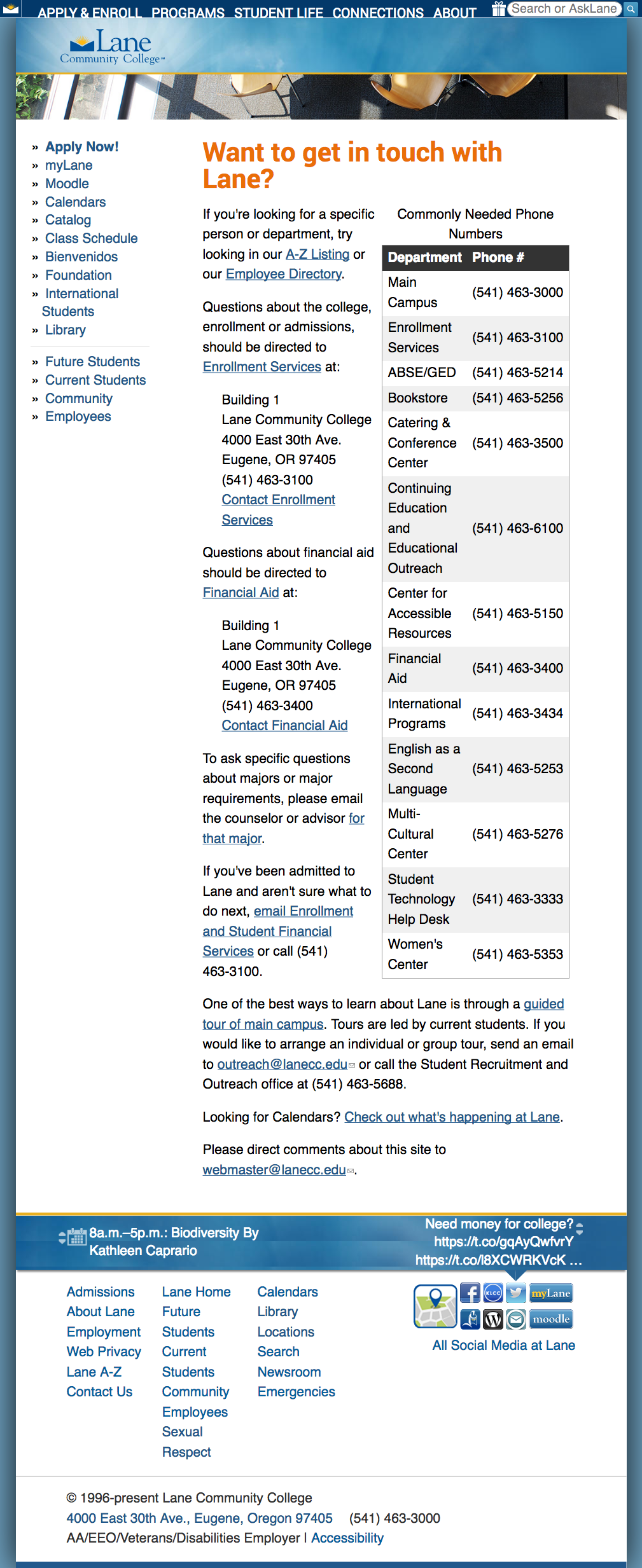
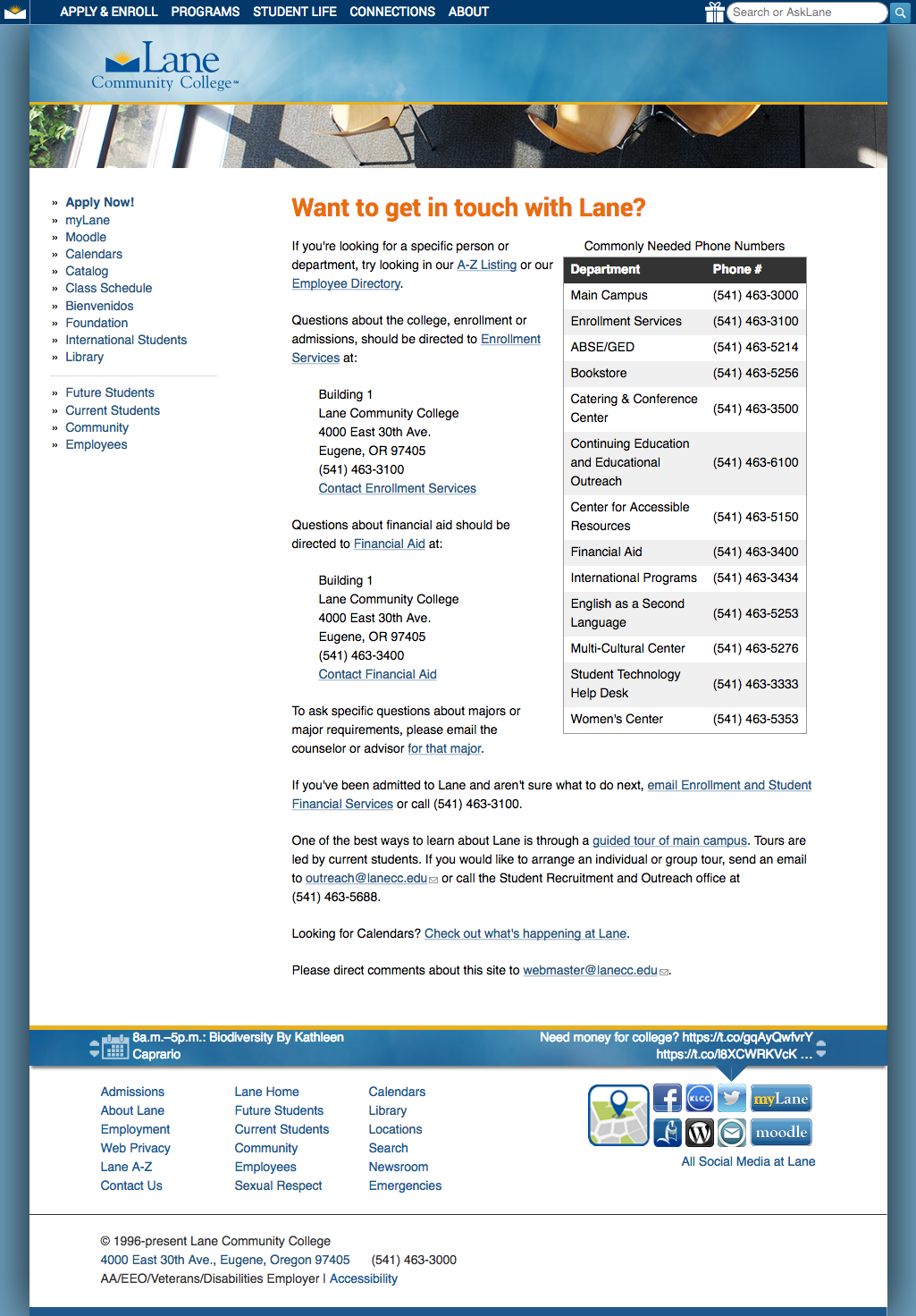
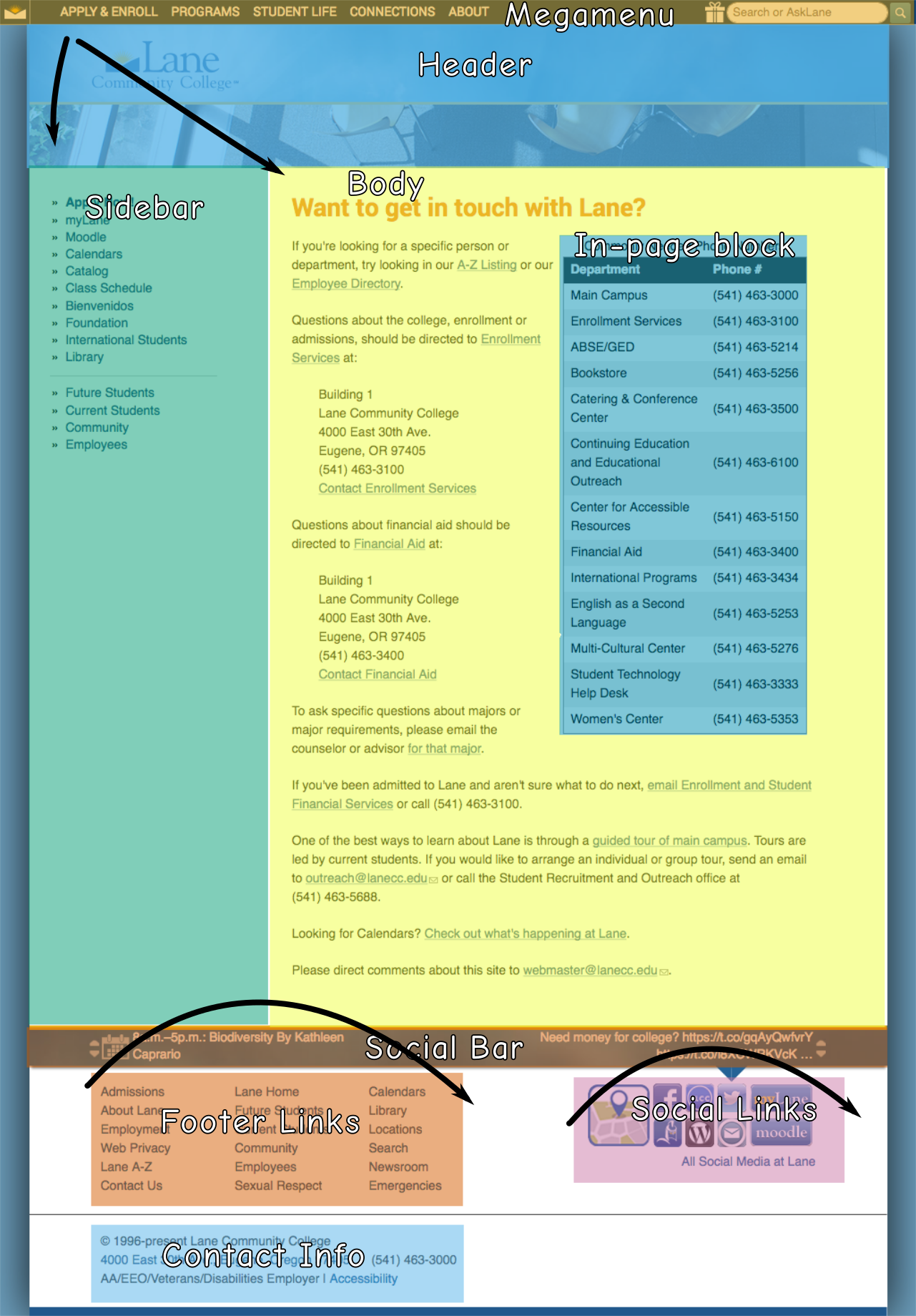
Let’s look at a screenshot of a page on the Lane website, and then break it into some blocks.*

The Lane contact page, at lanecc.edu/contact

If we overlay this page with some blocks, we get something like this:

A labeled version of the same page at lanecc.edu/contact

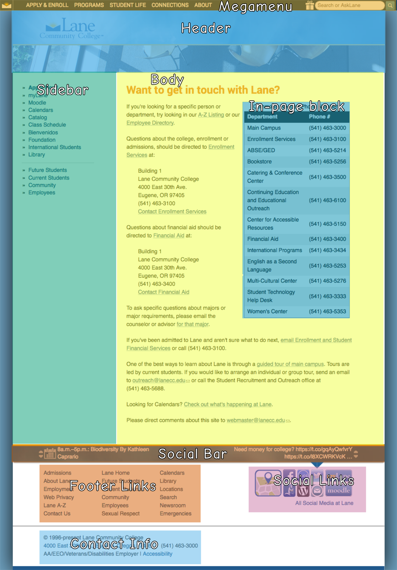
If you’re a sighted person, you can quickly skip over the repetitive blocks that appear on every page – you just move your eyes immediately to the start of the body. But if you’re dependent on a screen reader, you’re forced to read the entire page from top to bottom, with one notable exception, like this:

  1. Header
  2. Sidebar
  3. Body (including the in-page block)
  4. Social Bar
  5. Footer Links
  6. Social Links
  7. Contact Info
  8. Megamenu

Notice how the body is the 3rd thing on there? If you depend on a screen reader, you’ll be forced to hear those first three regions read to you on every single page. In our case, that could be well over a hundred links read to you before you get to the content you need.

And why’s the megamenu block read last, even though it’s at the top of the page? That’s an example of a block where the position in the code doesn’t match the position on the page. The megamenu appears to be at the top of the page, but it’s actually at the bottom of the code, meaning a screanreader reads it last. There’s some complex reasons for that, which would make this post unreasonably long, so we won’t go into them here.

Section 508 helps out by requiring a way to skip repetitive navigation links. Usually this is done by creating a link on the text “skip to content” at the very top of the page, which links to an anchor mid page, right where the body is. To meet this 508 requirement, we put a pair of skip links at the top of all our pages:

  • One that says “skip to navigation”, which skips directly to the sidebar
  • One that says “skip to main content”, which skips directly to the top of the body

We also put two more in the footer, which let you skip over parts of the footer:

  • One at the top of the footer links, which skips to the footer links
  • One at the top of the social links, which skips to the contact info

There isn’t one to skip the megamenu, since it’s at the bottom of the page, so there’s nothing to skip to – this is a bit of an imperfect solution, but until we can fix it (See this issue to follow along), it’ll work.

Together, these skip links give people these shortcuts to skip parts of the page that appear all over the site:

Same contact page, with arrows

Though it seems like the skip to navigation link is a bit silly (since it’s skipping nothing in that image), it’s actually important for other pages where we have links in the header (like our landing page).

Under WCAG, instead of just skipping repetitive navigation links, we also need to have a way to skip repetitive page blocks. And that means we need to consider content even at the paragraph level. So while the in-page block in our image isn’t a problem on the contact page, it would become a problem if it was on every page on the site, or even every page on a chunk of the site (like every page in the science department). Then we’d need a skip link.

I’ve seen repetitive text on our site in two places. First is departments that have a common paragraph or sentence they show on every page. For instance, a department might want to show their department vision on every page. That’s actually not ok – instead, they should have their vision just once on their landing page, or link to a page with their vision from their menu.

The second place is people who put lots of links that say “return to top”, which link to the top of the page. Strictly speaking, these aren’t really skip links, but they are completely unnecessary, and a holdover from an earlier time on the web. Screen readers and keyboards both have shortcuts to jump to the top of the page (it’s ctrl-home on a windows computer or cmd-up on a mac) – but most people just scroll or flick the page with their finger on a phone. There’s a place to use an in-page link to the top of the page, but those places are pretty rare.

If you’d like to read more about bypass blocks, you may also be interested in these techniques, which provides examples and more detail. Specifically, it includes discussion about about using aria-roles, which provide an easy way to identify page regions, and make it easier to navigate a page.

Interested in more? Check out the listing of all the posts in this series.

* The word blocks has a very specific meaning in Drupal, but that’s not how we’re using it here. As far as WCAG is concerned, blocks can refer to Drupal blocks, regions, zones, or even just paragraphs.

Understanding WCAG 2.0: 1.4.4 – Resize Text

The next standard we’ll explore in our series on understanding WCAG 2.0 is 1.4.4, Resize Text. This standard is required for WCAG level AA compliance, which is part of what Section 508 requires. Here’s the complete text:

1.4.4 Resize text: Except for captions and images of text, text can be resized without assistive technology up to 200 percent without loss of content or functionality. (Level AA)

This one might seem super straight forward, but there’s a bit of subtlety to it.

It used to be that browsers didn’t zoom, they’d actually just increase the font size. If you pressed Control + you’d increase the font size (Command + on a Mac), and if you pressed Control – you’d decrease the font size (Command – on a Mac). But this created all sorts of problems. If text was inside of a fixed width container, like a div or a table, and the font size increased, the text would suddenly outgrow the container. CSS developed something of a reputation:

Coffee mug, with the text "CSS is Awesome" overflowing a containing boxBrowser makers changed directions, and instead of the zoom shortcuts changing the font size, they’d instead zoom the entire page. As the apparent font size increased, the containing element would increase size at the same time.

But you can still force your browser to zoom only the text. In Firefox, under the view menu, there’s an option to tell it to zoom text only. Here’s what our contact page looks like normally:

The Lane contact page, at lanecc.edu/contactHere’s what it looks like if I tell Firefox to only zoom the the text, and press cmd + four times (which confusingly zooms the text 300%):

The Lane contact page, zoomed 300%. Description follows in text.See where the issues crop up? Across the top, in our mega menu, the text gets to be bigger than the container. And again, in the twitter and events bar at the bottom, there’s a weird line across the middle (because we should have used a tiling image).

Despite those issues, our pages pass this standard easily. You’re allowed to use either text zoom or page zoom, and using page zoom our page looks great.

As always, a couple of tricky things:

First, if we had to support an old browser that didn’t support zooming (I’m looking at you, IE6), then we’d need to provide an on page method to change text size, usually using a big of Javascript. But here at Lane, we don’t support anything before IE11, so we usually don’t need to worry about this.

Second, mobile is tricky. Our website includes this meta viewport tag:

<meta name="viewport" content="width=device-width, initial-scale=1, maximum-scale=1, minimum-scale=1, user-scalable=no" />

But that can actually be problematic, as it prevents pinch zooming. But it turns out that some browsers (like Safari) don’t respect that meta tag. And other browsers support a “reader view”, which strips out a lot of styling to make the page easier to read on mobile. So while the WCAG recommends not including that specific meta tag, and we’ll likely remove it on the next iteration the Lane website, we’re probably fine for now because of the ready availability of workarounds.

Third, text on images should be avoided whenever possible. While page zoom will increase the size of an image appropriately, when you zoom an image it gets pixelated. Pretty much exactly unlike on TV:

This, along with the need to include alt text, is one of the reasons we encourage you to not use text on images on your pages.*

There are a lot of technologies where text zooming is more of an issue than it is on the web, like Flash or Silverlight, but since they don’t typically apply to the Lane website, we’re going to skip over them here. But if you’d like to read more about text resizing, you may also be interested in some of the techniques, which provides examples and more detail.

Interested in more? Check out the listing of all the posts in this series.

* For the super nerdy, SVGs are actually the exception to this rule, since as web ready vector images, they’ll zoom with the browser. But there’s no real convention for placing alt text on an SVG, so I’d encourage you not to use these yet either.

Understanding WCAG 2.0: 1.4.3 – Contrast

The next standard we’ll explore in our series on understanding WCAG 2.0 is 1.4.3, Contrast. This standard is required for WCAG level AA compliance, which is part of what Section 508 requires. Here’s the complete text:

1.4.3 Contrast (Minimum): The visual presentation of text and images of text has a contrast ratio of at least 4.5:1, except for the following: (Level AA)

  • Large Text: Large-scale text and images of large-scale text have a contrast ratio of at least 3:1;
  • Incidental: Text or images of text that are part of an inactive user interface component, that are pure decoration, that are not visible to anyone, or that are part of a picture that contains significant other visual content, have no contrast requirement.
  • Logotypes: Text that is part of a logo or brand name has no minimum contrast requirement.

Low contrast ratios have been something of an unfortunate design trend recently. Before we get into what contrast ratios should be, let’s look at a couple of examples:

Hello!

Black text on a white background. Simple. Classic. Easy to read. Here’s another example:

Hello!

Yellow on white. It’s pretty obvious this is harder to read. But we can actually quantify just how much harder it is to read by calculating a contrast ratio. Getting the actual contrast ratio is kind of tricky, because color on screens is actually defined as a mix of three colors: red, green, and blue. The W3C provides a formula (at the bottom of this page), which calculates the luminance (a measure of the intensity of light) of the foreground color and divides it by the luminance of the background color to get a contrast ratio. But I found it easier to just use a calculator.

This blog doesn’t use a true black for the text, it uses a black with a little bit of white in it (because, as a rule of thumb, never use a true black on the web). So while true black on white has a ratio of 21, the ratio in our first example is 11.9, which easily meets our requirements. But our second example, which is yellow on white, has a ratio of 1, which is as bad as it gets.

To achieve AA compliance, we need a ratio of at least 4.5. But I find even 4.5 to be difficult to read, especially in a really bright room:

This line has a contrast ratio of 21:1

This line has a contrast ratio of 11:1

This line has a contrast ratio of 7:1

This line has a contrast ratio of 4.5:1

This line has a contrast ratio of 3:1

This line has a contrast ratio of 2:1

So we may want to consider always shooting for AAA compliance, which requires at least a 7. After a while, you kind of get a feel for contrast with black, white, and grey. But color is a lot harder. Let’s analyze a page on the website:

A screenshot of the top of the Lane community website.

There’s a lot of different color combinations there. When we designed the website, we tried to make sure we’d have sufficient contrast to make it readable by everyone. But we didn’t have any guidelines in mind, and just tried our best. It turns out it’s harder to judge contrast in colors.

Let’s start up at the top, on the four tabs for navigation to our different audience landing pages. The white on blue has a ratio of 7.4. But the yellow on blue for “The Community” has a ratio of just 3.8 – something that we’ll need to fix.

The banner had two surprises for me. I thought the white on blue would have fairly high contrast, but it was actually just a 3. While that’s on the edge, that’s actually sufficient here, because the text is considered large scale (at least 18pt, or a bold 14pt). I felt like the black text on the blue banner would have a fairly low ratio, but it’s a 7. So our banner checks out.

The announcements box has some troubles. The orange “Announcements” text has a ratio of just 2.3, partly because the background of that box is a little transparent, and partly because that orange is kind of bright. On the other hand, the linked announcement links are sufficiently contrasting, with a ratio of 5.5.

While I can fix the contrast on the website theme, this standard is part of the reason we encourage you not to change colors on your pages. In addition to not conveying information strictly through color, and keeping with the branding standards of the college, you need to make sure to keep sufficient contrast.

If you’d like to read more about color contrast, you may also be interested in these techniques, which provide examples and more detail.

Interested in more? Check out the listing of all the posts in this series.

2016 Archive Available

Every so often we take a snapshot of our website, to preserve exactly what it looked like, and simplify removing outdated content. While it’s important to prevent ROT, we also have an obligation to preserve a historical archive of what’s on our site. You can find the most recent site archive is available at https://2016sitearchive.lanecc.edu.

Unlike our current website, which is backed by a database, and which tracks even the smallest change to a page, the archive is a static set of HTML pages, and will not change further. While this means we’ll lose a little bit of history, we felt it to be a necessary compromise. Drupal, like WordPress of Joomla, is complex software, and to prevent security issues needs to be kept up to date and occasionally upgraded. HTML, on the other hand, isn’t interactive in the same way, and is mostly bulletproof. And, since it’s much simpler, it requires a lot less hardware to run.

The down side of these snapshots is that they will eventually decay. Links to external sites will go bad as other sites remove changes. Videos will be removed, and embeds will no longer work. But the content of our pages will stick around. So we can proceed less cautiously with removing content from the website, since to preserve it for the public all we need to do is link it to the archive.

If you’re interested in our last snapshot, from five years ago, you can visit https://2011sitearchive.lanecc.edu

Older snapshots are more limited, often just an image of the homepage. You can view them here:

Full details, along with further history and notes are available on the webguide pages.


Goals for 2017 on the web

There’s two months left in 2016, and the web team wanted to set a couple goals for the Lane website before we close out the year. An important part of our mission is to keep our pages as readable and relevant to our visitors as possible. One way to do that is to prevent and remove ROT – redundant, outdated, or trivial content on the web.

Redundant Content

Redundant content is dangerous content. If the same content appears in multiple places online, it’s only a matter of time until only one place is updated and the content is out of sync. Then we’re providing conflicting messages. Beyond that, redundant content makes it confusing for search engines to know which pages to serve. Pages are scored by search engines primarily by the number of other pages that link to them.

Here’s a (super simplified) scenario. Say we have two different places that describe our refund policies, and both of those pages link to the same page of meeting notes about changing those policies. Sites, both internal (on the www.lanecc.edu site) and external (including sites run by other organizations, but also places like moodle), link to a page on refund policy. But some link to the first place, and others link to the second page. When you search for refund policies, what do you get in your results?

We can’t be sure – and you might even get the PDF, because it’s getting some page rank from each of the two other pages. But if we had that content on just one page, everyone would link to it correctly, letting search engines value it correctly and making search better for everyone.

Outdated Content

That outdated content is an issue should be obvious, but even content that’s just several years old and no longer relevant can be an issue. We have 732 pages that haven’t been updated in over 4 years. Some of that content has certainly changed since then, and is now incorrect. It’s going to be a tremendous effort for us to go through and figure out which of those pages need updating, and which can just be removed.

Trivial Content

Trivial content is a difficult one. It might be content that you find really important – say, a photo album of an event a few years ago. But if that content isn’t helping the mission of your site and of the website as a whole and isn’t required to be there by law or by grant conditions, ultimately it’s trivial and should probably be removed..

Trivial content doesn’t need to be an entire page. Sometimes it’s just a line, like “Welcome to the Underwater Basketweaving Department!” that purports to make the department look friendly but falls flat. This excess content confuses search, and makes it dififcult for people to find what they need, ultimately leading people to feel like website is cluttered and difficult to navigate.

Long Content

We also have a problem with content length on our site. Sometimes pages are necessarily long, like COPPS policies (though there’s certainly some of those that could use help!). But often pages are so long they make it difficult to find what you need. Due to the way we store our pages, I don’t have an easy way to count words on pages, but I can count letters. These aren’t perfect counts, because they include some of the HTML that helps to style the page, but they’re a great estimate. I did a count of our pages last night and found some crazy pages: 50,000 characters. 80,000 characters. 90,000 characters. If we use an average of 6 letters per word, that’s as much as 15,000 words on a page! Positively insane. How can students find what they need?

Our Goals

As editors on the website, we’re enlisting you for help! Here’s the goals we’d love you to help us meet this year:

  1. Reduce the total number of pages on the Lane website by 5% (from 5768 to 5475).
  2. Reduce the number of pages with more than 20,000 characters by 20% (from 193 to 155)
  3. Reduce the average character count of our pages by 10.5%, from 4803 to 4300.
  4. improve the average age of our pages by 6 months, from roughly 24 months old to 18 months old.

Except for the total page count, these goals and statistics are actually calculated against what we call a “basic page”. So these don’t include news releases, COPPS pages, or the landing pages.

On December 1st, we’ll post an update with how we’re doing on each of the goals, then check in again on January 1st to see if we met them.

And of course, if you need any help getting back into editing your pages, let us know! Just contact Lori, Jim, or me and we’ll be happy to help.