Spelling, Internet Explorer, and Easier Linking

Currently, we use a plugin called LinkIt to handle linking between our pages (for a discussion of how we use it, see https://blogs.lanecc.edu/webteam/2013/02/05/common-pitfall-links/). LinkIt is pretty neat, and helpful. But it was always a pain for people to link to internal pages. We’d often get a scenario where someone wanted to link to some page, say, their department contact page. So they dutifully use LinkIt, and start searching for pages with titles like ‘contact’. But since every department has a contact page, they’d get fifty results and spend forever hunting for the right page.

Not helpful.

In fact, it was so unhelpful that people were directly pasting links to their pages into the page, meaning that when page titles changed, things started to 404, and things just got nasty. So I spent some time investigating why LinkIt couldn’t just figure out if a given URL is internal, and if so look up the node number and properly insert the link like a good little plugin.

Turns out the developers had already thought of this. Right there on line 388 there was a little todo that explained our problem. Like any responsible web site, we’re forcing page edits to happen on HTTPS. But for non-administrative users, we’re serving up most pages via HTTP (so we can take advantage of the speed our Varnish server provides us). So when an editor copied a link into LinkIt, the server would check the link (for example, ‘http://www.lanecc.edu/contact’) and see if the start of that link matched the scheme and server name of the current page. Since we’re forcing https, that’d end up being something like https://www.lanecc.edu/node/1337/edit. The server name matches, but the scheme doesn’t, and LinkIt would report that this link was external.

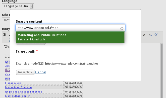
One simple change later, and now when you paste in a link it decides not to check the scheme. So from now on, if you’re linking to an internal page, just paste your url into the top box, and you’ll see something like this:

The new LinkIt dialog, showing a box that appears when you paste an internal link in the search box

When that little green popup appears, simply click on it and LinkIt will automatically identify your node number and insert it as the target path. Click Insert Link, like normal, and you’re good to go.

The second change is that we got spell check working on Internet Explorer 9. For others with a similar problem, our issue was on Drupal 7, using TinyMCE 3.something, with the wysiwyg_spellcheck module and wysiwyg modules enabled. Turns out that when you enable the module, you also need to make some changes to wysiwyg/editors/tinymce.inc. In the function wysiwyg_tinymce_settings, you need to add add another key to the settings array:

'spellchecker_rpc_url' => '/libraries/tinymce/jscripts/tiny_mce/plugins/spellchecker/rpc.php',

You should, of course, adjust that path to whatever is appropriate for your site. One final note, the problem described with LinkIt is actually fixed in the new 7.x-3.x version. But we’re using the older, 7.x-2.x version, which is no longer in active development (and which has no migration path to 7.x-3.x)

More New Features

Two more new features to report.

First, you can now add a caption to your images. When you insert an image, as always, you’re prompted with a dialog where you can enter a title, and where you can enter a description. At the end of last week, we started automatically converting whatever you put in as the title of your image to be a caption, appearing in boldface just below the image.

It’s important that these two fields – title and description – are used correctly. When implementing this feature, we found close to two hundred images where they were exactly the same text. Imagine a screen reader comes across this picture:

A cat chewing on a monitor


Since both the alt text and the caption are the same, and it wants to make sure to read all the text to you, it’ll actually read the exact same thing to you twice! And don’t get me started with the people that used the file name (“cat123.jpg”) as the alt text, or even worse, the word “picture” as the alt text.

So what to do?

In a conversational blog post like this one, it’d be perfectly fair to make the alt text descriptive (“A cat, chewing on a monitor”), and to use an amusing title/caption (“Delicious!”). But if you have a more serious picture, say a picture of some people, you’re actually allowed to explicitly set the alt text to empty, since the description now lives on as a caption. That way the screen reader knows to skip the alt text and just read the text  (caption) surrounding the picture. So if you have a picture of two people, Alice and Bob, you could make the alt text be “” (that’s literally what’s called an ’empty string’, meaning there’s nothing inside the quotes, but the quotes are present), and the title be “Pictured, left to right, Alice and Bob.”.

The second feature we’ve implemented is FAQ questions. If your department has, or would like a FAQ page, contact us for a quick crash course in how to use the FAQ module.

Draft Mode & More Forms

Over the last year, one feature we’ve heard requested over and over again is the ability to save a draft of your content and come back to it later. This last weekend we finally got it working, using a module called Workbench Moderation.

This module actually makes some pretty significant changes for everyone, even if you never use drafts, so let’s take a look.

In order, "View Published", "New Draft", "Moderate", "Webform", "Results"

The most easily noticed changes are the tabs along the top of pages you edit. The first one, “View Published”, is the same as the old “View” tab. You’d use this tab to see the content that the world currently sees. The second tab, “New Draft”, replaces the “Edit” tab. The last change is the new “Moderate” tab, which replaces the old “Revisions” tab.

For most people, your workflow shouldn’t really change. When you want to make an edit, click “New Draft”, make your changes, enter your revision message, and click save.

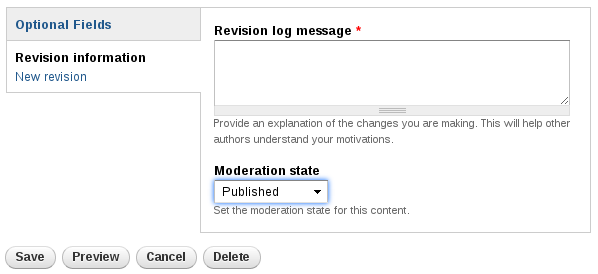
But if you’d like to save your work for later, click on the “Revision Information” horizontal tab at the bottom of the page. Below the log message you’ll find a dropdown showing three states: Draft, Needs Review, and Published.

Shows a Revision Log Message box, above a dropdown for moderation state.

If you set your Moderation State to “Draft”, and click Save, Drupal will make a draft for you. Alternatively, you could set your state to “Needs Review”. This is an intermediate state – you’re no longer making changes to it, but you need someone else to take a look at it before you publish it.

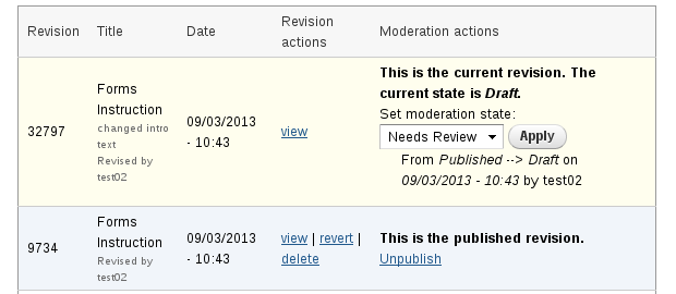
You can manage the states of your page using the Moderate tab:

Shows a list of revisions to a page. The top one includes the text "This is the current revision. The current state is draft". The second one has the text "This is the published version"

This is a bit confusing at first, but it makes sense after you’re used to it. The top entry is the current revision of this node – the one that’s been saved as a draft. If you’d like to change it to Needs Review or to publish it, you can use the dropdown on the right hand side. The second entry is the currently published version – the one everyone sees.

The second big change we made was to the forms module, where we upgraded four minor versions. On the webform tabs, you’ll see some extra options for your forms, including the ability to add a progress bar on multipage forms. You should also see improved handling of unicode characters (non-latin alphabet) and better Excel exports.

If you’re a content editor, expect an email with further details soon. And, as always, if you’d like more information about forms or draft, just email Lori.

Mobile Traffic Milestone

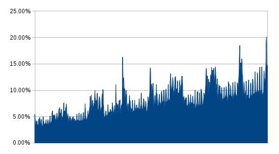
Graph of mobile traffic, showing a clear pattern of year over year growth, including one day when 20% of visitors were mobile.
Percentage of visitors each day using a mobile device over the last two years

Last Sunday, for the first time ever, more than 20% of visitors to the website were mobile. And I don’t think the general trend can be missed: we’re up 38% on mobile compared to last year. Just more proof that we can’t ignore mobile when thinking about the web.

Also interesting? I was surprised to find that Saturdays and Sundays are our biggest mobile days. Each of the small spikes on the graph (not the gigantic ones) is a weekend. Anyone have any ideas why?

Changes in Drupal Land

There’s a couple changes happening in Drupal that you might want to be aware of:

Google Analytics Modifications

Currently, we’re using the old style Google Analytics embed code, and adding it directly via our template in html.tpl.php. This works, but it isn’t optimal. For a long time we’ve known that there’s a couple users that use the website in a way that doesn’t reflect real visitors: the Lane Web Team.

To take me as an example, yesterday I looked for old links to www2 urls, and found them on sixty different pages. I directly navigated to each of those pages, stayed on them for about fifteen seconds, loaded the edit window, made a change, saved the page, and left, directly navigating to another page. The statistics for that day are now ever so slightly skewed toward a person that appears to change pages at random, staying on them for almost no time at all, and who appears to come from nowhere. I’m making it harder to understand what people do on our website, and how we can serve their needs. And it isn’t just me – the whole webteam could tell a similar story.

So, this weekend 9/20/14, we’ll be installing the Google Analytics module. With it, the tracking code will automatically be disabled for our administrative roles, who together represent a disproportionate number of visits. How does this impact you? Soon it will look like our traffic numbers went down – probably about 2% – just because we’re not tracking those three roles. So, if you get an analytics report mailed to you, don’t be too alarmed if the numbers go down, just adapt to the new baseline. And remember, you can always contact us if you’d like help thinking through your analytics numbers.

Friendlier URLs

By default, Drupal uses ugly URLs. The contact page is technically something like lanecc.edu/index.php?q=node/106. We’re using a couple of modules (Path Alias, part Drupal Core, and Pathologic) to make those urls look friendlier, like lanecc.edu/contact. But, ever notice what happens when you try to edit a page? You get another ugly url, like lanecc.edu/node/106/edit. This weekend, we’re also going to try to fix those, using the Extended Path Alias module. All of those pages that previously had a node number in them will now have a nice, aliased URL, like lanecc.edu/contact/edit.

I’m sure that doesn’t seem very exciting. But it is, because when someone submits a webform, they were previously taken to a confirmation page with an alias like lanecc.edu/node/86/submission/75309. Because that url starts with /node, Drupal isn’t able to figure out which menus to include, meaning the person that just submitted your webform is effectively no longer on your part of the website.

Of course, by replacing all those technical looking URLs with friendly ones, that makes it harder for you to tell us the node number, or to paste a node number into the link dialog when editing a page. So we’re also going to make it easier to find those node numbers – starting next week, just look to the right side of your screen while logged in and you’ll find a little black tab with the node number written on it.

EDIT (7/9) – Unfortunately, we had to roll this one back. With this enabled, /it/somepage.html would actually go to /it/, meaning no 404 was served. We’re still looking for a solution at this time.

Print Styles

This one is actually live right now! We’ve added a print style sheet to the pages, which attempts to make webpages more useful when printed out on paper. It’ll probably work best in Firefox or Chrome, but when you print:

  • The left menu will be hidden
  • The header of the page will be hidden, except for the department title (if present)
  • The megamenu will be hidden
  • The footer will be hidden, except on the landing pages
  • Links will have their urls added to them, so that if you stumble across a link in a printed page that you’re interested in, you can at least type that link into a browser manually.

If you notice any bugs (There’s a LOT of printers on this campus, and its impossible for me to test all of them), please let me know.

The Importance of Revisioning

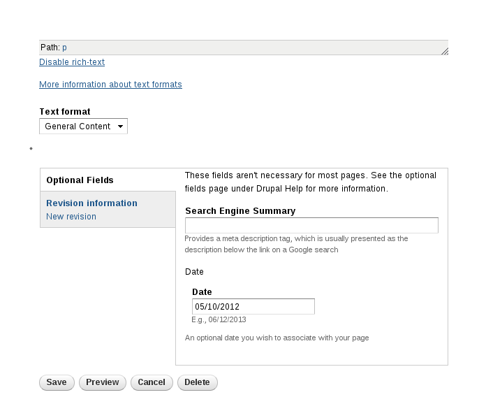
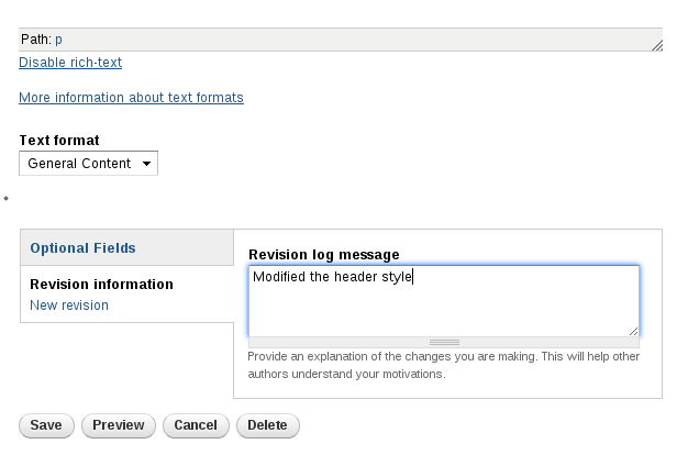
When you’re editing one of our Drupal pages, you may have noticed a little tab down at the bottom, right above the save button:

A picture of the bottom of our Drupal Edit screen. Of note is the "Revision Information" tab which defaults to closed.See that little grey box? The one that says “Revision Information”? That’s actually a very helpful box. In there, you’ll find a place to enter a revision log message, where you can describe the changes you made to the page, like this:

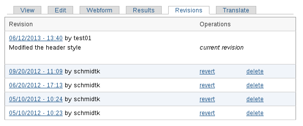
Shows a revision message added to a node: "Modified the header style"You may not have been aware, but if you click on the revisions tab at the top of a page, you can get a list of who made changes, and when those changes were made. If everyone also includes revision log messages, then we can also, at a glance, see what was changed. And that can be super helpful:

The revision log for our sample node, at the top is the revision made in the previous picture, including the message left. Other revisions didn't have a message.
Unfortunately, this example may be a case of “Do as I say, not as I do”

As you can see, the first 4 revisions, by me, have no revision message. It’s very difficult to see at a glance what changes I made, or why I made them. But the most recent message, “Modified the Header Style” tells you exactly what I changed.

If we wanted an ever better message, we could have written “Changed page header from a paragraph to an H2, in accordance with the guidelines provided by the webteam”. Then we’d know not only what was changed, but why.

So revisions are awesome, right? But they work best when everyone uses them, so that if I modify your page, you’ll know what I did, and I’ll know what you did before me. For that reason, this weekend we’ll be turning on a module that enforces a revision log message. In other words, if you forget to enter a revision message, you’ll get a nasty red message that highlights the revision message box and asks you to fill it in. Please take the time to write a brief, meaningful message. It’ll help everyone out.

This change is part of a broader set of changes we’re hoping to make to the Drupal editing experience to allow more flexible workflows. Expect more details in the upcoming weeks!

Archives Deployed

It took a bit longer than expected, but today we deployed our largest remaining chunk, with some 197 pages in it:

Also impressive? Internally, we’re down to just 17 404 errors on the entire site. Just 4 chunks, and 259 pages, left to go!

DrupalCon Portland, and the evils of and

Last week, two Lane Web Team members went up to DrupalCon Portland.

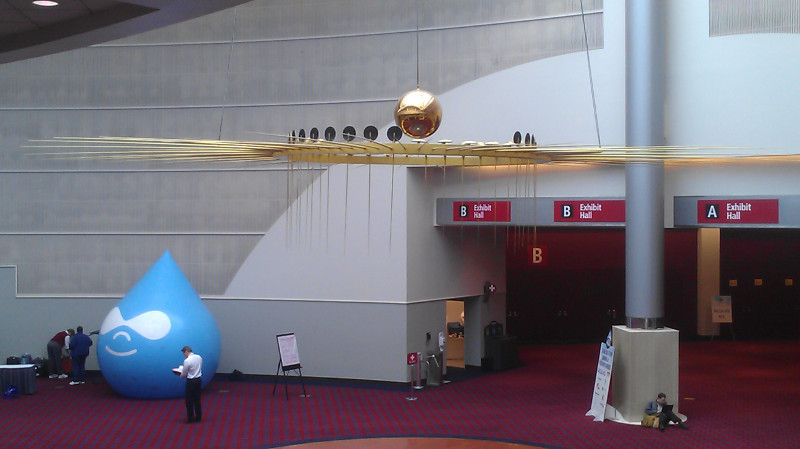
The Drupal "Drop" under a pendulum at the Portland Convention Center
Did you know Oregon has the world’s largest Foucault Pendulum?

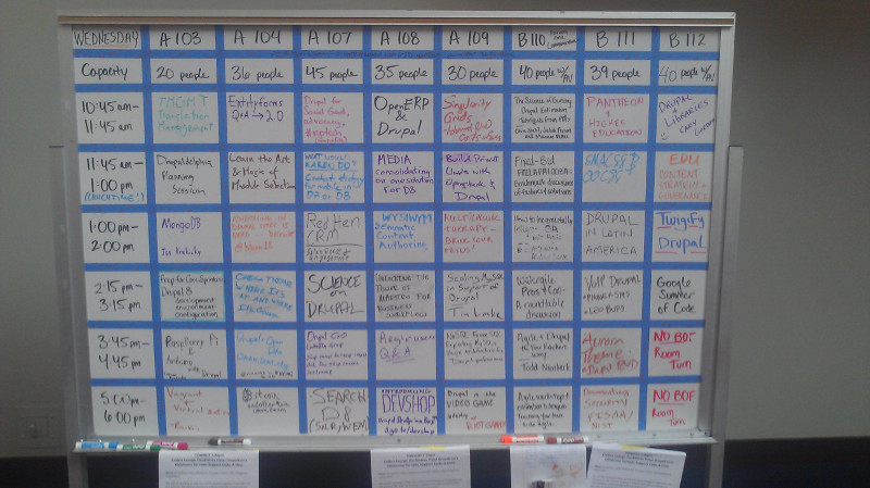
In addition to opportunities to network with other institutions running Drupal around the state and world, there were a ton of awesome speakers and “Bids of Feather” sessions, where groups of like minded people got together to talk about issues relevant to them. Take a look:

A whiteboard, showing a grid of different sessions at various times, including such sessions as "Pantheon and HigherEd" and "Higher Ed Content Strategies"
This seems like a weird thing to take a picture of, but the BOF listing couldn’t be found on the web anywhere – wifi at conferences is notoriously poor, so it wouldn’t have done us much good.

The second day’s keynote, by Karen McGrane, was about user experience and design, and provided some excellent insights for us (watch it here!). The one that will impact you most is our removal of the <i> (italics) and <b> (boldface) elements from the list of allowable elements on Drupal content pages.

As per why, it has to do with two things: Future Proofing, and Accessibility. Back in the day, when content was designed for paper, boldface and italics made a lot of sense. So the <b> and <i> HTML elements were used to replicate this on the web. But, not too long later, people realized that these elements didn’t actually convey any semantic information – they were purely visual. So they added the <strong> and <em> (emphasis) elements.

Now, here’s the thing. Strong text, and emphasized text look exactly the same as boldfaced and italicized text – this sentence actually uses <strong> and <em> tags. So the average web user won’t notice any difference. But what happens if you’re using some futuristic wearable computing device that reads web pages to you? With <strong>, your device would know to read a certain word or sentence strongly, and to emphasize text in <em> tags. But if they were <b> or <i> tags, you wouldn’t have even known they were there . Turns out this is the same way screen readers work.

As of this morning, we’re filtering out <i> tags and <b> tags. There’s a 99% chance this doesn’t impact you at all – using the buttons in the WYSIWYG on Drupal automatically uses <em> and <strong> instead. But if you’ve been doing something fancy after disabling the rich text editor, you might need to change your page some.