DrupalCon Portland, and the evils of and

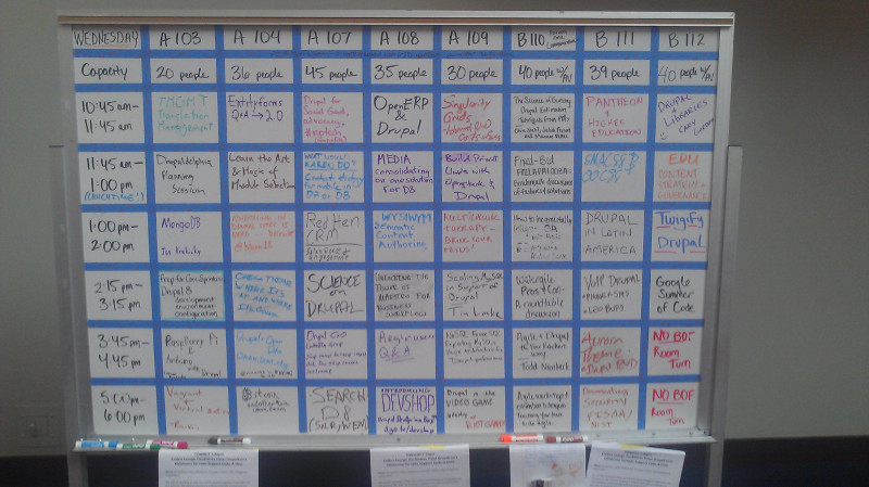
Last week, two Lane Web Team members went up to DrupalCon Portland.

The Drupal "Drop" under a pendulum at the Portland Convention Center
Did you know Oregon has the world’s largest Foucault Pendulum?

In addition to opportunities to network with other institutions running Drupal around the state and world, there were a ton of awesome speakers and “Bids of Feather” sessions, where groups of like minded people got together to talk about issues relevant to them. Take a look:

A whiteboard, showing a grid of different sessions at various times, including such sessions as "Pantheon and HigherEd" and "Higher Ed Content Strategies"
This seems like a weird thing to take a picture of, but the BOF listing couldn’t be found on the web anywhere – wifi at conferences is notoriously poor, so it wouldn’t have done us much good.

The second day’s keynote, by Karen McGrane, was about user experience and design, and provided some excellent insights for us (watch it here!). The one that will impact you most is our removal of the <i> (italics) and <b> (boldface) elements from the list of allowable elements on Drupal content pages.

As per why, it has to do with two things: Future Proofing, and Accessibility. Back in the day, when content was designed for paper, boldface and italics made a lot of sense. So the <b> and <i> HTML elements were used to replicate this on the web. But, not too long later, people realized that these elements didn’t actually convey any semantic information – they were purely visual. So they added the <strong> and <em> (emphasis) elements.

Now, here’s the thing. Strong text, and emphasized text look exactly the same as boldfaced and italicized text – this sentence actually uses <strong> and <em> tags. So the average web user won’t notice any difference. But what happens if you’re using some futuristic wearable computing device that reads web pages to you? With <strong>, your device would know to read a certain word or sentence strongly, and to emphasize text in <em> tags. But if they were <b> or <i> tags, you wouldn’t have even known they were there . Turns out this is the same way screen readers work.

As of this morning, we’re filtering out <i> tags and <b> tags. There’s a 99% chance this doesn’t impact you at all – using the buttons in the WYSIWYG on Drupal automatically uses <em> and <strong> instead. But if you’ve been doing something fancy after disabling the rich text editor, you might need to change your page some.


Color Blindness Testing

As we prepared to launch the new design, one of the things we were sure to focus on was accessibility. While that’s been covered in previous posts, there’s another area of web accessibility that’s often forgotten that I’d like to highlight here: Color Blindness.

Color Blindness is a complex condition, manifesting one at least ten different ways, and  affecting some ten million Americans. Although most color blind individuals are actually color weak – meaning some vision of a color, but trouble distinguishing it from nearby colors – we chose to do our tests on the more severe form, rationalizing that if we can design a website that works for true color blindness, it will also work for weakness.

Here’s some simulations of different areas of our site for different types of color blindness:

Homepage:

Future Students:

Current Students:

Community:

Content Page:

The primary thing to look for in those images is contrast. Do the color choices of our design ever create a situation where a color blind person wouldn’t be able to find some of the text? For example, if the design had adjacent green and orange elements, a person with Protanopia would probably be unable to tell them apart. From what I can see, we’re in pretty good shape. And just to make sure, I double checked with a colorblind coworker.

Another thing to think about with Color Blindness is the use of color to convey important information. For example, say you receive a message on a website, “The email was not sent”. If that message is in red, most of us would assume that it was a bad thing – the email we were trying to send didn’t make it. But if that message was in green, then most of us would assume it was a good thing – the message we desperately didn’t want to send was canceled. For this reason, Drupal includes a checkbox next to “good” messages, and an X next to “bad” messages, so that the intent of the message is always clear, even if the color isn’t apparent.

Although we tried our best to test a few regular content pages (like http://www.lanecc.edu/esfs, or http://www.lanecc.edu/finaid), with over 4000 pages, it isn’t possible for me to hand check every one. For that reason, if you’re a content editor, please try to keep contrast and intent in mind when you’re working on your pages.

I created those images using GIMP, a free software program, using the Color Deficiency Filter (under Views). If you’d like to try seeing your page, there’s a number of color blindness simulators online. I’d recommend http://www.etre.com/tools/colourblindsimulator/

Caching Changes

Once again, we’re on a quest to make the website as fast as possible. Drupal doesn’t make this easy – on an average page load, our request for that page passes through three servers, sometimes generating hundreds of database calls and touching dozens of files. But through caching, we’re able to skip most of those steps and serve you content that was already waiting for you.

Now that we’re a couple of weeks post launch, we’re going to start making our caching a little more aggressive. If you’re a web editor, this might impact you.

Previously, the cache time on all of the objects (pictures, fonts, stylesheets, etc) on our pages was set to six hours. This makes sense the first few days after a big launch – we were anticipating lots of changes. But now that things have stabilized some, we’re turning up the cache lifetime on our stylesheets and javascript files to one year, and turning the cache lifetime of images up to one month. For 99% of visitors to the Lane website, this will result in up to 17 fewer requests to our servers – a 70% savings – creating a significantly faster web experience.

Unfortunately, this also means that there’s certain circumstances when a picture you’ve added to your website remains in the cache, and you’re unable to force someone to use a new one. Let’s say that you have a picture, called “kitten.jpg”, of a kitten eating a hamburger. You save your page, and people flock to see your awesome image. Every one of their browsers sees that the picture has an expires header of 111600 seconds – 31 days. Next time they visit your page, their browser won’t attempt to download that picture again unless at least 111600 seconds has passed.

The bad situation happens when you want to replace your kitten picture with a better one (say, a picture of your kitten eating a cheeseburger). You upload your new file as “kitten.jpg”. But your visitors will never see the new picture – their browsers see the same filename, and they know that particular file hasn’t expired from their cache yet.

So how do you fix it? Well, for one, remember that the picture will automatically fix after 31 days. But if you need an immediate fix, there’s a simple trick. Just rename your picture as “kitten2.jpg” and add it to your page like a new image. Now when the browser visits the page it’ll realize that it doesn’t need kitten.jpg anymore, and grab kitten2.jpg instead. We’re setting the cache at 1 year for JavaScript and stylesheets because we’re able to depend on Drupal to create new stylesheet and JavaScript names automatically when they change, and effectively do the same thing as we did with kitten.jpg in the example.

Things are actually a bit more involved than what’s above, but it’s not worth the extra confusion. If you’re interested in how we’re actually implementing caching, please send me an email or leave a comment.

I know this extra renaming step might seem painful, but we can’t ignore page speed. Google is incorporating speed into their rankings, and for users on slow connections (3g, in particular), we want to make sure the page renders in less than 1 second. Caching will take us a long way towards where we want to be.

Curriculum & Scheduling and Facilities Deployed

Two chunks deployed today:

This upcoming weekend we’re tentatively planning to try switching www and www2, which is one of the final steps in our migration process. There will be no further deployments ntil then. Also, this will require a short outage Friday night while we rewrite a bunch of URLs and do some DNS changes. Expect the outage during the myLane maintenance window, some time between 6pm and 11pm. We’ll try to tweet more details later in the week.

7 departments and less than 500 pages to go!

Launched!

Welcome to your new website!

New Homepage, containing each of the regions further described in this post.
Lane’s new Homepage

Ready for a quick tour?

The Mega Menu

The MegaMenu open, displaying a set of commonly needed links.Up at the top of every single page on the site (and soon, other Lane websites) you’ll find this menu with the most popular and requested resources on the website. Make sure to check out all five tabs!

We’ve also upgraded the search:

The expanded Search box, showing search optionsWhen you click on the search, you’ll see a list of multiple search options. For now, this will let you directly search the Lane website or use AskLane. Soon, you’ll also be able to search people and departments.

And if you ever need to get to the homepage or one of the landing pages, just click on the Lane Icon on the left hand side:

The different homepage options available in the MegaMenu. These are the same as is listed below, in the Landing Page Menu area.You’ll see a link not only to the homepage, but also to each of our visitor landing pages.

Landing Pages

On the right hand side, you’ll find a menu with links to pages designed specifically for our different visitor types:

Links to our four landing pages: Future Students, Current Students, Community, and EmployeesAnd immediately below that you’ll find an area with announcements relevant to you.

Banner Links

On the large, colored banner on the homepage you’ll find a set of some of our most often needed links.

Image of the central banner links for the homepage. The purpose of this banner changes on the Landing Pages. Here, the banner links you to categories of content. So, on the Future Students Landing Page, when you click on “Paying for College”, you’ll be transported to a list of related links to help you find information about paying for college: Financial Aid, Tuition, Scholarship Information, etc.

The 'Paying for College' category of links. These are viewable at http://www2dev.lanecc.edu/future#PayingforCollegeWe conducted extensive surveys to learn how people categorize and name the resources we have on campus, to try and make these as intuitive as possible.

Events

During our research, we heard time and time again that you were interested in current, relevant content about what’s happening on campus. At the bottom of every page, you’ll find our two places you can learn about campus events and news.

The 25 Live Calendar Feed. There are no items displayed in this sample image.

On the left side is a feed from 25 Live, our Calendaring System. Each event is linked directly to a page with information about where and when that event is happening. This feed will update every time you visit a new Lane webpage, showing you the events happening that day (often, multiple events are happening, in which case two arrows will appear to let you scroll between them). If you’d like to see even more events, just click the calendar icon.

Dispaying a recent tweet about the beautiful weather we had on campus Friday.

On the right side are snippets from our Twitter account. You can use the arrows to scroll through our ten most recent tweets, or you can simply click the ellipsis (…) to go directly to our Twitter account.

Social Media and Applications

Links to the college map, Facebook, Youtube, and Twitter accounts, the Lane Titans website, our blogs site, Staff Email, and Moodle and MyLane.At the bottom right, in addition to links to Lane’s Social Media Presence, you’ll also find a link to the campus map, Moodle, and MyLane. If you’re an employee, you should know that the old ‘Groupwise for Staff’ link has been replaced with a single “GW” icon.

Footer Links

There were also a number of other links that we found visitors always needed easy access to:

In addition to some common footer links, there's also a link to the the campus on Google Maps and the main campus phone number.

These are in the bottom left of the site. In addition to these common links, you’ll also find the campus address (linked to us on Google Maps, in case you need directions), and the main phone number (if you’re on your cell, just click it to give us a call!).

Lost? Stuck? Can’t find something?

We can help!

Thank you!

Finally, thank you for all the feedback you’ve given us during the last few years as we put this together!

Finally

Remember, websites are always evolving. Although we’ve made some real, significant improvements to the Lane website, there’s still lots of places to improve. We’re constantly collecting analytics, getting visitor feedback, and looking for ways to making the website a better place.

Arts & Center

Two sites deployed today:

With those done, we’ve completed 91% of departments and 85% of all pages, and we have a new student worker hammering away on the remaining pages. He’s spent the entire day just working on Marketing and Public Relations pages – our biggest remaining chunk, with around 400 pages. Only 12 departments left to migrate!

Today’s deployment also marks another milestone for us: our first time having less than 200 404 (page not found) errors. That’s down from over 1000 a few months ago. Not bad, for over 10,700 pages of content checked.

Also, an important announcement:

Only 4 days until we go live!

Blog posts have been rather sporadic the last month or two while I’ve been hammering out the new theme. There’s no pictures to show yet, but after we launch (Sunday!), we’ll continue to refine and perfect our theme to improve support for all devices from IE8 on up. So expect news in the future about some of the details of our theme and some of its awesome features.