WebAIM Top Million 2024

Unfortunately for us, but fortunately for the rest of the world, our ranking has slipped a bit this year, from 149,013 last year to 199,996 this year. Our ranking among community colleges in Oregon hasn’t changedstill #4and our ranking across public educational institutions improved from #8 to #7.

So why do I say our ranking slipping is good? Because throughout the last year we’ve substantially increased our rate of PDF remediation, and are confident that we have fewer accessibility errors across our pages (we fix every accessibility error our checker finds! Plus we have fewer pages this year!). So if we’re slipping in the rankings, that’s because pages across the world are getting more accessible, and that’s good for everyone.

Getting access to edit pages on the website

We’re making an effort to bring this blog back! Wanted to start today with a quick note about getting editing control of your website.

On the old website, pages were organized into “folders”, and we’d provide access to the entire folder at once. On the new website, access is actually set on a per-page basis. This is a bit of a pain for us, since it means we need to add users individually to every page, but it opens a lot of flexibility for you.

There’s a couple areas where we’re still trying to work out how editing permissions are going to work. The first has to do with pictures & uploaded files. The media system on the new website is wildly different, and I’m still not sure how to assign permissions correctly. We can still provide permissions to pages with images, but it sometimes takes some work to make it happen, and so far there’s no way for most people to upload images or files to the site.

The other area is the types of pages that are available to edit. Most standard pages can be edited, but program pages and steps to enroll pages are  two where we’re not assigning permissions yet. For now, please continue to route those through us.

If you’d like to get involved with making edits to your site, reach out to webmaster@lanecc.edu and we’ll help you get started.

WebAIM Top Million 2023

A couple years back, we looked at how we placed in WebAIM’s top million homepages for accessibility. At the time, we were ranked #242,359, putting us in the top 25% for the first time, and ranking #7 in the state for community colleges and #13 for Oregon public colleges.

After the launch of our new website, we’re now ranked #149,013! That ranks us as #4 in the state for community colleges, and #8 for Oregon public colleges! See our entry on WebAIM’s site.

One of the really helpful things to come out of the website redesign is the addition of an automatic accessibility checker on every page. As we edit pages now, we’re correcting accessibility issues whenever we spot them, so we’re even more optimistic for our rank next year.

The Employee Directory

Our website has nearly fifty pages with the word “Contact” in the title. For us, this has actually been our standard for a long time: we’ve always tried to make the bottom link in a menu a contact page. But, in designing the website, we started to believe this was the wrong approach.

First, many department homepages work better as contact pages. Why  make someone click a link, just to see what the phone number for a department is?

Second, many of those contact pages ended up reproducing pages in the employee directory. Why have duplicate pages? And, since the employee directory updates directly from Banner, it’s much less likely to be out of date than a manually updated page.

On the new site, we’ll be introducing the support block on pages, and eliminating many of those contact pages. Here’s an example of a draft support block on the Continuing Education site:

New support block, showing contact information for CEThe support block supports a little bit of variation, and we’ll be able to do things like showcase people, include logos, and add additional yellow buttons. We’re hoping this will result in a standardized look and feel for our contact information, while allowing us to substantially reduce the size of the website.

Of course, this means we need to fix any data quality issues in the employee directory. Be sure to check out your listing in the directory, and use the edit button at the bottom of the page to make corrections. For extra credit, check your department’s listing, and see if anything is missing.

On the importance of events in the new site

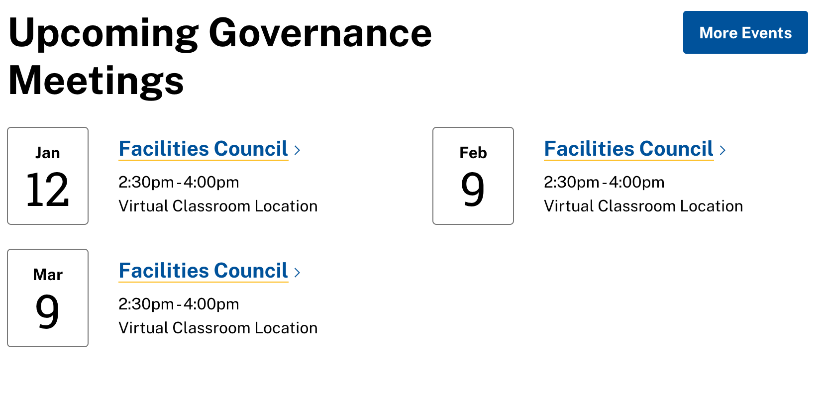
One of the changes we’ll be introducing in the new website is a better integration with 25 Live, our event scheduling system. If you’re hosting and event, and would like to get it on your website, rather than asking us to do it, and going several rounds via email to get something on there, you’ll instead schedule it on 25 Live (which, to reserve a room, you’d do anyway) and tag it so it shows up on the website. That’s it – somewhere around fifteen minutes later, the event will just show up. It’ll look like this:

Screenshot of an events feed, showing three upcoming facilities council eventsYou see the problem: it looks like we only have one governance council. Going forward, if your event is open to the public, it’s going to be incredibly important to make sure to get that scheduled on 25 Live. If you don’t, it simply won’t show up.

But here’s one potentially confusing thing: that “More Events” Button takes you to our all events age, rather than taking you to a list of events tagged like in the view (in this case, governance events). That might be something we reevaluate in the future, as we better understand the capabilities of the new integration, but it will be several weeks yet.

Content Freeze

I’ve had a lot of questions on the content freeze recently, and I’d like to clear one of those up: there’s no end date on the freeze. Part of that is practical: until the website launches, we need to make updates to both the old and new site whenever there’s a content changes.

But even after launch, we’re not going to be immediately adding a bunch of accounts. Last time, we had a massive training program where literally hundreds of people learned to use the website to make edits. In retrospect, this was a bad idea:

  • Many people took the training without ever making any changes to the website (only about 1 in 3 accounts on the website is even active anymore, and we’ve deleted dozens of accounts who never made edits)
  • Most people don’t make many edits to the site. Excluding Lori and me, over the last 9 years, the average user has only made about 100 edits – about one per month since launch. There are only 11 people, including 2 retirees, who have made more than 600 page edits since we started. By contrast, Lori has made more than 16,000.* Of course, there are some outliers who have made over a thousand edits – more on them in a minute.
  • Providing web editing access to hundreds of people ensured that our website would never have a consistent voice. Even today, there are sections written in very academic sounding third person, sometimes right next to a more casual 2nd person. If we’re going to provide a good experience to prospective students, this needs to stop.

Right now our focus is on launching the website. Once we’ve launched, and have a better handle on how we’ll handle user permissions, we’ll start exploring ways to help get our really frequent website users more involved. But whatever that process, it will be very slow, and very deliberate.

* These numbers are actually more complicated than this, since we’ve deleted thousands of pages, and I can’t capture those edits in these statistics. Since those pages were often the least edited pages, Lori’s total edits should be several thousand higher. 

Mid January Website Progress Report

The last few weeks, we’ve been testing every component of the website in every browser, operating system, and device combination we can come up with. Every time we find an issue (like, in Firefox only, a certain menu doesn’t correctly cover another menu), we file a ticket with iFactory, and they get to work fixing it.

We’ve also been working on our content. This helps testing, since we’re doing real world tasks with the website as we test. But working on content has made me realize there’s a lot more to do than I thought.

For instance, when we build the website back in 2011-2012, our primary focus was on an initial cleanup, and many of our pages were imported from the original website without substantial changes.  Often, that means they were built under the mistaken assumption that no one would scroll beneath the fold.  At the time, we thought most big monitors people had would be 1440 x 900 pixels. The monitor I’m writing this on today has a viewport almost three times that size, and 11 times as many pixels. Many of our pages from our current site simply look empty on the new site.  Some are so short that their content isn’t provided in a context that matters – if you landed on that page from a search, you might not know how what you’re looking at relates to anything else. Reworking all of those by, for instance, moving a page with a standalone Flickr slideshow into a slideshow widget on a page that tells you about what you’re seeing, takes some time.

Since, despite the cleanup efforts we’ve made in the last several years, there are still more than a thousand pages on the website right now, it’s going to take us some time to go through those. There’s almost 400 open tasks on our list of things to do before we launch, and those are just the tasks I’ve built – that number should be a lot higher. Consequently, there’s no launch date to announce yet. Hopefully I’ll have more to report next status post.


Clarification on Forms

Since we first announced the freeze, most of the questions we’ve received have been about webforms. That’s understandable, since forms are complicated, but often critical to our workflows. They need to just work. This post is going to try to provide some clarification.

Moving our forms into the new website

Unfortunately for all of us, the migration scripts can’t move webforms from the old to the new website. That means we’re going to need to rebuild each form individually. How we do that depends on if a form only contains transient data and the form is part of a workflow.

When we get to a point where we’re starting to build forms, our first step will be to disable form editing across the site, to make sure none of the forms change while we’re moving them. This will only impact form editing: you’ll still be able to view form results, people will still be able to submit forms, and you’ll still be able to edit form submissions (if that’s something you do).

The simplest cases are forms that only contain transient data. Often these are contact forms, like the advising contact form or the Board contact form. Submissions to those are relayed to an email address as soon as someone hits submit, and then the submission can essentially be forgotten. For these forms, we’ll build them on the new site, and they’ll go live at the same time as the new site.

On the other hand, you may have a form that collects submissions for a period of time, and then you download them all at once and don’t use the form for another year (e.g. an event registration form). For these, we’ll rebuild the form, but not take it live until we know you’ve been able to download your responses (if applicable) and are good with us switching over.

The most complex forms are the ones that have hidden fields that you use as part of a workflow. An example might be a form where someone submits it, and then you edit a hidden field to note that you’ve reviewed the submission and approved it. For these, we’ll rebuild them, but again work with you to make sure you’re good with us switching them over.

We don’t anticipate any interruptions: forms should continue to function and be available throughout the entire process.

Old submissions

Unfortunately, there’s no way for us to migrate form submissions from the old site to the new site. In some forms, this doesn’t matter. But if you do want to save old submissions, at some point you’ll need to download them to your computer. But there’s no hurry yet: we’ll send out reminder emails in the spring.

Drupal Webforms vs Softdocs

I’ve been asked a lot of questions about if a certain form should be moved to Softdocs, if Softdocs is more secure, if Softdocs is going to replace Drupal, and if Drupal webforms are going to go away.

Softdocs is an authenticated form and lightweight workflow solution. Drupal is a generalized content management system, with a bunch of plugins that can be used to make it do almost anything. While, superficially there’s some overlap, in reality they solve different problems. We need both.

Softdocs will hopefully replace a lot of the PDFs we have on campus, and  lead to more efficient workflows since it directly integrates with Banner. It provides authenticated forms, which legally meet the requirements for an e-signature. If you have a form where you need to verify the identity of the person submitting it, and you’re certain anyone submitting the form will have an L Number, you want to use Softdocs.

Drupal will continue to have a webform component. It will never integrate with Banner. There’s a limit to how complicated the forms can be (Softdocs allows you access to the HTML, so you can do much more). But since the forms are branded, integrated into your website, never require authentication, and are quick to create or edit, they’re very appropriate for collecting information from people not yet affiliated with the college.

Neither one is really more secure than the other – one just provides identity verification.

If you have a form that requires identify verification, is more of an internal process, or a form which would be improved by integrating with Banner, then you should move it to Softdocs.

 

Redesign Progress

Last week, we finally got a glimpse at the new website, live and working in browser. Things look great! This first look was just to make sure there wasn’t anything on the backend that would keep us from being able to work on content throughout the rest of December. We’re looking forward to having greater access later this week.

Please continue to email us any updates to your website.

We’re frozen

Last Friday night I officially locked out edits on most of the pages mentioned in our previous post, and then Sunday night I shipped all the locked nodes off to be imported into our new site. Here’s our timeline right now:

12/4 – Site Frozen
12/6 – Database sent off to development
12/7-12/8  – Database migrated into the new site
12/9 – Initial training in the new site, and the start of the QA process
12/18 – Second training in the new site, finalize QA
Early January – Migrate the site to the campus data center

For us, one of the most intense parts of the web design process starts this upcoming Wednesday. When our content is migrated into the database, it’ll be stored close to how it is now. For each of the 2061 pages we’re migrating in, Lori and I will need to reformat them using the design components we’ve been provided, rework the content, add media, and appropriately add them to our menus.

I’ve been asked a number of times this last week when we expect things to go live, and right now the answer is: we don’t know. That will depend entirely on how quickly we can get that content work done.

The last few days last week were one the busiest periods of edits we’ve ever had. Thank you to everyone that helped squeeze those in, since they saved us from double entry!