Better Ways to Track Progress

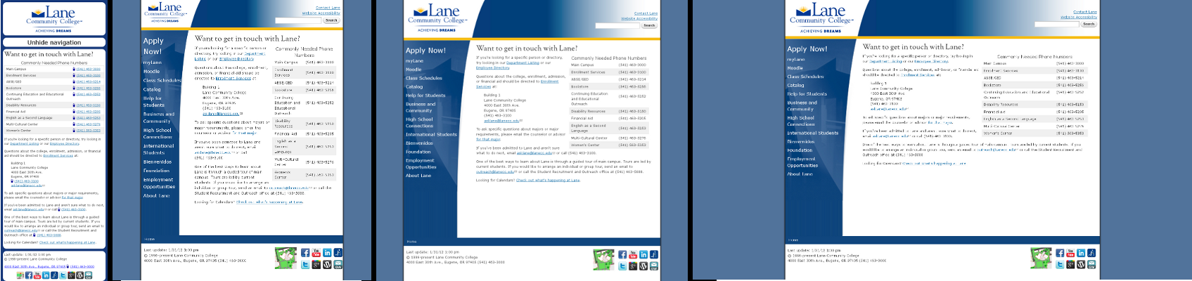
In an effort to understand the progress we’re making, we spent a few minutes earlier this week figuring out what the biggest “chunks” of the website are. Of course, once we had some data, we had to do a little bit of analysis. The results are now linked on the menu bar up above under “Current Progress“.

On that page, there’s two graphs which display the percent of our chunks in these five statuses:

Status Meaning
Cut Chunks that are just going away – still stored on backups, but not linked from anywhere.
Archive Chunks that pertain to old projects that need to be kept around for either legal or historical reasons. They’ll be stored on the Site Archive
Review Chunks that have been moved into Drupal, but need a final review before deployment
Done Chunks already moved into Drupal
Not Complete Chunks still on the old web server. This is chunks that are in progress or haven’t been started

Here’s the first graph, which shows the percentage of individual pages in each status:

Here’s the second graph, which shows the percentage of departments in each status*:

The best part about these graphs is that they update every time we update our spreadsheet. So, some day several months down the road, instead of these images showing a lot of grey with a little bit of yellow, they’ll show a lot of orange and no grey at all.

Unfortunately, I only have statistics for the pages that are still on the web server. If I included the work done last summer, when we deleted over 5000 pages, which would have made that first graph 46% blue!

* technically, this is the percentage of top level folders on the web server in each status, but that’s a pretty close approximation to departments.

Deployments this week

Three more sites are up in Drupal this week, including some that were never on the web before:

There’s also been a good deal of progress toward improving our backend setup, including fixing our version control server, more tuning and testing of our two reverse proxy servers, and quite a bit of work in fixing our forms handling. Expect to see bigger chunks in Drupal next week!

Progress Report

So, it’s been two weeks since my last post. What have we been up to?

First, we set up a new Google Mini, which gives us access to updated software that’s years newer than what we were using for search. We’ve also changed what pages we’re searching. Instead of only searching the Lane Website, we’re now including some of our other websites, including Titan Athletics and the LCC Knowledge Network.

Tuning a search server is pretty tricky, and since ours is indexing over 50,000 webpages, any adjustments we make take some time to see – sometimes hours. But we’re watching the logs, and trying to make it easier to find the things that you search for most.

We’ve also deployed a few more of our websites to Drupal. Here’s a list of all the “chunks” of the site that are now hosted on Drupal:

There’s a ton more “chunks” to do, but we’re making progress. As always, please let us know if you spot something not working! If you’re responsible for your department website, check out the ATC Training Schedule to to find a workshop so you can get trained.

Lane goes to DrupalCon

Recently, two of us got to go to DrupalCon Denver. There were a lot of other drupalista’s there:

DrupalCon Keynote, Day 1

We saw all sorts of sessions, but the one that stuck with me the most was Luke Wroblewski‘s keynote address on the last day. He gave a talk on the importance of Mobile First Development. You can (and should!) watch the full presentation at the his site, but here’s the thing that hit me hardest.

When you’re developing for mobile devices, you lose 80% of your screen size. That means you need to focus your pages on your core mission. Here’s the example he used, from Southwest’s website:

Southwest's website on the desktopWhereas here’s their exact same website, viewed on a (pretend) iPhone:

Southwest's website, viewed from an iPhoneFlickr does something similar. Here’s their site on the desktop:

Flickr's website, viewed on a Desktop computerAnd once again, here’s their site on a (pretend) iPhone:

Flickr's site viewed from an iPhoneIn each case the mobile website shows only the things you most want to do – buy a ticket, check in, upload photos, and seeing photos taken nearby you, which is hard to do on a regular old computer. The sites are, in many ways, actually providing a better experience than the normal desktop website, and are sometimes even providing capacities that can’t be found on a desktop.

We’re super excited to be committed to a mobile first approach, and are pumped from a week of learning all the latest and greatest things about Drupal. Plus, we learned that next year’s DrupalCon will be in our own backyard (be sure to resize their site and to try scrolling it some to see some awesome css/html5 effects!).

Git and Us

Let’s pretend you’re writing a big paper that’s due at the end of the week. Things are going pretty well, but suddenly you realize that maybe if you rework your argument a little bit and rearrange some text, your argument will be a lot stronger. But you’re not 100% sure it’ll work – there’s a chance you’ll shuffle a bunch of stuff around and it won’t read right, and you’ll regret you ever changed anything at all. What do you do? You make a snapshot of your paper, and save it elsewhere. So you might go to “Save As”, and create “BigPaperBackup” and then try out your changes on “BigPaper”. If things don’t go well, you can always switch back to BigPaperBackup.

But what if your paper also has some images in it, and they’re going to change in your new paper? Suddenly we’ve got to track two different things, so we can’t just rename the file. That’s ok, we can just create a folder, and save a snapshot of the paper and images in there. So now we have a “Paper-Backup” folder, and a “Paper-Working” folder, and we’ll just make all the changes in the Working folder. If things don’t go well, we can always switch back.

But what if our paper is actually a group paper, and there’s a bunch of people working on it? And what if we want to keep regular snapshots of what the paper looked like, so we can go back and see why we made each change? And what if I’m not actually talking about a simple paper, I’m actually talking about the Lane Drupal Migration, with has 8078 different files in it, all of which we need a history for?

The answer is a type of computer program called a Version Control System, and the little story I told up there is just a variant of the well known Git Parable. Git is the version control system we’re using here at Lane, but there’s actually a bunch out there, including Mercurial, which has an awesome tutorial and is a little friendlier for Windows users.

There’s another tool out there called Gource, which lets you take the commit log for your project and turn it into a video showing the changes you’ve made. Although you might not be able to see the effects of each of these changes (many are just fixes for little bugs that crop up in testing), here’s a video showing every change that’s happened over the last seven months:

Responsive Design

Usually I’m all technical, but let’s take a break and just look at some pictures. Here’s one:

Graph of Mobile Visits to Lane's WebpageThere’s two lines in that graph, both of which represent mobile visits to Lane’s Website. Both lines are for the time period December 7th to February 7th, but orange is last year while blue is this year. For those keeping score at home, that’s a 102% increase in traffic. Put another way, last year 1 in every 33 visits was on a cell phone, while this year it’s 1 in every 15. This is a trend we see accelerating.

So we’ve decided to adopt a Mobile First Website strategy. Our new website will be built first and foremost for mobile devices – but it’ll turn on extra things for fancier devices like normal computers and tablets.

There’s an important distinction here. Unlike some websites, which maintain two versions of their site (look for any website with a url like http://m.example.com), we’re only maintaining one site. This makes things a lot easier for us, but it also means that you always know you’re getting the exact same information, regardless of if you’re on a cell, a tablet, or a regular computer. It might just look different.

We’re implementing our Mobile First strategy using a technique called Responsive Design. Using this technique, we first check to see the size your screen using something called a Media Query. If your device doesn’t respond, or can’t respond, we assume that you’re on a mobile phone. This is the Mobile First approach – we first assume you’re on mobile. If your device does respond, we tell it to display things optimized for that device width.

Sorry –  I got technical again. Here’s a picture of what it looks like:

Lane's website appearance at 4 sizesThere’s actually 4 different images there. Which one you get depends on the size screen that you have. If you want to see it in action, get on the computer with the biggest monitor you can find and try resizing your browser window while viewing our contact page.