As an educational institution (and as responsible web developers!), we’re very concerned with the accessibility of our website. Although our primary concern is following the Section 508 guidelines, there’s a number of other best practices we’re trying to follow.
Before I get going, I’d like to note that this post only applies to our Drupal redesign, and to the pages on www2.lanecc.edu (though we’ll soon be moving www2 to www).
Section 508
508 contains sixteen standards that directly address web content. I think it’s worth looking at each of these standards in detail.
(a) A text equivalent for every non-text element shall be provided (e.g., via “alt”, “longdesc”, or in element content).
Through a combination of limiting editing functionality and filtering tags when pages are saved, we’re only allowing four non-text elements on pages: images, YouTube videos, Flickr slideshows, and Google Maps. This is a significant improvement over our old site, where we had no method to limit tags, allowing any number of non-text elements to be introduced.
When a user editing a page in Drupal inserts an image, they are prompted to add an Alt Tag, with a note about its importance in improving usability. Just to make sure no images escape our attention, we run a weekly report that checks all of the images on the site for alt tags, and alerts us if improvements are needed. Additionally, the importance of Alt tags and accessibility in general, is discussed with Drupal users during our normal Drupal training.
Unfortunately, there are some accessibility concerns with Flickr. For this reason, Flickr is not intended to be our final image slideshow solution, and is only a temporary measure while we explore alternate solutions. We’ll be rolling out an alternate slideshow solution, with a goal to be totally away from Flickr by the time we upgrade to Drupal 8. In the mean time, users are responsible for providing relevant accessibility information for their own Flickr accounts.
For more information on the accessibility of YouTube videos, see guideline b, below. More information on Google Maps accessibility can be found at http://www.google.com/accessibility/products/.
(b) Equivalent alternatives for any multimedia presentation shall be synchronized with the presentation.
Unfortunately, there is no automated method for us to ensure compliance with this standard. To improve the likelihood of compliance, we have removed the ability to embed videos on pages from sites other than YouTube, which has the best closed captioning support, sometimes providing them automatically. During our media training, we make a special note of pointing Drupal users toward captioning resources (which can be found at http://support.google.com/youtube/bin/answer.py?hl=en&answer=100079).
(c) Web pages shall be designed so that all information conveyed with color is also available without color, for example from context or markup.
As part of standardizing the appearance of our website, we’ve tried to reduce the role of color in providing information. Generally, users are unable to modify the colors of their pages, and where color is used to convey information, such as tables and alert notices, markup is provided to convey its purpose (through thead tags and alert classes, respectively).
(d) Documents shall be organized so they are readable without requiring an associated style sheet.
When developing the new Drupal site, one of our goals was to make each page’s content work independently of style, not only for accessibility, but also to facilitate easily modifying page style in the future. We’ve tried our best to ensure that pages use ordered, semantic HTML, to provide hierarchy that’s easy for screen readers to navigate, and we’ve added helpful links to allow screen readers to jump over or directly to the page navigation.
(e) Redundant text links shall be provided for each active region of a server-side image map.
We do not use image maps on our site.
(f) Client-side image maps shall be provided instead of server-side image maps except where the regions cannot be defined with an available geometric shape.
We do not use image maps on our site.
(g) Row and column headers shall be identified for data tables.
When using the table wizard in our Drupal page editor (TinyMCE), table headers are automatically provided. Row headers are not always relevant, and as such are not automatically inserted. If we notice a pattern of missing row headers, we’ll add a test to our weekly accessibility and 404 check script and assist the owners of problem pages.
(h) Markup shall be used to associate data cells and header cells for data tables that have two or more logical levels of row or column headers.
At this time we are unaware of any tables on the site with more than one row of header information. Multiple header rows should automatically be incorporated into a single thead tag, however at this time we depend on our users to be aware of table header accessibility issues. Again, if we notice our users are misusing table or row headers, we’ll add a check to our script.
(i) Frames shall be titled with text that facilitates frame identification and navigation.
We do not use framesets on our site, and where iframes are used (rare), they are automatically tagged with titles.
(j) Pages shall be designed to avoid causing the screen to flicker with a frequency greater than 2 Hz and lower than 55 Hz.
Our pages should flicker at the rate set by end users (refresh rate). For most users on LCD screens, this should be around 60Hz, though it’s important to note this isn’t something we can control.
(k) A text-only page, with equivalent information or functionality, shall be provided to make a web site comply with the provisions of this part, when compliance cannot be accomplished in any other way. The content of the text-only page shall be updated whenever the primary page changes.
As we are unaware of any areas of our site where we’re out of compliance, we’re planning to discontinue our existing text-only site, which was unfortunately often out of data with our main site.
(l) When pages utilize scripting languages to display content, or to create interface elements, the information provided by the script shall be identified with functional text that can be read by assistive technology.
Due to security concerns, the use of JavaScript is actually disabled for Drupal content editors. Javascript is only used as an integral part of two pages: The SAP Calculator and the Tuition Estimator. The Tuition Estimator is provided to us, and thus we’re dependent on the makers of that software to ensure accessibility. Neither page uses JavaScript to render interface elements. Although the SAP Calculator does depend on JavaScript to perform calculations, instructions for calculating SAP independent of the calculator are provided, as is contact information for help if needed.
(m) When a web page requires that an applet, plug-in or other application be present on the client system to interpret page content, the page must provide a link to a plug-in or applet that complies with §1194.21(a) through (l).
Java is not required to use our website, so applets do not apply. Flash elements should prompt the user automatically if needed.
(n) When electronic forms are designed to be completed on-line, the form shall allow people using assistive technology to access the information, field elements, and functionality required for completion and submission of the form, including all directions and cues.
Form elements are automatically assigned names, and labels are automatically created to associate those labels with the appropriate elements. This is a significant improvement, as our old site relied on hand created forms that may or may not have had accessible elements.
(o) A method shall be provided that permits users to skip repetitive navigation links.
The first two links on every page are hidden to most users, but should be read by screen readers. The first will allow a user to skip directly to the main page content. The second will allow a user to skip directly to the main navigation.
(p) When a timed response is required, the user shall be alerted and given sufficient time to indicate more time is required.
There are no timed responses required on our site.
Additional Accessibility Practices
Proper use of Structured HTML
As part of migrating content to the Drupal site, our content migrators were instructed to insert header tags where possible, providing a structured outline to many pages. This was a dramatic improvement, as many of our old pages simply used bold or large text to denote a new section.
Additionally, we’re developing our pages in HTML5. Although not fully supported by all screen readers, our pages are now marked up with meaningful divisions, such as nav and article, which help screenreaders to automatically find important sections of the page.
Retraining of users
As part of moving to a CMS, all of our content editors were retrained in a series of one to four trainings. Accessibility information was distributed at each of these trainings, and linked help documentation throughout the site includes accessibility guidelines.
Text Size
One common request we’ve had is to increase the default size of the text, in order to make it easier to read. This is actually an unwinnable battle, as the size of the text is actually dependent on a lot of things other than the styles we set. For example, the resolution of your screen has a tremendous impact (I know I have difficulty reading text on my 1920×1080 laptop screen that I didn’t have on my old 1440×900 laptop).
But it is reasonable for us to increase the text size some, as on the whole devices have been increasing in resolution. We will be exploring different options with CSS Media Queries to use a larger size than you may be used to seeing, even after we launch the new site. The most important change we’ll be making is to ensure pages look good regardless of the zoom level you use at home. If you increase the size of the text in your local browser, it should continue to flow correctly on our page, rather than overlap with other elements.
Color Blindness
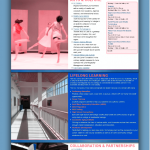
Although I’m not able to show them here yet (coming in a future post!), we’ve run mock-ups of our new website through color blindness simulators to make sure there’s enough contrast in our content to make it visible to all sighted users. You can get an idea of what we’re talking about online.
Use of Tables
For a long time in HTML, tables were used not only to display tabular data but also to lay out pages, which violates the idea of semantic HTML. Unfortunately, our site was very guilty of this practice. We’ve since removed all the tables that were used for layout, and instead replaced them with appropriate block level elements.
Tables are tricky on mobile devices, as they force a width that will accommodate their contents. We tried a few different solutions, and settled on one that provides an alternate visual layout while preserving the existing table structure, which should allow screen readers to work even from mobile devices.
Because tables can be so difficult, we’ve also sought places where tables were improperly used to list data, and have converted most of those to ordered or unordered lists.
Drupal User Accessibility
Although we are not aware of any accessibility concerns for our users at this time, we also make an effort to improve accessibility for our content editors. Drupal has some accessibility resources, as well as a group dedicated to accessibility concerns that can be helpful. The WYSIWYG editor that our users use to make changes to pages has a similar page for accessibility information. We’ve also made a conscious decision to avoid administrative modules that rely heavily on the use of javascript to provide functionality.
Conclusion
Possibly the most important thing we’ve done is to refocus ourselves around constantly improving accessibility. We regularly share articles about site accessibility with each other, and try to stay current on things like WAI-ARIA. We’ve also started including disability demographic information in our surveys, to get a better picture of our audience. Accessibility factors into every decision we make as a webteam.
As with any other current technology, accessibility on the web is a moving target, changing every year. We do our best to make our site accessible, and try to continually improve troublesome areas. Of course, if you notice something on our site that isn’t accessible, please let me know!

