Understanding WCAG 2.0: 1.4.4 – Resize Text

The next standard we’ll explore in our series on understanding WCAG 2.0 is 1.4.4, Resize Text. This standard is required for WCAG level AA compliance, which is part of what Section 508 requires. Here’s the complete text:

1.4.4 Resize text: Except for captions and images of text, text can be resized without assistive technology up to 200 percent without loss of content or functionality. (Level AA)

This one might seem super straight forward, but there’s a bit of subtlety to it.

It used to be that browsers didn’t zoom, they’d actually just increase the font size. If you pressed Control + you’d increase the font size (Command + on a Mac), and if you pressed Control – you’d decrease the font size (Command – on a Mac). But this created all sorts of problems. If text was inside of a fixed width container, like a div or a table, and the font size increased, the text would suddenly outgrow the container. CSS developed something of a reputation:

Coffee mug, with the text "CSS is Awesome" overflowing a containing boxBrowser makers changed directions, and instead of the zoom shortcuts changing the font size, they’d instead zoom the entire page. As the apparent font size increased, the containing element would increase size at the same time.

But you can still force your browser to zoom only the text. In Firefox, under the view menu, there’s an option to tell it to zoom text only. Here’s what our contact page looks like normally:

The Lane contact page, at lanecc.edu/contact
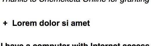
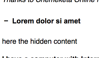
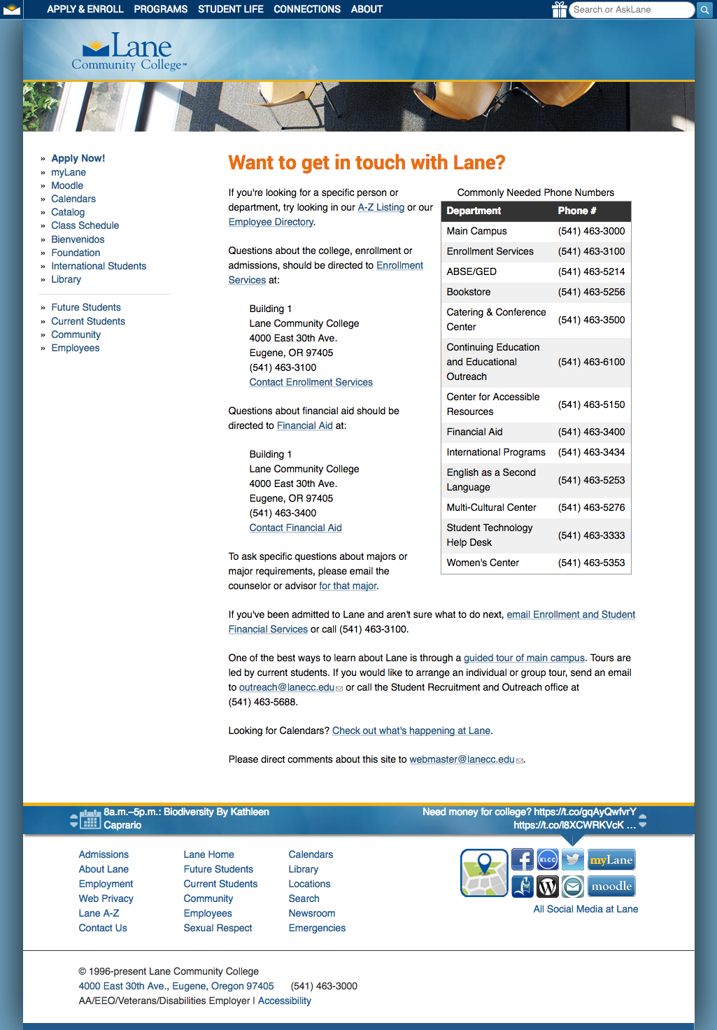
Here’s what it looks like if I tell Firefox to only zoom the the text, and press cmd + four times (which confusingly zooms the text 300%):

The Lane contact page, zoomed 300%. Description follows in text.See where the issues crop up? Across the top, in our mega menu, the text gets to be bigger than the container. And again, in the twitter and events bar at the bottom, there’s a weird line across the middle (because we should have used a tiling image).

Despite those issues, our pages pass this standard easily. You’re allowed to use either text zoom or page zoom, and using page zoom our page looks great.

As always, a couple of tricky things:

First, if we had to support an old browser that didn’t support zooming (I’m looking at you, IE6), then we’d need to provide an on page method to change text size, usually using a big of Javascript. But here at Lane, we don’t support anything before IE11, so we usually don’t need to worry about this.

Second, mobile is tricky. Our website includes this meta viewport tag:

<meta name="viewport" content="width=device-width, initial-scale=1, maximum-scale=1, minimum-scale=1, user-scalable=no" />

But that can actually be problematic, as it prevents pinch zooming. But it turns out that some browsers (like Safari) don’t respect that meta tag. And other browsers support a “reader view”, which strips out a lot of styling to make the page easier to read on mobile. So while the WCAG recommends not including that specific meta tag, and we’ll likely remove it on the next iteration the Lane website, we’re probably fine for now because of the ready availability of workarounds.

Third, text on images should be avoided whenever possible. While page zoom will increase the size of an image appropriately, when you zoom an image it gets pixelated. Pretty much exactly unlike on TV:

This, along with the need to include alt text, is one of the reasons we encourage you to not use text on images on your pages.*

There are a lot of technologies where text zooming is more of an issue than it is on the web, like Flash or Silverlight, but since they don’t typically apply to the Lane website, we’re going to skip over them here. But if you’d like to read more about text resizing, you may also be interested in some of the techniques, which provides examples and more detail.

Interested in more? Check out the listing of all the posts in this series.

* For the super nerdy, SVGs are actually the exception to this rule, since as web ready vector images, they’ll zoom with the browser. But there’s no real convention for placing alt text on an SVG, so I’d encourage you not to use these yet either.

Understanding WCAG 2.0: 1.4.3 – Contrast

The next standard we’ll explore in our series on understanding WCAG 2.0 is 1.4.3, Contrast. This standard is required for WCAG level AA compliance, which is part of what Section 508 requires. Here’s the complete text:

1.4.3 Contrast (Minimum): The visual presentation of text and images of text has a contrast ratio of at least 4.5:1, except for the following: (Level AA)

  • Large Text: Large-scale text and images of large-scale text have a contrast ratio of at least 3:1;
  • Incidental: Text or images of text that are part of an inactive user interface component, that are pure decoration, that are not visible to anyone, or that are part of a picture that contains significant other visual content, have no contrast requirement.
  • Logotypes: Text that is part of a logo or brand name has no minimum contrast requirement.

Low contrast ratios have been something of an unfortunate design trend recently. Before we get into what contrast ratios should be, let’s look at a couple of examples:

Hello!

Black text on a white background. Simple. Classic. Easy to read. Here’s another example:

Hello!

Yellow on white. It’s pretty obvious this is harder to read. But we can actually quantify just how much harder it is to read by calculating a contrast ratio. Getting the actual contrast ratio is kind of tricky, because color on screens is actually defined as a mix of three colors: red, green, and blue. The W3C provides a formula (at the bottom of this page), which calculates the luminance (a measure of the intensity of light) of the foreground color and divides it by the luminance of the background color to get a contrast ratio. But I found it easier to just use a calculator.

This blog doesn’t use a true black for the text, it uses a black with a little bit of white in it (because, as a rule of thumb, never use a true black on the web). So while true black on white has a ratio of 21, the ratio in our first example is 11.9, which easily meets our requirements. But our second example, which is yellow on white, has a ratio of 1, which is as bad as it gets.

To achieve AA compliance, we need a ratio of at least 4.5. But I find even 4.5 to be difficult to read, especially in a really bright room:

This line has a contrast ratio of 21:1

This line has a contrast ratio of 11:1

This line has a contrast ratio of 7:1

This line has a contrast ratio of 4.5:1

This line has a contrast ratio of 3:1

This line has a contrast ratio of 2:1

So we may want to consider always shooting for AAA compliance, which requires at least a 7. After a while, you kind of get a feel for contrast with black, white, and grey. But color is a lot harder. Let’s analyze a page on the website:

A screenshot of the top of the Lane community website.

There’s a lot of different color combinations there. When we designed the website, we tried to make sure we’d have sufficient contrast to make it readable by everyone. But we didn’t have any guidelines in mind, and just tried our best. It turns out it’s harder to judge contrast in colors.

Let’s start up at the top, on the four tabs for navigation to our different audience landing pages. The white on blue has a ratio of 7.4. But the yellow on blue for “The Community” has a ratio of just 3.8 – something that we’ll need to fix.

The banner had two surprises for me. I thought the white on blue would have fairly high contrast, but it was actually just a 3. While that’s on the edge, that’s actually sufficient here, because the text is considered large scale (at least 18pt, or a bold 14pt). I felt like the black text on the blue banner would have a fairly low ratio, but it’s a 7. So our banner checks out.

The announcements box has some troubles. The orange “Announcements” text has a ratio of just 2.3, partly because the background of that box is a little transparent, and partly because that orange is kind of bright. On the other hand, the linked announcement links are sufficiently contrasting, with a ratio of 5.5.

While I can fix the contrast on the website theme, this standard is part of the reason we encourage you not to change colors on your pages. In addition to not conveying information strictly through color, and keeping with the branding standards of the college, you need to make sure to keep sufficient contrast.

If you’d like to read more about color contrast, you may also be interested in these techniques, which provide examples and more detail.

Interested in more? Check out the listing of all the posts in this series.

Understanding WCAG 2.0: 1.4.2 – Audio Control

The third standard we’ll explore in our series on understanding WCAG 2.0 is 1.4.2, Audio Control. This standard is required for WCAG level A compliance, which is part of the level AA compliance that Section 508 requires. Here’s the complete text:

1.4.2 Audio Control: If any audio on a Web page plays automatically for more than 3 seconds, either a mechanism is available to pause or stop the audio, or a mechanism is available to control audio volume independently from the overall system volume level. (Level A)

I wasn’t able to think of a place this applies on a Lane website, but I wanted to be sure to mention it. The only place we usually have audio play is on pages with video, and the embed options we have available on Lane pages make it difficult, if not impossible, for audio to play automatically. If you’re building pages for your class, or are doing some web development as part of IT, please be alert to this guideline.

Of course, I’m also of the personal opinion that we don’t want your site reminding everyone of mid 2000’s mySpace profile pages. You know the ones. You’d land on it to find a crazy, mismatched background and Nickelback playing with no way to make it stop. You couldn’t close the browser fast enough. Let’s not bring those days back.

If you’d like to read more about audio control, you may also be interested in this list of techniques, which provides examples and more detail.

Interested in more? Check out the listing of all the posts in this series.

Understanding WCAG 2.0: 1.3.3 – Sensory Characteristics

The second standard we’ll explore in our series on understanding WCAG 2.0 is 1.3.3, Sensory Characteristics. This standard is required for WCAG level A compliance, which is part of the level AA compliance that Section 508 requires. Here’s the complete text:

1.3.3 Sensory Characteristics: Instructions provided for understanding and operating content do not rely solely on sensory characteristics of components such as shape, size, visual location, orientation, or sound. (Level A)

As a mostly non-technical requirement, this one is actually pretty easy to understand, and it isn’t too different from a standard that’s already in section 508 (§1194.22(c)), which says you’re not allowed to convey information strictly through color. Standard 1.3.3 simply expands that requirement to cover visual and auditory impairments.

This doesn’t mean that you can’t convey information using some sort of sensory characteristic. You often should. If you have a button on a page to proceed to the next page, I’d encourage you make it look like a green arrow, and tell people to look for a green arrow right in the instructions. But you then also have to very carefully label the arrow as linking to the next page – you can’t rely on someone seeing green or being able to identify the arrow shape.

You also need to be careful referring to an element on a page by position. You can’t have instructions that say “Click on the link in the top right corner of the page”. But you can have instructions that say “Click on the link titled ‘College Catalog’ in the top right corner of the page”. Again, you need to provide an alternate method of locating that link. In this case, we’re using the link text.

The exception to this is above and below. In English, it’s generally acceptable to refer to content preceding the current reading position as being “above”, and content that follows to be “below”. Since your page should have sequence, you can usually refer to content above and below.

Here’s a final example:

Time 8 9 10 11 12 1 2 3 4
Underwater Basketweaving
Quidditch

Above, you’ll see a table with my schedule for this academic year. I’m not taking a particularly demanding schedule, but this way of presenting my schedule only conveys when classes are through color. So this doesn’t even pass existing 508 rules.

Time 8 9 10 11 12 1 2 3 4
Underwater Basketweaving
Quidditch

This one isn’t ok either. We’ve just traded colors for shapes. But you can probably see where this is going:

Time 8 9 10 11 12 1 2 3 4
Underwater Basketweaving
Quidditch

This one is probably ok, according to a strict reading of the guideline. But we could improve it further, by providing span‘s that are visible only to screen readers, which describe when the classes take place. We can’t be sure those symbols are readable by a screen reader either.

If you’d like to read more about sensory characteristics, you may also be interested in Guideline 96: Providing textual identification of items that otherwise rely only on sensory information to be understood, which provides an example and a bit more detail.

Interested in more? Check out the listing of all the posts in this series.

Understanding WCAG 2.0: 1.3.2 – Meaningful Sequence

The first standard that we’ll explore in our series on understanding WCAG 2.0 is 1.3.2, Meaningful Sequence. This standard is required for WCAG level A compliance, which is part of the level AA compliance that Section 508 requires. Here’s the complete text:

1.3.2 Meaningful Sequence: When the sequence in which content is presented affects its meaning, a correct reading sequence can be programmatically determined. (Level A)

In other words, if the order of the content on the page is important, you need to tell a screen reader the order somehow.

There’s a lot of ways to give content order. This blog post has order, for example. So far, we have a paragraph (a p element), a blockquote, then two more paragraphs. WordPress puts all of those a division (a div element). So the structure of this blog post is:

  1. div
    1. p
    2. blockquote
    3. p
    4. p

This blog post depends on sequence for the content to make sense – after all, if the paragraphs got switched, it wouldn’t make sense.

Screen readers use the order of tags on a page to automatically determine sequence. So if your page is mostly text and pictures, you probably already meet this requirement.

The problem occurs when there’s content which is visually in sequence, but whose actual representation isn’t in sequence. Imagine this scenario. You want to put two pictures on your page next to each other, with a caption on each one. You’re having trouble making it look right, so you decide to use a table. It’d look something like this:

A picture of a cat in a monitor A picture of a cat chewing on a monitor

Poof! It works, right? But tables can be read left to right or top to bottom, and the screen reader has no way to know which it should do. So, like most of us, it defaults to left to right, meaning it reads this:

  1. table
    1. A picture of a cat in a monitor
    2. A picture of a cat chewing on a monitor

See the problem now?

Ah, but wait, you say, what about alt tags? Don’t they label the picture?

Well, they would. But this is a circumstance where you want to have an explicitly empty alt tag – alt="". Because these pictures are captioned, an alt tag is redundant. If they had an alt tag we’d be reading the caption to them twice: once in the tag, and once in the caption. And also, even if we did want an alt tag here, that wouldn’t solve the problem.

Blind people aren’t the only people to use screen readers. Many people simply have really, really poor vision, and may be using a screen reader to help read to them. And while their vision is poor, it doesn’t mean they couldn’t still enjoy these cat pictures. The table above doesn’t let someone with poor vision associate a caption with the appropriate picture.

The solution is to use div tags, and set them to the left and the right side of the page. One easy way is to set your div tags to 50% of the width of the page, then set one to float to the left, and the other to float to the right (for the technically minded, you’d may also need to clear afterward). On our Drupal pages, you can use the classes “half left” and “half right” on div tags. Because we’re then grouping our picture and our caption inside of a div on each side, everything will be read in order.

Tables aren’t the only concern with sequence. Have a look at this list:

  • Head east on H St NWt
  • Turn right onto 13th St NW
  • Turn left onto Pennsylvania Ave NW
  • At the traffic circle, take the 1st exit onto 1st St NW

We recognize those as directions, right? But the bullet points are actually a problem. Those bullet points are considered an unordered list (A UL tag). Directions have a sequence. If we use bullet points, we haven’t told the screen reader what order to read the bullets in (it’ll probably know, but why risk it?). Instead, we need to use an ordered list (an OL tag):

  1. Head east on H St NWt
  2. Turn right onto 13th St NW
  3. Turn left onto Pennsylvania Ave NW
  4. At the traffic circle, take the 1st exit onto 1st St NW

You should also pay attention to div tags that are floated from the text. If you have an introductory paragraph that explains some topic, then a sidebar floating that provides clarifying points, you’ll want to make sure the clarifying sidebar is inserted into the HTML after the introductory paragraph, since understanding it depends on first reading the introduction.

If you’d like to read more about meaningful sequence, you may also be interested in Guideline 57, Ordering the Content in a Meaningful Sequence, which provides an example and a bit more detail. For complex layouts, you may also want to look at aria-flowto, which provides a kind of goto statement for text, to tell the screen reader when to jump over text that is out of sequence for presentation.

Interested in more? Check out the listing of all the posts in this series.

Updated Accessibility Requirements

An Update to the Update:

1/23/17 – The new 508 rules are out! You can read the announcement from the Access Board (on a website powered by Drupal!), or read my summary of the rules changes.

Original Post:

As people that maintain content on the web, we’re all responsible for making sure our content adheres to the Section 508 standards. However, as discussed in an earlier post, these rules are a little dated. Fortunately, the government is currently in the process of updating the rules, and a final rule could come any day – although the government has not been successful updating these standards in the past.

The new rules are likely to closely mirror the WCAG 2.0 standards, which are an international, consensus driven standard for accessibility for a wide range of technology formats, including web pages, Word documents, PDFs, and many others. WCAG 2.0 includes three different levels of compliance: A, AA, and AAA. It’s expected that the new 508 ruling will require compliance to the AA level.

During the next few posts, we’ll explore some of the ways the new standards differ from what we currently require of our Drupal pages. If you’d like a head start, you can view a complete comparison table on the Access Board website, which we’ll use as the basis to explore what’s different between 508 and WCAG 2.0.

One final note: although I’ll be writing these posts with a lens toward how it applies to our web pages, 508 rules apply to all the materials we create or purchase, including classroom materials. If you’re an instructor, you may want to get in touch the ATC for help ensuring your class materials comply with accessibility requirements.

All Posts in this Series

Click to Expand

A few days ago, an astute employee over in Enrollment Services pointed out that our steps to enroll pages weren’t completely accessible to the blind. This is an important problem, and a surprisingly tricky one.

The current legal requirements for web accessibility (including §1194.22, which we’re most interested in) are referred to as Section 508. These standards provide some useful guidance on how to help folks with an impairment of some kind. For instance, they describe how images should have an alt text field, except for when that image doesn’t support understanding of the content (e.g. a background or filler image).

On the other hand, these standards are now old enough to vote, meaning they’re older than Facebook, Twitter, selfie sticks, Google Chrome, iPhones, the Columbus Blue Jackets, and Windows XP. Needless to say, they’re showing their age.

There’s no way to make click to expand text accessible under current 508 guidelines. Our best option would be to duplicate the page and provide a text only version. Unfortunately, that could lead to a screenreader having to read a lot of unnecessary text.

The solution relies in the proposed new standards. These are still in progress, but the web community is confident they’re going to heavily include something called WAI-ARIA. WAI-ARIA provides a way to mark up your pages with extra attributes that screen readers know how to recognize, so the blind can better use interactive pages.

Returning to our original problem, starting this evening we’re now using the hide-show accessible plugin on those pages. This plugin lets you write some fairly simple markup in your page which will then get converted to a click to expand box like on the steps to enroll.

To use, you’ll first want to click the blue link below the edit box in Drupal that says “disable rich text”. Then, if you want a simple button with some text below it, you’ll want to paste this in:

 <p class="js-expandmore">Click on me</p>
 <div class="js-to_expand">
     here is the hidden content!
 </div>

Then replace “Click on me” and “to show me!” with whatever works for your page. You’ll get something like this:

plus sign with some latin text that'd normally be clickable

And when you click to expand, you’ll see this:

minus sign, with the same text as before, but now with more text shown below it

If you’d like a little bit of color, you can also use an h3 element, which would place that text in an orange box:

    <h2 class="js-expandmore">Lorem dolor si amet</h2>
    <div class="js-to_expand">
       here is the hidden content
    </div>

Exactly the same as before, but now it’ll look like this:

same plus with text, but now with an orange background

This is actually the more correct use – you nearly always want to use an h element of some kind when it describes the text after it.

For really advanced use, you can also add a full class to make the button full width. Or you can add the blue class to make the orange background blue instead. Or both!

    <h3 class="js-expandmore blue full">Lorem dolor si amet</h2>
    <div class="js-to_expand">
       here is the hidden content
    </div>

would look like this:

blue background, full width, with same plus and text

This is definitely getting into advanced content editing in Drupal, so if you’re stuck don’t hesitate to contact us at webmaster@lanecc.edu.

Remember, we should always try to use the right tool. For instance, these kinds of show and hide buttons might seem like they’d be perfect for an FAQ. But we already have a different setup for FAQ questions, that takes care of alphabetizing and tracking changes to each question. And remember that many of the visitors to your page won’t bother clicking the button at all. Always spend time simplifying your content to make sure the important message is apparent even without clicking to show your other text.

Common Pitfalls – Alt Text

Recently we updated our link checking script to hunt for some common mistakes in image alt text.

As you may recall from your initial Drupal training, alt text is very important for accessibility, as it’s the text that’s read to the visually impaired to describe what’s in the image. Close your eyes for a second and pretend whatever you put in the alt text is being read to you. Is what’s being read so short that it’s meaningless? So long that you get bored just listening to it? Does it repeat something that you already say in the text, making it redundant?

But we’re interested in even worse problems today. Sometimes people put in alt text that doesn’t event attempt to describe the image. For example, some people use the file name as the alt text. Like this:

<img src="/dog.png" alt="dog.png">

If you were using a screen reader, your software would get to that image and read you “dog dot p n g”, which is summarily unhelpful. Reading the file name won’t help anyone better understand what’s in that image. Also unhelpful is this:

<img src="/dog.png" alt="goldenRetrieverPuppy">

which we haven’t seen recently, but has come up in the past. That’d just cause the program to attempt to read goldenRetrieverPuppy as a word, possibly completely unintelligibly.

And then some people are just lazy:

<img src="/dog.png" alt="picture">

Completely unhelpful.

Remember, for us (as it should be for everyone) being accessible isn’t optional. Starting today, we’ll be scanning for these errors automatically, and emailing content editors that need to touch up their alt tags a bit.


More New Features

Two more new features to report.

First, you can now add a caption to your images. When you insert an image, as always, you’re prompted with a dialog where you can enter a title, and where you can enter a description. At the end of last week, we started automatically converting whatever you put in as the title of your image to be a caption, appearing in boldface just below the image.

It’s important that these two fields – title and description – are used correctly. When implementing this feature, we found close to two hundred images where they were exactly the same text. Imagine a screen reader comes across this picture:

A cat chewing on a monitor


Since both the alt text and the caption are the same, and it wants to make sure to read all the text to you, it’ll actually read the exact same thing to you twice! And don’t get me started with the people that used the file name (“cat123.jpg”) as the alt text, or even worse, the word “picture” as the alt text.

So what to do?

In a conversational blog post like this one, it’d be perfectly fair to make the alt text descriptive (“A cat, chewing on a monitor”), and to use an amusing title/caption (“Delicious!”). But if you have a more serious picture, say a picture of some people, you’re actually allowed to explicitly set the alt text to empty, since the description now lives on as a caption. That way the screen reader knows to skip the alt text and just read the text  (caption) surrounding the picture. So if you have a picture of two people, Alice and Bob, you could make the alt text be “” (that’s literally what’s called an ’empty string’, meaning there’s nothing inside the quotes, but the quotes are present), and the title be “Pictured, left to right, Alice and Bob.”.

The second feature we’ve implemented is FAQ questions. If your department has, or would like a FAQ page, contact us for a quick crash course in how to use the FAQ module.

DrupalCon Portland, and the evils of and

Last week, two Lane Web Team members went up to DrupalCon Portland.

The Drupal "Drop" under a pendulum at the Portland Convention Center
Did you know Oregon has the world’s largest Foucault Pendulum?

In addition to opportunities to network with other institutions running Drupal around the state and world, there were a ton of awesome speakers and “Bids of Feather” sessions, where groups of like minded people got together to talk about issues relevant to them. Take a look:

A whiteboard, showing a grid of different sessions at various times, including such sessions as "Pantheon and HigherEd" and "Higher Ed Content Strategies"
This seems like a weird thing to take a picture of, but the BOF listing couldn’t be found on the web anywhere – wifi at conferences is notoriously poor, so it wouldn’t have done us much good.

The second day’s keynote, by Karen McGrane, was about user experience and design, and provided some excellent insights for us (watch it here!). The one that will impact you most is our removal of the <i> (italics) and <b> (boldface) elements from the list of allowable elements on Drupal content pages.

As per why, it has to do with two things: Future Proofing, and Accessibility. Back in the day, when content was designed for paper, boldface and italics made a lot of sense. So the <b> and <i> HTML elements were used to replicate this on the web. But, not too long later, people realized that these elements didn’t actually convey any semantic information – they were purely visual. So they added the <strong> and <em> (emphasis) elements.

Now, here’s the thing. Strong text, and emphasized text look exactly the same as boldfaced and italicized text – this sentence actually uses <strong> and <em> tags. So the average web user won’t notice any difference. But what happens if you’re using some futuristic wearable computing device that reads web pages to you? With <strong>, your device would know to read a certain word or sentence strongly, and to emphasize text in <em> tags. But if they were <b> or <i> tags, you wouldn’t have even known they were there . Turns out this is the same way screen readers work.

As of this morning, we’re filtering out <i> tags and <b> tags. There’s a 99% chance this doesn’t impact you at all – using the buttons in the WYSIWYG on Drupal automatically uses <em> and <strong> instead. But if you’ve been doing something fancy after disabling the rich text editor, you might need to change your page some.