
The next standard we’ll explore in our series on understanding WCAG 2.0 is 2.4.4, Link Purpose. This standard is required for WCAG level A compliance, which is part of what Section 508 requires. Here’s the complete text:
2.4.4 Link Purpose (In Context): The purpose of each link can be determined from the link text alone or from the link text together with its programmatically determined link context, except where the purpose of the link would be ambiguous to users in general. (Level A)
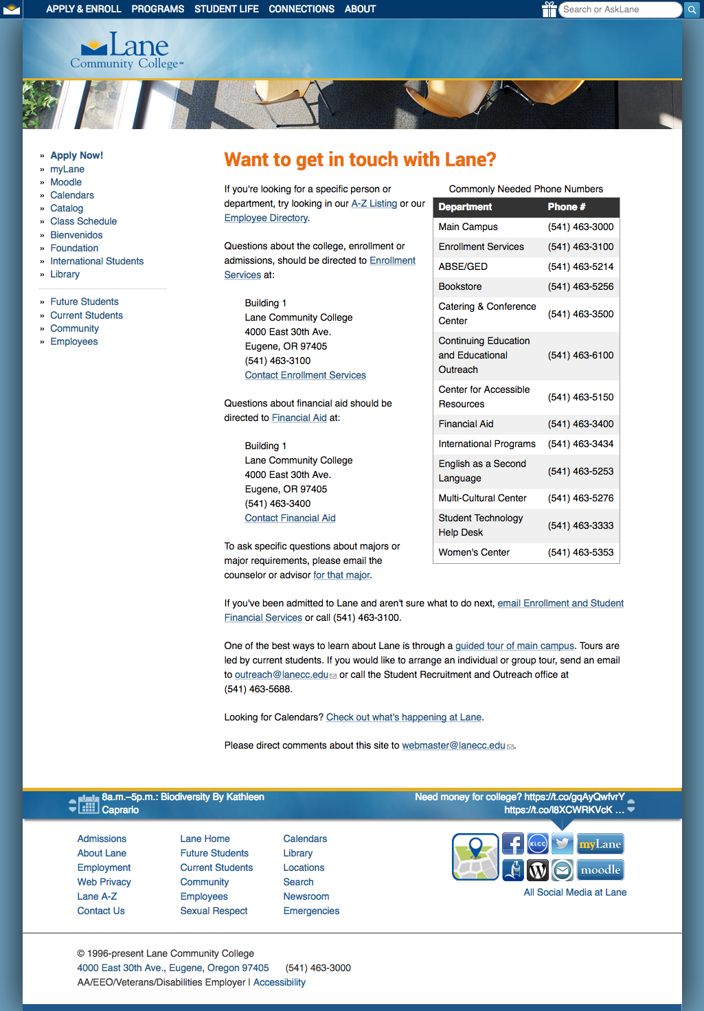
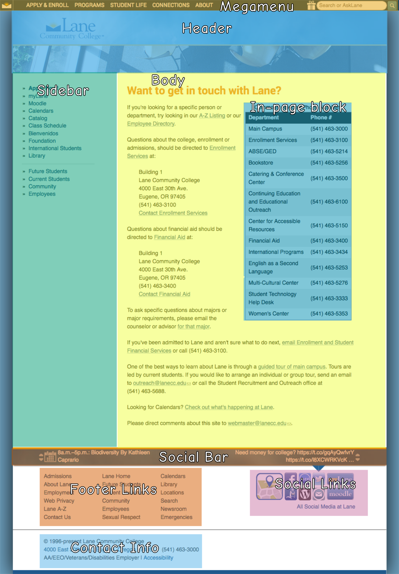
Before we get into this standard, let’s first take a look at how sighted people read on the web. And to do that, we first need to discuss this contraption:
![]() That’s a modern eye tracker – the ones I used in college were closer to these. But they all work the same. You rest your head on a head rest and a camera records where your focus is as you look at a screen. Lots of interesting work has been done with eye trackers, like determining that your eyes don’t move smoothly over text while reading. On the web, eye trackers have helped us learn that people don’t carefully read pages from the top to the bottom, carefully considering every line of text. Instead, people read pages in an F shaped pattern:
That’s a modern eye tracker – the ones I used in college were closer to these. But they all work the same. You rest your head on a head rest and a camera records where your focus is as you look at a screen. Lots of interesting work has been done with eye trackers, like determining that your eyes don’t move smoothly over text while reading. On the web, eye trackers have helped us learn that people don’t carefully read pages from the top to the bottom, carefully considering every line of text. Instead, people read pages in an F shaped pattern:
![]() That’s part of an image from this page discussing the F-shaped pattern at length. People are busy and don’t really read web pages. They read a little across the top, then they scan.
That’s part of an image from this page discussing the F-shaped pattern at length. People are busy and don’t really read web pages. They read a little across the top, then they scan.
Why should we expect non-sighted people to be any different?
Most screen reading software (JAWS of course, but even Voiceover, which comes with Macs) features tools that make it possible to jump around the page, effectively skimming for content the visitor is interested in.
Which brings us back to link purpose. Imagine you’re using a screen reader, and you ask it to get you the links in a page, so you can skim to the one you’re looking for. It gets you these:
- Learn more about Lane
- https://classes.lanecc.edu/course/view.php?id=50473
- Sign up for GED tests at http://ged.com
Would you have any idea what class you were going to look at for the second link? To meet this standard, we’d need to adjust how that link is presented in the page. So let’s work with an example. We’ll assume I’m putting together a short snippet that links people to my Underwater Basketweaving class.
<a href="https://classes.lanecc.edu/course/view.php?id=50473">
  https://classes.lanecc.edu/course/view.php?id=50473
</a>
That’s about as bad as you can possibly do, and almost exactly what’s in the list above. It’s just a linked URL in the page, with no context at all.
<a href="https://classes.lanecc.edu/courses/underwater-basketweaving/schmidt">
   https://classes.lanecc.edu/courses/underwater-basketweaving/schmidt
</a>
That’d be better – that’ll still appear as just as link on the page, but at least it’ll be a meaningful and friendly url. Not ideal, but better than what we had before. Also, better for SEO. Better yet would be to set the link text to be something meaningful:
<a href="https://classes.lanecc.edu/course/view.php?id=50473">
  Underwater Basketweaving Class
</a>
That’d look like this: Underwater Basketweaving Class, which could be perfect. But that isn’t your only option. You can instead choose to provide context in the surrounding text:
<p>Check out the Underwater Basketweaving class
  <a href="https://classes.lanecc.edu/course/view.php?id=50473">
    https://classes.lanecc.edu/course/view.php?id=50473
  </a>
</p>
You can also make use of the title attribute to clarify the purpose a link:
<a title="Underwater Basketweaving Class" href="https://classes.lanecc.edu/course/view.php?id=50473">
  Learn about the best class around!
</a>
If you have a particularly complex situation, like where a single label for a link can apply to multiple links, you can also use the aria-labeledby attribute. Confusingly (at least to me) there’s also the aria-label attribute which can be used as well. But I’m not sure why you’d prefer that to the title.
There’s a lot more information available on link purpose, in particular the rest of the techniques I didn’t discuss above.
Interested in more? Check out the listing of all the posts in this series.
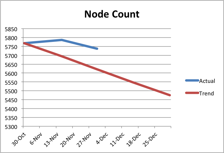


