Are resource pages problematic?

As mentioned in the broken links post, there are a lot of pages on the Lane website that are what I’d call “Resource pages”. These pages don’t necessarily provide a lot of content on their own, but have a lot of links on them to help visitors find useful resources on other pages. I’ve heard some conflicting opinions on resource pages, so I wanted to dig into if these pages are problematic, or generally helpful.

Our resource pages are often full of broken or moved links

While we’ve made some progress on how many broken or moved external links there are still thousands of broken links on the site. Because resource pages tend to be full of links to external sites, they naturally collect bad links. I’ve spent a lot of time during the last week fixing pages, and I keep coming back to resource pages, just because they have so many links.

It only takes a few bad links on a page before visitors start to wonder if the other links are any good. If I’m on a page with a couple bad links, for me it’s an immediate indicator that this page hasn’t been reviewed in a while, and I probably shouldn’t trust it.

They’re only helpful sometimes

Resource pages are usually put together out of a genuine desire to be helpful. But they’re not as well used as you might think. Here’s some data for the last year on 5 different pages I’d consider to be resource pages:

Page External links on page % of external links clicked
1 17 47%
2 133 19%
3 27 19%
4 12 42%
5 25 52%

At best, only about half the links on a resource page are even clicked. And sometimes, that number is a lot worse.

There’s also a whole set of people who are never even going to see your resource page. In user experience discussions, we sometimes talk about searchers (who use the search box) and browsers (who explore the site using navigation). While obviously you can be both at different times, finding a resource page as a searcher feels like a long shot to me. More likely, you’d just perform a search on Google itself and not look for anything on our site.

To me, it feels like resource pages are for browsers. People who came to the site for something else, and then stumbled on these pages and have time and interest in what was is them.

Of course, that’s just my conjecture. So I thought I’d check the data.

Page  Views Entrance Exit % Bounce
1 774 30% 27.39% 38.2%
2 222 45% 38.74% 60.61%
3 93 5% 5.43% 0%
4 78 5% 17.95% 0%
5 410 14% 11.19% 64.29%

This surprised me. While pages 3 and 4 certainly match my thinking, pages 1, 4, and 5 don’t. 1 and 2 actually have a higher than average entrance and bounce rates – an indicator that these pages are being found via search and attracting traffic. But the higher than average bounce rate is an indicator that we’re not retaining that lands on those pages. The people who find those links aren’t staying around.

I did a quick check on Google Webmaster Tools to see what people were searching for. Unfortunately, there weren’t enough queries listed for Pages 2 or 4 to learn much, but Page 1 stood out. There were a lot of queries referencing a specific service that actually has a page of its own, but was linked from this page. That’s a potential issue: it means that searchers aren’t finding the page they’re looking for, but instead have to land on the resource page first, then figure out what link to click.

That said, at least page 1 provided context for the links. Some resource pages are literally just collections of links, without even headers, making it very difficult for people landing on the page to find what they’re looking for.

Can hurt us in SEO

To understand this one, you’ve got to know a little bit about how Google works. This will, of course, be a gross oversimplification. If you’re interested, the wikipedia page has considerable detail.

Here’s a simple directed graph:

A basic directed graph. A links to C, B links to C, and C links to D
True story: I once vehemently told a professor in college that I would never need to know anything about directed graphs like this.

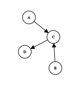
Pretend each one of those circles is a web page, and each arrow represents a link from one page to another. Google uses those links to infer importance, and gives each page a score. If we start with each page having a score of 1, and we allow each page to transfer a third of its score to a linked page, we get something like this:

A and B both have scores of 1. They each give a third to C, giving that a score of 1.66. C then gives a third, or 0.55, to D, giving that a score o 1.55.
Turns out that professor was totally right, and I was totally wrong. Common experience for me.

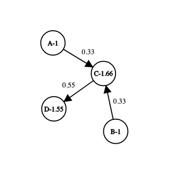
If each page has a base score of 1, and gives a third of that rank across every link, you end up with A and B keeping their scores (no one links to them), C having a score of 1.66, and D a score of 1.55. So if there’s a search, and these 4 pages are in the result set, they’ll end up with C first, and D second. Links from C are more valuable than other links, but can still be beat out by lots of low value links.

You can likely predict how people try to game this: link farming. If you get a bunch of websites to link to your page, you’ll get ranked higher. For a while, you could even pay for links to your page. Google has since adjusted their algorithm to account for that and now, if they see your page as a link farm, they’ll bump it down in the rankings. So how do they know if you’re a link farm?

We’re not entirely sure. But we think one way has to do with the ratio of outbound to inbound links – that is, links to other sites vs links to your own. If we have a page with a few dozen outbound links, like on some of our resource pages, then suddenly that ratio isn’t so good. There’s no strict rule about what that ratio should be, and since Google doesn’t publish either its actual algorithm for ranking pages, or what your score is, we can’t really know if our resource pages make Google see us as a link farm. But it’s something to keep an eye on.

You should also be alert to backlink requests. These often show up as an email, where someone will ask you to include a link to their page on your page. It’s possible that their site is actually helpful, but more likely they’re reaching out trying to capitalize on your page’s score to improve their own.

Internal resources are just as bad

Of course, that doesn’t mean you should just start packing your page full of internal links either. There are a number of pages on the site that are entirely internal link resources pages, often including an abbreviated steps to enroll or a subset of our one master resources for students page. As previously mentioned, the intent is good, but if enough people add pages like that, we’ve just added more pages for our visitors to sort through, and set up a circumstance where pages can be out of sync (that is, content doesn’t match, and we tell students potentially conflicting things). What starts out as an attempt to fix a broken navigation on our site can end up exacerbating the problem.

There’s a place for resource pages

For instance, here’s a budget page. If I do an analysis like with the pages above, the numbers will look terrible. And this page definitely doesn’t provide any links in context. And compared to some of our pages, I can’t imagine it gets a lot of traffic. But that isn’t the point. This page gets used a lot in the budget planning cycle, as emails and presentations refer people to this site as a place to find specific resources. While it may be one of the most plain pages on the site, the headers make it quite functional. Sometimes a resource page is the right choice.

So what’s the conclusion?

As with anything else complicated, it depends. There’s a place for resource pages, but if you’re thinking about putting one together, you should think long and hard about if that’s the best solution. For instance, if you’re putting that page together because you genuinely think it’s important students learn about each of those links, you might be better off communicating a few resources every so often with a targeted population, or regularly posting resources to social media, or you might be better off working resources into each of your other pages, surrounded by related content.

If you absolutely must have a resources page, then make certain to put some context with the links, so that page visitors know why you’re bothering to put this link on a page. Be sure to revisit your links once in a while, and fix any broken or moved ones. And watch out for backlink requests!

If you have a page and you’d like to know if it’s working, reach out! We can dig into how people are finding it, what they’re clicking on, and if they go on to other pages.


Web Redesign and Broken Links

We’ve getting to the stage of the web redesign where it’s time to think about content. And our website has a lot of content. Even though our website is  smaller than it’s ever been, it still has more than 3000 pages and some 10,805 external links.

While I’m pretty good at clicking links, I can’t possibly click all of those. Instead, the website has a service which checks some links every fifteen minutes. Right now, every external links on the site gets checked every 3 days. Here’s a terrifying statistic: about 1 in 4 external links on our site needs to be updated somehow.

The vast majority of those are 301 errors. The page isn’t really broken, it’s just moved. Much of that is due to Chrome’s move to mark HTTP pages as not secure. But even though those links still work when we click on them, it’s important that we update them. Eventually, server redirections stop working, and if we don’t update the link before then, the link will eventually turn into a 404.

404 links are pages that can’t be found. Those are the next biggest category of broken links on our site. A 404 is the worst. We’ve all encountered them. You think you’ve found a helpful link, but when you click it, you’re left guessing about what was there. And they make us look bad, like we dont’t even have the decency to keep our pages updated.

Here’s another terrifying statistic: out of the 3439 nodes on our site, only 1 in 3 has no problematic links on it.

We need to do better. Lori and I are going to spending a lot of quality time over the next few weeks trying to fix some of these. I’m afraid this is another place where you can expect some nagging emails from us: if a page 404s, we may not have any idea what we should link to instead, and we may be asking you for help.

There’s one particular type of page which tends to have a lot of links with errors: resource pages. There’s a few dozen pages on the site which are little more than collections of links to other sites. While these page are often well meaning – they’re trying to help students find resources we’ve verified as being helpful – they’re sometimes misguided. We’ll dig into those pages deeper in a later post, but for now, when Lori or I find broken links on these pages, we’re just going to remove the link and move on.

Our new goal is to cut the number of links with errors in half before Fall term. Wish us luck!


Coming Soon

In the mid to late 90s, you could count on most websites having some sort of under construction or coming soon message on them. Often as a gif. Mental Floss reports this was due to people seeing a website as a project, like a film or a book, that would be eventually completed. Website design reflected that process: outline your chapters, then fill them in. Hence the placeholder messages and gifs, just so people didn’t get confused when they got to an empty page.

But now we know the web isn’t like that. We now know the web to be a continual process. Content gets stale and you have to revisit. Images need refreshing. And while we can miss certain amazing pieces of 90s web design, I don’t miss the under construction gifs.

Site under construction image
Unless Bill Clinton is the president and you’re excited to replace your VHS tapes with DVDs, you’d better not be using an image like this on your site.

As of right now, the phrase “coming soon” appears on the Lane website 15 times. In 10 instances, buried in the text is a promise that more information on a certain topic is coming soon. On 4 pages, the phrase “coming soon” is the only text on the page.

“Coming soon” and “Under construction” are aspirational messages. They’re a way to tell a visitor that we’ve thought about content we know they’ll care about, and remind them to check back later.

But these intentions often don’t work. Remember those four pages that just have a “coming soon” message? Here’s the last time they were edited:

  • March 30th, 2020
  • February 20th, 2020
  • October 19th, 2018
  • October 16th, 2017

The other pages have a similar range of edit dates. “Coming soon” sometimes seems to mean forever. If I’m browsing the web and I that message, I don’t set up a calendar reminder to come back and check later. I move on.

Here’s a scenario. There’s some new program, and we know about 90% of the information. But we’re waiting on the state to tell us about the application process. We need to alert students to the program, but until the state gets back to us, we can’t tell them how to apply.

First option better than just saying “coming soon”? Add a date. Simply saying “information on the application process will be released by May 15, 2020” creates a whole different impression of the page. But what about when there’s no date?

A good option is to use that opportunity to drive people to another communications channel: “We’re currently waiting for application information from the state. Follow us on Twitter to be updated as soon as application information becomes available.” As an alternative to social media, this could be a great time to get an email list going, which you can repurpose later to promote other programs.

Sometimes that won’t be appropriate either. As a last resort, at least add a note about when someone should check back: “As of April 27th, we are yet to receive application information from the state. We will post an updated message here by May 11th.” Then you can keep updating that message, even just to tell people that you still don’t know anything new. Not only does that help to demonstrate to the visitor that there will actually be information here, it forces you to remember to actually go back and update the page.

Coming soon messages happen with new pages too. Someone will be thinking about how to redesign their site, and they’ll create some empty pages as placeholders, or they’ll be thinking about some cool new feature on their site. Except then something doesn’t work out, or some more pressing task comes up, and we end up with a page that just says “Coming soon”.

Solution? Always have your content ready first. We’ll actually be adopting this rule as a policy going forward for the web team. While we’ll be happy to talk with you about what a webpage could look like, we won’t actually create the page until you can show us some content first.

Over the next week or two, expect some nastygrams from Lori or me as we try to clean up some of these content gaps. And if you’re having trouble trying to think around a difficult “coming soon” situation, let us know. We’d love to help.

Does phone number format matter?

The other day, Lori pointed out that the phone number format on one of the mockups from iFactory was different from what we normally use. In accordance with AP style, we use (541) 463-3000. But the new mockups use the format 541-463-3000. And it’s pretty common to see phone numbers formatted with two dots: 541.463.3000. Does the format matter?

Yes. It turns out google is better at recognizing some formats as phone numbers than others. That post tested ten different formats, and found that the one we use and the one iFactory used are the ones best recognized by Google. The double dot notation? To quote the linked blog: “The phone number format you should avoid at all costs is #3: [###.###.###].

Of course, that doesn’t settle which of those two is best. So I checked to see if there are any accessibility considerations with phone numbers. There are, but they don’t relate to visible format. All phone number formats are terrible, and something like (541) 463-3000 would probably be read to a blind person as “five hundred forty-one [pause] four hundred sixty-three three thousand”. There’s a fix for that, using aria-label on a surrounding link, but that just adds something for my todo list, and doesn’t solve the debate here.

And that’s how I found myself at 10pm, doing a survey of college websites, to see how they format phone numbers:

541-463-3000 25 Harvard, UO, OSU, Washington, UC Denver, KSU, UMass, FSU, F&M, UCLA, MIT, Cal State Fullerton, Ohio State, Penn State, VT, Louisiana State, Wisconsin State, Yale, Georgetown, Alaska, Berkeley, Skidmore, Colby, Baylor, OHSU
541.463.3000 10 Portland State, Gettysburg, NYU, SNHU, WGU, U Phoenix, UVA, Middlebury, GA Tech, U Maine
(541) 463.3000 1 Gonzaga
(541) 363-3000 13 Idaho, UVM, Dickinson, Michigan State, Kentucky State, U Penn, UConn, Binghamton, Dartmouth, Cornell, Ithaca, Notre Dame, American
Mix 2 Rutgers, Princeton
This, for a variety of reasons, is not a scientific study. They’re just the first 50 colleges and universities that came to mind (and now you know I don’t follow college sports), and I didn’t check their style guide. I just looked at the first contact number I could find. As I said, not a scientific study. Just evidence of a person who’s too far down this rabbit hole to give up, far too late on a weeknight.
 
Of course, that left me with a clear winner. And I had to know why. From a blog post in 2006, I learned AP changed their preferred style, and Lane hasn’t kept up. A quick email to someone who owns a recent AP style guide verified it.
 
So we’ll probably go with 541-463-3000. The parenthetical format, (541) 463-3000, feels like it come from an age when area codes were mostly optional. And for many of us, me included, that’s no longer the case. Just please don’t use the dotted phone notation on your pages!
related XKCD comic
 

Let’s talk about FAQ Pages

As part of our website redesign, over the last two months I’ve visited each and every page on the Lane website. As part of that process, we’ve cut a lot of pages, and at just 3413 nodes, the Lane website is now smaller and more svelte than it was when we launched it back in 2011 (and that includes more than 100 nodes that aren’t even real pages!).

But also as part of that process, I discovered that there were two categories of pages that had a lot of pages, and a lot of good information, but not necessarily a lot of value.

The first was contact pages. By convention, we try to have a page, usually located at a url like lanecc.edu/department/contact, which contains contact information for a department. This is an important page, and the way we structured things was an attempt to bring some standardization to the Lane website. But it also resulted in duplicate information (contact information is sometimes on the department homepage, and some departments also created employee directory pages). We’ll likely to contact pages differently next time around.

The second chunk was frequently asked questions pages. There are probably forty or fifty pages on the website that are full of FAQs. And while often the information in them is helpful, just by presenting that information in the FAQ format we may be making it less likely students will find and understand what we need to tell them.

For a good overview of why FAQ pages can be less helpful than other  content, you should read this A List Apart article. A brief summary of  issues:

  • Duplicate content – many times information on a FAQ is contained elsewhere
  • Lack of order – FAQ content doesn’t tend to flow question to question, making it harder to understand and process
  • Repetitive structure – since all the content gets phrased as questions, you’re often introducing extra words to the page that get repetitive to read
  • Increased cognitive load – often a student will come to your page with a specific question, phrased differently from how you’ve asked it, resulting in increased processing to determine if your question matches their question

I also think FAQs are problematic for people that aren’t searching for an answer to a specific question. If you’re just exploring a site, trying to determine if a program is for you then a FAQ often fails to guide you through content in a meaningful way.

If you happen to be stuck at home with some time to do website edits, one thing that would be really helpful is working on your FAQ page. Here’s my suggestions for slimming down, or dumping, your FAQ:

  1. Read through your questions, and make sure you still feel like each question is important. If one isn’t important, remove it. You might be surprised by how much old content is out there.
  2. Find any questions in your FAQ that have answers elsewhere, whether on your site or another page on our website, and get rid of them. Reducing duplicate content is possibly the most helpful thing we can do. We’ve found that many people have tried to be helpful by copying content from elsewhere on the website, ostensibly to simplify things for their audience, but almost always this ends up making the website bigger and more confusing.
  3. Find any FAQ questions that are related to some other page on your site, and incorporate them into the content on that page. For instance, if you have a question like “What prerequisite courses do I need to take before applying to this program?”, consider moving that content to your program application page under a heading “Required Prerequisite Courses”
  4. Are there any groups of questions that are related, and which could be combined into just a paragraph or two of more effective content, either on a new page, or as a new section on an existing one?

After all that, you may still be left with some FAQ questions which just don’t fit in anywhere. And that’s ok. Sometimes a FAQ provides the right solution. But even just shortening the length of your FAQ page can help students to better find information and improve the quality of your other pages.

As always, if you’re working on something like an FAQ and have a question, send us an email at webmaster@lanecc.edu.

Kicking off a Website Redesign

With the start of the new school year comes to the launching of our website redesign project! We’re pleased to announce that over this year, we’ll be working together closely with iFactory, a Boston based company specializing in higher education and non-profit websites, to completely re-envision what Lane’s front door on the web looks like.  iFactory has done a lot of college websites, including Santa Barbara City College, Central Wyoming College,  and Prince George’s Community College, and has already impressed us with their transparency and project management skill.

Since our last redesign, it’s become clear that the front page of an effective college website needs to be oriented to the needs of prospective students. The other primary audiences (current students and employees) need to have a better home online which more directly serves their needs, and which integrates the tools they most commonly use. So as part of this launch, we’re hoping to move some employee-centric pages (like CPDT, FPD, Budget, and others – there’s about 1000 pages in total that are really only important to employees) to a more employee oriented site, where we can offer greater flexibility in terms of content editing and viability. 

And we’re interested in your opinions on the college website. Some folks from iFactory will be coming to visit soon, and they’ll be conducting some interviews with folks around campus. But of course they won’t be able to talk to everyone. So if you have any feedback on the website (and remember, we’re just talking about www.lanecc.edu here – myLane and Moodle are outside the scope of the redesign), please email us at webmaster@lanecc.edu. We’ll be sure to pass that feedback along and use it as part of the research phase in this redesign. 

Accessibility and Pizza

This is just a quick post to share some news about the ever evolving legal web accessibility landscape. The LA Times has a nice write-up of Robles v Dominos, and how by declining to review the 9th Circuit ruling, we’ve conclusively determined that the Americans with Disabilities Act does apply to websites and apps.

While this doesn’t impact the college directly – we were already subject to website accessibility requirements – it does serve as a great reminder that digital accessibility lawsuits are on the rise, and we need to continually work to ensure what we do is accessible.

And remember, that work doesn’t include just websites, but all things posted online, on any website used in relation to Lane. PDFs have some pretty good checking tools that are worth looking at.

Posts that spark joy

The other day, I saw this blog post about tidying up your website using the Marie Kondo method. While I think peak Kondo-mania is likely behind us (unless she’s renewed for a second season, of course!), as our date for content migration approaches (probably late this upcoming spring!), that post got me thinking about how her tidying principles can help provide a good frame for tidying and improving websites here at Lane. There are six principles:

Commit yourself to tidying up

Like any other tidying project, working on cleaning up your website is going to take some time. The most Kondo-like advice, of course, is to carve out an entire afternoon. But at the very least, try to find a regular time to dedicate to tidying your website and cleaning out the ROT. Even an hour every other week is enough time to make a considerable impact.

Imagine your ideal lifestyle

If you spend a minute imagining what your dream website would look like, I’d be willing to bet a lot of your dreaming is related to the look and feel of the website. Don’t get me wrong, website appearance is important. But design alone is never enough to capture, retain, or influence an audience. As you imagine your dream website, I’d encourage you to think first about what your website goals. What specific behaviors are you trying to influence through your content? What actions are you trying to get visitors to take?

The Lane website has a surprising number of pages that aren’t really about getting anyone to do anything, but are instead about documenting internal processes, documenting old projects, or displaying mandatory information. Some of this is unavoidable. Our privacy statement isn’t about to be tidied up. But imagine a page that’s just a photo gallery. They may be compelling photos in that gallery. But because they’re buried in a gallery on their own, no one is going to find that page and take the time to look through the photos. Instead, choose some outstanding pictures and work them directly into your content. If you really need to have a gallery, use a dedicated photo site (like your Lane Google Photos account), and link to it.

As you imagine, try to think about how all the pieces of your online presence – photo, video, social, and copy – support each other and to tell a compelling story and influence an action. Think about how you can show, rather than tell.

Finish discarding first

Our largest pieces of the site have over 130 pages, and hundreds of attached files. Not only can that seem overwhelming, but thinking about all that content can make your head spin. By discarding first (even just a sentence here or there!), you’ll get a better understanding of your content and where the gaps are, and maybe spot some opportunities to combine pages into one, more cohesive page.

Tidy by category, not location

The advice in that blog post is spot 0n – don’t just think about if you need this particular page, think about if you need all the pages like that. So, for instance, don’t just think about if you need a page describing Underwater Basket Weaving 201, which hasn’t been run in three years. Think about if you need pages describing your Underwater Basket Weaving courses at all – after all, the course descriptions should be in the catalog, which got a pretty spiffy update this year.

Follow the right order

One of the Google Analytics reports we’re happy to provide you is a page popularity report. For each of your pages, we can help you discover how many times it was viewed, how many times it was viewed by different people, how long they were on that page, and if it was their first or last page. I’d recommend you use these reports from the bottom up: start with your least popular pages. Since you already know they’re not being seen as often as you probably wish they were, you already know they need to change. Look elsewhere on your site to see if there’s a place they can fit in or, even better, see if you can get rid of them entirely. You can email Lori or me for help getting one of those reports.

Find joy

This one is complicated. Because the web isn’t your house, and how much a page brings you joy isn’t really the goal. The real goals relate to helping increase access to education and helping students meet their educational objectives. So find joy in what that page does, and in the goals it helps accomplish. If you can’t relate that page to a goal, thank it for it service, and say goodbye.


Responding to an accessibility concern

At the beginning of the month we changed our normally static homepage to include the following animated gif:

Watercolor image of a fountain on campus, showing a bunch of leavesWe tend to swap the homepage image to be an animated gif about three or four weeks before classes start, and link it directly to our registration platform. While these images can be pretty, after you’ve watched them for a couple of minutes, they start to feel really annoying. And, invariably, after a week or so, the first complaints show up. But here’s how we respond:

Traffic graph for that image, showing a sizeable bump in the days after we launched it, with a dip lin the weekendThose images drive hundreds of clicks in the weeks after we launch them. So, annoying or not, if they’re achieving their objective, that’s what’s important, right?

But then we got a complaint email that wasn’t about the image being annoying, it was about the image being distracting. And that got me thinking – they were probably right. Motion can negatively impact people with various cognitive impairments.

Before we go into how we responded, let’s talk a little bit about why we’re using a gif. I mean, the gif format is 30 years old. Almost everyone has moved on to web video. But when we launched the updated website, we were stuck supporting all the way back to Internet Explorer 6. And for Internet Explorer 6, 7, and 8, there was no non-flash video option. So we build the website with support for images, but often not video (though we’ve been adding some support, it hasn’t been across all parts of the site).

WCAG 2.2.2: Pause, Stop, Hide

Stuck with gifs, I tried to resolve this as quickly as possible, since there was someone out that I knew was negatively impacted by the image. I quickly skimmed the WCAG 2.0: 2.2.2 standard, but it turns out this one is a little more complicated than I first thought. Here’s the full text:

2.2.2 Pause, Stop, Hide: For moving, blinking, scrolling, or auto-updating information, all of the following are true: (Level A)

  • Moving, blinking, scrolling: For any moving, blinking or scrolling information that (1) starts automatically, (2) lasts more than five seconds, and (3) is presented in parallel with other content, there is a mechanism for the user to pause, stop, or hide it unless the movement, blinking, or scrolling is part of an activity where it is essential; and
  • Auto-updating: For any auto-updating information that (1) starts automatically and (2) is presented in parallel with other content, there is a mechanism for the user to pause, stop, or hide it or to control the frequency of the update unless the auto-updating is part of an activity where it is essential.

On a first read, I assumed this success criterion didn’t apply. After all, there’s no moving, blinking, or scrolling information. Leaves are moving, but text is not. But, as many high school teachers I ignored told me, always read all of the instructions.

Attempt 1 – the programming solution:

My first thought was to do some searches and see if I could find a way to quickly add a pause button to animated gifs, since that would be an easy, site wide fix. I was definitely reaching here, but it turns out it’s a somewhat viable option. This solution involves creating a png of a single frame of the gif, and swapping them on click. That felt problematic to me. While it might work if you click to pause the image, because our image is linked to our registration platform, I’d need to add an actual button over the image somewhere. That can be rather involved, with making it cross-browser, all screen size friendly, and ensuring it’s sufficiently accessible itself.

Attempt 2 – reduce complexity:

With the button ruled out, I thought that the easiest thing we could do would be to just remove some complexity from the image. We could make the leaves go slower, and maybe remove a few leaves. After a bit of work, our student designer put together this image for us within a few hours of the initial complaint:

The same image, but with about half as many falling leavesThat image has about half as many leaves, so it’s a lot less complex. And the leaves stay off the screen for a bit, meaning there’s always time without motion on the screen.

But while I was able to confirm the reduced complexity image solved the problem for our user with the complaint, I couldn’t shake the feeling that I really ought to read the entire standard. 

Returning to the standard

It turns out that if I’d just scrolled the page down a little bit, I’d have seen the information in the very first sentence. Here it is:

The intent of this Success Criterion is to avoid distracting users during their interaction with a Web page.

While I still think the success criterion needs some edits to be more clear about what constitutes “information”, certainly the purpose of the standard is to reduce distraction. And both Penn State and WebAIM agree: animations need to be very short or user controllable.

Attempt 3 – short animation:

The next easiest fix was to turn off looping on the animation. That way there’s still enough motion to capture attention, but not enough to distract. Here’s what we came up with:

The same image, but with looping turned offOf course, there’s some some downsides. For instance, say you embed a gif halfway down a page, and it takes more than 5 seconds to scroll there (like this page! If you’re not seeing motion, reload the page and scroll quickly). The visitor will never see the animation (note – this is fixable with lazy loading of images, but those weren’t a thing when we built this site, and we’ve had trouble grafting them on). But for us, with the image essentially at the top of the page, it’ll probably work. This also doesn’t work for cinemagraphs, which depend on perfectly looping images to create the effect of slight motion in an otherwise still world.

Next steps:

After we had an actual fix in place, we did a quick check across the entire site for other animated gifs, and found only one other place where there was a problem. That image has since been removed completely.

We’re currently exploring finally adding video support for some of the last areas of the website that don’t support it. Video would not only provide a way to pause animation, it would also allow for much higher resolution images and more complex animations. But fitting video into pages is also more complex, and if we’re unable to find a way to do what we need without a lot of work, we might end up waiting for the next iteration of the website. More details on that soon!