Recently, the Webteam was tasked with formalizing the procedures we use for testing websites and applications for cross browser compatibility. When we put together our initial design, we tested against 17 different browser/operating system configurations in person, then looked at another few dozen configurations through browsershots.org. Thanks to all our testing, so far we’ve only had one browser issue – which is only in one version of Chrome, on one version of Windows, on one particular screen resolution. I’m pretty happy with that.
But browser popularity changes, and people are regularly upgrading their devices. It’s been over a year since we last launched a design. Charged with formalizing procedures or not, as we get ready to develop a new theme for the Lane website, it’s time to take a look at what devices are accessing our website.
For this data set, we’re actually only going to look at data from the last month – Oct 6, 2012 to Nov 5, 2012. We won’t be getting as complete a picture, but we also won’t see traffic from earlier this year, before some of the more recent browsers were even launched. We’ll start with a super high overview, then dig in deeper.
Browsers & Operating Systems
So from this data we can conclude that the average (median) person visiting the Lane website is a Windows user with Firefox. Of course, we know that there’s a ton of different browser versions out there, so the story might be much more complex. But this data is still useful. Doing the same sort of extensive testing we do with the main website (millions of visits a year) with all of our sites (example: this blog, which sees about 4,000 visits a year) would be prohibitively time consuming and expensive. Testing on the latest versions of Firefox, Chrome, and IE on Windows, and then Safari on a Mac is probably good enough for most of our smaller sites.
But let’s go deeper.
Whoa! Sorry you can’t click the little down arrow and see all three pages of the key. I’m only looking at the top 100 browser versions, and I’m combining minor version numbers (treating Firefox 3.6.3 and Firefox 3.6.5 as just Firefox 3.6.x). That still leaves us with 39 different browser/version combinations.
Turns out that the average person is actually an Internet Explorer 9 user. And their operating system:
As expected, most people use Windows. There’s no way to generate a graph of browser, version, and operating system (and it might be too complex anyway!), so we’ll have to conclude our analysis here. But we’ve learned a few things. For one, Safari on Windows, Chrome Frame, and Linux all aren’t important to us. And we’re probably ok to stick with our high level testing plan for basic sites – it’ll still cover a majority of users.
Screen Resolutions
Screen resolutions are usually listed as number of pixels wide by number of pixels tall. Pixels tall can be useful to know, as it helps us determine where the “fold” is. But at this stage we’re mostly concerned with width, since that more directly impacts layout. This used to be simple to do, but with the advent of tablets that rotate their orientation, screen width has become a little more fluid: 1024×768 and 768×1024 might actually be the same device. For the purposes of our analysis, we’ll just assume that tablets don’t rotate. As long as we’ve set our media queries appropriately, things should still work.
There’s something else to consider here. A device that’s 1024 pixels wide will have trouble displaying a webpage that’s 1600 pixels wide. But there’s no issue the other way. So we’re really looking for a lowest common denominator. In this case, I’d submit that our lowest common screen resolution is 1024×768. It’s ancient, yes, but it’s also the standard resolution on most tablets.
In our case, we set our media queries up as:
Global: <740px
Narrow: 740px to 979px
Normal: 980px to 1219px
Wide: >1220px
Is this a good fit? I think so. It a content area gets to be too wide, it gets to be hard to read. So though it’d be totally justified to have a media query for browsers that are greater than 1400 px wide, I’d argue that it’d be hard to maintain the same look and feel without decreasing readability. And we should be ok with the tablet assumptions we made earlier – most should jump between narrow and normal view depending on orientation, but shouldn’t fall to a cell phone optimized view.
Java Support
28.38% of visitors reported no Java support. Although its a free plugin, we should probably seek alternatives whenever possible.
Flash Support
Although Google Analytics doesn’t provide us with a simple way to check Flash support, we can assume that “(Not Set)” is a reasonable guess at “Not Supported”. In this case, about 13% of our visitors don’t support Flash. Since 7-8% of our traffic is mobile, and we know that iOS devices don’t support Flash, this sounds about right. The lack of support we’re seeing here is a good reason for us to try to move away from Flash on our pages wherever possible.
Mobile Devices
Compared to this time last year, mobile traffic is up 50%. We’ve got to keep thinking mobile. What devices do people use? iPhones. Followed by iPads. In fact, the next 10 devices put together only add up to 1/3 the traffic we get from iPhones. For every Android device visiting a page, there were 2 iOS devices visiting that same page.
But Androids aren’t insignificant. In fact, more people visit via Android than people do via IE7. So let’s have a look:
It looks Android 2.x hasn’t quite gone away, although we seem to have skipped Android 3. When testing phones, we should probably be sure to find a mix of Android 2.2, 2.3, and 4.0 devices.
What Now?
Now that we’ve drawn together all our data, its time to make some decisions about testing procedures. We’ll convene as a web team, go through all our data, and try to come up with a check-list. Except to see some further details soon!
Last time, we analyzed where people go on the Lane website. This time, we’re going to wonder how they found the Lane website in the first place.
That’s right. This post has pictures.
We’ve analyzed our SearchTraffic to death, and right now our Campaigns (targeted emails and such) aren’t a significant source of traffic. Direct traffic isn’t very interesting, since it’s just people that type our URL into the address bar of their browser (or are referred from an evil website that prevents us from seeing referral information – more on that later). But we can learn a lot from Referral Traffic, which we can define as visits from people who found us by clicking on a link on another website.
Of course, not all referral traffic is equally interesting. I exported the top 500 referral sites (anyone who has sent at least 52 visitors last year) to a spreadsheet, and went to work.
The vast majority of our referral traffic to www.lanecc.edu is actually traffic from another one of our Lane websites – Moodle, MyLane, etc. So let’s ignore those for now – although unifying navigation is a goal, we can’t also do that in this blog post. While we’re at it, let’s ignore the 7% of referral traffic that came from search that Google Analytics didn’t identify. I’m being a little generous at what constitutes search – people that are squatting on a domain and putting a search bar on it to collect ad revenue should really count as “Bad People”, but we’ll pretend they’re legitimate search engines here.
We’ll also ignore AskLane, our Knowledge Base about Lane. It’s a useful tool, but people generally find it from a Lane website, so we shouldn’t count it as a distinct referrer.
That’s better. It’s also not entirely accurate. The number of people who come to the Lane website via Email is likely much higher, but some email providers make it impossible to see that they were the referrer – even Google’s own email service. If you’re a department here on campus, and you’re thinking about sending out a mass email, come talk to us first – there’s things we can do to make it super easy to identify who’s clicking your email links.
Let’s look at each of the other categories one by one. Keep comparing each category against the overall averages – referral traffic averages 2.98 pages/visitor, about 4 minutes on site per visitor, with a new traffic rate of 23% and a bounce rate of 55%.
Social Referrals
Google Analytics actually provides a much more comprehensive interface for analyzing Social traffic. So we’ll augment our data set.
I think that graph kind of speaks for itself. And forget about the other 13 Social Networks (including Tumblr, MySpace and Pinterest), who send so little traffic that they don’t even show up. But is there a difference in the quality of traffic from Social Networks?
I think it’s clear that yes, there is a difference. For pages per visit, we want the bar to be as high as possible – an indicator that the average visitor not only came to the site, but they then explored some other pages. In this case, the clear winner is Naver – a Korean Search and Social Networking Site. The biggest losers are Delicious and Facebook. So even though Facebook sends us 92% of our referral traffic, most of those visitors only view one page and then leave.
We see a similar pattern in Bounce Rates (percent of people who view a page then leave. Facebook and Delicious have terrible Bounce Rates. Twitter (shown as t.co, since t.co is Twitter’s URL shortening service, and thus is the referrer) fares only a little better. But both Google Plus and LinkedIn tend to send us visitors that visit at least one other page. They also tend to send us more visitors that are new – 16% and 19%, respectively, compared to 9% for Facebook and 4% for Twitter.
Lessons? Facebook is so big that its impossible to ignore, but its also some of the worst traffic. Don’t ignore the other networks.
Government Referrals
Visitors from government websites have better than average statistics. Here’s the complete list:
Source
Visits
Pages / Visit
Avg. Visit Duration
% New Visits
Bounce Rate
ltd.org
5642
2.24
0:02:48
8.53%
63.58%
oregon.gov
3354
4.24
0:03:37
58.86%
36.49%
stateoforegon.com
1780
3.65
0:02:53
78.71%
43.54%
eugene-or.gov
750
3.87
0:03:22
52.93%
47.07%
cms.oregon.gov
616
4.39
0:06:38
43.18%
29.87%
public.health.oregon.gov
539
4.02
0:05:20
63.45%
33.58%
ode.state.or.us
133
2.98
0:02:25
33.08%
51.13%
www1.eere.energy.gov
111
3.27
0:02:54
50.45%
63.06%
ci.florence.or.us
107
4.27
0:04:25
50.47%
38.32%
odccwd.state.or.us
103
2.73
0:02:35
59.22%
57.28%
egov.oregon.gov
94
6.2
0:05:09
24.47%
19.15%
nces.ed.gov
85
6.13
0:07:30
61.18%
23.53%
ci.corvallis.or.us
75
2.83
0:01:54
52.00%
48.00%
boli.state.or.us
63
3
0:02:35
26.98%
49.21%
ci.springfield.or.us
53
2.47
0:03:59
11.32%
47.17%
Averages:
900.3
3.75267
0:03:52
44.99%
43.40%
In the interest of not writing the world’s longest blog post, I won’t go into too much detail, but there’s a lot of questions to ask. Are visitors from www1.eere.energy.gov looking for info on our Energy Management program? Are the visitors from public.health.oregon.gov looking for Health Professions information? Knowing that, can we do anything to help those visitors?
Educational Referrals
Once again, here’s some data:
Source
Visits
Pages / Visit
Avg. Visit Duration
% New Visits
Bounce Rate
oregonstate.edu
846
3.02
0:05:52
10.05%
50.00%
utexas.edu
801
2.86
0:02:10
78.28%
55.43%
lcsc.edu
786
2.72
0:02:14
49.49%
57.76%
osba.org
567
3.52
0:02:18
73.37%
45.15%
ohsu.edu
387
2.34
0:02:56
23.77%
69.51%
umpqua.edu
333
3.47
0:03:59
22.52%
52.85%
nac.uoregon.edu
331
1.17
0:00:57
0.00%
91.54%
oregoncis.uoregon.edu
330
3.86
0:03:54
36.67%
47.88%
blogs.bethel.k12.or.us
327
3.46
0:05:34
44.34%
33.64%
uodos.uoregon.edu
306
3.78
0:14:27
3.27%
37.25%
Averages
247
2.8339
0:03:50
32.59%
53.51%
The averages don’t add up right, but that’s because I’m only showing the top ten here.
Why do some of these referrers have exceptionally high (78%) new visitor rates? Let’s dig deeper into traffic from utexas.edu. In this case, it turns out that the University of Texas maintains a list of Community Colleges around the country, and this is the source of almost all of the referrals. If we follow the visitor flow of those visitors, we get this:
Click the image to see a bigger version with legible text
So there’s people in Texas, looking at a list of Community Colleges, who click a link to our website. They look at some basic informational pages, and then go away. Do they come back later? (We get 29,000 visits a year from Texas, either as direct links or Search). Digging even deeper into this visitor flow, I can see that Texans are looking at many of our pages in Spanish. Should we further develop our translated pages?
Employment Referrals
Source
Visits
Pages / Visit
Avg. Visit Duration
% New Visits
Bounce Rate
qualityinfo.org
1236
3.05
0:03:49
44.09%
58.33%
worksourceoregon.org
869
2.61
0:02:46
17.38%
64.67%
eugene.craigslist.org
794
2.46
0:03:01
19.90%
59.32%
univjobs.com
556
2.42
0:00:49
69.78%
15.47%
academic360.com
368
2.46
0:00:50
65.22%
11.68%
higheredjobs.com
170
5.04
0:02:44
83.53%
37.06%
chronicle.com
55
3.55
0:04:47
80.00%
54.55%
Averages
578.2
2.981
0:04:07
23.08%
55.00%
Having dealt with more than a couple hiring committees, I’ve always been curious to see what sites with job listings send traffic our way. Strictly speaking, the above is a pretty poor list. Most of our job postings link directly to the job post at jobs.lanecc.edu, so we may not see all the traffic in the above table.
College Guide Referrals
These are websites that attempt to guide you into picking a college, or provide listings of colleges with certain programs.
Source
Visits
Pages / Visit
Avg. Visit Duration
% New Visits
Bounce Rate
oregoncollegesonline.com
945
3.05
0:03:44
40.21%
52.59%
technical-schools-guide.com
433
4.01
0:02:51
62.59%
37.18%
medicalassistantschools.com
245
3.84
0:03:04
47.76%
46.53%
flightschoollist.com
235
5.55
0:04:39
66.38%
35.74%
bestaviation.net
167
7.38
0:04:55
67.07%
14.97%
communitycollegereview.com
156
2.96
0:02:30
54.49%
48.08%
nursingschools.com
142
3.47
0:03:39
78.17%
35.92%
studyusa.com
129
5.81
0:06:46
70.54%
31.78%
a2zcolleges.com
123
3.93
0:02:50
75.61%
46.34%
justflightschools.com
108
6.55
0:04:16
76.85%
22.22%
communitycollegesusa.com
106
6.09
0:07:01
44.34%
31.13%
educationatlas.com
92
2.78
0:01:35
84.78%
50.00%
artschools.com
90
4.77
0:03:06
70.00%
21.11%
braintrack.com
90
3.58
0:03:19
51.11%
32.22%
universities.com
89
3.19
0:07:07
8.99%
48.31%
collegestats.org
87
3.98
0:03:42
81.61%
37.93%
collegeview.com
83
4.23
0:04:07
54.22%
26.51%
aviationschoolsonline.com
69
5.71
0:04:10
79.71%
20.29%
campusexplorer.com
63
5
0:05:43
55.56%
22.22%
uscollegesearch.org
63
4.95
0:02:58
80.95%
34.92%
community-college.org
62
3.82
0:02:08
87.10%
46.77%
collegesearch.collegeboard.com
55
4.58
0:03:03
74.55%
29.09%
Averages
165.09
4.51
0:03:57
64.21%
35.08%
If this wasn’t already a record long post, we could try to compare programs – do referrals for flight programs differ from referrals for health professions programs? Is there something either of these programs could learn from each other to try to drive more traffic to their pages?
News Website Referrals
Source
Visits
Pages / Visit
Avg. Visit Duration
% New Visits
Bounce Rate
coder.targetednews.com
359
1.37
0:00:36
9.19%
72.14%
special.registerguard.com
155
2
0:03:44
8.39%
67.10%
eugeneagogo.com
80
2.22
0:01:48
21.25%
62.50%
eugenedailynews.com
67
2.78
0:04:07
10.45%
56.72%
oregonlive.com
57
1.98
0:00:46
45.61%
59.65%
myeugene.org
55
7.62
0:21:53
9.09%
34.55%
Averages
128.8
2.995
0:05:29
17.33%
58.78%
Here we can ask questions like: why do visitors from myeugene.org spend so long on the website?
Everybody Else
The last 18% is the hardest to figure out. Some are sites like tiki-toki.com, where we host some time lines, but aren’t really Lane webpages. Others simply don’t resolve to anything any more – it’s like that website isn’t on the Internet any more. And others appear to have been proxies that purposely disguise the referrer. But if I cut out ones that really seem to be irrelevant, and we look at the top 30, here’s what we get:
Source
Visits
Pages / Visit
Avg. Visit Duration
% New Visits
Bounce Rate
nwaacc.org
1366
1.83
0:01:41
51.54%
63.98%
planeteugene.com
1179
2.61
0:01:57
39.78%
32.99%
en.wikipedia.org
1167
3.8
0:02:42
68.98%
43.70%
oregonchildcare.org
712
3.09
0:05:40
19.94%
38.06%
nweei.org
497
3.71
0:03:28
32.39%
44.27%
osaa.org
494
1.75
0:01:30
75.10%
74.90%
windustry.org
456
2.69
0:01:58
87.94%
58.99%
artshow.com
437
2.28
0:01:03
72.77%
55.61%
ocne.org
434
4.35
0:04:32
38.48%
34.10%
oregon.ctepathways.org
397
8.16
0:11:31
12.59%
40.55%
mypathcareers.org
372
4.95
0:03:52
47.58%
23.66%
capteonline.org
343
5.14
0:03:43
74.93%
11.08%
racc.org
332
2.57
0:01:14
57.23%
31.33%
league.org
263
3.09
0:04:12
37.26%
50.57%
peacehealth.org
263
2.19
0:02:20
15.59%
69.58%
adha.org
227
6.03
0:04:21
68.28%
29.96%
apta.org
214
5.78
0:04:58
71.96%
10.28%
maps.google.com
183
4.58
0:03:30
59.02%
39.89%
mtai.org
182
2.15
0:02:35
61.54%
63.74%
flashalerteugene.net
178
2.55
0:03:58
7.30%
67.42%
ratemyprofessors.com
176
2.91
0:02:10
28.41%
58.52%
florencechamber.com
161
4.27
0:04:35
44.72%
37.27%
lanecountyseniornetwork.com
156
1.93
0:02:07
25.00%
69.87%
4cnas.com
154
1.66
0:02:40
11.04%
78.57%
degreedays.net
152
2.55
0:01:31
90.79%
53.95%
startatlane.com
136
2.63
0:03:11
13.97%
57.35%
healthguideusa.org
134
3.2
0:02:25
79.10%
46.27%
wadsworth.com
134
1.18
0:00:22
85.82%
90.30%
kpflight.com
131
2.35
0:01:46
12.21%
41.98%
Lots of questions spring to mind. Our stats from Wikipedia are pretty good. But when’s the last time anyone cleaned and updated our page? (Answer: May 19th, 2011, when a paragraph was added about the Longhouse , if you don’t count the two pictures added a few weeks back) Our stats from Google Maps are also pretty good, which I’m happy to see – last year I spent a couple days improving our campus map on Google Maps using their mapmaker tool. But since those maps are community edited, is our listing still ok? Are there things we’re missing?
Also interesting is the number of websites that simply list colleges offering a degree. For example, 90% of visits from degreedays.net are new, and are probably people interested in Energy Management. Can we do anything with this data? Are each of those sites linking directly to the program? (degreedays.net does) Do we need to ask any of those sites to update their links, since we’re changing our url structure? (In this case, no – and this is actually a complex question. Email me if you’re concerned).
Conclusions
Phew. That was a lot of data. I’ve only been processing it for a couple hours and I already have dozens of questions to try to answer. But I think its all important stuff to keep in mind as we continue to refine our information architecture. Are we keeping the needs of those 300,000 referral visitors in mind? If we come back to this data in another year or two and look at our bounce rates, will they have gone down, because interesting information is easier to find due to our new Information architecture? Are there any opportunities on any of those sites to increase the number of referrals?
As always, let us know if you’d like to sit down and look through some more complete data for your department.
One of our goals for this redesign has been to simplify the website navigation for our visitors. We’re taking a three pronged approach:
Reduce the number of pages on the site
Unify navigation
Simplify entry page navigation
The first one is the most rewarding – we’re getting rid of pages. So far, we’ve cut 5920 pages by either deleting or moving them to a separate archive site. Hopefully we’re narrowing the focus of our site and reducing the number of links that would take you away from what you’re looking for.
The second two approaches are much harder, and will be the focus of this post. Both require a pretty serious knowledge of where people go our our website, as well as what people are looking for. The first place we’ll look for this data is our own internal search traffic, which we graphed a few posts ago. That gives us 50,000 searches for 3700 different terms over the last three months. We’ll scale it by a factor of 4 to get an estimate of what traffic looks like over the year.
Our second source is much bigger, 1,000,000 searches on Google for 500 different terms. We can immediately throw out the 83% that are people searching for the Lane homepage. Then we can combine similar searches: in addition to obvious misspellings, like “Modle” and “Moodle”, there’s terms like “fall classes” and “spring classes” that are really just searches for “schedule”. It’s important to combine the right things – if we combine too many terms, we’re losing an opportunity to provide a more direct link to a resource. But if we combine too few, then our rankings might not be right.
When we’re all done, we can combine the Google searches with the internal searches, which leaves us with 278 different search terms. Here’s the top ten:
Search Term
Google
Internal
Total
staff directory
8569
7832
16401
mylane
14196
1520
15716
moodle
12314
1756
14070
map
7934
5944
13878
testing
4036
6384
10420
library
6326
2928
9254
jobs
6594
2148
8742
nursing
3403
5252
8655
downtown center
5791
292
6083
express lane
2631
3312
5943
Our next step is to look at our actual page views. That’ll let us validate our search traffic, and tell us where our current navigation works. If a page is getting visited a ton, and no one is searching for it, then we did something right… right?
We’ll look at our 500 most popular URLs. Once again, our first step will be to combine them where appropriate, a job made somewhat more difficult since we’ve been switching URLs around as we move into Drupal. We’ll also look out for things that unfairly influence our page counts. For example, some of the computers on campus automatically open to the computer labs landing page – 65% of the page views on that page are “entrances”, meaning it was the first page viewed. To account for this, we’ll subtract the number of entrances, minus the number of times “computer labs” was searched (searches also generate entrances, and we don’t want to discount those). Our page views will now be:
Views = Views – (Entrances – Traffic from Search)
Sadly, that’s a real pain to calculate due to how our data is set up. But we have a pretty good idea of where this is applicable, so I’ll hand calculate it on the half dozen pages where it’s needed.
When we’re done, here’s our 10 most popular pages:
I’d rather use unique pageviews, to see what pages are important to people, rather than the pages visited most, but unique pageviews are impossible to accurately combine. But we’re really just doing a back of the envelope calculation here, just finding a starting point for our navigation. We’ll perfect it as we look at how people interact with the website after the launch of the new design.
At a quick glance, we see some differences between here and the search data set. But that’s somewhat explained by looking at the pages people go to while applying for admission – the steps to enroll and /esfs/admissions. It seems people don’t search for the application, they search for the institution, then apply. But overall, there’s a good deal of overlap in our two data sets. That’s good – it means our search data is a fairly valid representation of what people look for on our website.
As part of the new design, we’ll be adding landing pages for each of our visitor types. Students, Employees, Future Students, and Community Members will all have a page full of relevant links and information. Since each of those pages will be linked from the homepage, we can create a goal: within two clicks of the homepage you should be able to access all of the pages that account for at least 85% of our page views. Put another way, if you land on the Lane homepage, there should be an 85% chance of getting you where you want to be with only two clicks of the mouse.
In addition to the landing pages, we’ll also have a dedicated Mega Menu on all of our pages on all of our sites. Since there isn’t as much real estate to work with, we can’t have quite as many links. But we’ll also need to use all of the data we’ve collected to build these links with the same goal – the pages people need should be easily accessible.
Unfortunately, now we’ve reached the point where things get a little more subjective.
Some of these links aren’t relevant for some of our visitors. Most new students don’t really care about staff instructions for accessing email.
There’s still grouping to do. We can’t link to each department, but we can link to a department listing. There’s a couple options for this.
Some pages, like guest lecturer information, were only relevant this last year.
We need to consider marketing needs. There’s often a program or event that we’re trying to advertise to campus. We cannot ignore this need – it’s how new programs are discovered.
There’s some things that aren’t links that need to be added to those pages. One example would be announcements about things like financial aid deadlines. We need to get that information out, but it won’t show up in either of our data sources.
In order to avoid any bias from me, I’ll convene a group of people to dig through this data a bit more and build our links and menu using both the search data and the list of popular pages.. When we’re done, it’ll be time to start testing. Expect updates then!
Our apologies for the unplanned website downtime around 10:30 this morning.Everything should have been working again by 10:40.
As part of our process of modernizing our servers, last week we upgraded the operating system software running our website, making some improvements as we did it. Unfortunately, there was a mistyped IP address, causing the server to hiccup a couple times a day.The really bad news is that while fixing that this morning, the networking service froze up, causing the server to stop responding. A quick restart fixed things.
Things should be fixed now. And the silver lining to all of this is that we further tuned some database parameters this time around – the administrative interface to the website should be much faster than it was.
I was on a bike ride through West Eugene the other day, and I got to thinking about people that visit the Lane Website. What is it they’re looking for? What pages do they go to? Where do they come from? What web browsers do they use? Where are they from? I couldn’t wait to get home and find out.
So as soon as I got home, I fired up Google Analytics and started digging around. It wasn’t long before I realized that I wasn’t going to just find a couple quick answers to my questions. Every answer I found raised two questions. There was a lot of exploring to do. So over the next few months, every Friday I’m going to try to make a post about analyzing some particular aspect of our website. Hopefully it’ll help us refine the designs we’ve been working with for the website redesign.
We’ve been tracking visits to the Lane homepage since 2008, giving us lots of data to work with. So much with that it’s almost impossible to draw any conclusions – think about how things have changed on the Internet in the last five years! So, for the purposes of this analysis, we’ll mostly be working with data from the last year – Oct 15, 2011 to Oct 15, 2012.
While we analyze that data, it’s helpful to keep some simple statistics in the back of your mind, just to help frame things. This way you’ll have an anchor in mind – so that if I tell you that some website sent us 150 visits last year, you’ll know that isn’t many when you’re talking about a website that sees 4.8 million visits a year. Here’s the stats:
Visits
4,872,025
Unique Visits
1,420,264
Pages/Visit
2.57
Avg Visit Duration
00:04:00
Bounce Rate
59.06%
Bounce rate is a helpful term to know – it simply means the number of people that saw one page and left. A high bounce rate is good on some websites, where people just go for quick bits of information (like a thesaurus). But on our website, where we want people to learn and explore a little, we generally want a low bounce rate.
Next week I’ll post about how people actually find the Lane Website, and I’ll try to update this post with links to subsequent posts as we go:
And now’s a good a time as any to plug what we can do with Analytics for your website. If you’ve got a website on campus and you’re interested in how people find and use your website, send Lori Brenden or me an email. We’ll hook you up.
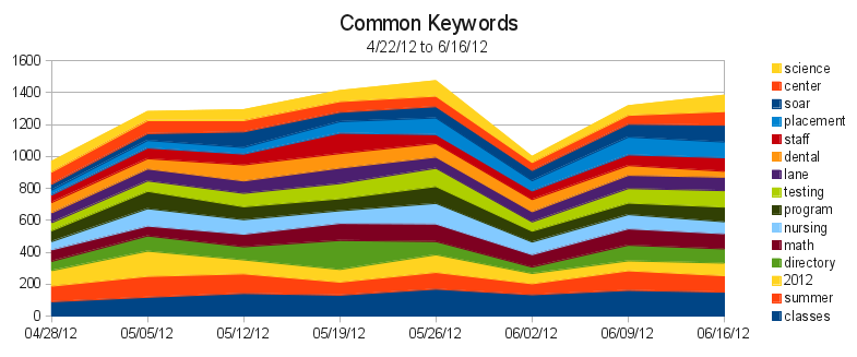
Originally we were only looking at keywords (each of the words you search for) and queries (your exact search, often a phrase). As a refresher, here’s the graph of our common queries at the time:
Right away we can see some redundant queries. “staff directory” and “directory” are really people searching for the same thing. Similarly, “campus map” and “map” are both people looking for the campus map. Although this is useful information to know, as it lets us figure out what terminology to use, it’d be nice if we could condense things so we just saw what people were trying to find – these are the sites that should be more prominently linked.
So our first change was to condense the number of queries, by grouping related ones into their most common term. We didn’t do it for all of them – just the top 300 or so – but it was enough to represent the majority of our search traffic. Our second change was to increase the amount of data for better accuracy. We’re now looking at the top 500 keywords and queries every week, instead of just the top 100. After 12 weeks, that gives us 1523 different queries, and 921 different keywords.
That much data means we needed a new, fancier way to get a big picture of it. Conveniently, as part of a different project, I’ve been learning to visualize data using d3.js *, and the thousands of points in our search data make a perfect starter project for me.
To really see the power of d3, you’ve got to see the graph in person. But here’s an image, in case you’re on an older browser (IE7 & 8 support is sketchy):
Top 50 Search Queries
This particular type of graph is called a streamgraph. To read it, click on it to go to the website where it’s actually hosted, then mouse over a particular band. The width of that stream represents the proportion of traffic that searched that a particular query. The thickness of the river represents the total amount of traffic. Because a streamgraph sits around a central line, rather than a bottom line (like the one in the first image of this post), it’s easier to see changes in volatile data.
If you look at the graph on the webpage (and not here!), you’ll see a few dots below the graph. Mouse over them to see annotated events that we think might have contributed to sudden search bursts. Some of them, like the ExpressLane burst, are obvious. Others are just my guesses. And others are totally unidentified. If you have any ideas what might have caused one of those bursts, let me know in a comment, so I can have an even better understanding of how our site is used!
* I also cheated and used a project called Rickshaw, which provides an even gentler interface to d3 for time series data.
I promised earlier that there’d be a follow-up post with new and interesting search data from our Google Mini. I’ll do my best to geek-out with as many stats as I can.
Google’s search statistics are given for for two types of data: queries and keywords. A query is the actual search performed on the search engine, for example “Labrador Puppy”. The keywords are (mostly) the words in the query. For my example we’d have two keywords, “Labrador” and “Puppy”. Some keywords, such as “the” or “and” we choose to ignore – no one is seriously searching for “the” on our website and expecting to find something meaningful.
Every Monday we collect data on the 100 most common queries and keywords from the previous week. After two months of collecting data, we’re have 190 keywords and 330 queries in our database. Let’s look at just the top 15 of each:
This graph is called a “Stacked Area Graph”, and it helps us to compare not only queries against each other, but also to see how queries change over time. So, in this chart, it appears that 6/2 was the busiest day on the search engine. In reality, because we’re only looking at the top 15 queries, we’re seeing some skewed data. If you look at all 300 of the queries we’re tracking, 6/2 was actually one of the slowest days.
So what can we learn? For one, we can learn what people are having trouble finding. The most popular search on our search engine has been for “soar”, and that it peaked last week – right before SOAR happened yesterday. This might be a hint that people were having trouble finding SOAR information without searching for it – a good indicator that maybe a more prominent link to SOAR should appear before the event.
We also see a few queries that should be combined. “map” and “campus map” is one example, “staff directory” and “directory” are another. We’re not combining them in our data right now because we want to see what people call things. For example, we can tell that more people are searching for “staff directory” than just “directory”, so it’s probably better to call our future staff directory (yes! this is coming!) a “Staff Directory” instead of just “Directory”.
We can also start to wonder why “library” was such a common query on 6/2, which is right around finals. If there’s often a lot of searches for the Library just before finals, we’d probably want to feature something on the Library on the homepage, to make it easier to find.
Keywords help us in different ways. Here we can see that our most popular keyword, “classes”, is actually used in searches more than any of our actual queries. So we know that many people are searching for classes, using a variety of queries. So we should probably investigate our analytics figure out where people are going after searching for classes. Then we can try to make those pages easier to find.
While there’s certainly improvements to make, most of this data is simply baseline information for after we finish revamping our information architecture. Then, as we implement our new Information Architecture, we should be able to see how that impacts our search traffic, to see if we’re providing a quantitatively better experience.
And to think, there’s thousands of data points inside the mini, and we’ve barely scratched the surface!
It’s fairly well accepted that it’s important to have a super fast webpage. We’ve spent much of the last two weeks working on our back end design to make the new Lane webpage as fast as it can possibly be. This blog post will be about sharing our results. A few notes before we begin:
These tests were conducted mostly on my own laptop, which was busily doing other things, so results aren’t scientific – but it’s good enough for the type of basic improvements we’re going here. On the plus side, this will totally eliminate network effects, since there isn’t really a network.
Some of these improvements are technically still in testing, and thus you won’t see on the main website (yet). Others were actually implemented weeks ago, but I’m rehashing them here because they’re some of the simplest improvements you can make.
I’ll be using Firebug to watch the event timeline to see how long things took. This isn’t perfectly accurate, but it’s pretty good for us. And Firebug is amazing.
Baseline
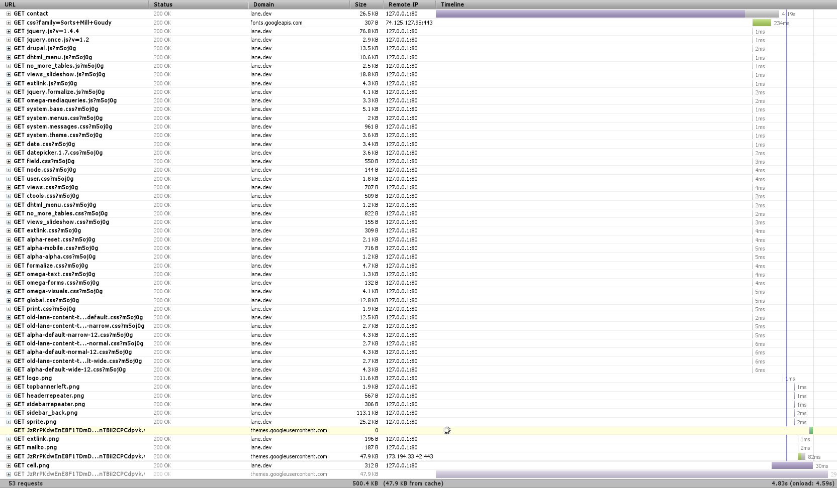
In any testing, you need a baseline. Here’s the timeline for loading the contact page (remember to click on any image to see the full size):
Right away we notice three things – first, that there’s a font that hasn’t finished loading, and which is highlighted in yellow toward the bottom. That’s actually an issue with Firebug, so we can just ignore it.
We also notice that there’s a TON of requests. In this case, 53 (technically 52, since we’re ignoring the font one). When we’re dealing with a local server like this, each of those requests happens super fast. But when we’re dealing with a remote server, like with 99.999% of web requests, there’s a limit of how many requests you can make at one time – always less than 10. So we can get a significant speed boost if we combine requests (You can see some of that limit at the bottom of this post).
Finally, we see a huge purple bar up at top. Any time you see purple in Firebug, that’s when we’re waiting on the server to do something. In this case, we can see that it took about 4 seconds for Drupal to render the page. Surely we can do better!
CSS/JS Aggregation
Our first step will be to combine CSS and Javascript files. We won’t see much of a difference on our tests (things might actually get worse!), but we’ll see a significant improvement on the actual site.
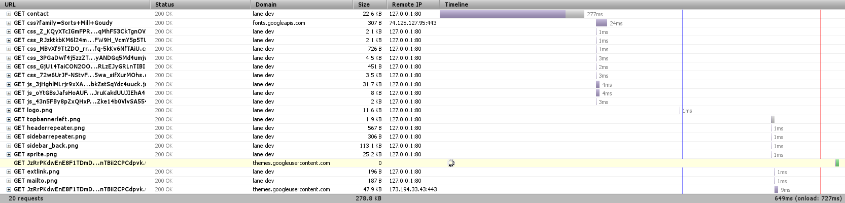
We’re down to 20 requests, just by telling Drupal to combine JavaScript and CSS files where it can. Eliminating 30 requests is actually a significant speedup (Sorry I can’t easily show it here, but you can see other research online).
Also worth noting is the file ‘sprite.png’ that’s listed on there. This is essentially the same idea, applied to images. You can look at our sprite here.
Medium Level: APC
We’re going to skip over the next most obvious method of speeding things up and instead have a look at the Alternative PHP Cache (APC). Drupal is written in PHP, which is an interpreted language. That means that when we process the index.php file, we first turn it from normal PHP code to optcode, which is then run on the PHP virtual machine. APC lets us store (cache) optcode, so that we can skip that first, interpreting step.
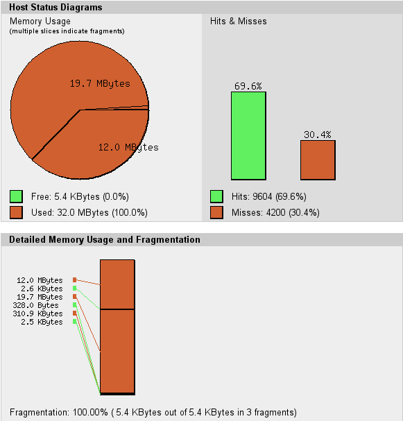
The other night, we found that our server was actually freezing on some requests. We had a look at the apc cache, and we found something like this:
The circle is all red – there’s no more free memory available for APC to use to cache optcode. Our memory is also fragmented – APC can’t keep things near each other, which is going to make the cache work harder than it should. Together, these two things make us ‘miss’ the cache – on my computer, there were 4200 opportunities to speed things up that we missed. So we simply increased the cache size.
Now we’re loading the entire page in 640ms, and it’s only taking Drupal 277ms to get us the page content – less than 1% of the time it took before.
Medium Level: MySQL Caching
The other place to do caching is our database. Some types of requests to the database are really simple, repetitive things that could easily be stored in memory instead of on disk. MySQL provides a query cache where it learns what those things are. By default, this cache is turned off. If we turn it back on:
Now Drupal is able to get us that page in 212 ms – almost 25% faster.
Now what?
So we’re pretty quick. But, being programmers, we’re never satisfied. On our actual server we’re also:
Tuning our Web Server parameters so that we always have something waiting for your web page request
Pushing some resources onto a Content Delivery Network (videos, fonts, some JavaScript), so that they’re shared between multiple websites, reducing the likelihood you’ll need to download them.
Running much JavaScript from the bottom of the page instead of the head, so that the page will render in your browser before doing Javascript – giving the appearance of it being faster.
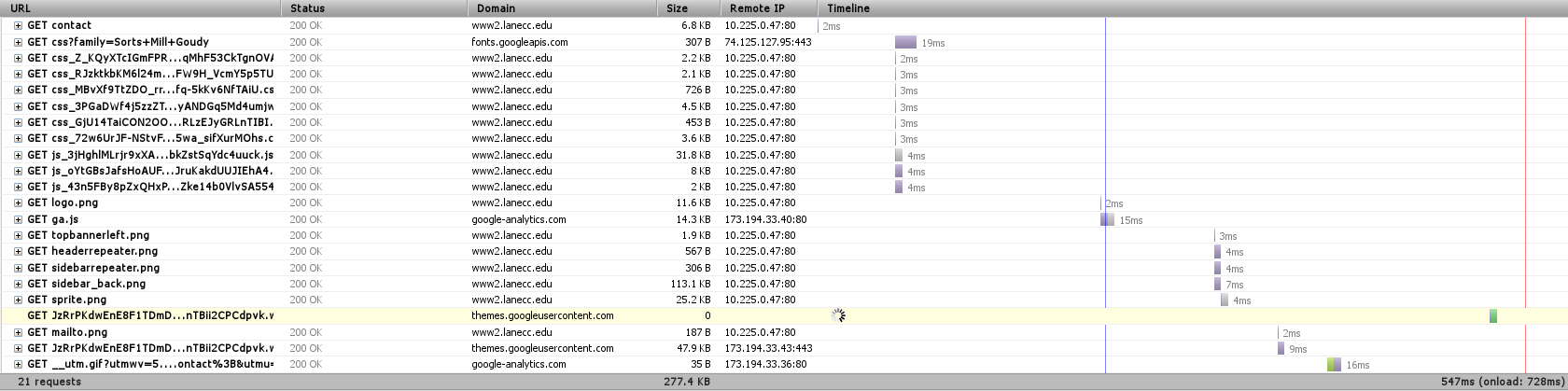
Here’s the timeline from the actual server to my computer, as it is right now:
But there’s one more big thing we can do.
Anonymous User Caching
When Drupal renders a page, it needs to fetch information from the database, process a bunch of templates, check user permissions on a ton of objects, and then build the page. Then Apache, our web server, needs to serve that page to you. Apache is a good web server, but it’s a general purpose web server, designed to serve many different languages. There are faster alternatives.
We currently have a server in testing which is designed from the ground up to serve pages as fast as it possible. Pages loaded from that look like this:
Our Varnish server is an entire separate server that sites between you and Drupal and does nothing but determine what pages could be stored in RAM as complete pages, ready and waiting for when you want them. In this case, it was able to return the contact page to me in 2ms – most of the rest of the time was spent waiting for other resources – CSS, Javascript, and fonts – to load. Now it’s obvious why reducing the number of HTTP requests would speed up our page load – those bottom requests would be made sooner.
Varnish posed a special problem for us these last two months while we were testing it. First, it doesn’t do encrypted traffic. For that we have a separate nginx server, which takes care of passing your encrypted requests straight to Drupal. But our second, more fun problem was figuring out how to load test Varnish. My laptop wasn’t strong enough, then our other web server wasn’t strong enough, and then a set of 5 other machines on the same network weren’t strong enough. Varnish was able to handle thousands of requests per second, and not even blink.
Finally
Thanks for sticking with me this long! Except a much faster web site before the end of the month, as we finally turn on Varnish for the rest of the world. And we know there’s still work to be done. Our next design should feature fewer requests and less JavaScript, letting your page load and render just a little bit faster.


