DrupalCon Portland, and the evils of and

Last week, two Lane Web Team members went up to DrupalCon Portland.
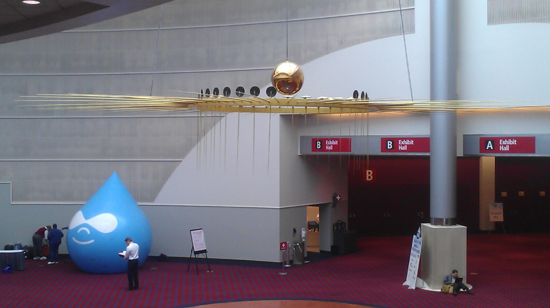
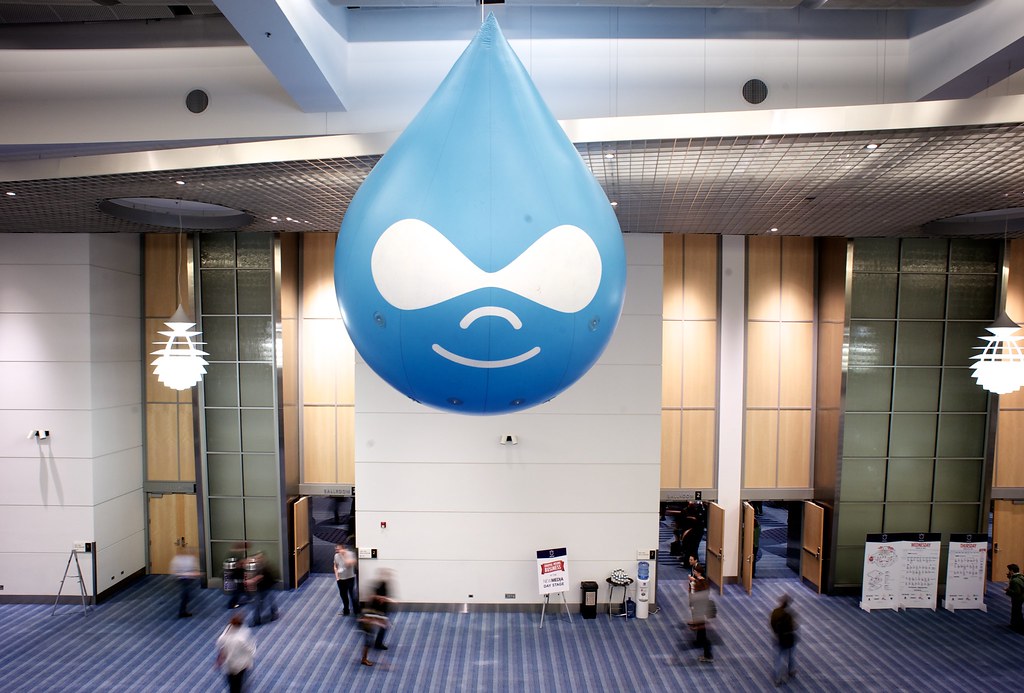
The Drupal "Drop" under a pendulum at the Portland Convention Center
Did you know Oregon has the world’s largest Foucault Pendulum?

In addition to opportunities to network with other institutions running Drupal around the state and world, there were a ton of awesome speakers and “Bids of Feather” sessions, where groups of like minded people got together to talk about issues relevant to them. Take a look:
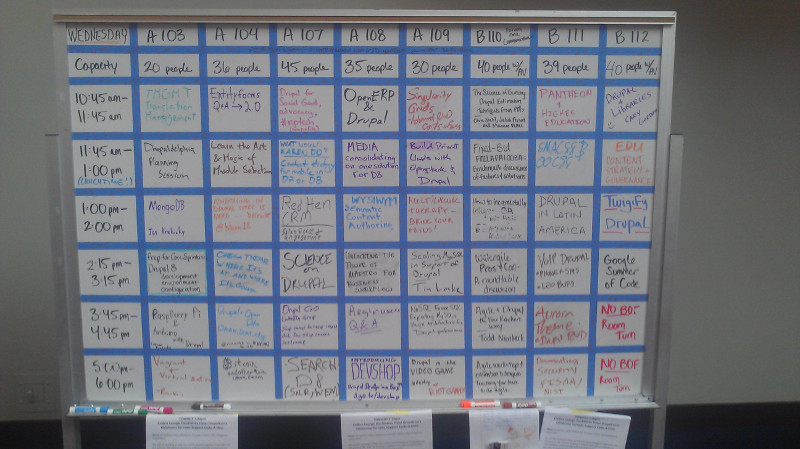
A whiteboard, showing a grid of different sessions at various times, including such sessions as "Pantheon and HigherEd" and "Higher Ed Content Strategies"
This seems like a weird thing to take a picture of, but the BOF listing couldn’t be found on the web anywhere – wifi at conferences is notoriously poor, so it wouldn’t have done us much good.

The second day’s keynote, by Karen McGrane, was about user experience and design, and provided some excellent insights for us (watch it here!). The one that will impact you most is our removal of the <i> (italics) and <b> (boldface) elements from the list of allowable elements on Drupal content pages.

As per why, it has to do with two things: Future Proofing, and Accessibility. Back in the day, when content was designed for paper, boldface and italics made a lot of sense. So the <b> and <i> HTML elements were used to replicate this on the web. But, not too long later, people realized that these elements didn’t actually convey any semantic information – they were purely visual. So they added the <strong> and <em> (emphasis) elements.

Now, here’s the thing. Strong text, and emphasized text look exactly the same as boldfaced and italicized text – this sentence actually uses <strong> and <em> tags. So the average web user won’t notice any difference. But what happens if you’re using some futuristic wearable computing device that reads web pages to you? With <strong>, your device would know to read a certain word or sentence strongly, and to emphasize text in <em> tags. But if they were <b> or <i> tags, you wouldn’t have even known they were there . Turns out this is the same way screen readers work.

As of this morning, we’re filtering out <i> tags and <b> tags. There’s a 99% chance this doesn’t impact you at all – using the buttons in the WYSIWYG on Drupal automatically uses <em> and <strong> instead. But if you’ve been doing something fancy after disabling the rich text editor, you might need to change your page some.

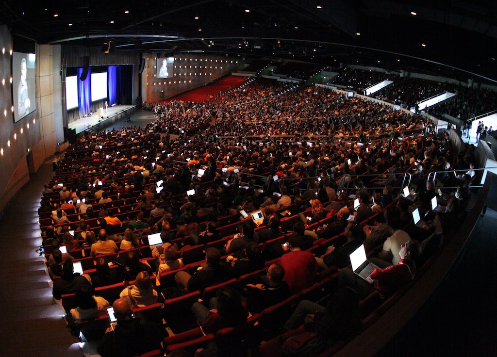
 

Lane goes to DrupalCon

Recently, two of us got to go to DrupalCon Denver. There were a lot of other drupalista’s there:

DrupalCon Keynote, Day 1

We saw all sorts of sessions, but the one that stuck with me the most was Luke Wroblewski‘s keynote address on the last day. He gave a talk on the importance of Mobile First Development. You can (and should!) watch the full presentation at the his site, but here’s the thing that hit me hardest.

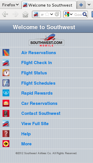
When you’re developing for mobile devices, you lose 80% of your screen size. That means you need to focus your pages on your core mission. Here’s the example he used, from Southwest’s website:

Southwest's website on the desktopWhereas here’s their exact same website, viewed on a (pretend) iPhone:

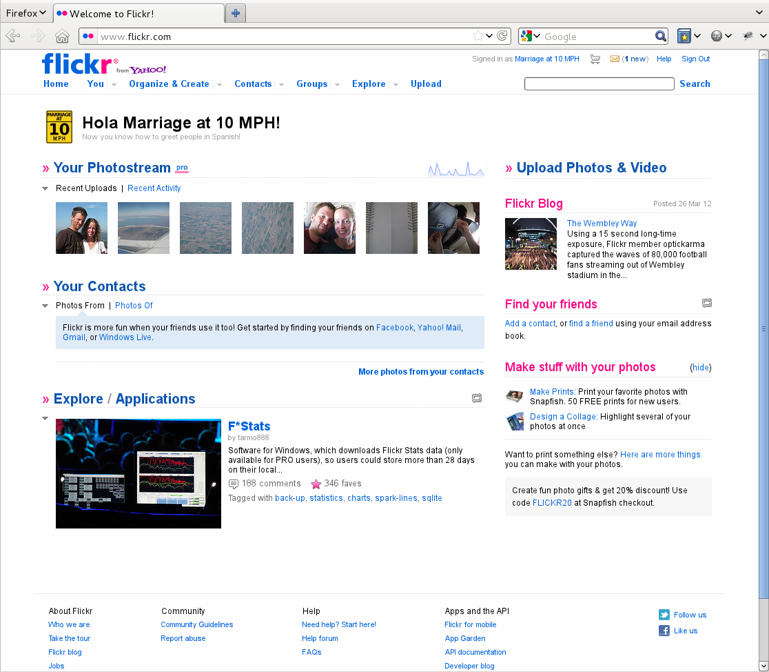
Southwest's website, viewed from an iPhoneFlickr does something similar. Here’s their site on the desktop:

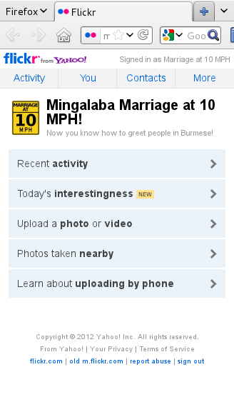
Flickr's website, viewed on a Desktop computerAnd once again, here’s their site on a (pretend) iPhone:

Flickr's site viewed from an iPhoneIn each case the mobile website shows only the things you most want to do – buy a ticket, check in, upload photos, and seeing photos taken nearby you, which is hard to do on a regular old computer. The sites are, in many ways, actually providing a better experience than the normal desktop website, and are sometimes even providing capacities that can’t be found on a desktop.

We’re super excited to be committed to a mobile first approach, and are pumped from a week of learning all the latest and greatest things about Drupal. Plus, we learned that next year’s DrupalCon will be in our own backyard (be sure to resize their site and to try scrolling it some to see some awesome css/html5 effects!).