Web Redesign and Broken Links

We’ve getting to the stage of the web redesign where it’s time to think about content. And our website has a lot of content. Even though our website is  smaller than it’s ever been, it still has more than 3000 pages and some 10,805 external links.

While I’m pretty good at clicking links, I can’t possibly click all of those. Instead, the website has a service which checks some links every fifteen minutes. Right now, every external links on the site gets checked every 3 days. Here’s a terrifying statistic: about 1 in 4 external links on our site needs to be updated somehow.

The vast majority of those are 301 errors. The page isn’t really broken, it’s just moved. Much of that is due to Chrome’s move to mark HTTP pages as not secure. But even though those links still work when we click on them, it’s important that we update them. Eventually, server redirections stop working, and if we don’t update the link before then, the link will eventually turn into a 404.

404 links are pages that can’t be found. Those are the next biggest category of broken links on our site. A 404 is the worst. We’ve all encountered them. You think you’ve found a helpful link, but when you click it, you’re left guessing about what was there. And they make us look bad, like we dont’t even have the decency to keep our pages updated.

Here’s another terrifying statistic: out of the 3439 nodes on our site, only 1 in 3 has no problematic links on it.

We need to do better. Lori and I are going to spending a lot of quality time over the next few weeks trying to fix some of these. I’m afraid this is another place where you can expect some nagging emails from us: if a page 404s, we may not have any idea what we should link to instead, and we may be asking you for help.

There’s one particular type of page which tends to have a lot of links with errors: resource pages. There’s a few dozen pages on the site which are little more than collections of links to other sites. While these page are often well meaning – they’re trying to help students find resources we’ve verified as being helpful – they’re sometimes misguided. We’ll dig into those pages deeper in a later post, but for now, when Lori or I find broken links on these pages, we’re just going to remove the link and move on.

Our new goal is to cut the number of links with errors in half before Fall term. Wish us luck!


Coming Soon

In the mid to late 90s, you could count on most websites having some sort of under construction or coming soon message on them. Often as a gif. Mental Floss reports this was due to people seeing a website as a project, like a film or a book, that would be eventually completed. Website design reflected that process: outline your chapters, then fill them in. Hence the placeholder messages and gifs, just so people didn’t get confused when they got to an empty page.

But now we know the web isn’t like that. We now know the web to be a continual process. Content gets stale and you have to revisit. Images need refreshing. And while we can miss certain amazing pieces of 90s web design, I don’t miss the under construction gifs.

Site under construction image
Unless Bill Clinton is the president and you’re excited to replace your VHS tapes with DVDs, you’d better not be using an image like this on your site.

As of right now, the phrase “coming soon” appears on the Lane website 15 times. In 10 instances, buried in the text is a promise that more information on a certain topic is coming soon. On 4 pages, the phrase “coming soon” is the only text on the page.

“Coming soon” and “Under construction” are aspirational messages. They’re a way to tell a visitor that we’ve thought about content we know they’ll care about, and remind them to check back later.

But these intentions often don’t work. Remember those four pages that just have a “coming soon” message? Here’s the last time they were edited:

  • March 30th, 2020
  • February 20th, 2020
  • October 19th, 2018
  • October 16th, 2017

The other pages have a similar range of edit dates. “Coming soon” sometimes seems to mean forever. If I’m browsing the web and I that message, I don’t set up a calendar reminder to come back and check later. I move on.

Here’s a scenario. There’s some new program, and we know about 90% of the information. But we’re waiting on the state to tell us about the application process. We need to alert students to the program, but until the state gets back to us, we can’t tell them how to apply.

First option better than just saying “coming soon”? Add a date. Simply saying “information on the application process will be released by May 15, 2020” creates a whole different impression of the page. But what about when there’s no date?

A good option is to use that opportunity to drive people to another communications channel: “We’re currently waiting for application information from the state. Follow us on Twitter to be updated as soon as application information becomes available.” As an alternative to social media, this could be a great time to get an email list going, which you can repurpose later to promote other programs.

Sometimes that won’t be appropriate either. As a last resort, at least add a note about when someone should check back: “As of April 27th, we are yet to receive application information from the state. We will post an updated message here by May 11th.” Then you can keep updating that message, even just to tell people that you still don’t know anything new. Not only does that help to demonstrate to the visitor that there will actually be information here, it forces you to remember to actually go back and update the page.

Coming soon messages happen with new pages too. Someone will be thinking about how to redesign their site, and they’ll create some empty pages as placeholders, or they’ll be thinking about some cool new feature on their site. Except then something doesn’t work out, or some more pressing task comes up, and we end up with a page that just says “Coming soon”.

Solution? Always have your content ready first. We’ll actually be adopting this rule as a policy going forward for the web team. While we’ll be happy to talk with you about what a webpage could look like, we won’t actually create the page until you can show us some content first.

Over the next week or two, expect some nastygrams from Lori or me as we try to clean up some of these content gaps. And if you’re having trouble trying to think around a difficult “coming soon” situation, let us know. We’d love to help.

Does phone number format matter?

The other day, Lori pointed out that the phone number format on one of the mockups from iFactory was different from what we normally use. In accordance with AP style, we use (541) 463-3000. But the new mockups use the format 541-463-3000. And it’s pretty common to see phone numbers formatted with two dots: 541.463.3000. Does the format matter?

Yes. It turns out google is better at recognizing some formats as phone numbers than others. That post tested ten different formats, and found that the one we use and the one iFactory used are the ones best recognized by Google. The double dot notation? To quote the linked blog: “The phone number format you should avoid at all costs is #3: [###.###.###].

Of course, that doesn’t settle which of those two is best. So I checked to see if there are any accessibility considerations with phone numbers. There are, but they don’t relate to visible format. All phone number formats are terrible, and something like (541) 463-3000 would probably be read to a blind person as “five hundred forty-one [pause] four hundred sixty-three three thousand”. There’s a fix for that, using aria-label on a surrounding link, but that just adds something for my todo list, and doesn’t solve the debate here.

And that’s how I found myself at 10pm, doing a survey of college websites, to see how they format phone numbers:

541-463-3000 25 Harvard, UO, OSU, Washington, UC Denver, KSU, UMass, FSU, F&M, UCLA, MIT, Cal State Fullerton, Ohio State, Penn State, VT, Louisiana State, Wisconsin State, Yale, Georgetown, Alaska, Berkeley, Skidmore, Colby, Baylor, OHSU
541.463.3000 10 Portland State, Gettysburg, NYU, SNHU, WGU, U Phoenix, UVA, Middlebury, GA Tech, U Maine
(541) 463.3000 1 Gonzaga
(541) 363-3000 13 Idaho, UVM, Dickinson, Michigan State, Kentucky State, U Penn, UConn, Binghamton, Dartmouth, Cornell, Ithaca, Notre Dame, American
Mix 2 Rutgers, Princeton
This, for a variety of reasons, is not a scientific study. They’re just the first 50 colleges and universities that came to mind (and now you know I don’t follow college sports), and I didn’t check their style guide. I just looked at the first contact number I could find. As I said, not a scientific study. Just evidence of a person who’s too far down this rabbit hole to give up, far too late on a weeknight.
 
Of course, that left me with a clear winner. And I had to know why. From a blog post in 2006, I learned AP changed their preferred style, and Lane hasn’t kept up. A quick email to someone who owns a recent AP style guide verified it.
 
So we’ll probably go with 541-463-3000. The parenthetical format, (541) 463-3000, feels like it come from an age when area codes were mostly optional. And for many of us, me included, that’s no longer the case. Just please don’t use the dotted phone notation on your pages!
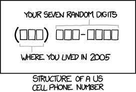
related XKCD comic
 

Let’s talk about FAQ Pages

As part of our website redesign, over the last two months I’ve visited each and every page on the Lane website. As part of that process, we’ve cut a lot of pages, and at just 3413 nodes, the Lane website is now smaller and more svelte than it was when we launched it back in 2011 (and that includes more than 100 nodes that aren’t even real pages!).

But also as part of that process, I discovered that there were two categories of pages that had a lot of pages, and a lot of good information, but not necessarily a lot of value.

The first was contact pages. By convention, we try to have a page, usually located at a url like lanecc.edu/department/contact, which contains contact information for a department. This is an important page, and the way we structured things was an attempt to bring some standardization to the Lane website. But it also resulted in duplicate information (contact information is sometimes on the department homepage, and some departments also created employee directory pages). We’ll likely to contact pages differently next time around.

The second chunk was frequently asked questions pages. There are probably forty or fifty pages on the website that are full of FAQs. And while often the information in them is helpful, just by presenting that information in the FAQ format we may be making it less likely students will find and understand what we need to tell them.

For a good overview of why FAQ pages can be less helpful than other  content, you should read this A List Apart article. A brief summary of  issues:

  • Duplicate content – many times information on a FAQ is contained elsewhere
  • Lack of order – FAQ content doesn’t tend to flow question to question, making it harder to understand and process
  • Repetitive structure – since all the content gets phrased as questions, you’re often introducing extra words to the page that get repetitive to read
  • Increased cognitive load – often a student will come to your page with a specific question, phrased differently from how you’ve asked it, resulting in increased processing to determine if your question matches their question

I also think FAQs are problematic for people that aren’t searching for an answer to a specific question. If you’re just exploring a site, trying to determine if a program is for you then a FAQ often fails to guide you through content in a meaningful way.

If you happen to be stuck at home with some time to do website edits, one thing that would be really helpful is working on your FAQ page. Here’s my suggestions for slimming down, or dumping, your FAQ:

  1. Read through your questions, and make sure you still feel like each question is important. If one isn’t important, remove it. You might be surprised by how much old content is out there.
  2. Find any questions in your FAQ that have answers elsewhere, whether on your site or another page on our website, and get rid of them. Reducing duplicate content is possibly the most helpful thing we can do. We’ve found that many people have tried to be helpful by copying content from elsewhere on the website, ostensibly to simplify things for their audience, but almost always this ends up making the website bigger and more confusing.
  3. Find any FAQ questions that are related to some other page on your site, and incorporate them into the content on that page. For instance, if you have a question like “What prerequisite courses do I need to take before applying to this program?”, consider moving that content to your program application page under a heading “Required Prerequisite Courses”
  4. Are there any groups of questions that are related, and which could be combined into just a paragraph or two of more effective content, either on a new page, or as a new section on an existing one?

After all that, you may still be left with some FAQ questions which just don’t fit in anywhere. And that’s ok. Sometimes a FAQ provides the right solution. But even just shortening the length of your FAQ page can help students to better find information and improve the quality of your other pages.

As always, if you’re working on something like an FAQ and have a question, send us an email at webmaster@lanecc.edu.

Posts that spark joy

The other day, I saw this blog post about tidying up your website using the Marie Kondo method. While I think peak Kondo-mania is likely behind us (unless she’s renewed for a second season, of course!), as our date for content migration approaches (probably late this upcoming spring!), that post got me thinking about how her tidying principles can help provide a good frame for tidying and improving websites here at Lane. There are six principles:

Commit yourself to tidying up

Like any other tidying project, working on cleaning up your website is going to take some time. The most Kondo-like advice, of course, is to carve out an entire afternoon. But at the very least, try to find a regular time to dedicate to tidying your website and cleaning out the ROT. Even an hour every other week is enough time to make a considerable impact.

Imagine your ideal lifestyle

If you spend a minute imagining what your dream website would look like, I’d be willing to bet a lot of your dreaming is related to the look and feel of the website. Don’t get me wrong, website appearance is important. But design alone is never enough to capture, retain, or influence an audience. As you imagine your dream website, I’d encourage you to think first about what your website goals. What specific behaviors are you trying to influence through your content? What actions are you trying to get visitors to take?

The Lane website has a surprising number of pages that aren’t really about getting anyone to do anything, but are instead about documenting internal processes, documenting old projects, or displaying mandatory information. Some of this is unavoidable. Our privacy statement isn’t about to be tidied up. But imagine a page that’s just a photo gallery. They may be compelling photos in that gallery. But because they’re buried in a gallery on their own, no one is going to find that page and take the time to look through the photos. Instead, choose some outstanding pictures and work them directly into your content. If you really need to have a gallery, use a dedicated photo site (like your Lane Google Photos account), and link to it.

As you imagine, try to think about how all the pieces of your online presence – photo, video, social, and copy – support each other and to tell a compelling story and influence an action. Think about how you can show, rather than tell.

Finish discarding first

Our largest pieces of the site have over 130 pages, and hundreds of attached files. Not only can that seem overwhelming, but thinking about all that content can make your head spin. By discarding first (even just a sentence here or there!), you’ll get a better understanding of your content and where the gaps are, and maybe spot some opportunities to combine pages into one, more cohesive page.

Tidy by category, not location

The advice in that blog post is spot 0n – don’t just think about if you need this particular page, think about if you need all the pages like that. So, for instance, don’t just think about if you need a page describing Underwater Basket Weaving 201, which hasn’t been run in three years. Think about if you need pages describing your Underwater Basket Weaving courses at all – after all, the course descriptions should be in the catalog, which got a pretty spiffy update this year.

Follow the right order

One of the Google Analytics reports we’re happy to provide you is a page popularity report. For each of your pages, we can help you discover how many times it was viewed, how many times it was viewed by different people, how long they were on that page, and if it was their first or last page. I’d recommend you use these reports from the bottom up: start with your least popular pages. Since you already know they’re not being seen as often as you probably wish they were, you already know they need to change. Look elsewhere on your site to see if there’s a place they can fit in or, even better, see if you can get rid of them entirely. You can email Lori or me for help getting one of those reports.

Find joy

This one is complicated. Because the web isn’t your house, and how much a page brings you joy isn’t really the goal. The real goals relate to helping increase access to education and helping students meet their educational objectives. So find joy in what that page does, and in the goals it helps accomplish. If you can’t relate that page to a goal, thank it for it service, and say goodbye.


Responding to an accessibility concern

At the beginning of the month we changed our normally static homepage to include the following animated gif:

Watercolor image of a fountain on campus, showing a bunch of leavesWe tend to swap the homepage image to be an animated gif about three or four weeks before classes start, and link it directly to our registration platform. While these images can be pretty, after you’ve watched them for a couple of minutes, they start to feel really annoying. And, invariably, after a week or so, the first complaints show up. But here’s how we respond:

Traffic graph for that image, showing a sizeable bump in the days after we launched it, with a dip lin the weekendThose images drive hundreds of clicks in the weeks after we launch them. So, annoying or not, if they’re achieving their objective, that’s what’s important, right?

But then we got a complaint email that wasn’t about the image being annoying, it was about the image being distracting. And that got me thinking – they were probably right. Motion can negatively impact people with various cognitive impairments.

Before we go into how we responded, let’s talk a little bit about why we’re using a gif. I mean, the gif format is 30 years old. Almost everyone has moved on to web video. But when we launched the updated website, we were stuck supporting all the way back to Internet Explorer 6. And for Internet Explorer 6, 7, and 8, there was no non-flash video option. So we build the website with support for images, but often not video (though we’ve been adding some support, it hasn’t been across all parts of the site).

WCAG 2.2.2: Pause, Stop, Hide

Stuck with gifs, I tried to resolve this as quickly as possible, since there was someone out that I knew was negatively impacted by the image. I quickly skimmed the WCAG 2.0: 2.2.2 standard, but it turns out this one is a little more complicated than I first thought. Here’s the full text:

2.2.2 Pause, Stop, Hide: For moving, blinking, scrolling, or auto-updating information, all of the following are true: (Level A)

  • Moving, blinking, scrolling: For any moving, blinking or scrolling information that (1) starts automatically, (2) lasts more than five seconds, and (3) is presented in parallel with other content, there is a mechanism for the user to pause, stop, or hide it unless the movement, blinking, or scrolling is part of an activity where it is essential; and
  • Auto-updating: For any auto-updating information that (1) starts automatically and (2) is presented in parallel with other content, there is a mechanism for the user to pause, stop, or hide it or to control the frequency of the update unless the auto-updating is part of an activity where it is essential.

On a first read, I assumed this success criterion didn’t apply. After all, there’s no moving, blinking, or scrolling information. Leaves are moving, but text is not. But, as many high school teachers I ignored told me, always read all of the instructions.

Attempt 1 – the programming solution:

My first thought was to do some searches and see if I could find a way to quickly add a pause button to animated gifs, since that would be an easy, site wide fix. I was definitely reaching here, but it turns out it’s a somewhat viable option. This solution involves creating a png of a single frame of the gif, and swapping them on click. That felt problematic to me. While it might work if you click to pause the image, because our image is linked to our registration platform, I’d need to add an actual button over the image somewhere. That can be rather involved, with making it cross-browser, all screen size friendly, and ensuring it’s sufficiently accessible itself.

Attempt 2 – reduce complexity:

With the button ruled out, I thought that the easiest thing we could do would be to just remove some complexity from the image. We could make the leaves go slower, and maybe remove a few leaves. After a bit of work, our student designer put together this image for us within a few hours of the initial complaint:

The same image, but with about half as many falling leavesThat image has about half as many leaves, so it’s a lot less complex. And the leaves stay off the screen for a bit, meaning there’s always time without motion on the screen.

But while I was able to confirm the reduced complexity image solved the problem for our user with the complaint, I couldn’t shake the feeling that I really ought to read the entire standard. 

Returning to the standard

It turns out that if I’d just scrolled the page down a little bit, I’d have seen the information in the very first sentence. Here it is:

The intent of this Success Criterion is to avoid distracting users during their interaction with a Web page.

While I still think the success criterion needs some edits to be more clear about what constitutes “information”, certainly the purpose of the standard is to reduce distraction. And both Penn State and WebAIM agree: animations need to be very short or user controllable.

Attempt 3 – short animation:

The next easiest fix was to turn off looping on the animation. That way there’s still enough motion to capture attention, but not enough to distract. Here’s what we came up with:

The same image, but with looping turned offOf course, there’s some some downsides. For instance, say you embed a gif halfway down a page, and it takes more than 5 seconds to scroll there (like this page! If you’re not seeing motion, reload the page and scroll quickly). The visitor will never see the animation (note – this is fixable with lazy loading of images, but those weren’t a thing when we built this site, and we’ve had trouble grafting them on). But for us, with the image essentially at the top of the page, it’ll probably work. This also doesn’t work for cinemagraphs, which depend on perfectly looping images to create the effect of slight motion in an otherwise still world.

Next steps:

After we had an actual fix in place, we did a quick check across the entire site for other animated gifs, and found only one other place where there was a problem. That image has since been removed completely.

We’re currently exploring finally adding video support for some of the last areas of the website that don’t support it. Video would not only provide a way to pause animation, it would also allow for much higher resolution images and more complex animations. But fitting video into pages is also more complex, and if we’re unable to find a way to do what we need without a lot of work, we might end up waiting for the next iteration of the website. More details on that soon!

Correctly Linking Images

We all know how to make an image accessible. And we all know how to make a link. But how do we make them play together? How do we do something like this:

Download the Graphic StandardsSince we’re good people, we add alt text describing the image, right? Maybe something like “Graphic Standards Cover”? That’d give us (overly simplified) HTML like this:

<a href="standards.pdf"><img src="cover.png" alt="Graphic Standards Cover"></a>

But that’s actually not so great for accessibility. A screen reader will read “Graphic Standards Cover”, which doesn’t make the action (downloading the standards) clear.

My first instinct was to add a title to the link. But the title is almost never read by a screen reader, and may even make things worse. The reader will read the alt text. To make it clear what the link does we need to change the alt text:

<a href="standards.pdf"><img src="cover.png" alt="Download the Lane Graphic Standards"></a>

Now we’ve solved the accessibility problem, but we may have created a user experience (UX) problem. Scroll up a second and look at that image again. Did you know that you should click that picture to download the PDF? Or did you think it was just a picture? We can’t even rely on people discovering the picture is linked by hovering over it with the mouse and the cursor changing: it isn’t possible to hover with your finger on a phone.

Sometimes it may be immediately clear that a picture is clickable from context. If it isn’t we may need to add some help:

<a href="standards.pdf"><img src="cover.png" alt="Download the Lane Graphic Standards">Download the Lane Graphic Standards</a>

Now we’ve solved our UX problem, but we’re back to an accessibility issue! A screen reader will read the alt text and the link text. It’ll be like the same sentence is printed twice. The solution to this is to have explicitly empty alt text:

<a href="standards.pdf"><img src="cover.png" alt="">Download the Lane Graphic Standards</a>

Explicitly empty alt text will be ignored by the screen reader entirely, while missing alt text can cause unpredictable or even negative behavior.

You could also go back to adding descriptive text as the alt text. In our example above, that isn’t appropriate, since the cover is really just decorative. But consider another example:

A cat chewing on a monitor. Link opens a larger image.That image is linked to the full size picture. Describing the contents of the picture is completely appropriate. But remember that most screen readers can pull links out of a page, and let someone navigate from link to link directly. For that reason, our alt text is “A cat chewing on a monitor. Link opens a larger image.” The alt text serves double duty.

This post does not, of course, mean it’s always appropriate to use an image. It’s important to avoid off-brand or inappropriate images. It’s important not to add so many linked pictures that your page hierarchy gets lost and navigation gets more difficult. And if something can be done in CSS, it probably should be. It wouldn’t hurt to use images as pictures as rarely as you can.

If you’re not sure what to do with links at Lane, get in touch! We’re always happy to help.

Using all Capital Letters

An instructor asked me the other day, “How does a screen reader read text in ALL CAPITAL LETTERS?”

I didn’t know, and through it was a great question, and had to figure it out. Let’s start with some sample text:

It’s VERY important you remember these:

  • USPS
  • NASA
  • DVD

There’s four words in all caps there. Let’s look at each one, from the bottom to the top:

DVD is an initialism, meaning you read each letter in it, like CPU or FBI. NASA is an acronym, meaning you read it as a word, even though each letter stands for a word. USPS is another initialism. But VERY is just a word, with all capital letters being used for emphasis.

Of course, it’s wrong to use capital letters in this way – you should instead be using an em or strong tag (though which one is complex, and I didn’t find the examples in the specification very helpful). But the instructor’s question wasn’t about what should happen, it was about what does happen. How can a screen reader know which of those words it should treat as words or acronyms (which are like words, in terms of pronunciation), and which it should treat as initialism (and read letters instead of the word)?

I ran each of the examples through the say program on my Mac, and here’s what I got (sentence case was pronounced like lowercase):

Word Uppercase Lowercase
Very word word
USPS letters word
NASA word word
DVD letters letters

There’s some interesting logic there. I think this table shows my Mac will always read dictionary words as words (like “very”). And I think it shows that my Mac also has a list of known acronyms and initialisms, so it knows how to read those. For words that aren’t in either list, but also aren’t in the dictionary (like USPS), it reads all capital letters as initialisms, but lowercase as a word (a reasonable assumption, since most of the time it encounters words that aren’t in the dictionary, it’s probably due to the lang attribute not being set correctly.

Of course, this is just say on my Mac, which isn’t even a screen reader. WebAIM has some general rules for how screen readers read things, but it isn’t really predictable how a screen reader is going to pronounce words in all capitals. Pronouncing typographic symbols is hit or miss as well — some, like @ and % are read correctly. But most others (like the parenthesis, or the mdash in the previous sentence) aren’t read universally. Rare punctuation, like the interrobang (‽) may not be read at all.

I was hoping that abbr would influence how screen readers pronounce words, but that doesn’t appear to be the case (and, if you’ve been around HTML for a while, remember you’re not supposed to use acronym at all — though it probably wouldn’t do anything here anyway).

What does this mean for you at Lane?

Use the abbr tag to specify acronyms and initialisms if possible. Even though screen readers won’t necessarily change how they handle pronunciation, abbr with a title attribute makes it easier for anyone to understand meaning. Try hovering over this: NASA.

If you want to use capital letters for emphasis: don’t. Instead, use either an em or a strong tag, depending on if you’re trying to emphasize something or make it note that it’s more important than surrounding text. And, of course, never use strong in place of a header.

If you want to use capital letter for aesthetic reasons, then you should use a bit of CSS to make it happen:

.all-caps {
  text-transform: uppercase;
}

Screen readers ignore CSS, so this use is entirely for presentation. Just make sure you don’t confuse presentation with meaning.

I ran a quick search on our website for pages that have a lot of capital letters all in a row:

SELECT entity_id
FROM   field_data_body
WHERE  body_value REGEXP BINARY '[A-Z ]{10}';

There were 748 results. Editing 748 pages obviously won’t happen overnight, and on each one we’ll need to determine if we should instead be using a header, a strong, an em, or just normal text. For now, I’ve queued a task for us to tackle in the future, but if you’re editing your page and notice some misuse of capital letters, we’d be forever appreciative if you’d fix it.

A couple no-nos

I’m taking a break from our accessibility posts this week to instead post on a couple bad practices I spotted across the website while trying to meet our website goals.

&nbsp;

Many typewriters, especially less expensive ones, used the same amount of space for each letter – that way, the platen of the typewriter would advance the same amount no matter what character you typed. Your page would end up being monospaced  – here’s an example on screen using a monospaced font:

Lane’s mission is to transform students’ lives through learning, but how do we know this is so? To know, we must develop clear learning outcomes and evaluate our curriculum and pedagogical practices regularly to ensure a quality learning environment. Assessment of student learning focuses on students’ attainment of knowledge and skills at the course and program or discipline level. This is accomplished by infusing the curriculum with general education learning outcomes intended to prepare students for success in the 21st century.

Because each character is the same width, it can be hard to distinguish sentences. So people taught to type on typewriters were often taught to include a second space after the period, like this:

Lane’s mission is to transform students’ lives through learning, but how do we know this is so?  To know, we must develop clear learning outcomes and evaluate our curriculum and pedagogical practices regularly to ensure a quality learning environment.  Assessment of student learning focuses on students’ attainment of knowledge and skills at the course and program or discipline level.  This is accomplished by infusing the curriculum with general education learning outcomes intended to prepare students for success in the 21st century.

As computers and printers become commonplace, new fonts were available and proportional spaced fonts, which had always been used in professional printing, came back into use. Here’s our sample paragraph again in a proportional spaced font:

Lane’s mission is to transform students’ lives through learning, but how do we know this is so? To know, we must develop clear learning outcomes and evaluate our curriculum and pedagogical practices regularly to ensure a quality learning environment. Assessment of student learning focuses on students’ attainment of knowledge and skills at the course and program or discipline level. This is accomplished by infusing the curriculum with general education learning outcomes intended to prepare students for success in the 21st century.

Every letter gets the appropriate amount of horizontal space. Narrow letters, like i, l, or I get much less space than wide letters, like W, M, or G. Characters like the comma or period are built with an appropriate amount of space after them already. So what happens if you were trained on a typewriter and have been typing double spaces your entire life? Right now, you get this:

Lane’s mission is to transform students’ lives through learning, but how do we know this is so?  To know, we must develop clear learning outcomes and evaluate our curriculum and pedagogical practices regularly to ensure a quality learning environment.  Assessment of student learning focuses on students’ attainment of knowledge and skills at the course and program or discipline level.  This is accomplished by infusing the curriculum with general education learning outcomes intended to prepare students for success in the 21st century.

Let’s put aside that the font wasn’t designed to work with double spaces like that, leading to it looking like there’s holes in the text, and increasing the chance that our text will have rivers (in other words, it looks funny). Let’s instead talk about how HTML gets double spaces to work.

HTML wasn’t designed to support two spaces after a period, so browsers automatically collapse repeated spaces into just one. So to create to spaces after a period, as I did in some of the examples above, I had to insert a non-breaking space character. It’ll appear as a normal space when you’re viewing it, but if you were to look at the source of the page, you’d see &nbsp; – & in HTML means we’re about to start a character entity of some sort, the nbsp means non breaking space, and ; finishes the entity.

Non-breaking spaces act like invisible letters, and have some weird effects. They’re designed for places where the text shouldn’t break – that is, move onto two lines. So say we have a brand name, like ACME Products, that we don’t ever want to be on two lines. We’d put a non-breaking space between, like ACME&nbsp;Products, and then no matter how we resize the browser, we’ll always see those words together: ACME Products.

If you use them in regular text, you do weird things. If you have a space, followed by a  non-breaking space, your non-breaking space might become the first letter in a line, and you’d have something like the second line of this paragraph. It just looks weird. If you’re not seeing it, here’s a picture (since you’ll only see it at certain widths):

screenshot of the text of the previous paragraphYou might also have trouble centering things:

This line should be centered 

This line is actually centered

I doubled the size of the text to make the problem more pronounced, but it’s true at any size. Since non-breaking spaces are invisible unless you know to view the source, they can be an endless source of frustration when you try to lay out your page.

There’s a place to use the non-breaking space, but almost everywhere it’s used on our website it’s used incorrectly. This week, we’ll be adding a filter to remove double spaces after periods when when the page is rendered. This is an imperfect solution, since the non-breaking spaces will still be present in the editor, and this won’t fix other problems, like the text centering problem above. But it will make our website look a little more uniform.

Horizontal Rules

The HR tag used to be strictly a presentation element – it was there so you could draw a horizontal line across your page. While HR’s are still usually rendered as a horizontal line, they now have a semantic meaning. From MDN: The HTML <hr> element represents a thematic break between paragraph-level elements (for example, a change of scene in a story, or a shift of topic with a section).

If your website uses HR’s to break paragraphs that have very different subjects, you’re in great shape. But if there’s another element that might indicate that break, then you shouldn’t use the HR. So, for example, if you have a series of paragraphs, each labeled by a header, don’t use an HR since the headers act as the break. Similarly, an HR should never be the first thing in a section (like pages that start with an HR), because there’s nothing to break at the start of a section. And you should never have more than one HR in a row.

We’ll be removing some HR’s from the site in the coming weeks where they’re not used properly. If you’d like some more info on HR’s, you can go into depth in the specification.