Understanding WCAG 2.0: 3.3.4 Error Prevention (Legal, Financial, Data)

The next standard we’ll explore in our series on understanding WCAG 2.0 is 3.3.4 Error Prevention. This standard is required for WCAG level AA compliance, which is part of what Section 508 requires. Here’s the complete text (it’s a long one):

3.3.4 Error Prevention (Legal, Financial, Data): For Web pages that cause legal commitments or financial transactions for the user to occur, that modify or delete user-controllable data in data storage systems, or that submit user test responses, at least one of the following is true: (Level AA)

  1. Reversible: Submissions are reversible.
  2. Checked: Data entered by the user is checked for input errors and the user is provided an opportunity to correct them.
  3. Confirmed: A mechanism is available for reviewing, confirming, and correcting information before finalizing the submission.

Here’s the idea: sometimes users, especially those with disabilities (and me, as you’ll see in a minute), submit forms either by accident or without fully understanding what happens when the form is submitted. Imagine, for example, someone with motor control issues who accidentally presses enter early while filling out a form, submitting it. This standard asks us to make sure that one of the three things in that list applies to the form.

There are a number of circumstances where we don’t need to do anything at all. For example, say we have a web form in our ERP that lets us set an address. As long as changing the address again is easy (for example, by filling out the form again), and we’re shown what the new address is after submission (either as a confirmation, or just with a page reload on submit), then we’re in good shape.

But we need to look for web forms that are not easily reversible. For instance, let’s look at a situation which may or may not have happened in my life about ten years ago. I was trying to pay a bill online. When paying it, I misplaced a decimal point, and paid ten times as much as I owed (like this: $3000.0). The system processed my payment without complaint, overdrawing my checking account, bouncing a $2.00 check at the library, and leading to so very many bank fees. A  simple confirmation page (which, to be fair, they’ve added), or even better, a confirmation page that warned me my payment only had one 0 after the decimal point, would have saved me a lot of grief.

What’s tricky about this accessibility requirement is that most of us rely on third party services for these kinds of legal, financial, and data programs. We buy our ERP system and payment processing systems from vendors, rather than create them at home. Even though we’re not doing development ourselves, we’re still responsible for ensuring our systems are complaint. If your system is receiving updates, and compliance won’t be available by January 18th, 2018, you may need to file a bug with your vendor.

If you’d like to know more about this method, check out these examples and techniques.

Interested in more? Check out the listing of all the posts in this series.

Understanding WCAG 2.0: 3.3.3 Error Suggestion

The next standard we’ll explore in our series on understanding WCAG 2.0 is 3.3.3 Error Suggestion. This standard is required for WCAG level AA compliance, which is part of what Section 508 requires. Here’s the complete text:

3.3.3 Error Suggestion: If an input error is automatically detected and suggestions for correction are known, then the suggestions are provided to the user, unless it would jeopardize the security or purpose of the content. (Level AA)

This standard has to do with input validation. Let’s say that we have a webform, like this:

This standard is all about what happens when you enter the wrong thing. Say, for example, we enter “9740” as our zip code. This is the wrong way to tell the user:

Wrong

To meet this standard, all you need to do is provide a helpful error message:

Please make sure your zip code contains exactly five numbers, then resubmit the form

Of course, you don’t want go to the other extreme, either. Think about this nightmare:

Invalid Password. Your password must meet the following rules:

  • Not be more than 255 characters long
  • Contain at least one number
  • Contain a special character (!, @, #, $, %, ^, &, *)
  • Contain both an uppercase and a lower case letter
  • Not contain a space character
  • Be at least 8 characters long
  • Use only ASCII characters
  • Not contain your username or birth date
  • Not be written down on a note under your keyboard

One of the goals of this standard is to help people with cognitive disabilities. Yes, that error message explains all the possible circumstances that could have caused the error. But the suggestions aren’t helpful — you have to work to figure out which rule you violated.

And that’s it for this standard. If you’d like to avoid the the messy details, you’re welcome to just skip to the end. But this post got me thinking. When you’re making a form, labels are associated with form fields via the for attribute on the label and the id attribute on the field. That way a screen reader knows how to associate labels and form elements. But how does that work with an error message? There’s no for attribute for an error message. Right?

How to Associate an Error Message with a Form Element

The first place my research took me was the WebAIM site, which suggests a two part approach. First, error messages should be listed at the top of the form. Second, each error message should link to the associated input element. So our form would look like this:

Please make sure your zip code contains exactly five numbers, then resubmit the form

This method meets accessibility requirements, but fails from a usability perspective. If we were to expand that form to have several fields, then visually associating error messages and fields would be difficult. The best practice is to instead display the error message next to the form component it applies to, like Twitter does:

Screen shot of the Twitter sign up form, showing an error message next to an invalid phone numberBut that leads us back to linking the error message and the form component. WAI-ARIA provides a way to do that:

Please make sure your zip code contains exactly five numbers, then resubmit the form

I know that looks pretty much exactly the same, but I promise if you break out your developer tools, there’ll be some extra attributes. First, we need to add aria-invalid=true to the input (depending on your error, there are some additional attributes you can use). Then, we add the aria-describedby attribute to the input and have it point to the id on our error message.

If you’d like to know more about this method, check out this page on WAI-ARIA regarding form validation. Or, if you’d just like to know strictly what WCAG 2.0 requires, you can look at these examples and techniques. Specifically, be sure to check out the technique for using aria-required to indicate a required field – just putting a * next to each field isn’t good enough. This blog post provides some additional examples and advice.

Interested in more? Check out the listing of all the posts in this series.

Understanding WCAG 2.0: 3.2.3 – Consistent Navigation

The next standard we’ll explore in our series on understanding WCAG 2.0 is 3.2.3 Consistent Navigation. This standard is required for WCAG level AA compliance, which is part of what Section 508 requires. Here’s the complete text:

3.2.3 Consistent Navigation: Navigational mechanisms that are repeated on multiple Web pages within a set of Web pages occur in the same relative order each time they are repeated, unless a change is initiated by the user. (Level AA)

Imagine you’re on a page, and you see these three menu items:

  • Home
  • Cat Pictures
  • Contact

Obviously, you click the Cat Pictures link. After enjoying some amazing pictures, you want to contact the site owner and contribute your own amazing pictures. So you go to click on the bottom link in the navigation. And what do you find?

  • Contact
  • Home
  • Cat Pictures

You:
Gif of Woman's eyes getting closer and closer, while looking more and more stern

But it’s ok. You adapt. You click the contact link at top, and contribute your pictures, and the page reloads, thanking you for your pictures. Of course, now you want to see your pictures in the gallery. But what do you see on the reloaded thank you page?

  • Cat Pictures
  • Contact
  • Home

Then you do this:
Gif of Dweight Schrute from the Office screaming

There’s two ways I’ve seen this happen. One, the rare way, is that someone just wrote their menu query with select * from menu and didn’t bother to set an order by clause, and the database server has (for reasons known only to it) changed how it’s returning results. The much more common way is that some PHP programmer got lazy and rather than put the menu links in an included template file, he just has a PHP file per page, with all the menu links in them, and somewhere while doing edits he mixed up the order. I may or may not speak from experience.

There’s two almost exceptions to this rule. One, you’re welcome to insert additional links within your menu – that’s what they mean by relative order. So although your page may show just the three links in the examples above, once you click on the Cat Pictures link, it’s ok to have this:

  • Home
  • Cat Pictures
    • Cats with short hair
    • Cats that shed everywhere
  • Contact

As long as the three top level links keep the same order (Home, Cat Pictures, Contact) on every page, you’re golden.

The second exception has to do with the phrase “set of web pages”. If you have two sites, one in English (at example.com/en/), and one in Spanish (example.com/es), then the navigation between them doesn’t need to match. So if your menus are ordered alphabetically, and that order changes because the language changes, that’s ok (though make sure you’re setting your page default language!).

And, though we’ve talked mostly about menus on this post, note that the standard actually applies to any recurring navigation element. So things like footer links, search boxes, and skip links should all be consistent.

If you’d like to read more on this statement, you may also be interested in these examples and techniques.

Interested in more? Check out the listing of all the posts in this series.

Understanding WCAG 2.0: 3.1.2 – Language of Parts

The next standard we’ll explore in our series on understanding WCAG 2.0 is 3.1.2 Language of Parts. This standard is required for WCAG level AA compliance, which is part of what Section 508 requires. Here’s the complete text:

3.1.2 Language of Parts: The human language of each passage or phrase in the content can be programmatically determined except for proper names, technical terms, words of indeterminate language, and words or phrases that have become part of the vernacular of the immediately surrounding text. (Level AA)

This standard is very similar to 3.1.1, which deals with the default language of the entire page. This standard simply provides a way to display multiple languages within the same page. So for example, here’s a paragraph of text in Arabic (from Wikipedia):

كولومبوس (إنديانا) هي مدينة تقع في الولايات المتحدة في Bartholomew County. يقدر عدد سكانها بـ 44,061 نسمة ومساحتها 72.23 كم2 و وترتفع عن سطح البحر 192 متر.

That paragraph is right aligned because Arabic is read from the right to the left. Here’s the source of that paragraph:

<p dir="rtl" lang="ar"><b>كولومبوس (إنديانا)</b> هي مدينة تقع في الولايات المتحدة في Bartholomew County. يقدر عدد سكانها بـ 44,061 نسمة ومساحتها 72.23 كم<sup>2</sup> و وترتفع عن سطح البحر 192 متر.</p>

There’s two attributes added to the p element, dir and lang. Only the lang attribute is required to comply with this standard, but because the language is read right to left, we also need to provide the dir attribute to clarify to both browsers and screen readers that they should read from right to left.

I’m afraid that I’m not sure why it’s necessary to specify the text direction if you’ve already specified a language – after all, Arabic, Farsi, and Hebrew are always read RTL, so isn’t the dir attribute redundant? The W3C says no, you must use both. I wish I could find a more clear rationale.

If you’d like to read more on this statement, you may also be interested in these examples and techniques.

Interested in more? Check out the listing of all the posts in this series.

Understanding WCAG 2.0: 3.1.1 – Language of Page

The next standard we’ll explore in our series on understanding WCAG 2.0 is 3.1.1 Language of Page. This standard is required for WCAG level A compliance, which is part of what Section 508 requires. Here’s the complete text:

3.1.1 Language of Page: The default human language of each Web page can be programmatically determined. (Level A)

When a screen reader reads a page, it needs a voice to use. Here’s the default voice on my Mac reading some words in Spanish:

That’s not too dissimilar from how I sound, which isn’t a coincidence. The default voice tried to pronounce words like an American English speaker (IETF code EN_US), which is what I am. The problem in the audio file above is that we told my computer to pronounce Spanish words (“¡Hola! Cómo estás!“) as though they were in English.

If we’d instead told the computer the words were in Spanish, we’d have heard this:

That uses the ES_ES voice (which, on a Mac, is named Monica). And it sounds totally natural (or, at least, as natural as computer generated language can be).

To specify a language for your entire document, simply add a lang attribute to the html tag:

<html lang="en">

Confusingly, the language codes we use in HTML are different from the IETF codes. Instead, we use ISO-639-1.

Sometimes it isn’t possible to modify the tags on the page. For instance, you might be using a platform that generates HTML, and you don’t have access to change the output. In those cases, you can instead add a Content-Language header to your server:

Content-Language: en

But sometimes, that’s not an option either. You might be stuck with a platform that can only generate HTML 4.01, or you might only be able to insert tags into the header and body, but not modify html tag directly.

For those times, your only option is to use the absolute wrong way to specify a language:

<meta http-equiv="content-language" content="en">

This meta tag (meaning a tag that’s about a page, rather than part of a page), is now considered obsolete. But if it’s your only option, it’s your only option.

If you’d like to read more document language codes, you may also be interested in these techniques, which provides more detail. I also found this blog post very helpful, as well as this page on w3.org.

Interested in more? Check out the listing of all the posts in this series.

508 Refresh is done!

So we’ve been waiting a long time for the Section 508 refresh to finish. There’s even a time lapse of Matt Damon waiting for the updated rule:

Matt Damon's aging scene from Saving Private Ryan

But it’s here. Finally, actually here. Published on January 18th, and in effect in one year. You can read the entire thing online (scroll to the end for the appendix to find the actual rule) or just keep reading for the parts I found interesting.

As expected, it looks like the new rule matches pretty closely with WCAG 2.0:

For Section 508-covered ICT, all covered Web and non-Web content and software – including, for example, Web sites, intranets, word processing documents, portable document format documents, and project management software – is required, with a few specific exceptions, to conform to WCAG 2.0’s Level A and Level AA Success Criteria and Conformance Requirements

There’s also a safe harbor for the new rule:

…the Revised 508 Standards include a “safe harbor” provision for existing (i.e., legacy) ICT. Under this safe harbor, unaltered, existing ICT (including content) that complies with the existing 508 Standards need not be modified or upgraded to conform to the Revised 508 Standards

In other words, if your existing stuff is compliant with the old 508 standards, and you don’t alter it, you’re ok. The access board also clarified what an alteration is:

 “Alteration,” in turn, is defined as a change to existing ICT that affects interoperability, the user interface, or access to information or data

And they clarified what existing ICT (including content) is:

ICT that has been procured, maintained or used on or before January 18, 2018.

I’m not entirely sure to what extent changes to existing content matter. In other words, if you update just part of a web page that’s compliant under the old rules, but not the new rules, are you obligated to bring the entire page up to the new rules?

The old standards didn’t do a very good job of specifying which types of content were covered; the new standards clarify this:

First, in proposed E205.2, the Board proposed that all public-facing content comply with applicable technical requirements for accessibility. Public-facing content refers to electronic information and data that a Federal agency makes available directly to the general public.

In this case, while most of us aren’t Federal agencies, our school receives Federal money, so this still applies to us. This section goes on:

Second, in proposed E205.3, the Board proposed that non-public-facing electronic content covered by the 508 Standards be limited to the following eight categories of official agency communications: (1) emergency notifications; (2) initial or final decisions adjudicating an administrative claim or proceeding; (3) internal or external program or policy announcements; (4) notices of benefits, program eligibility, employment opportunity, or personnel action; (5) formal acknowledgements of receipt; (6) survey questionnaires; (7) templates and forms; and (8) educational and training materials.

You can ignore the word “proposed” in those two quotes – there’s further clarification that these were the categories adopted, in addition to this one:

…the Board has added a ninth category to final E205.3, requiring that “intranet content designed as a Web page”…

Since the new 508 requirements cover not only web pages, but all ICT (Information and Computing Technology), there was some concern that the WCAG 2.0 standards (which were written primarily for the web), wouldn’t apply to non-web ICT. In the end, it was determined that some of the WCAG 2.0 standards don’t make sense:

Specifically, non-Web documents and non-Web software need not comply with WCAG 2.0 Success Criteria 2.4.1 Bypass Blocks, 2.4.5 Multiple Ways, 3.2.3 Consistent Navigation, and 3.2.4 Consistent Identification.

I’m seeing a lot of WAI-ARIA in modern web apps, but:

WAI-ARIA is a valuable specification, but the technology it addresses is too narrow for our Standards and Guidelines to require its use at this time.

So in other words, you can use WAI-ARIA to comply with a WCAG 2.0 standard, but the use of WAI-ARIA isn’t required.

To sum it up, the new 508 rules (at least, the part that applies to web pages) are just the WCAG 2.0 guidelines, with this change:

For non-Web software, wherever the term “Web page” or “page” appears in WCAG 2.0 Level A and AA Success Criteria and Conformance Requirements, the term “software” shall be substituted for the terms “Web page” and “page”. In addition, in Success Criterion in 1.4.2, the phrase “in software” shall be substituted for the phrase “on a Web page.”

Later this month there’ll be two webinars on the updated rules. I’ll be attending one of them, and will be sure to update this post if my understanding of any of the above was incorrect.

If you’d like a lot of detail on the differences between the old 508 rules and WCAG 2.0, you can follow along with the posts I’ve been writing, complete with examples and how the guidelines apply to Lane.

Understanding WCAG 2.0: 2.4.6 – Heading and Labels

The next standard we’ll explore in our series on understanding WCAG 2.0 is 2.4.6, Multiple Ways. This standard is required for WCAG level AA compliance, which is part of what Section 508 requires. Here’s the complete text:

2.4.6 Headings and Labels: Headings and labels describe topic or purpose. (Level AA)

For a really short standard, there’s a lot to unpack.

The first thing you might notice is this standard doesn’t explicitly require headings or labels. While labels are definitely required, there’s actually no specific requirement to have headings on your pages. If it’s appropriate to not have any headings, you are (from an accessibility standpoint) welcome to have nothing but paragraph after paragraph after paragraph.

But situations where it’s appropriate to not have any headers are rare, and adding headers makes your document more navigable. For example, most PDF readers will automatically generate a clickable table of contents for you, as in this picture:

Screenshot of a page and table of contents from a PDFScreen readers can take advantage of headers in a similar way. Imagine if you were stuck listening to your computer reading you all 624 pages of that book sequentially. It’d be almost useless to you. Being able to jump to certain headers would help a lot.

Standard 2.4.6 simply says that if you’re using headers, you need to use headers that describe the topic or the purpose of the subsequent section.

But buried further down on that post, in a little green note, there’s a bit of text that says “Note: Headings and labels must be programmatically determined, per Success Criterion 1.3.1

Programmatically determined is a tricky phrase. Just about anything is programmatically determinable – so that seems like a phrase ripe for abuse. Fortunately, WCAG 2.0 provides a definition:

determined by software from author-supplied data provided in a way that different user agents, including assistive technologies, can extract and present this information to users in different modalities

So if we do use headings, not only do that have to be programmatically determinable, they need to be programmatically determinable by the software that interprets that page.

If that doesn’t make sense, it might be easier to look at some examples. The paragraph in the example comes courtesy of wikipedia, which has some surprisingly awesome writing.

Parentheses

Parentheses may be nested (generally with one set (such as this) inside another set). This is not commonly used in formal writing (though sometimes other brackets [especially square brackets] will be used for one or more inner set of parentheses [in other words, secondary {or even tertiary} phrases can be found within the main parenthetical sentence]).

That example fails, because the heading above is a paragraph element – there’s no way to determine that it describes the subsequent content.

Parentheses

Parentheses may be nested (generally with one set (such as this) inside another set). This is not commonly used in formal writing (though sometimes other brackets [especially square brackets] will be used for one or more inner set of parentheses [in other words, secondary {or even tertiary} phrases can be found within the main parenthetical sentence]).

This one looks ok, but isn’t. Boldface isn’t a heading standard, so most user agents wouldn’t consider it one.

#Parentheses

Parentheses may be nested (generally with one set (such as this) inside another set). This is not commonly used in formal writing (though sometimes other brackets [especially square brackets] will be used for one or more inner set of parentheses [in other words, secondary {or even tertiary} phrases can be found within the main parenthetical sentence]).

This one is different, because rather than HTML it’s a format called markdown. Markdown has very specific rules about formatting text, which make it easy to determine where a heading is. Remember: the WCAG guidelines apply to all documents.

Parentheses

Parentheses may be nested (generally with one set (such as this) inside another set). This is not commonly used in formal writing (though sometimes other brackets [especially square brackets] will be used for one or more inner set of parentheses [in other words, secondary {or even tertiary} phrases can be found within the main parenthetical sentence]).

That’s probably the best example here – we’re using the H1 tag for the heading. Not only does the browser apply some styles to make it obvious to most folks where the heading is, but we’re using semantic HTML and adhering to a standard browsers can use to navigate pages.

One last example:

The Marathon

Parentheses may be nested (generally with one set (such as this) inside another set). This is not commonly used in formal writing (though sometimes other brackets [especially square brackets] will be used for one or more inner set of parentheses [in other words, secondary {or even tertiary} phrases can be found within the main parenthetical sentence]).

This example uses a heading with the correct markup, but it doesn’t provide the topic in any way, so it fails this guideline.

At Lane, to keep pages consistent, any page that will be interpreted by the browser as HTML should use semantic HTML, with headings and other elements used correctly. Documents that aren’t HTML are a little trickier. In Microsoft Word, for instance, many people use font sizes and bold face to create headings. That’s really not ok – you should be using the headers tools.

Example of using the heading tools in Microsoft WordIf you’d like to read more about the headers and labels guideline, you may also be interested in these techniques, which provides examples and more detail.

Interested in more? Check out the listing of all the posts in this series.

A couple no-nos

I’m taking a break from our accessibility posts this week to instead post on a couple bad practices I spotted across the website while trying to meet our website goals.

&nbsp;

Many typewriters, especially less expensive ones, used the same amount of space for each letter – that way, the platen of the typewriter would advance the same amount no matter what character you typed. Your page would end up being monospaced  – here’s an example on screen using a monospaced font:

Lane’s mission is to transform students’ lives through learning, but how do we know this is so? To know, we must develop clear learning outcomes and evaluate our curriculum and pedagogical practices regularly to ensure a quality learning environment. Assessment of student learning focuses on students’ attainment of knowledge and skills at the course and program or discipline level. This is accomplished by infusing the curriculum with general education learning outcomes intended to prepare students for success in the 21st century.

Because each character is the same width, it can be hard to distinguish sentences. So people taught to type on typewriters were often taught to include a second space after the period, like this:

Lane’s mission is to transform students’ lives through learning, but how do we know this is so?  To know, we must develop clear learning outcomes and evaluate our curriculum and pedagogical practices regularly to ensure a quality learning environment.  Assessment of student learning focuses on students’ attainment of knowledge and skills at the course and program or discipline level.  This is accomplished by infusing the curriculum with general education learning outcomes intended to prepare students for success in the 21st century.

As computers and printers become commonplace, new fonts were available and proportional spaced fonts, which had always been used in professional printing, came back into use. Here’s our sample paragraph again in a proportional spaced font:

Lane’s mission is to transform students’ lives through learning, but how do we know this is so? To know, we must develop clear learning outcomes and evaluate our curriculum and pedagogical practices regularly to ensure a quality learning environment. Assessment of student learning focuses on students’ attainment of knowledge and skills at the course and program or discipline level. This is accomplished by infusing the curriculum with general education learning outcomes intended to prepare students for success in the 21st century.

Every letter gets the appropriate amount of horizontal space. Narrow letters, like i, l, or I get much less space than wide letters, like W, M, or G. Characters like the comma or period are built with an appropriate amount of space after them already. So what happens if you were trained on a typewriter and have been typing double spaces your entire life? Right now, you get this:

Lane’s mission is to transform students’ lives through learning, but how do we know this is so?  To know, we must develop clear learning outcomes and evaluate our curriculum and pedagogical practices regularly to ensure a quality learning environment.  Assessment of student learning focuses on students’ attainment of knowledge and skills at the course and program or discipline level.  This is accomplished by infusing the curriculum with general education learning outcomes intended to prepare students for success in the 21st century.

Let’s put aside that the font wasn’t designed to work with double spaces like that, leading to it looking like there’s holes in the text, and increasing the chance that our text will have rivers (in other words, it looks funny). Let’s instead talk about how HTML gets double spaces to work.

HTML wasn’t designed to support two spaces after a period, so browsers automatically collapse repeated spaces into just one. So to create to spaces after a period, as I did in some of the examples above, I had to insert a non-breaking space character. It’ll appear as a normal space when you’re viewing it, but if you were to look at the source of the page, you’d see &nbsp; – & in HTML means we’re about to start a character entity of some sort, the nbsp means non breaking space, and ; finishes the entity.

Non-breaking spaces act like invisible letters, and have some weird effects. They’re designed for places where the text shouldn’t break – that is, move onto two lines. So say we have a brand name, like ACME Products, that we don’t ever want to be on two lines. We’d put a non-breaking space between, like ACME&nbsp;Products, and then no matter how we resize the browser, we’ll always see those words together: ACME Products.

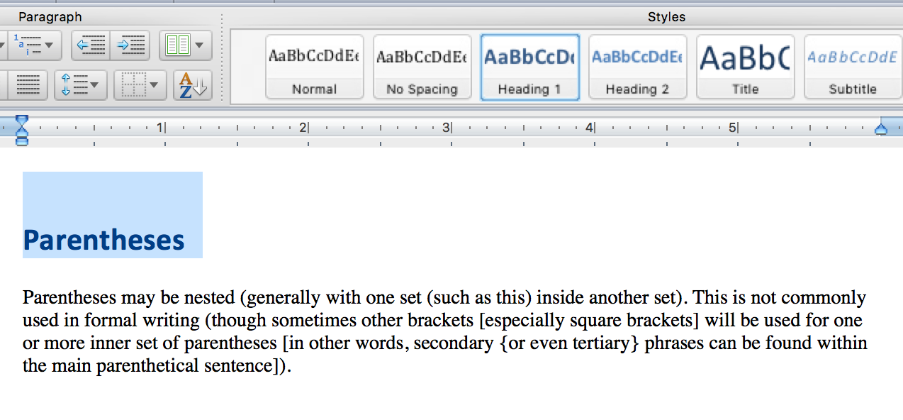
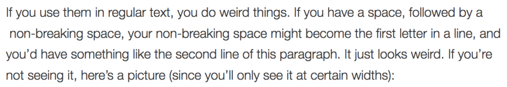
If you use them in regular text, you do weird things. If you have a space, followed by a  non-breaking space, your non-breaking space might become the first letter in a line, and you’d have something like the second line of this paragraph. It just looks weird. If you’re not seeing it, here’s a picture (since you’ll only see it at certain widths):

screenshot of the text of the previous paragraphYou might also have trouble centering things:

This line should be centered 

This line is actually centered

I doubled the size of the text to make the problem more pronounced, but it’s true at any size. Since non-breaking spaces are invisible unless you know to view the source, they can be an endless source of frustration when you try to lay out your page.

There’s a place to use the non-breaking space, but almost everywhere it’s used on our website it’s used incorrectly. This week, we’ll be adding a filter to remove double spaces after periods when when the page is rendered. This is an imperfect solution, since the non-breaking spaces will still be present in the editor, and this won’t fix other problems, like the text centering problem above. But it will make our website look a little more uniform.

Horizontal Rules

The HR tag used to be strictly a presentation element – it was there so you could draw a horizontal line across your page. While HR’s are still usually rendered as a horizontal line, they now have a semantic meaning. From MDN: The HTML <hr> element represents a thematic break between paragraph-level elements (for example, a change of scene in a story, or a shift of topic with a section).

If your website uses HR’s to break paragraphs that have very different subjects, you’re in great shape. But if there’s another element that might indicate that break, then you shouldn’t use the HR. So, for example, if you have a series of paragraphs, each labeled by a header, don’t use an HR since the headers act as the break. Similarly, an HR should never be the first thing in a section (like pages that start with an HR), because there’s nothing to break at the start of a section. And you should never have more than one HR in a row.

We’ll be removing some HR’s from the site in the coming weeks where they’re not used properly. If you’d like some more info on HR’s, you can go into depth in the specification.

Closing out the year for the Web Team

If you’ll recall from our original goals post, or the update that followed, we had a few goals on the web team the last two months of the year:

  1. Reduce the total number of pages on the Lane website by 5% (from 5768 to 5475).
  2. Reduce the number of pages with more than 20,000 characters by 20% (from 193 to 155)
  3. Reduce the average character count of our pages by 10.5%, from 4803 to 4300.
  4. improve the average age of our pages by 6 months, from roughly 24 months old to 18 months old.

I’m very sorry to report that while we made a lot of progress, we were unable to meet any of our four goals. Here’s the graphs:

Node Count Graph, showing progress from 5768 to 5557We were able to make some progress eliminating nodes even in December, but things slowed down. Part of that is because with so many people on vacation around the holidays, it’s difficult to get permission to delete a page. We’d been shooting for a 5% reduction, but we were only able to get 3.5%.

Graph of nodes wiht more than 20k characters, showing progress from193 to 172As mentioned in the previous goals post, it turns out that many of these really long nodes are pages that are really hard to reduce, like board meeting minutes or transcripts of in-service addresses. I reviewed almost every page and removed a lot of really bad markup: things that we should have removed when initially porting pages to Drupal, boldfaced text that should have been headers, HR tags used improperly, and so very, very many &nbsp; characters. We’ll tackle some of those in a future post.

We’d been looking to make a 20% improvement, but we only managed 10.8%.

Graph of average length of our pages, showing no progress in the last month.Average length was really depressing for me, especially as I’d update statistics after working on these goals for a few hours. I might spend two hours meticulously working my way through the list of really long nodes, since they’d help us meet this goal the most. And I might see a visible improvement on the body length graph. But then I’d work on eliminating some nodes, and inevitably those nodes would be really short, meaning our average body length would go right back up.

Still, we made some gains early on, and the site as a whole is improved. We’d been shooting for a 10.5% reduction, but we only made a depressing 2% improvement – about 100 characters.

Average Age, showing steady progress along our trend lineWe probably made the most progress on this goal, but our failure to make progress early in November really hurt us. Over the two months we tried to meet our goals, pages got about four months newer.

We tried to meet this goal primarily by updating our oldest pages.

Count of pages at least four years old, showing progress from 732 to 513We substantially reduced our really old pages. And while it’s great we made that progress, since we hate ROT, it just wasn’t enough for us to meet our goal.

We still have lots of tasks queued up in Basecamp for us to do related to content, that we just didn’t have time to get to as part of this challenge including reworking some tables that are used improperly, removing even more HR’s, fixing some pages that are using redundant text blocks, eliminating duplicated pages, adding headers, removing improper use of the • character (people use it for bullets, but they should be using the bullet tool), and figuring out what to do with pages where people wrote “check back for content soon” several years ago. So we expect to make more progress in the coming months.

A special things to everyone who helped out with our goals. Here are the ten champions of the last two months, who made the most edits on the site, helping us toward our goals:

Name Number of Revisions
Lori Brenden 545
Kyle Schmidt 179
Amy G 132
Emily M 91
Tammy S 58
Elizabeth P 41
Melanie B 39
Joan A 31
Wendy S 30
Penny M 27

Happy New Year everyone!

Understanding WCAG 2.0: 2.4.5 – Multiple Ways

The next standard we’ll explore in our series on understanding WCAG 2.0 is 2.4.5, Multiple Ways. This standard is required for WCAG level AA compliance, which is part of what Section 508 requires. Here’s the complete text:

2.4.5 Multiple Ways: More than one way is available to locate a Web page within a set of Web pages except where the Web Page is the result of, or a step in, a process. (Level AA)

At first glance, it might be surprising this is even an accessibility guideline. But the WCAG 2.0 guidelines are designed to help everyone use and navigate the web. And this guideline is all about helping people navigate the web.

There’s two pieces to this guideline. The first requires two different ways to get to a given page. That’s not a hard guideline to meet. The easiest way is to have each page linked to from another page as well as each page accessible from a search engine. That’s what we strive to do on the Lane site. Orphans, pages that aren’t linked at all, directly violate this guideline (though we’ll come back to them in a minute).

Another option is to use a site map. But be careful with this one. The SEO definition of a site map is something more akin to our sitemap XML files. But those pages aren’t accessible at all, nor even intended for humans to read. The WAI has a great example of a human accessible site map that does help to meet this guideline.

The second half of this guideline deals with an exception. There’s sometimes information that needs presenting as a result of a process, which isn’t appropriate for people to find any other way. For example, say there’s a confirmation page which appears after you register for a class. It isn’t really appropriate for this page to be found through search or even to be linked at all. It should only be seen in the context of successfully registering for a class.

A couple places you should look out for issues. If your server has a robots.txt file that prevents search engines from indexing pages, remember that search engines may not index your page, so beyond linking to your page, make sure you offer a second path (either a separate internal search engine, a site map, or one of these other techniques). Also be alert to pages that you might have excluded from your sitemap file (the SEO kind), since those pages are a lot less likely to show up in search. And watch out for pages behind authentication, as they’re usually not indexed by search engines, and due to permissions levels can be hard to integrate into site maps.

If you’d like to read more about the multiple ways guideline, you may also be interested in these techniques, which provides examples and more detail.

Interested in more? Check out the listing of all the posts in this series.