Just a couple more sites to finish our week:
The first three of those used to be entire top level sites, but in our new, leaner website, we’ve tired to make it easier for you to find things by reducing them to one page each

Just a couple more sites to finish our week:
The first three of those used to be entire top level sites, but in our new, leaner website, we’ve tired to make it easier for you to find things by reducing them to one page each
We’re moving on to some bigger chunks this week:
Not too long ago I wrote a post on how we use search data to influence our information architecture decisions. In our quest to be even better, we’ve made a few modifications.
Originally we were only looking at keywords (each of the words you search for) and queries (your exact search, often a phrase). As a refresher, here’s the graph of our common queries at the time:
 Right away we can see some redundant queries. “staff directory” and “directory” are really people searching for the same thing. Similarly, “campus map” and “map” are both people looking for the campus map. Although this is useful information to know, as it lets us figure out what terminology to use, it’d be nice if we could condense things so we just saw what people were trying to find – these are the sites that should be more prominently linked.
So our first change was to condense the number of queries, by grouping related ones into their most common term. We didn’t do it for all of them – just the top 300 or so – but it was enough to represent the majority of our search traffic. Our second change was to increase the amount of data for better accuracy. We’re now looking at the top 500 keywords and queries every week, instead of just the top 100. After 12 weeks, that gives us 1523 different queries, and 921 different keywords.
That much data means we needed a new, fancier way to get a big picture of it. Conveniently, as part of a different project, I’ve been learning to visualize data using d3.js *, and the thousands of points in our search data make a perfect starter project for me.
To really see the power of d3, you’ve got to see the graph in person. But here’s an image, in case you’re on an older browser (IE7 & 8 support is sketchy):

This particular type of graph is called a streamgraph. To read it, click on it to go to the website where it’s actually hosted, then mouse over a particular band. The width of that stream represents the proportion of traffic that searched that a particular query. The thickness of the river represents the total amount of traffic. Because a streamgraph sits around a central line, rather than a bottom line (like the one in the first image of this post), it’s easier to see changes in volatile data.
If you look at the graph on the webpage (and not here!), you’ll see a few dots below the graph. Mouse over them to see annotated events that we think might have contributed to sudden search bursts. Some of them, like the ExpressLane burst, are obvious. Others are just my guesses. And others are totally unidentified. If you have any ideas what might have caused one of those bursts, let me know in a comment, so I can have an even better understanding of how our site is used!
* I also cheated and used a project called Rickshaw, which provides an even gentler interface to d3 for time series data.
Three more went up today:
I’m sneaking off for vacation next week, so these are probably the last we’ll deploy until after I get back:
Many thanks to the ATC for doing the legwork to update the computer labs pages.
With today’s deployment we can celebrate putting more than 2000 pages into Drupal! Today we moved Child and Family Education. Be sure to check out their new and improved photo slideshows!
With the help of our first New Media Center students, we were able to take two more sites live today:
As part of the migration, we updated how you interact with the Art at Lane website. Through the use of Drupal’s Views Module, we changed how artwork is presented. Rather than have multiple pages to display the same information sorted in different ways, now you can simply click on a table header to sort by that column. And by having our own content type for artwork, we unified how pages are presented, and made it even easier to expand in the future.
Three more sites went live today:
We also officially finished our migration to Varnish. Based on some testing from yesterday, it looks like about 92% of our page requests are served from cache. Hopefully you’re noticing a much faster site!
Last Friday deployment until the end of summer!
I promised earlier that there’d be a follow-up post with new and interesting search data from our Google Mini. I’ll do my best to geek-out with as many stats as I can.
Google’s search statistics are given for for two types of data: queries and keywords. A query is the actual search performed on the search engine, for example “Labrador Puppy”. The keywords are (mostly) the words in the query. For my example we’d have two keywords, “Labrador” and “Puppy”. Some keywords, such as “the” or “and” we choose to ignore – no one is seriously searching for “the” on our website and expecting to find something meaningful.
Every Monday we collect data on the 100 most common queries and keywords from the previous week. After two months of collecting data, we’re have 190 keywords and 330 queries in our database. Let’s look at just the top 15 of each:
This graph is called a “Stacked Area Graph”, and it helps us to compare not only queries against each other, but also to see how queries change over time. So, in this chart, it appears that 6/2 was the busiest day on the search engine. In reality, because we’re only looking at the top 15 queries, we’re seeing some skewed data. If you look at all 300 of the queries we’re tracking, 6/2 was actually one of the slowest days.
So what can we learn? For one, we can learn what people are having trouble finding. The most popular search on our search engine has been for “soar”, and that it peaked last week – right before SOAR happened yesterday. This might be a hint that people were having trouble finding SOAR information without searching for it – a good indicator that maybe a more prominent link to SOAR should appear before the event.
We also see a few queries that should be combined. “map” and “campus map” is one example, “staff directory” and “directory” are another. We’re not combining them in our data right now because we want to see what people call things. For example, we can tell that more people are searching for “staff directory” than just “directory”, so it’s probably better to call our future staff directory (yes! this is coming!) a “Staff Directory” instead of just “Directory”.
We can also start to wonder why “library” was such a common query on 6/2, which is right around finals. If there’s often a lot of searches for the Library just before finals, we’d probably want to feature something on the Library on the homepage, to make it easier to find.
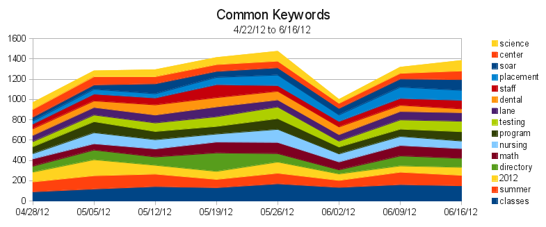 Keywords help us in different ways. Here we can see that our most popular keyword, “classes”, is actually used in searches more than any of our actual queries. So we know that many people are searching for classes, using a variety of queries. So we should probably investigate our analytics figure out where people are going after searching for classes. Then we can try to make those pages easier to find.
While there’s certainly improvements to make, most of this data is simply baseline information for after we finish revamping our information architecture. Then, as we implement our new Information Architecture, we should be able to see how that impacts our search traffic, to see if we’re providing a quantitatively better experience.
And to think, there’s thousands of data points inside the mini, and we’ve barely scratched the surface!