Understanding WCAG 2.0: 4.1.1 Parsing

The last standard we’ll explore in our series on understanding WCAG 2.0 is 4.1.1 Parsing. This standard is required for WCAG level A compliance, which is part of what Section 508 requires. Here’s the complete text:

4.1.1 Parsing: In content implemented using markup languages, elements have complete start and end tags, elements are nested according to their specifications, elements do not contain duplicate attributes, and any IDs are unique, except where the specifications allow these features. (Level A)

Web Browsers operate under a forgiveness by default principle. They’re very liberal in what sorts of input they accept, and they do their best to show you something. Here’s an example, taken straight from that link:

Hello!

If you inspect that line, you’ll find the color is specified as “sxbxxsreen”. “Sxbxxsreen” doesn’t exist as a color, either in the real world or within the browser. While most computer programs would either ignore “sxbxxsreen” or crash, browsers make a guess. Firefox converts the whole thing to a set of rgb hex values, using 0’s for invalid characters (look for Dak’s comments in that link for full explanation). Not every browser guesses the same way.

Web browsers also guess with malformed html:

<title>hello</title>
<p>Hello!
<body bgcolor="sxbxxsreen">

There’s no doctype, no html tag, no head tag, the p tag isn’t nested properly and doesn’t close, the specified background color doesn’t exist, and the body doesn’t close. But, amazingly, my web browser renders that page without complaint:
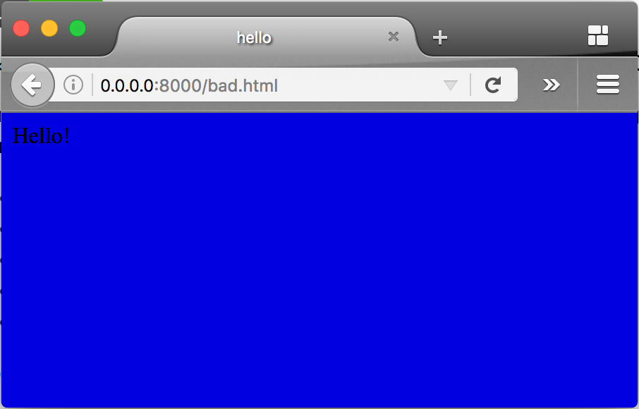
Screenshot of the previously desribed website, showing the word hello poorly contrasting on a blue backgroundWhile this is generally a good thing (nobody really wants a browser to stop working because of a minor syntax error), it can become a problem if we depend on browsers to always guess correctly. A screen reader, which is a type of browser (though the WCAG specification refers to both browsers and screen readers as “user-agents“, I’m calling them browsers in these posts because user-agent has another meaning). And while most of us test our web pages to make sure they work in the most common browsers, none of us has every browser out there.

This standard requires four things: close open tags, nest tags correctly, don’t use duplicate attributes, and make ids unique. The easiest way to see if you meet those requirements is by validating your page. To do that, first make sure your doctype is correct, since that will tell the browser how to interpret the html. In older pages, you might see something like this at the very start of the source:

<!DOCTYPE HTML PUBLIC "-//W3C//DTD HTML 4.01 Transitional//EN" 
                      "http://www.w3.org/TR/html4/loose.dtd">

But most new web pages use the HTML5 doctype:

<!doctype html>

which is the first and only doctype I can write from memory.

One your doctype is correct, you can use the W3C validator to check your document for errors. Here’s links for the legacy validator and the HTML5 validator.

If we validate the Lane home page, we’ll find many errors and warnings that don’t relate to the WCAG standard, and which we’ll have to interpret ourselves. For instance, there’s these:

  • Attribute xmlns:video not allowed here.
  • Attribute xmlns:product not allowed here.
  • Attribute xmlns:content not allowed here.
  • Attribute xmlns:dc not allowed here.

While technically these attributes aren’t supposed to be there (since they’re XML namespaces and not part of the HTML5 specification), none of them are duplicate attributes, so they’re allowed according to the WCAG 2.0 standard. This page also has a bunch of warnings. Some of them we can also ignore, but others are spot on:

  • Consider avoiding viewport values that prevent users from resizing documents.
  • The name attribute is obsolete. Consider putting an id attribute on the nearest container instead.
  • Consider using the h1 element as a top-level heading only (all h1 elements are treated as top-level headings by many screen readers and other tools).

Without any doubt, I should fix those three warnings. But note what this validator didn’t find: missing tags, improper nesting, repeated attributes, or duplicate ids. In other words, this page meets this standard, even though there’s some work I should do, and even though it doesn’t technically validate.

If you’d like to know more about this standard, check out these examples and techniques.

Interested in more? Check out the listing of all the posts in this series.

Understanding WCAG 2.0: 3.3.4 Error Prevention (Legal, Financial, Data)

The next standard we’ll explore in our series on understanding WCAG 2.0 is 3.3.4 Error Prevention. This standard is required for WCAG level AA compliance, which is part of what Section 508 requires. Here’s the complete text (it’s a long one):

3.3.4 Error Prevention (Legal, Financial, Data): For Web pages that cause legal commitments or financial transactions for the user to occur, that modify or delete user-controllable data in data storage systems, or that submit user test responses, at least one of the following is true: (Level AA)

  1. Reversible: Submissions are reversible.
  2. Checked: Data entered by the user is checked for input errors and the user is provided an opportunity to correct them.
  3. Confirmed: A mechanism is available for reviewing, confirming, and correcting information before finalizing the submission.

Here’s the idea: sometimes users, especially those with disabilities (and me, as you’ll see in a minute), submit forms either by accident or without fully understanding what happens when the form is submitted. Imagine, for example, someone with motor control issues who accidentally presses enter early while filling out a form, submitting it. This standard asks us to make sure that one of the three things in that list applies to the form.

There are a number of circumstances where we don’t need to do anything at all. For example, say we have a web form in our ERP that lets us set an address. As long as changing the address again is easy (for example, by filling out the form again), and we’re shown what the new address is after submission (either as a confirmation, or just with a page reload on submit), then we’re in good shape.

But we need to look for web forms that are not easily reversible. For instance, let’s look at a situation which may or may not have happened in my life about ten years ago. I was trying to pay a bill online. When paying it, I misplaced a decimal point, and paid ten times as much as I owed (like this: $3000.0). The system processed my payment without complaint, overdrawing my checking account, bouncing a $2.00 check at the library, and leading to so very many bank fees. A  simple confirmation page (which, to be fair, they’ve added), or even better, a confirmation page that warned me my payment only had one 0 after the decimal point, would have saved me a lot of grief.

What’s tricky about this accessibility requirement is that most of us rely on third party services for these kinds of legal, financial, and data programs. We buy our ERP system and payment processing systems from vendors, rather than create them at home. Even though we’re not doing development ourselves, we’re still responsible for ensuring our systems are complaint. If your system is receiving updates, and compliance won’t be available by January 18th, 2018, you may need to file a bug with your vendor.

If you’d like to know more about this method, check out these examples and techniques.

Interested in more? Check out the listing of all the posts in this series.

Understanding WCAG 2.0: 3.3.3 Error Suggestion

The next standard we’ll explore in our series on understanding WCAG 2.0 is 3.3.3 Error Suggestion. This standard is required for WCAG level AA compliance, which is part of what Section 508 requires. Here’s the complete text:

3.3.3 Error Suggestion: If an input error is automatically detected and suggestions for correction are known, then the suggestions are provided to the user, unless it would jeopardize the security or purpose of the content. (Level AA)

This standard has to do with input validation. Let’s say that we have a webform, like this:

This standard is all about what happens when you enter the wrong thing. Say, for example, we enter “9740” as our zip code. This is the wrong way to tell the user:

Wrong

To meet this standard, all you need to do is provide a helpful error message:

Please make sure your zip code contains exactly five numbers, then resubmit the form

Of course, you don’t want go to the other extreme, either. Think about this nightmare:

Invalid Password. Your password must meet the following rules:

  • Not be more than 255 characters long
  • Contain at least one number
  • Contain a special character (!, @, #, $, %, ^, &, *)
  • Contain both an uppercase and a lower case letter
  • Not contain a space character
  • Be at least 8 characters long
  • Use only ASCII characters
  • Not contain your username or birth date
  • Not be written down on a note under your keyboard

One of the goals of this standard is to help people with cognitive disabilities. Yes, that error message explains all the possible circumstances that could have caused the error. But the suggestions aren’t helpful — you have to work to figure out which rule you violated.

And that’s it for this standard. If you’d like to avoid the the messy details, you’re welcome to just skip to the end. But this post got me thinking. When you’re making a form, labels are associated with form fields via the for attribute on the label and the id attribute on the field. That way a screen reader knows how to associate labels and form elements. But how does that work with an error message? There’s no for attribute for an error message. Right?

How to Associate an Error Message with a Form Element

The first place my research took me was the WebAIM site, which suggests a two part approach. First, error messages should be listed at the top of the form. Second, each error message should link to the associated input element. So our form would look like this:

Please make sure your zip code contains exactly five numbers, then resubmit the form

This method meets accessibility requirements, but fails from a usability perspective. If we were to expand that form to have several fields, then visually associating error messages and fields would be difficult. The best practice is to instead display the error message next to the form component it applies to, like Twitter does:

Screen shot of the Twitter sign up form, showing an error message next to an invalid phone numberBut that leads us back to linking the error message and the form component. WAI-ARIA provides a way to do that:

Please make sure your zip code contains exactly five numbers, then resubmit the form

I know that looks pretty much exactly the same, but I promise if you break out your developer tools, there’ll be some extra attributes. First, we need to add aria-invalid=true to the input (depending on your error, there are some additional attributes you can use). Then, we add the aria-describedby attribute to the input and have it point to the id on our error message.

If you’d like to know more about this method, check out this page on WAI-ARIA regarding form validation. Or, if you’d just like to know strictly what WCAG 2.0 requires, you can look at these examples and techniques. Specifically, be sure to check out the technique for using aria-required to indicate a required field – just putting a * next to each field isn’t good enough. This blog post provides some additional examples and advice.

Interested in more? Check out the listing of all the posts in this series.

Understanding WCAG 2.0: 3.2.3 – Consistent Navigation

The next standard we’ll explore in our series on understanding WCAG 2.0 is 3.2.3 Consistent Navigation. This standard is required for WCAG level AA compliance, which is part of what Section 508 requires. Here’s the complete text:

3.2.3 Consistent Navigation: Navigational mechanisms that are repeated on multiple Web pages within a set of Web pages occur in the same relative order each time they are repeated, unless a change is initiated by the user. (Level AA)

Imagine you’re on a page, and you see these three menu items:

  • Home
  • Cat Pictures
  • Contact

Obviously, you click the Cat Pictures link. After enjoying some amazing pictures, you want to contact the site owner and contribute your own amazing pictures. So you go to click on the bottom link in the navigation. And what do you find?

  • Contact
  • Home
  • Cat Pictures

You:
Gif of Woman's eyes getting closer and closer, while looking more and more stern

But it’s ok. You adapt. You click the contact link at top, and contribute your pictures, and the page reloads, thanking you for your pictures. Of course, now you want to see your pictures in the gallery. But what do you see on the reloaded thank you page?

  • Cat Pictures
  • Contact
  • Home

Then you do this:
Gif of Dweight Schrute from the Office screaming

There’s two ways I’ve seen this happen. One, the rare way, is that someone just wrote their menu query with select * from menu and didn’t bother to set an order by clause, and the database server has (for reasons known only to it) changed how it’s returning results. The much more common way is that some PHP programmer got lazy and rather than put the menu links in an included template file, he just has a PHP file per page, with all the menu links in them, and somewhere while doing edits he mixed up the order. I may or may not speak from experience.

There’s two almost exceptions to this rule. One, you’re welcome to insert additional links within your menu – that’s what they mean by relative order. So although your page may show just the three links in the examples above, once you click on the Cat Pictures link, it’s ok to have this:

  • Home
  • Cat Pictures
    • Cats with short hair
    • Cats that shed everywhere
  • Contact

As long as the three top level links keep the same order (Home, Cat Pictures, Contact) on every page, you’re golden.

The second exception has to do with the phrase “set of web pages”. If you have two sites, one in English (at example.com/en/), and one in Spanish (example.com/es), then the navigation between them doesn’t need to match. So if your menus are ordered alphabetically, and that order changes because the language changes, that’s ok (though make sure you’re setting your page default language!).

And, though we’ve talked mostly about menus on this post, note that the standard actually applies to any recurring navigation element. So things like footer links, search boxes, and skip links should all be consistent.

If you’d like to read more on this statement, you may also be interested in these examples and techniques.

Interested in more? Check out the listing of all the posts in this series.

Understanding WCAG 2.0: 3.1.2 – Language of Parts

The next standard we’ll explore in our series on understanding WCAG 2.0 is 3.1.2 Language of Parts. This standard is required for WCAG level AA compliance, which is part of what Section 508 requires. Here’s the complete text:

3.1.2 Language of Parts: The human language of each passage or phrase in the content can be programmatically determined except for proper names, technical terms, words of indeterminate language, and words or phrases that have become part of the vernacular of the immediately surrounding text. (Level AA)

This standard is very similar to 3.1.1, which deals with the default language of the entire page. This standard simply provides a way to display multiple languages within the same page. So for example, here’s a paragraph of text in Arabic (from Wikipedia):

كولومبوس (إنديانا) هي مدينة تقع في الولايات المتحدة في Bartholomew County. يقدر عدد سكانها بـ 44,061 نسمة ومساحتها 72.23 كم2 و وترتفع عن سطح البحر 192 متر.

That paragraph is right aligned because Arabic is read from the right to the left. Here’s the source of that paragraph:

<p dir="rtl" lang="ar"><b>كولومبوس (إنديانا)</b> هي مدينة تقع في الولايات المتحدة في Bartholomew County. يقدر عدد سكانها بـ 44,061 نسمة ومساحتها 72.23 كم<sup>2</sup> و وترتفع عن سطح البحر 192 متر.</p>

There’s two attributes added to the p element, dir and lang. Only the lang attribute is required to comply with this standard, but because the language is read right to left, we also need to provide the dir attribute to clarify to both browsers and screen readers that they should read from right to left.

I’m afraid that I’m not sure why it’s necessary to specify the text direction if you’ve already specified a language – after all, Arabic, Farsi, and Hebrew are always read RTL, so isn’t the dir attribute redundant? The W3C says no, you must use both. I wish I could find a more clear rationale.

If you’d like to read more on this statement, you may also be interested in these examples and techniques.

Interested in more? Check out the listing of all the posts in this series.

Understanding WCAG 2.0: 3.1.1 – Language of Page

The next standard we’ll explore in our series on understanding WCAG 2.0 is 3.1.1 Language of Page. This standard is required for WCAG level A compliance, which is part of what Section 508 requires. Here’s the complete text:

3.1.1 Language of Page: The default human language of each Web page can be programmatically determined. (Level A)

When a screen reader reads a page, it needs a voice to use. Here’s the default voice on my Mac reading some words in Spanish:

That’s not too dissimilar from how I sound, which isn’t a coincidence. The default voice tried to pronounce words like an American English speaker (IETF code EN_US), which is what I am. The problem in the audio file above is that we told my computer to pronounce Spanish words (“¡Hola! Cómo estás!“) as though they were in English.

If we’d instead told the computer the words were in Spanish, we’d have heard this:

That uses the ES_ES voice (which, on a Mac, is named Monica). And it sounds totally natural (or, at least, as natural as computer generated language can be).

To specify a language for your entire document, simply add a lang attribute to the html tag:

<html lang="en">

Confusingly, the language codes we use in HTML are different from the IETF codes. Instead, we use ISO-639-1.

Sometimes it isn’t possible to modify the tags on the page. For instance, you might be using a platform that generates HTML, and you don’t have access to change the output. In those cases, you can instead add a Content-Language header to your server:

Content-Language: en

But sometimes, that’s not an option either. You might be stuck with a platform that can only generate HTML 4.01, or you might only be able to insert tags into the header and body, but not modify html tag directly.

For those times, your only option is to use the absolute wrong way to specify a language:

<meta http-equiv="content-language" content="en">

This meta tag (meaning a tag that’s about a page, rather than part of a page), is now considered obsolete. But if it’s your only option, it’s your only option.

If you’d like to read more document language codes, you may also be interested in these techniques, which provides more detail. I also found this blog post very helpful, as well as this page on w3.org.

Interested in more? Check out the listing of all the posts in this series.
Understanding WCAG 2.0: 2.4.6 – Heading and Labels

The next standard we’ll explore in our series on understanding WCAG 2.0 is 2.4.6, Multiple Ways. This standard is required for WCAG level AA compliance, which is part of what Section 508 requires. Here’s the complete text:

2.4.6 Headings and Labels: Headings and labels describe topic or purpose. (Level AA)

For a really short standard, there’s a lot to unpack.

The first thing you might notice is this standard doesn’t explicitly require headings or labels. While labels are definitely required, there’s actually no specific requirement to have headings on your pages. If it’s appropriate to not have any headings, you are (from an accessibility standpoint) welcome to have nothing but paragraph after paragraph after paragraph.

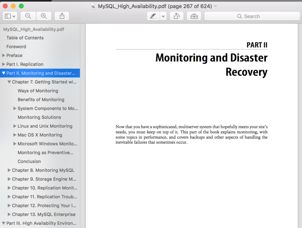
But situations where it’s appropriate to not have any headers are rare, and adding headers makes your document more navigable. For example, most PDF readers will automatically generate a clickable table of contents for you, as in this picture:

Screenshot of a page and table of contents from a PDFScreen readers can take advantage of headers in a similar way. Imagine if you were stuck listening to your computer reading you all 624 pages of that book sequentially. It’d be almost useless to you. Being able to jump to certain headers would help a lot.

Standard 2.4.6 simply says that if you’re using headers, you need to use headers that describe the topic or the purpose of the subsequent section.

But buried further down on that post, in a little green note, there’s a bit of text that says “Note: Headings and labels must be programmatically determined, per Success Criterion 1.3.1

Programmatically determined is a tricky phrase. Just about anything is programmatically determinable – so that seems like a phrase ripe for abuse. Fortunately, WCAG 2.0 provides a definition:

determined by software from author-supplied data provided in a way that different user agents, including assistive technologies, can extract and present this information to users in different modalities

So if we do use headings, not only do that have to be programmatically determinable, they need to be programmatically determinable by the software that interprets that page.

If that doesn’t make sense, it might be easier to look at some examples. The paragraph in the example comes courtesy of wikipedia, which has some surprisingly awesome writing.

Parentheses

Parentheses may be nested (generally with one set (such as this) inside another set). This is not commonly used in formal writing (though sometimes other brackets [especially square brackets] will be used for one or more inner set of parentheses [in other words, secondary {or even tertiary} phrases can be found within the main parenthetical sentence]).

That example fails, because the heading above is a paragraph element – there’s no way to determine that it describes the subsequent content.

Parentheses

Parentheses may be nested (generally with one set (such as this) inside another set). This is not commonly used in formal writing (though sometimes other brackets [especially square brackets] will be used for one or more inner set of parentheses [in other words, secondary {or even tertiary} phrases can be found within the main parenthetical sentence]).

This one looks ok, but isn’t. Boldface isn’t a heading standard, so most user agents wouldn’t consider it one.

#Parentheses

Parentheses may be nested (generally with one set (such as this) inside another set). This is not commonly used in formal writing (though sometimes other brackets [especially square brackets] will be used for one or more inner set of parentheses [in other words, secondary {or even tertiary} phrases can be found within the main parenthetical sentence]).

This one is different, because rather than HTML it’s a format called markdown. Markdown has very specific rules about formatting text, which make it easy to determine where a heading is. Remember: the WCAG guidelines apply to all documents.

Parentheses

Parentheses may be nested (generally with one set (such as this) inside another set). This is not commonly used in formal writing (though sometimes other brackets [especially square brackets] will be used for one or more inner set of parentheses [in other words, secondary {or even tertiary} phrases can be found within the main parenthetical sentence]).

That’s probably the best example here – we’re using the H1 tag for the heading. Not only does the browser apply some styles to make it obvious to most folks where the heading is, but we’re using semantic HTML and adhering to a standard browsers can use to navigate pages.

One last example:

The Marathon

Parentheses may be nested (generally with one set (such as this) inside another set). This is not commonly used in formal writing (though sometimes other brackets [especially square brackets] will be used for one or more inner set of parentheses [in other words, secondary {or even tertiary} phrases can be found within the main parenthetical sentence]).

This example uses a heading with the correct markup, but it doesn’t provide the topic in any way, so it fails this guideline.

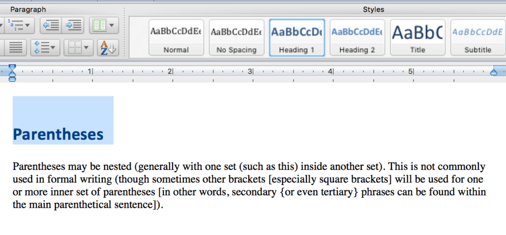
At Lane, to keep pages consistent, any page that will be interpreted by the browser as HTML should use semantic HTML, with headings and other elements used correctly. Documents that aren’t HTML are a little trickier. In Microsoft Word, for instance, many people use font sizes and bold face to create headings. That’s really not ok – you should be using the headers tools.

Example of using the heading tools in Microsoft WordIf you’d like to read more about the headers and labels guideline, you may also be interested in these techniques, which provides examples and more detail.

Interested in more? Check out the listing of all the posts in this series.
Understanding WCAG 2.0: 2.4.5 – Multiple Ways

The next standard we’ll explore in our series on understanding WCAG 2.0 is 2.4.5, Multiple Ways. This standard is required for WCAG level AA compliance, which is part of what Section 508 requires. Here’s the complete text:

2.4.5 Multiple Ways: More than one way is available to locate a Web page within a set of Web pages except where the Web Page is the result of, or a step in, a process. (Level AA)

At first glance, it might be surprising this is even an accessibility guideline. But the WCAG 2.0 guidelines are designed to help everyone use and navigate the web. And this guideline is all about helping people navigate the web.

There’s two pieces to this guideline. The first requires two different ways to get to a given page. That’s not a hard guideline to meet. The easiest way is to have each page linked to from another page as well as each page accessible from a search engine. That’s what we strive to do on the Lane site. Orphans, pages that aren’t linked at all, directly violate this guideline (though we’ll come back to them in a minute).

Another option is to use a site map. But be careful with this one. The SEO definition of a site map is something more akin to our sitemap XML files. But those pages aren’t accessible at all, nor even intended for humans to read. The WAI has a great example of a human accessible site map that does help to meet this guideline.

The second half of this guideline deals with an exception. There’s sometimes information that needs presenting as a result of a process, which isn’t appropriate for people to find any other way. For example, say there’s a confirmation page which appears after you register for a class. It isn’t really appropriate for this page to be found through search or even to be linked at all. It should only be seen in the context of successfully registering for a class.

A couple places you should look out for issues. If your server has a robots.txt file that prevents search engines from indexing pages, remember that search engines may not index your page, so beyond linking to your page, make sure you offer a second path (either a separate internal search engine, a site map, or one of these other techniques). Also be alert to pages that you might have excluded from your sitemap file (the SEO kind), since those pages are a lot less likely to show up in search. And watch out for pages behind authentication, as they’re usually not indexed by search engines, and due to permissions levels can be hard to integrate into site maps.

If you’d like to read more about the multiple ways guideline, you may also be interested in these techniques, which provides examples and more detail.

Interested in more? Check out the listing of all the posts in this series.

Understanding WCAG 2.0: 2.4.4 – Link Purpose

The next standard we’ll explore in our series on understanding WCAG 2.0 is 2.4.4, Link Purpose. This standard is required for WCAG level A compliance, which is part of what Section 508 requires. Here’s the complete text:

2.4.4 Link Purpose (In Context): The purpose of each link can be determined from the link text alone or from the link text together with its programmatically determined link context, except where the purpose of the link would be ambiguous to users in general. (Level A)

Before we get into this standard, let’s first take a look at how sighted people read on the web. And to do that, we first need to discuss this contraption:

An eye tracking machine. Described in detail in textThat’s a modern eye tracker – the ones I used in college were closer to these. But they all work the same. You rest your head on a head rest and a camera records where your focus is as you look at a screen. Lots of interesting work has been done with eye trackers, like determining that your eyes don’t move smoothly over text while reading. On the web, eye trackers have helped us learn that people don’t carefully read pages from the top to the bottom, carefully considering every line of text. Instead, people read pages in an F shaped pattern:

A screenshot of a web page, showing a heat map over laid on top of it, with the red areas in a vague F patternThat’s part of an image from this page discussing the F-shaped pattern at length. People are busy and don’t really read web pages. They read a little across the top, then they scan.

Why should we expect non-sighted people to be any different?

Most screen reading software (JAWS of course, but even Voiceover, which comes with Macs) features tools that make it possible to jump around the page, effectively skimming for content the visitor is interested in.

Which brings us back to link purpose. Imagine you’re using a screen reader, and you ask it to get you the links in a page, so you can skim to the one you’re looking for. It gets you these:

Would you have any idea what class you were going to look at for the second link? To meet this standard, we’d need to adjust how that link is presented in the page. So let’s work with an example. We’ll assume I’m putting together a short snippet that links people to my Underwater Basketweaving class.

<a href="https://classes.lanecc.edu/course/view.php?id=50473">
  https://classes.lanecc.edu/course/view.php?id=50473
</a>

That’s about as bad as you can possibly do, and almost exactly what’s in the list above. It’s just a linked URL in the page, with no context at all.

<a href="https://classes.lanecc.edu/courses/underwater-basketweaving/schmidt">
   https://classes.lanecc.edu/courses/underwater-basketweaving/schmidt
</a>

That’d be better – that’ll still appear as just as link on the page, but at least it’ll be a meaningful and friendly url. Not ideal, but better than what we had before. Also, better for SEO. Better yet would be to set the link text to be something meaningful:

<a href="https://classes.lanecc.edu/course/view.php?id=50473">
  Underwater Basketweaving Class
</a>

That’d look like this: Underwater Basketweaving Class, which could be perfect. But that isn’t your only option. You can instead choose to provide context in the surrounding text:

<p>Check out the Underwater Basketweaving class
  <a href="https://classes.lanecc.edu/course/view.php?id=50473">
    https://classes.lanecc.edu/course/view.php?id=50473
  </a>
</p>

You can also make use of the title attribute to clarify the purpose a link:

<a title="Underwater Basketweaving Class" href="https://classes.lanecc.edu/course/view.php?id=50473">
  Learn about the best class around!
</a>

If you have a particularly complex situation, like where a single label for a link can apply to multiple links, you can also use the aria-labeledby attribute. Confusingly (at least to me) there’s also the aria-label attribute which can be used as well. But I’m not sure why you’d prefer that to the title.

There’s a lot more information available on link purpose, in particular the rest of the techniques I didn’t discuss above.

Interested in more? Check out the listing of all the posts in this series.

Understanding WCAG 2.0: 2.4.3 – Focus Order

The next standard we’ll explore in our series on understanding WCAG 2.0 is 2.4.3, Focus Order. This standard is required for WCAG level A compliance, which is part of what Section 508 requires. Here’s the complete text:

2.4.3 Focus Order: If a Web page can be navigated sequentially and the navigation sequences affect meaning or operation, focusable components receive focus in an order that preserves meaning and operability. (Level A)

Any part of a program or web page that can receive input from the user can have focus. Let’s take a look at a webform, so we have a something to reference:

Sample Form


This is an interactive webform, so you can click in either of the input boxes. Go ahead, try it right now. I’ll wait.

There’s four elements on that page that could receive focus, but only three that can. I’ve marked the submit button as disabled, so you can’t click it. That element can’t have focus, so you can’t submit the form.

There’s a couple ways to navigate that form. If you’re sighted, you might use the mouse to first click in the first box, and then again to click in the second box. But if you can’t see the screen, it’s hard to use a mouse. Instead, you’d probably use the tab key to move between elements.

The sequence focus follows when tabbing is called the tab order, and is set using the tabindex attribute on html elements. I didn’t set the tab index on any of those elements, so the browser automatically fills in the tab order for us, using the structure of the HTML – in this case, from top to bottom. But take a look at this form:

Bad Sample Form


Doesn’t that feel a little… evil?

For the purposes of editing our web pages, that’s really all there is to this standard. Make sure that the order you move from input to input on your pages makes sense. And if it doesn’t, use the tabindex attribute to fix it.

If you’re doing web development, there’s a little more to consider. Using CSS, it’s possible to position elements in a different order visually than the way they’re written in code. That isn’t necessarily against the rules, but you need to make sure the tab order still works (in addition to the concerns in 1.3.2). Also be alert to things like modal dialogs, or popovers which can visually steal focus from the webpage, but which may not trap the tab key, and may mean someone with low vision can only see the modal, but can still tab outside of it.

If you’d like to read more about focus order, you may also be interested in these techniques, which provides examples and more detail.

And if you’ve never watched a blind person use a computer, you really should. That video is part of a great, funny collection of videos on what it’s like to live without sight.

Interested in more? Check out the listing of all the posts in this series.