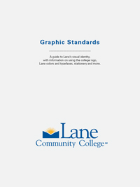
We all know how to make an image accessible. And we all know how to make a link. But how do we make them play together? How do we do something like this:
 Since we’re good people, we add alt text describing the image, right? Maybe something like “Graphic Standards Cover”? That’d give us (overly simplified) HTML like this:
<a href="standards.pdf"><img src="cover.png" alt="Graphic Standards Cover"></a>
But that’s actually not so great for accessibility. A screen reader will read “Graphic Standards Cover”, which doesn’t make the action (downloading the standards) clear.
My first instinct was to add a title to the link. But the title is almost never read by a screen reader, and may even make things worse. The reader will read the alt text. To make it clear what the link does we need to change the alt text:
<a href="standards.pdf"><img src="cover.png" alt="Download the Lane Graphic Standards"></a>
Now we’ve solved the accessibility problem, but we may have created a user experience (UX) problem. Scroll up a second and look at that image again. Did you know that you should click that picture to download the PDF? Or did you think it was just a picture? We can’t even rely on people discovering the picture is linked by hovering over it with the mouse and the cursor changing: it isn’t possible to hover with your finger on a phone.
Sometimes it may be immediately clear that a picture is clickable from context. If it isn’t we may need to add some help:
<a href="standards.pdf"><img src="cover.png" alt="Download the Lane Graphic Standards">Download the Lane Graphic Standards</a>
Now we’ve solved our UX problem, but we’re back to an accessibility issue! A screen reader will read the alt text and the link text. It’ll be like the same sentence is printed twice. The solution to this is to have explicitly empty alt text:
<a href="standards.pdf"><img src="cover.png" alt="">Download the Lane Graphic Standards</a>
Explicitly empty alt text will be ignored by the screen reader entirely, while missing alt text can cause unpredictable or even negative behavior.
You could also go back to adding descriptive text as the alt text. In our example above, that isn’t appropriate, since the cover is really just decorative. But consider another example:
 That image is linked to the full size picture. Describing the contents of the picture is completely appropriate. But remember that most screen readers can pull links out of a page, and let someone navigate from link to link directly. For that reason, our alt text is “A cat chewing on a monitor. Link opens a larger image.” The alt text serves double duty.
This post does not, of course, mean it’s always appropriate to use an image. It’s important to avoid off-brand or inappropriate images. It’s important not to add so many linked pictures that your page hierarchy gets lost and navigation gets more difficult. And if something can be done in CSS, it probably should be. It wouldn’t hurt to use images as pictures as rarely as you can.
If you’re not sure what to do with links at Lane, get in touch! We’re always happy to help.
