Today’s post is a quick one, to share this awesome captioning style guide from Humber College, which I found while trying to figure out the appropriate way to caption a choir singing a round acapella (I still don’t know the answer). In addition to the most helpful information I found on captioning music, also included are suggestions on timing, dialog, sound effects, and accents. Since we need to caption almost every video on our website, it’s worth a quick glace to get an idea of how it should be done.
Links
Creating an inaccessible website
Recently I found a post which explores some of the limitations of automated website accessibility checking tools by building a site that scores a 100% on Google’s accessibility checker, while being completely inaccessible.
That post explores the very real limitations of automated tools. Tools like that can be useful, and help us by checking some of the low hanging fruit. But they never do a great job. For instance, just to highlight one obvious example mentioned in the post, here’s some examples of alt text on a logo which links to the homepage which would pass an automated check, but are really terribly inaccessible:
- alt=”logo”
- alt=”logo.png”
- alt=”Picture”
- alt=”The Lane Community College Logo”
- alt=”Lane Community College”
You know what some good alt text would be? “Visit the LCC homepage” – it’s a linked logo, so provide the purpose of the link.
When it comes to automated accessibility tools, use them to give you an idea of the overall accessibility of a page, but always double-check some items yourself – particularly ones that are difficult to for a computer to check, like link purpose.
Looking for more on alt text? Check out a decision tree for alt text
Accessibility and Pizza
This is just a quick post to share some news about the ever evolving legal web accessibility landscape. The LA Times has a nice write-up of Robles v Dominos, and how by declining to review the 9th Circuit ruling, we’ve conclusively determined that the Americans with Disabilities Act does apply to websites and apps.
While this doesn’t impact the college directly – we were already subject to website accessibility requirements – it does serve as a great reminder that digital accessibility lawsuits are on the rise, and we need to continually work to ensure what we do is accessible.
And remember, that work doesn’t include just websites, but all things posted online, on any website used in relation to Lane. PDFs have some pretty good checking tools that are worth looking at.
Alt text decision tree
While researching the WCAG 2.1 post series, I found an excellent alt text decision tree that walks you through how to select appropriate alt text for an image on the web.
If image accessibility interests you, you might be interested in the WCAG 2.0 or 2.1 post series.
Accessibility Posters
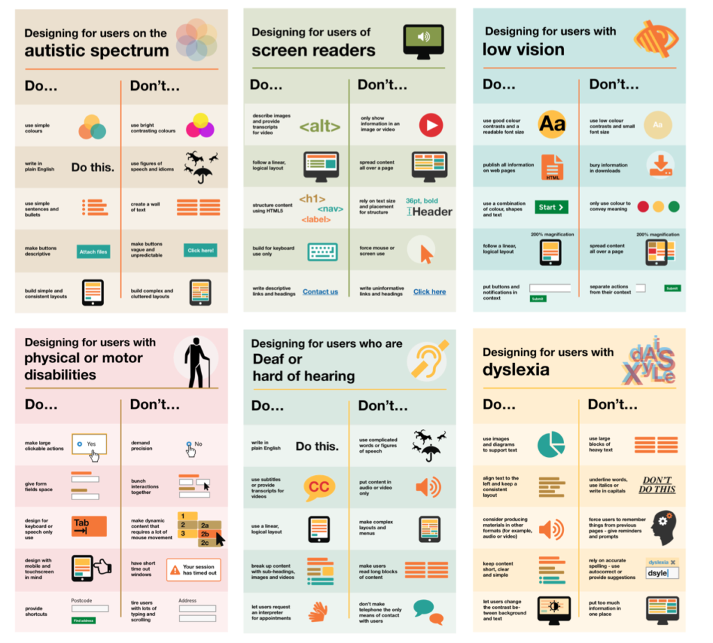
The UK Government Digital Service has published a great set of posters about designing for accessibility. They’re a great reminder that designing for accessibility isn’t just about screen reader, but about designing for a lot of different conditions that impact a lot of people.

