Analyzing Traffic on the Lane Website

I was on a bike ride through West Eugene the other day, and I got to thinking about people that visit the Lane Website. What is it they’re looking for? What pages do they go to? Where do they come from? What web browsers do they use? Where are they from? I couldn’t wait to get home and find out.

So as soon as I got home, I fired up Google Analytics and started digging around. It wasn’t long before I realized that I wasn’t going to just find a couple quick answers to my questions. Every answer I found raised two questions. There was a lot of exploring to do. So over the next few months, every Friday I’m going to try to make a post about analyzing some particular aspect of our website. Hopefully it’ll help us refine the designs we’ve been working with for the website redesign.

We’ve been tracking visits to the Lane homepage since 2008, giving us lots of data to work with. So much with that it’s almost impossible to draw any conclusions – think about how things have changed on the Internet in the last five years! So, for the purposes of this analysis, we’ll mostly be working with data from the last year – Oct 15, 2011 to Oct 15, 2012.

While we analyze that data, it’s helpful to keep some simple statistics in the back of your mind, just to help frame things. This way you’ll have an anchor in mind – so that if I tell you that some website sent us 150 visits last year, you’ll know that isn’t many when you’re talking about a website that sees 4.8 million visits a year. Here’s the stats:

Visits 4,872,025
Unique Visits 1,420,264
Pages/Visit 2.57
Avg Visit Duration 00:04:00
Bounce Rate 59.06%

Bounce rate is a helpful term to know – it simply means the number of people that saw one page and left. A high bounce rate is good on some websites, where people just go for quick bits of information (like a thesaurus). But on our website, where we want people to learn and explore a little, we generally want a low bounce rate.

Next week I’ll post about how people actually find the Lane Website, and I’ll try to update this post with links to subsequent posts as we go:

And now’s a good a time as any to plug what we can do with Analytics for your website. If you’ve got a website on campus and you’re interested in how people find and use your website, send Lori Brenden or me an email. We’ll hook you up.

Search Visualization

Not too long ago I wrote a post on how we use search data to influence our information architecture decisions. In our quest to be even better, we’ve made a few modifications.

Originally we were only looking at keywords (each of the words you search for) and queries (your exact search, often a phrase). As a refresher, here’s the graph of our common queries at the time:

Graph of Common Search QueriesRight away we can see some redundant queries. “staff directory” and “directory” are really people searching for the same thing. Similarly, “campus map” and “map” are both people looking for the campus map. Although this is useful information to know, as it lets us figure out what terminology to use, it’d be nice if we could condense things so we just saw what people were trying to find – these are the sites that should be more prominently linked.

So our first change was to condense the number of queries, by grouping related ones into their most common term. We didn’t do it for all of them – just the top 300 or so – but it was enough to represent the majority of our search traffic. Our second change was to increase the amount of data for better accuracy. We’re now looking at the top 500 keywords and queries every week, instead of just the top 100. After 12 weeks, that gives us 1523 different queries, and 921 different keywords.

That much data means we needed a new, fancier way to get a big picture of it. Conveniently, as part of a different project, I’ve been learning to visualize data using d3.js *, and the thousands of points in our search data make a perfect starter project for me.

To really see the power of d3, you’ve got to see the graph in person. But here’s an image, in case you’re on an older browser (IE7 & 8 support is sketchy):

top 50 Search Query, using a streamgraph
Top 50 Search Queries

This particular type of graph is called a streamgraph. To read it, click on it to go to the website where it’s actually hosted, then mouse over a particular band. The width of that stream represents the proportion of traffic that searched that a particular query. The thickness of the river represents the total amount of traffic. Because a streamgraph sits around a central line, rather than a bottom line (like the one in the first image of this post), it’s easier to see changes in volatile data.

If you look at the graph on the webpage (and not here!), you’ll see a few dots below the graph. Mouse over them to see annotated events that we think might have contributed to sudden search bursts. Some of them, like the ExpressLane burst, are obvious. Others are just my guesses. And others are totally unidentified. If you have any ideas what might have caused one of those bursts, let me know in a comment, so I can have an even better understanding of how our site is used!

* I also cheated and used a project called Rickshaw, which provides an even gentler interface to d3 for time series data.

Search Statistics

I promised earlier that there’d be a follow-up post with new and interesting search data from our Google Mini. I’ll do my best to geek-out with as many stats as I can.

Google’s search statistics are given for for two types of data: queries and keywords. A query is the actual search performed on the search engine, for example “Labrador Puppy”. The keywords are (mostly) the words in the query. For my example we’d have two keywords, “Labrador” and “Puppy”. Some keywords, such as “the” or “and” we choose to ignore – no one is seriously searching for “the” on our website and expecting to find something meaningful.

Every Monday we collect data on the 100 most common queries and keywords from the previous week. After two months of collecting data, we’re have 190 keywords and 330 queries in our database. Let’s look at just the top 15 of each:

Graph of Common Search QueriesThis graph is called a “Stacked Area Graph”, and it helps us to compare not only queries against each other, but also to see how queries change over time. So, in this chart, it appears that 6/2 was the busiest day on the search engine. In reality, because we’re only looking at the top 15 queries, we’re seeing some skewed data. If you look at all 300 of the queries we’re tracking, 6/2 was actually one of the slowest days.

So what can we learn? For one, we can learn what people are having trouble finding. The most popular search on our search engine has been for “soar”, and that it peaked last week – right before SOAR happened yesterday. This might be a hint that people were having trouble finding SOAR information without searching for it – a good indicator that maybe a more prominent link to SOAR should appear before the event.

We also see a few queries that should be combined. “map” and “campus map” is one example, “staff directory” and “directory” are another. We’re not combining them in our data right now because we want to see what people call things. For example, we can tell that more people are searching for “staff directory” than just “directory”, so it’s probably better to call our future staff directory (yes! this is coming!) a “Staff Directory” instead of just “Directory”.

We can also start to wonder why “library” was such a common query on 6/2, which is right around finals. If there’s often a lot of searches for the Library just before finals, we’d probably want to feature something on the Library on the homepage, to make it easier to find.

Graph of 15 most common KeywordsKeywords help us in different ways. Here we can see that our most popular keyword, “classes”, is actually used in searches more than any of our actual queries. So we know that many people are searching for classes, using a variety of queries. So we should probably investigate our analytics figure out where people are going after searching for classes. Then we can try to make those pages easier to find.

While there’s certainly improvements to make, most of this data is simply baseline information for after we finish revamping our information architecture. Then, as we implement our new Information Architecture, we should be able to see how that impacts our search traffic, to see if we’re providing a quantitatively better experience.

And to think, there’s thousands of data points inside the mini, and we’ve barely scratched the surface!


Speeding up Drupal 7

It’s fairly well accepted that it’s important to have a super fast webpage. We’ve spent much of the last two weeks working on our back end design to make the new Lane webpage as fast as it can possibly be. This blog post will be about sharing our results. A few notes before we begin:

  • These tests were conducted mostly on my own laptop, which was busily doing other things, so results aren’t scientific – but it’s good enough for the type of basic improvements we’re going here. On the plus side, this will totally eliminate network effects, since there isn’t really a network.
  • We’ll be testing on the development version of our contact page at http://www.lanecc.edu/contact
  • Some of these improvements are technically still in testing, and thus you won’t see on the main website (yet). Others were actually implemented weeks ago, but I’m rehashing them here because they’re some of the simplest improvements you can make.
  • I’ll be using Firebug to watch the event timeline to see how long things took. This isn’t perfectly accurate, but it’s pretty good for us. And Firebug is amazing.

Baseline

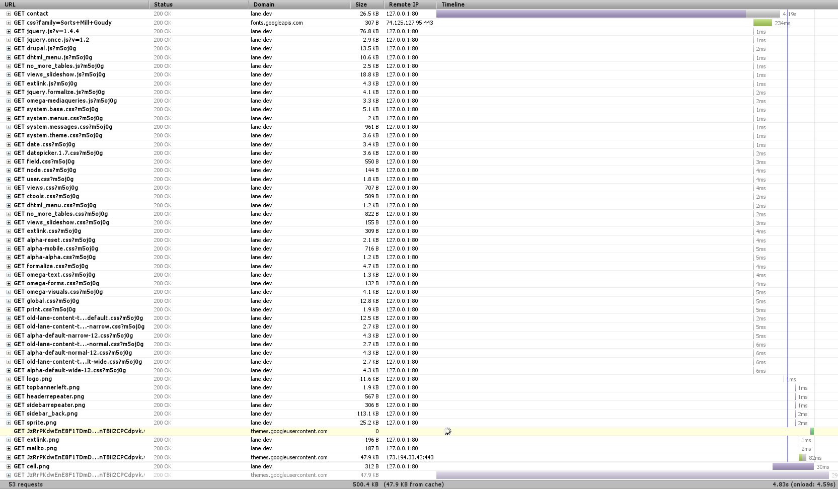
In any testing, you need a baseline. Here’s the timeline for loading the contact page (remember to click on any image to see the full size):

53 HTTP requests over 4.59 seconds

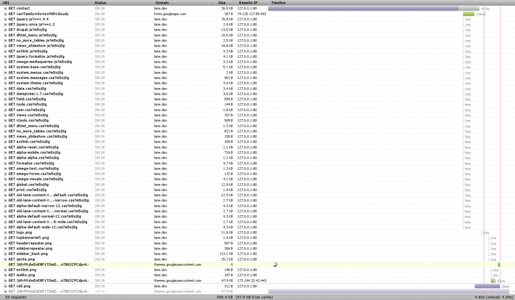
Right away we notice three things – first, that there’s a font that hasn’t finished loading, and which is highlighted in yellow toward the bottom. That’s actually an issue with Firebug, so we can just ignore it.

We also notice that there’s a TON of requests. In this case, 53 (technically 52, since we’re ignoring the font one). When we’re dealing with a local server like this, each of those requests happens super fast. But when we’re dealing with a remote server, like with 99.999% of web requests, there’s a limit of how many requests you can make at one time – always less than 10. So we can get a significant speed boost if we combine requests (You can see some of that limit at the bottom of this post).

Finally, we see a huge purple bar up at top. Any time you see purple in Firebug, that’s when we’re waiting on the server to do something. In this case, we can see that it took about 4 seconds for Drupal to render the page. Surely we can do better!

CSS/JS Aggregation

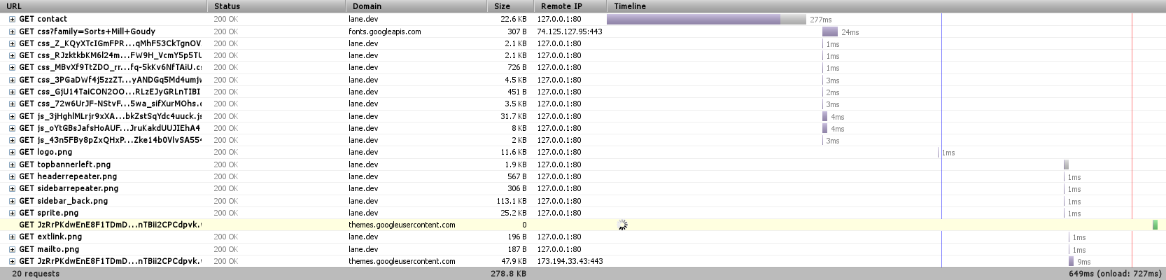
Our first step will be to combine CSS and Javascript files. We won’t see much of a difference on our tests (things might actually get worse!), but we’ll see a significant improvement on the actual site.

Down to 20 requests

We’re down to 20 requests, just by telling Drupal to combine JavaScript and CSS files where it can. Eliminating 30 requests is actually a significant speedup (Sorry I can’t easily show it here, but you can see other research online).

Also worth noting is the file ‘sprite.png’ that’s listed on there. This is essentially the same idea, applied to images. You can look at our sprite here.

Medium Level: APC

We’re going to skip over the next most obvious method of speeding things up and instead have a look at the Alternative PHP Cache (APC). Drupal is written in PHP, which is an interpreted language. That means that when we process the index.php file, we first turn it from normal PHP code to optcode, which is then run on the PHP virtual machine. APC lets us store (cache) optcode, so that we can skip that first, interpreting step.

The other night, we found that our server was actually freezing on some requests. We had a look at the apc cache, and we found something like this:

A full APC Cache

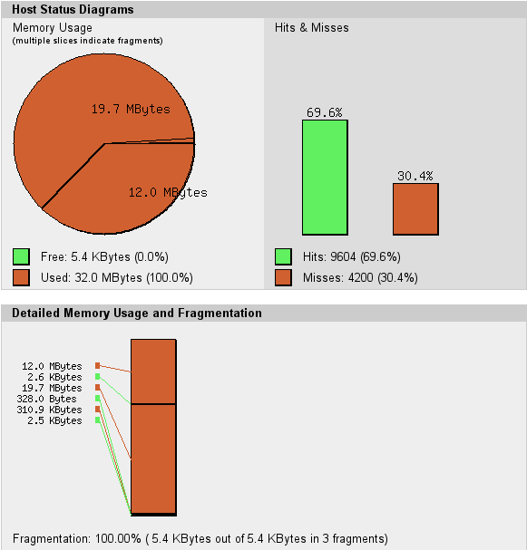
The circle is all red – there’s no more free memory available for APC to use to cache optcode. Our memory is also fragmented – APC can’t keep things near each other, which is going to make the cache work harder than it should. Together, these two things make us ‘miss’ the cache – on my computer, there were 4200 opportunities to speed things up that we missed. So we simply increased the cache size.

300ms load

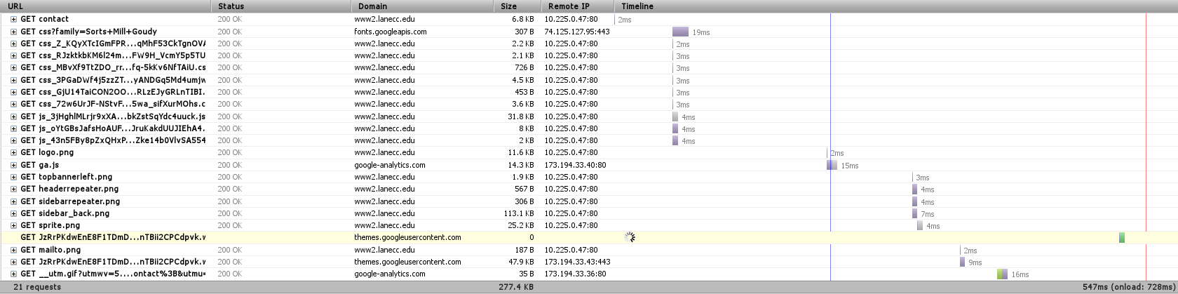
Now we’re loading the entire page in 640ms, and it’s only taking Drupal 277ms to get us the page content – less than 1% of the time it took before.

Medium Level: MySQL Caching

The other place to do caching is our database. Some types of requests to the database are really simple, repetitive things that could easily be stored in memory instead of on disk. MySQL provides a query cache where it learns what those things are. By default, this cache is turned off. If we turn it back on:

212 ms for Drupal to load the node

Now Drupal is able to get us that page in 212 ms – almost 25% faster.

Now what?

So we’re pretty quick. But, being programmers, we’re never satisfied. On our actual server we’re also:

  • Minifying additional JavaScript & CSS
  • Tuning our Web Server parameters so that we always have something waiting for your web page request
  • Pushing some resources onto a Content Delivery Network (videos, fonts, some JavaScript), so that they’re shared between multiple websites, reducing the likelihood you’ll need to download them.
  • Running much JavaScript from the bottom of the page instead of the head, so that the page will render in your browser before doing Javascript – giving the appearance of it being faster.
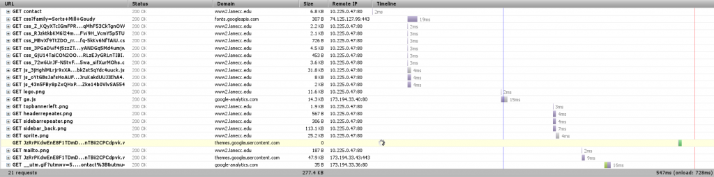
Here’s the timeline from the actual server to my computer, as it is right now:
800 ms

But there’s one more big thing we can do.

Anonymous User Caching

When Drupal renders a page, it needs to fetch information from the database, process a bunch of templates, check user permissions on a ton of objects, and then build the page. Then Apache, our web server, needs to serve that page to you. Apache is a good web server, but it’s a general purpose web server, designed to serve many different languages. There are faster alternatives.

We currently have a server in testing which is designed from the ground up to serve pages as fast as it possible. Pages loaded from that look like this:


Varnish gives us the page in 2ms

Our Varnish server is an entire separate server that sites between you and Drupal and does nothing but determine what pages could be stored in RAM as complete pages, ready and waiting for when you want them. In this case, it was able to return the contact page to me in 2ms – most of the rest of the time was spent waiting for other resources – CSS, Javascript, and fonts – to load. Now it’s obvious why reducing the number of HTTP requests would speed up our page  load – those bottom requests would be made sooner.

Varnish posed a special problem for us these last two months while we were testing it. First, it doesn’t do encrypted traffic. For that we have a separate nginx server, which takes care of passing your encrypted requests straight to Drupal. But our second, more fun problem was figuring out how to load test Varnish. My laptop wasn’t strong enough, then our other web server wasn’t strong enough, and then a set of 5 other machines on the same network weren’t strong enough. Varnish was able to handle thousands of requests per second, and not even blink.

Finally

Thanks for sticking with me this long! Except a much faster web site before the end of the month, as we finally turn on Varnish for the rest of the world. And we know there’s still work to be done. Our next design should feature fewer requests and less JavaScript, letting your page load and render just a little bit faster.