A few days ago, an astute employee over in Enrollment Services pointed out that our steps to enroll pages weren’t completely accessible to the blind. This is an important problem, and a surprisingly tricky one.
The current legal requirements for web accessibility (including §1194.22, which we’re most interested in) are referred to as Section 508. These standards provide some useful guidance on how to help folks with an impairment of some kind. For instance, they describe how images should have an alt text field, except for when that image doesn’t support understanding of the content (e.g. a background or filler image).
On the other hand, these standards are now old enough to vote, meaning they’re older than Facebook, Twitter, selfie sticks, Google Chrome, iPhones, the Columbus Blue Jackets, and Windows XP. Needless to say, they’re showing their age.
There’s no way to make click to expand text accessible under current 508 guidelines. Our best option would be to duplicate the page and provide a text only version. Unfortunately, that could lead to a screenreader having to read a lot of unnecessary text.
The solution relies in the proposed new standards. These are still in progress, but the web community is confident they’re going to heavily include something called WAI-ARIA. WAI-ARIA provides a way to mark up your pages with extra attributes that screen readers know how to recognize, so the blind can better use interactive pages.
Returning to our original problem, starting this evening we’re now using the hide-show accessible plugin on those pages. This plugin lets you write some fairly simple markup in your page which will then get converted to a click to expand box like on the steps to enroll.
To use, you’ll first want to click the blue link below the edit box in Drupal that says “disable rich text”. Then, if you want a simple button with some text below it, you’ll want to paste this in:
 <p class="js-expandmore">Click on me</p>
 <div class="js-to_expand">
     here is the hidden content!
 </div>
Then replace “Click on me” and “to show me!” with whatever works for your page. You’ll get something like this:
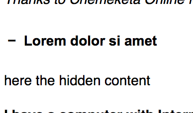
And when you click to expand, you’ll see this:
If you’d like a little bit of color, you can also use an h3 element, which would place that text in an orange box:
    <h2 class="js-expandmore">Lorem dolor si amet</h2>
    <div class="js-to_expand">
       here is the hidden content
    </div>
Exactly the same as before, but now it’ll look like this:
This is actually the more correct use – you nearly always want to use an h element of some kind when it describes the text after it.
For really advanced use, you can also add a full class to make the button full width. Or you can add the blue class to make the orange background blue instead. Or both!
    <h3 class="js-expandmore blue full">Lorem dolor si amet</h2>
    <div class="js-to_expand">
       here is the hidden content
    </div>
would look like this:
This is definitely getting into advanced content editing in Drupal, so if you’re stuck don’t hesitate to contact us at webmaster@lanecc.edu.
Remember, we should always try to use the right tool. For instance, these kinds of show and hide buttons might seem like they’d be perfect for an FAQ. But we already have a different setup for FAQ questions, that takes care of alphabetizing and tracking changes to each question. And remember that many of the visitors to your page won’t bother clicking the button at all. Always spend time simplifying your content to make sure the important message is apparent even without clicking to show your other text.


