Our website has nearly fifty pages with the word “Contact” in the title. For us, this has actually been our standard for a long time: we’ve always tried to make the bottom link in a menu a contact page. But, in designing the website, we started to believe this was the wrong approach.
First, many department homepages work better as contact pages. Why make someone click a link, just to see what the phone number for a department is?
Second, many of those contact pages ended up reproducing pages in the employee directory. Why have duplicate pages? And, since the employee directory updates directly from Banner, it’s much less likely to be out of date than a manually updated page.
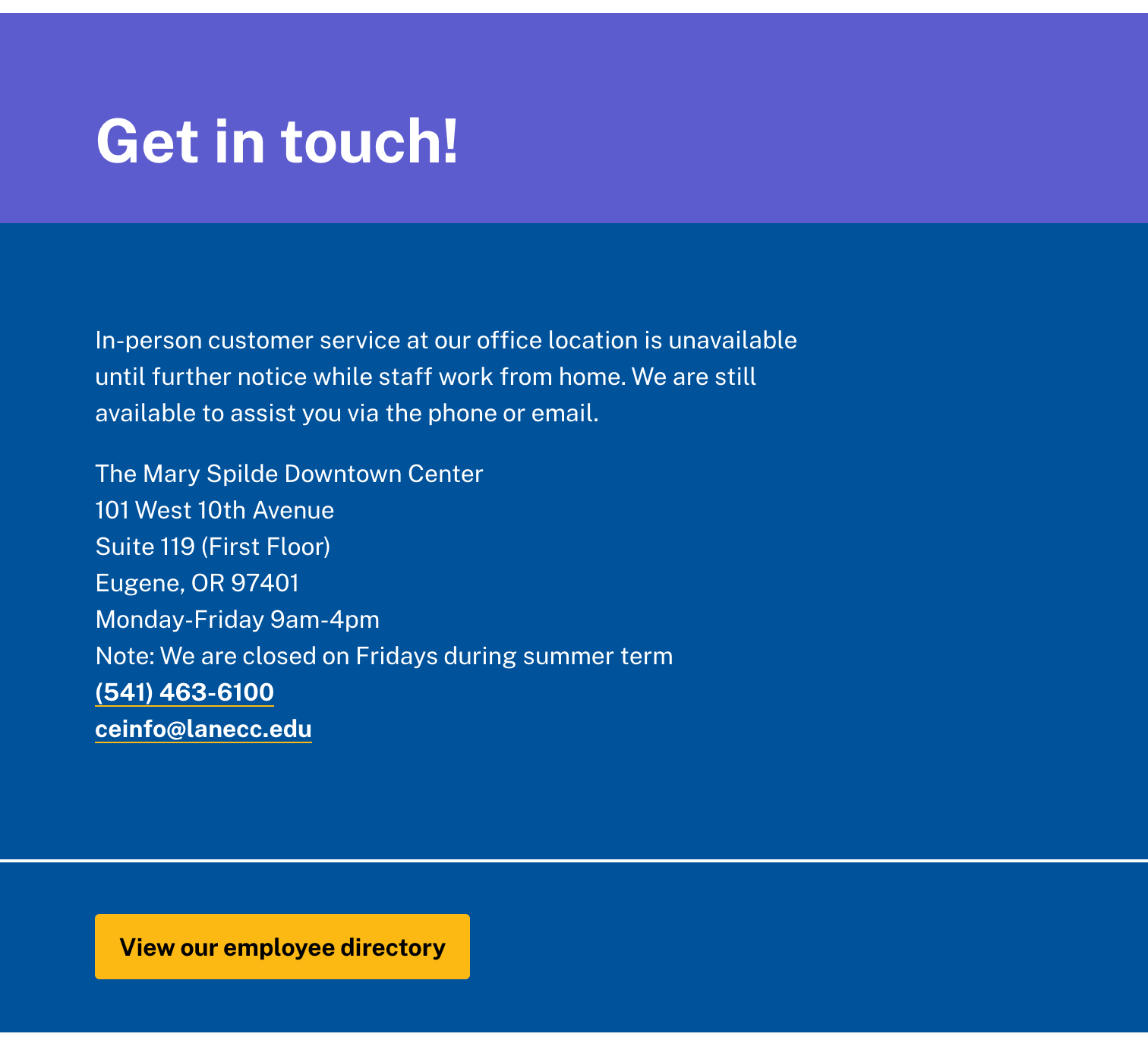
On the new site, we’ll be introducing the support block on pages, and eliminating many of those contact pages. Here’s an example of a draft support block on the Continuing Education site:
 The support block supports a little bit of variation, and we’ll be able to do things like showcase people, include logos, and add additional yellow buttons. We’re hoping this will result in a standardized look and feel for our contact information, while allowing us to substantially reduce the size of the website.
Of course, this means we need to fix any data quality issues in the employee directory. Be sure to check out your listing in the directory, and use the edit button at the bottom of the page to make corrections. For extra credit, check your department’s listing, and see if anything is missing.
