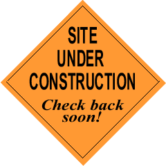
In the mid to late 90s, you could count on most websites having some sort of under construction or coming soon message on them. Often as a gif. Mental Floss reports this was due to people seeing a website as a project, like a film or a book, that would be eventually completed. Website design reflected that process: outline your chapters, then fill them in. Hence the placeholder messages and gifs, just so people didn’t get confused when they got to an empty page.
But now we know the web isn’t like that. We now know the web to be a continual process. Content gets stale and you have to revisit. Images need refreshing. And while we can miss certain amazing pieces of 90s web design, I don’t miss the under construction gifs.

As of right now, the phrase “coming soon” appears on the Lane website 15 times. In 10 instances, buried in the text is a promise that more information on a certain topic is coming soon. On 4 pages, the phrase “coming soon” is the only text on the page.
“Coming soon” and “Under construction” are aspirational messages. They’re a way to tell a visitor that we’ve thought about content we know they’ll care about, and remind them to check back later.
But these intentions often don’t work. Remember those four pages that just have a “coming soon” message? Here’s the last time they were edited:
- March 30th, 2020
- February 20th, 2020
- October 19th, 2018
- October 16th, 2017
The other pages have a similar range of edit dates. “Coming soon” sometimes seems to mean forever. If I’m browsing the web and I that message, I don’t set up a calendar reminder to come back and check later. I move on.
Here’s a scenario. There’s some new program, and we know about 90% of the information. But we’re waiting on the state to tell us about the application process. We need to alert students to the program, but until the state gets back to us, we can’t tell them how to apply.
First option better than just saying “coming soon”? Add a date. Simply saying “information on the application process will be released by May 15, 2020” creates a whole different impression of the page. But what about when there’s no date?
A good option is to use that opportunity to drive people to another communications channel: “We’re currently waiting for application information from the state. Follow us on Twitter to be updated as soon as application information becomes available.” As an alternative to social media, this could be a great time to get an email list going, which you can repurpose later to promote other programs.
Sometimes that won’t be appropriate either. As a last resort, at least add a note about when someone should check back: “As of April 27th, we are yet to receive application information from the state. We will post an updated message here by May 11th.” Then you can keep updating that message, even just to tell people that you still don’t know anything new. Not only does that help to demonstrate to the visitor that there will actually be information here, it forces you to remember to actually go back and update the page.
Coming soon messages happen with new pages too. Someone will be thinking about how to redesign their site, and they’ll create some empty pages as placeholders, or they’ll be thinking about some cool new feature on their site. Except then something doesn’t work out, or some more pressing task comes up, and we end up with a page that just says “Coming soon”.
Solution? Always have your content ready first. We’ll actually be adopting this rule as a policy going forward for the web team. While we’ll be happy to talk with you about what a webpage could look like, we won’t actually create the page until you can show us some content first.
Over the next week or two, expect some nastygrams from Lori or me as we try to clean up some of these content gaps. And if you’re having trouble trying to think around a difficult “coming soon” situation, let us know. We’d love to help.
