We’ve reached the Information Architecture stage of our web-project planning, a.k.a. how are we going to organize the new site? The ideal experience for any web user is to simply find what they need when they need it, without having to think. The ideal site is completely intuitive. Steve Jobs has been quoted as saying the ideal technology does not require a how-to manual. The aesthetics are such that users can simply figure it out. Given the breadth of the Lane web site this may be out of reach, but it is certainly an ideal worth pursuing.
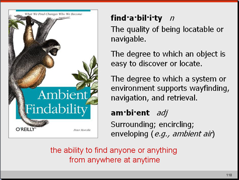
Taking ques from the de-facto experts on web usability and intuitive design (see Peter Morville’s Ambient Findability and Steve Krug’s Don’t Make Me Think), we have begun a series of card-sorting activities with our stakeholders.
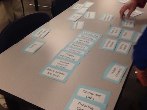
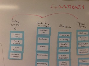
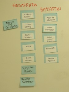
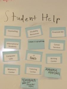
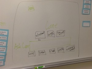
Card-sorting is exactly what it sounds like. A small group is provided a stack of 40 – 50 index cards with site names on them (counseling, welding, child care, library, course schedules, etc.) and ask them to organize them into 5 (or less) categories. Minimal direction is given – groups can add new cards – combine cards – organize as they see fit. Then we watch and listen to the discussion… see what they devise and listen to the logic behind it. They have a small window of time to get this done – 20 minutes or so – and then we have an open discussion about the results. A simple exercise that gets folks thinking about taxonomy and information architecture without having to know those terms – without having to read Ambient Findability or Don’t Make Me Think! Useful. Insightful. Simple.
So far, we’ve done card-sorting activities with current students, potential students (high schools), and lane employees. And we are now at the stage of aggregating and comparing the results. We aren’t there yet, but thought it might be worth while to share some of the process (and pics) of this activity.

