It’s been a while since our last redesign post, but don’t think we haven’t made some progress. We’ve been averaging about one video call per week, and are getting closer and closer to development work. Some of the things we’ve done:
Developed Batch 1 Designs
Our first batch of pages included the homepage, a career community page, and a program page. Our assumption is that these are some of the first pages most prospective students are going to look for, so we wanted to dive right into them. Our homepage is definitely going to shift direction, and be focused very narrowly on prospective student.
User Tested Batch 1
To be certain that we were on track with design and the information architecture, we did some intensive testing with some real prospective students. Users were asked to perform specific tasks, with people watching exactly what they did and seeing where they struggled.
Finalized Batch 1 Designs
We made some changes to the designs to address issues uncovered in user testing. Some were easy to address, but one has been a particular thorn.
Lane has a lot of different offerings, and people are confused by them. We have degrees, 2 year certificates, 1 year certificates, less than 1 year certificates, career pathways certificates, and non-credit credentials. There’s even more variety within the certificates. Some are financial aid eligible, some are not. Some are stackable with a degree, some are independent. Some are stackable, but you choose between multiple options. Some are technically stackable, but are marketed to a different market segment than the degree. We’ve gone several rounds with trying to balance standardization of design (to reduce confusion) with the flexibility to accommodate all our programs (to stay accurate). We’ve landed on a layout we think will work, and we hope to test it again, but it’ll be difficult to know if it’s worked for all programs until well after launch.
Reviewed Batch 2 Mockups
Our batch 2 pages included some Registration and Tuition related pages. While we’re pretty happy with the design of these pages, they’ve helped highlight a problem for us: our internal organization doesn’t always match how people think about us. For example, consider how students pay for college. We have a lot of departments that deal with money: a Financial Aid office, a scholarship and student employment office, a veterans benefits office, a bursar, and several people that work with sponsored accounts. There’s probably more. There’s really good reason for splitting them apart, and each requires a ton of very specific expertise. But if I have a question, and I’m not sure which of those areas can answer my question, who do I call?
Started Batch 3
Our Batch 3 designs relate to the application sorter and steps to enroll pages. We’ve done quite a few versions of these since our last redesign in 2013. For instance, our sorter page swapped from being person type oriented to goal oriented. Yet, despite all those changes, our sorter continues to be one of the least liked pages on the site. Our new design is going to try to leverage some of that experience, and include information that can help you navigate either way, while simultaneously emphasizing the most commonly used enrollment pathways.
Content planner
Our greatest amount of work has been the content planner. This maps content on our current website to the new website, and identifies where the gaps are. We’ve got a bunch of folders and empty documents set up in google docs right now where we’ve been starting to develop new content and rewrite some old content. There were more than a hundred pages which we need to keep, but which don’t have an obvious home in the new website, and I’ve been slowly making my way through. Some of the rewritten content will be launched before we launch, while most of the new stuff won’t be launched until the whole site is ready.
Meanwhile, as we continue our review of every page on the website, Lori’s been aggressively working on some of the recommended page merging and deletion. Thank you to the dozens of you that have helped us delete old pages!
What’s next?
After we finalize batch 3 this week, we’re hoping to do another round of prospective student testing. Very soon development will start, and while the site is being built, we’ll continue our work on content.
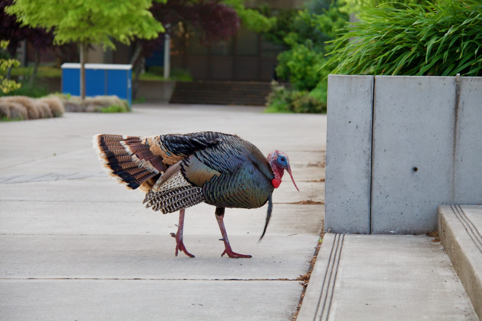
One of our big challenges will be photography. Normally for a website redesign you’d schedule a couple of professional photo sessions on campus, but due to COVID-19, that’s tricky. Before launch, it’s unlikely campus will look quite as busy as it would normally, we won’t see groups of people together, and the people we do see may be wearing masks. I’ve been trying to make it out to campus once in a while to get some photos, but there’s only so many empty shots of campus we can use. If you have any amazing photos – ideally where everyone in the picture has signed a photo release – and you’d be willing to let us use them, send them our way!

