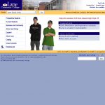
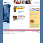
Let’s think way back for a minute, to a time when Gnarls Barkley’s “Crazy” was #2 on the charts and people were just starting to watch OK Go dance on treadmills. To when we got used to Daniel Craig as James Bond, and to Al Gore being on the big screen. To when Pluto was still a planet. To the last time Lane got a new webpage.
At the time, we had a nice, modern website. Unfortunately, our story isn’t much different from the guy who owns the nicest VCR on the block – times have changed. Our website was designed before there was an Internet Explorer 7 or any version of Google Chrome. There was no such thing as social media: both Facebook and Twitter launched to the general public after our last redesign. And perhaps most importantly, no one was looking at websites on cell phones – the iPhone wasn’t released until almost a year later.
I think we can all agree that Lane is (over) due for an update.
Our mission this year is to realize that update. But this isn’t a small task. Ever after three months of intense cleaning, Lane’s website has 11,795 pages of HTML files living on our server. If we want to update the design, we need to make a change to each and every one of those files. In other words, even if we started today, we wouldn’t be able to finish before it was time for the next redesign. Plus, we wouldn’t be fixing the information architecture of our site – we wouldn’t be making things easier to find.
So we’re going to build the next generation of the Lane website using a technology called a Content Management System (CMS). A CMS is going to offer us a lot of awesome things in the near future:
- The ability to modify and change the website from anywhere in the world, at any time of day.
- The separation of presentation and content – we’ll be able to change the design of the entire website without having to worry about what’s happening to the content.
- Editing from the browser – no need to download any special software, just fire up your web browser and get to work.
- A mobile version of each page – because presentation and content are separate, it’s easy to serve the same content with a design optimized for a mobile device.
The CMS we’ve picked is called Drupal, an open source project that powers all sorts of important websites, including The Economist and the White House as well as a number of university websites right here in our backyard such as the University of Oregon and Portland State University.
Obviously, a transition like this isn’t going to happen all at once. In fact, this one is going to take until summer, and we’ve already been working on it for almost a year! We’ll do as much as we can to keep you posted on changes through this blog. Expect a post in the not too distant future about some of the changes you’ll notice before we officially launch the new design.


This is exciting news. . . Thank you to our amazing IT department for projecting ahead in this way.
Uhhhh…. (o.O)….. “Proudly power by WordPress”
Correct. While we’re going to be running the main website on Drupal, we’re using WordPress to power our blogs. While Drupal will certainly do a blog based website (or e-commerce, forum, or any of a number of types of sites), we saw an opportunity to keep functions separate and simplify administration – after all, this is a very big site.
Another entity that you may wish to mention is the City of Cottage Grove uses DRUPAL in conjunction with their city-wide WIFI network.
Did not know this. I’ll be sure to take a look next time I’m down that way
It’d be nice to see more focus on areas of study and actual learning and less time and money redecorating digital bedrooms to attract more business.
Your point is well made. But, the web site project is being done in direct service to Lane students. By updating and streamlining the site, we can better communicate and serve students so they can *connect* with learning resources. It will facilitate finding information on courses, faculty, facilities, etc. – providing quicker and easier methods of connecting you with what you want and need. The site is purposefully being redesigned with a very distinct student focus. We want to provide students with quicker, easier, methods of connecting with learning resources – courses, services, people, etc. If we make it easier to come here, easier to navigate the administrative part of student life, easier to study/learn, easier to graduate or transfer, and easier to get and keep a job — we will be fulfilling our mission! Win Win.
I am not really wonderful with English but I find this really easygoing to read.
WOO HOO!! We are very proud of our IT & Mkt’g depts – we’re gonna have a FAB new website and we and our students can’t wait! Great job!
How can those of us who are interested and have perspectives important to this redesign weigh in on what we would like to see? I’m very glad to see this happening! Just want to have some input, since we get a lot of the student questions regarding where to find things on the website.
Hey Fiora, We are about to launch an open survey to all constituent groups as a sort-of… solicitation for feedback. We’ll be asking folks to generally tell us what works in the current site (and what doesn’t) and what is vital for the new site as well. Beyond that there will be multiple open feedback opportunities available – including a showcase of possible designs. We are attempting to keep this process as transparent and open as possible. If you’d like to contribute more broadly/deeply just say the word – something can be arranged. = )