Posts that spark joy

The other day, I saw this blog post about tidying up your website using the Marie Kondo method. While I think peak Kondo-mania is likely behind us (unless she’s renewed for a second season, of course!), as our date for content migration approaches (probably late this upcoming spring!), that post got me thinking about how her tidying principles can help provide a good frame for tidying and improving websites here at Lane. There are six principles:

Commit yourself to tidying up

Like any other tidying project, working on cleaning up your website is going to take some time. The most Kondo-like advice, of course, is to carve out an entire afternoon. But at the very least, try to find a regular time to dedicate to tidying your website and cleaning out the ROT. Even an hour every other week is enough time to make a considerable impact.

Imagine your ideal lifestyle

If you spend a minute imagining what your dream website would look like, I’d be willing to bet a lot of your dreaming is related to the look and feel of the website. Don’t get me wrong, website appearance is important. But design alone is never enough to capture, retain, or influence an audience. As you imagine your dream website, I’d encourage you to think first about what your website goals. What specific behaviors are you trying to influence through your content? What actions are you trying to get visitors to take?

The Lane website has a surprising number of pages that aren’t really about getting anyone to do anything, but are instead about documenting internal processes, documenting old projects, or displaying mandatory information. Some of this is unavoidable. Our privacy statement isn’t about to be tidied up. But imagine a page that’s just a photo gallery. They may be compelling photos in that gallery. But because they’re buried in a gallery on their own, no one is going to find that page and take the time to look through the photos. Instead, choose some outstanding pictures and work them directly into your content. If you really need to have a gallery, use a dedicated photo site (like your Lane Google Photos account), and link to it.

As you imagine, try to think about how all the pieces of your online presence – photo, video, social, and copy – support each other and to tell a compelling story and influence an action. Think about how you can show, rather than tell.

Finish discarding first

Our largest pieces of the site have over 130 pages, and hundreds of attached files. Not only can that seem overwhelming, but thinking about all that content can make your head spin. By discarding first (even just a sentence here or there!), you’ll get a better understanding of your content and where the gaps are, and maybe spot some opportunities to combine pages into one, more cohesive page.

Tidy by category, not location

The advice in that blog post is spot 0n – don’t just think about if you need this particular page, think about if you need all the pages like that. So, for instance, don’t just think about if you need a page describing Underwater Basket Weaving 201, which hasn’t been run in three years. Think about if you need pages describing your Underwater Basket Weaving courses at all – after all, the course descriptions should be in the catalog, which got a pretty spiffy update this year.

Follow the right order

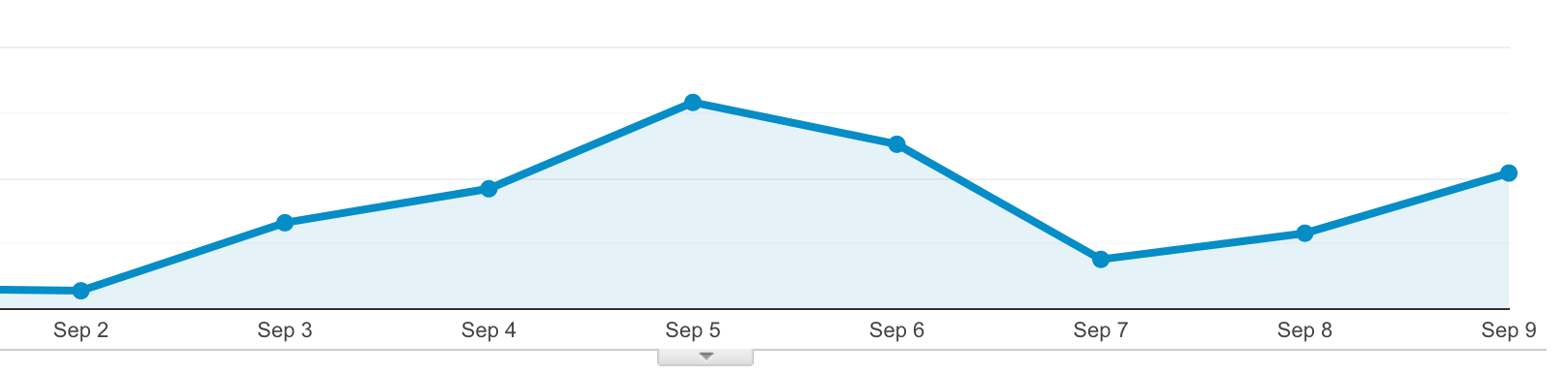
One of the Google Analytics reports we’re happy to provide you is a page popularity report. For each of your pages, we can help you discover how many times it was viewed, how many times it was viewed by different people, how long they were on that page, and if it was their first or last page. I’d recommend you use these reports from the bottom up: start with your least popular pages. Since you already know they’re not being seen as often as you probably wish they were, you already know they need to change. Look elsewhere on your site to see if there’s a place they can fit in or, even better, see if you can get rid of them entirely. You can email Lori or me for help getting one of those reports.

Find joy

This one is complicated. Because the web isn’t your house, and how much a page brings you joy isn’t really the goal. The real goals relate to helping increase access to education and helping students meet their educational objectives. So find joy in what that page does, and in the goals it helps accomplish. If you can’t relate that page to a goal, thank it for it service, and say goodbye.


Understanding WCAG 2.1 – 1.3.4 Orientation

The very first success criterion we’ll look at is 1.3.4: Orientation (level AA). Remember that WCAG 2.1 extends on the work already done in 2.0, so because there was nothing added to parts 1.0, 1.1, or 1.2 we can skip those. Here’s the full text of the new criterion:

Content does not restrict its view and operation to a single display orientation, such as portrait or landscape, unless a specific display orientation is essential.

This is one that definitely feels like a best practice in user experience. Let’s take a look at an the Garmin Connect app, which both follows this standard really well and really poorly at the same time.

Here’s one of the screens showing my steps for the day on my phone:

A screen, showing various widgets listing step information
Why yes, I did choose a day when I met my step goal handily.

When the phone is in portrait mode (the way most of us hold our phones most of the time), everything looks good, although the astute reader will note that app violates success criterion 1.4.1). But here’s what happens when we flip that onto its side:

It's the same picture, just sideways.When we’re in landscape (the way most of us should shoot videos on our phone), everything is sideways. It’s, honestly, terribly annoying, if not a little lazy. If those boxes were to all rotate with the screen, and maybe just be oriented a little differently, the screen would be just as useful, and provide the exact same information.

But the connect app also does a good job taking advantage of the different screen orientations to show different information. Here’s another example from an activity a while back:

Showing some statistics and two small graphs
It’s a little embarrassing how far back I had to look to find an activity.

But this time, when we switch to landscape, we get a different screen:

A close-up, just of the two graphsThe developers over at Garmin clearly felt that those graphs only make sense in landscape, where they can be a larger while maintaining proportion. I’m not sure I fully agree – sometimes activities are so long you need a monitor, not a phone – but they clearly feel that the specific screen orientation is essential to the information being displayed.

If you’re leaving out screen orientation as a part of your media queries when developing for the web, then you’re probably in good shape. And, on the topic of good shape, feel free to send me a step challenge on Garmin Connect. I’ve got a camping trip coming up this fall, and for once I’d like to huff and puff less than the other folks with me.

Looking for the rest of the posts in this series?

Responding to an accessibility concern

At the beginning of the month we changed our normally static homepage to include the following animated gif:

Watercolor image of a fountain on campus, showing a bunch of leavesWe tend to swap the homepage image to be an animated gif about three or four weeks before classes start, and link it directly to our registration platform. While these images can be pretty, after you’ve watched them for a couple of minutes, they start to feel really annoying. And, invariably, after a week or so, the first complaints show up. But here’s how we respond:

Traffic graph for that image, showing a sizeable bump in the days after we launched it, with a dip lin the weekendThose images drive hundreds of clicks in the weeks after we launch them. So, annoying or not, if they’re achieving their objective, that’s what’s important, right?

But then we got a complaint email that wasn’t about the image being annoying, it was about the image being distracting. And that got me thinking – they were probably right. Motion can negatively impact people with various cognitive impairments.

Before we go into how we responded, let’s talk a little bit about why we’re using a gif. I mean, the gif format is 30 years old. Almost everyone has moved on to web video. But when we launched the updated website, we were stuck supporting all the way back to Internet Explorer 6. And for Internet Explorer 6, 7, and 8, there was no non-flash video option. So we build the website with support for images, but often not video (though we’ve been adding some support, it hasn’t been across all parts of the site).

WCAG 2.2.2: Pause, Stop, Hide

Stuck with gifs, I tried to resolve this as quickly as possible, since there was someone out that I knew was negatively impacted by the image. I quickly skimmed the WCAG 2.0: 2.2.2 standard, but it turns out this one is a little more complicated than I first thought. Here’s the full text:

2.2.2 Pause, Stop, Hide: For moving, blinking, scrolling, or auto-updating information, all of the following are true: (Level A)

  • Moving, blinking, scrolling: For any moving, blinking or scrolling information that (1) starts automatically, (2) lasts more than five seconds, and (3) is presented in parallel with other content, there is a mechanism for the user to pause, stop, or hide it unless the movement, blinking, or scrolling is part of an activity where it is essential; and
  • Auto-updating: For any auto-updating information that (1) starts automatically and (2) is presented in parallel with other content, there is a mechanism for the user to pause, stop, or hide it or to control the frequency of the update unless the auto-updating is part of an activity where it is essential.

On a first read, I assumed this success criterion didn’t apply. After all, there’s no moving, blinking, or scrolling information. Leaves are moving, but text is not. But, as many high school teachers I ignored told me, always read all of the instructions.

Attempt 1 – the programming solution:

My first thought was to do some searches and see if I could find a way to quickly add a pause button to animated gifs, since that would be an easy, site wide fix. I was definitely reaching here, but it turns out it’s a somewhat viable option. This solution involves creating a png of a single frame of the gif, and swapping them on click. That felt problematic to me. While it might work if you click to pause the image, because our image is linked to our registration platform, I’d need to add an actual button over the image somewhere. That can be rather involved, with making it cross-browser, all screen size friendly, and ensuring it’s sufficiently accessible itself.

Attempt 2 – reduce complexity:

With the button ruled out, I thought that the easiest thing we could do would be to just remove some complexity from the image. We could make the leaves go slower, and maybe remove a few leaves. After a bit of work, our student designer put together this image for us within a few hours of the initial complaint:

The same image, but with about half as many falling leavesThat image has about half as many leaves, so it’s a lot less complex. And the leaves stay off the screen for a bit, meaning there’s always time without motion on the screen.

But while I was able to confirm the reduced complexity image solved the problem for our user with the complaint, I couldn’t shake the feeling that I really ought to read the entire standard. 

Returning to the standard

It turns out that if I’d just scrolled the page down a little bit, I’d have seen the information in the very first sentence. Here it is:

The intent of this Success Criterion is to avoid distracting users during their interaction with a Web page.

While I still think the success criterion needs some edits to be more clear about what constitutes “information”, certainly the purpose of the standard is to reduce distraction. And both Penn State and WebAIM agree: animations need to be very short or user controllable.

Attempt 3 – short animation:

The next easiest fix was to turn off looping on the animation. That way there’s still enough motion to capture attention, but not enough to distract. Here’s what we came up with:

The same image, but with looping turned offOf course, there’s some some downsides. For instance, say you embed a gif halfway down a page, and it takes more than 5 seconds to scroll there (like this page! If you’re not seeing motion, reload the page and scroll quickly). The visitor will never see the animation (note – this is fixable with lazy loading of images, but those weren’t a thing when we built this site, and we’ve had trouble grafting them on). But for us, with the image essentially at the top of the page, it’ll probably work. This also doesn’t work for cinemagraphs, which depend on perfectly looping images to create the effect of slight motion in an otherwise still world.

Next steps:

After we had an actual fix in place, we did a quick check across the entire site for other animated gifs, and found only one other place where there was a problem. That image has since been removed completely.

We’re currently exploring finally adding video support for some of the last areas of the website that don’t support it. Video would not only provide a way to pause animation, it would also allow for much higher resolution images and more complex animations. But fitting video into pages is also more complex, and if we’re unable to find a way to do what we need without a lot of work, we might end up waiting for the next iteration of the website. More details on that soon!

Exploring WCAG 2.1

A few years have passed since our last accessibility series, and since then, the W3C has published the new WCAG 2.1 standard, which has further complicated the digital accessibility landscape. This post will dig into why things are a little more complicated and then, much like last time, future posts will explore what we can expect from WCAG 2.1. I’ll keep this post updated with links to the future posts, so check back here if you’d like a  table of contents to all the entire WCAG 2.1 series.

Do we need WCAG 2.1 compliance for 508 compliance?

No. But.

Creating federal standards is a fairly involved process, and the official 508 standard is likely to lag behind for some time. However, the actual digital accessibility compliance landscape is a little more complicated, and it’s likely only a matter of time before WCAG 2.1 becomes a commonly accepted digital accessibility standard, and we start seeing case law referencing WCAG 2.1.

Don't take legal advice from strangers on the Internet - Abraham Lincoln, 1863
Remember folks – I am not a lawyer, and I definitely would not depend on this blog post for legal advice.

But beyond that, we shouldn’t be thinking of accessibility strictly as a compliance issue. We also need to be thinking about open access for everyone. And some of the new rules, in my mind anyway, aren’t just good accessibility practices, they’re good user experience practices.

For the foreseeable future, Lane will continue to use WCAG 2.0, level AA as our official accessibility standard. But that doesn’t mean we can’t start thinking about what’s coming, and implementing best practices where we can.

How much of this applies to me?

WCAG standards aren’t just for website builders, they’re also for anyone who develops digital documents, like PDFs, Moodle courses, online quizzes, or graphics for display on our digital signs. While many of the changes in WCAG 2.1 are on the technical side, there are some that almost certainly apply to you. I’ll make a note on each entry in this series I think is more broadly applicable to people who work outside of web development.

What are these persona things?

When developing the 2.1 standard, the W3C developed personas through which they could view different problems. You can think of a persona as a pretend person, with a set of needs that could be a real person’s. For instance, as part of the upcoming website redesign, we may develop a persona like this:

Alice is a recent retiree who is interested in using her newfound free time to explore her long dormant artistic interests. She feels confident about using a computer, but she’s a little nervous about how long it’s been since she took a course in school.

There isn’t an Alice, of course, but there are people like that out in the community. Contrast that with Bob:

Bob is a high school senior, who hasn’t considered what he might want to do for a career, but knows he’ll be attending Lane in the fall. He isn’t terribly interested in school, and mostly does things when his parents prompt him.

Clearly Bob and Alice are going to use the website a little differently. With website design, the problem is how to make one site that works for both of those people. For the W3C, they used personas to explore how different, specific impairments could impact technology use. For each of the criteria in the WCAG 2.1 standard, I’ll try to include the persona that the W3C used, since they really help to illustrate just who this standard is going to help.

The W3C provides a comprehensive list of personas they used for WCAG 2.1.

Why 2.1 and not 3.0?

In the software engineering world, many software projects use a practice called semantic versioning to illustrate the magnitude of differences in a new software release. The first number is typically the major version number, followed by a dot, and then a minor version number. Sometimes that will then be followed by another dot containing the patch number, or other information. When the major version is incremented, that usually means that the changes were so great that they broke how things were done in the past. When the minor version is incremented, that means new functionality was added, but nothing was added that would have broken how things used to work.

For instance, Slack on my computer is in version 4.0. From that, we can determine that Slack is yet to add new features to this release of their software, but they’ve made several major releases and rewritten quite a few things. On the other hand, right now my parents are using WhatsApp to ask me why I haven’t bought planet tickets home for the holidays yet. WhatsApp is currently in version 0.3. The leading 0 seems odd, but typically is thought to mean that the software is still in some sort of test version, even if the whole world is using it (much like how Gmail was in beta for 5 years). The 3 means that WhatsApp has put out three updates which introduced new functionality, but didn’t break things.

While that might seem confusing, it’s worth reflecting that it’s a lot better than certain other software projects, which used the version numbers 1, 2, 3, 3.1, 95, NT, 98, 2000, ME, XP, Vista, 7, 8, and 10.

This is a bit of an unfair joke, because Windows has meaningful internal version numbers, but those still skip around a bit (there is no version 7, 8, or 9) and don’t match (Windows 7 was version 6), so I feel like we can still criticize some.

In the WCAG world, you can see that when they moved from version 1.0 to version 2.0. The changes were so great that the rules from 1.0 wouldn’t apply anymore, and could just be thrown out. WCAG 2.1 is a minor release. Rather than replace WCAG 2.0, the 2.1 standards extend the 2.0 standards, and give us new ways to ensure our software is accessible.